How do artists use color to affect perception


. A study in complementary colors.")


")


- Slides: 26
How do artists use color to affect perception and set the mood or tone of an artwork?
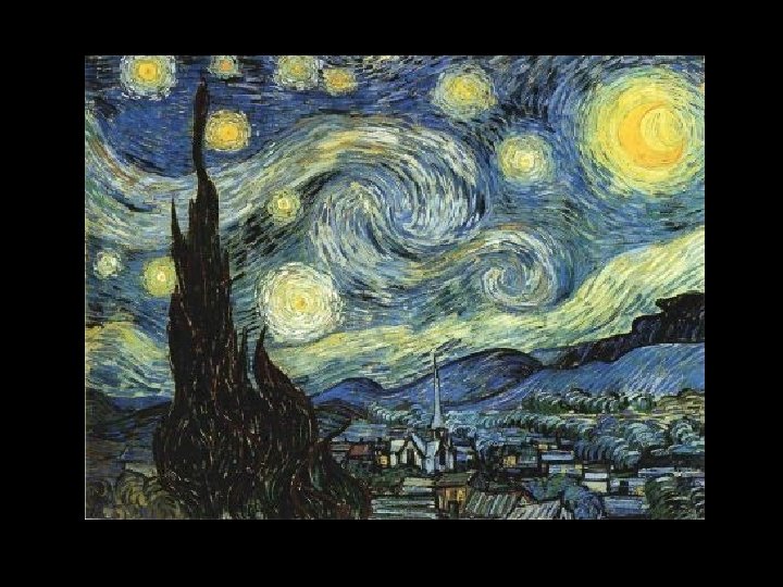
Color Theory The names of the primary and secondary colors are often among the first words we learn to speak and write. Even very young children can identify the red object in a painting, or the blue object in a photograph, but there is a lot more to color than initially meets the eye. In the next slide, stare at the center of the image for thirty seconds and them stare at the next blank slide. What do you see? This is a complementary color after image.
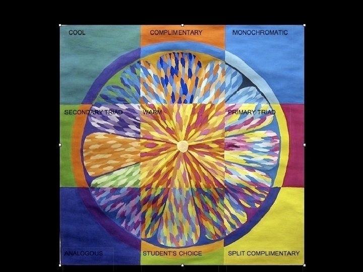
Color Schemes are harmonious combinations of colors within a work of art.
Color Schemes we will study • • Monochromatic Analogous Complementary Warm Colors Cool Colors Color Triads Split Complements
Monochromatic Color Scheme: Monochromatic one color plus black and white (lighter and darker variations of the same color) What is the mood of this painting? How did Picasso use color to convey this mood?
analogous color scheme Analogous colors sit side by side on the color wheel and share a common hue.
Complementary colors are the colors that sit on the opposite sides of the color spectrum when the spectrum is shown as a circle.
Winslow Homer, The Milk Maid, 1878 (detail). A study in complementary colors.
Warm and Cool Colors
Warm colors appear to come forward in a painting. • Cool colors appear to recede to the background.
Houses of Parliament at Night, 1905 -06 André Derain (Chatou 1880 - Paris 1954) French Robert Lehman Collection, 1975 (1975. 1. 168)
When looking at a painting or a photograph, one's eye is usually drawn to the lightest points within a composition, as well as the points with the brightest or most vibrant color. In addition, our eye tends also to be drawn towards warmer colors, such as red and orange.
Color Triad Three colors that are equally spaced on the color wheel.
Split Complements A color and the two colors on either side of its complement.
Monochromatic Analogous Complementary Warm Cool
http: //www. pinterest. com/pi n/28991991324566222/ http: //www. pinterest. com/pi n/28991991324597097/
Upon completing this lesson, you will be able to: Explain the ways in which color is used to create a sense of depth in a two dimensional space Identify the ways in which the artist uses color to draw the viewer's attention to points within the composition Discuss the effect of color on the tone and mood of an artwork
Color Scheme Book • Create a hand made book according to the directions provided. • Include at least four color schemes in your book. • Design at least one page per color scheme. • You may use the media of your choice for illustration. • The book should have a unifying theme.