HORROR POSTER ANALYSIS OLD HORROR POSTER Theres an
- Slides: 4

HORROR POSTER ANALYSIS

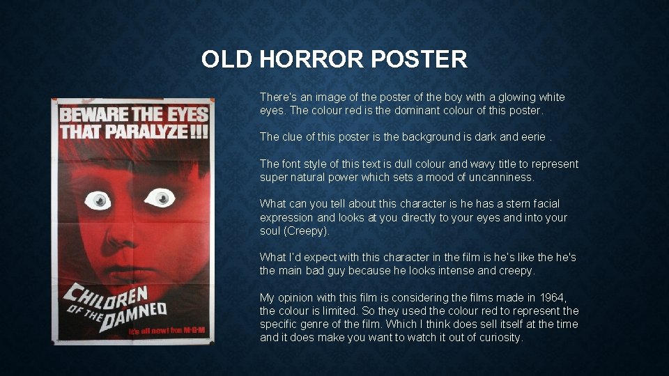
OLD HORROR POSTER There’s an image of the poster of the boy with a glowing white eyes. The colour red is the dominant colour of this poster. The clue of this poster is the background is dark and eerie. The font style of this text is dull colour and wavy title to represent super natural power which sets a mood of uncanniness. What can you tell about this character is he has a stern facial expression and looks at you directly to your eyes and into your soul (Creepy). What I’d expect with this character in the film is he’s like the he's the main bad guy because he looks intense and creepy. My opinion with this film is considering the films made in 1964, the colour is limited. So they used the colour red to represent the specific genre of the film. Which I think does sell itself at the time and it does make you want to watch it out of curiosity.

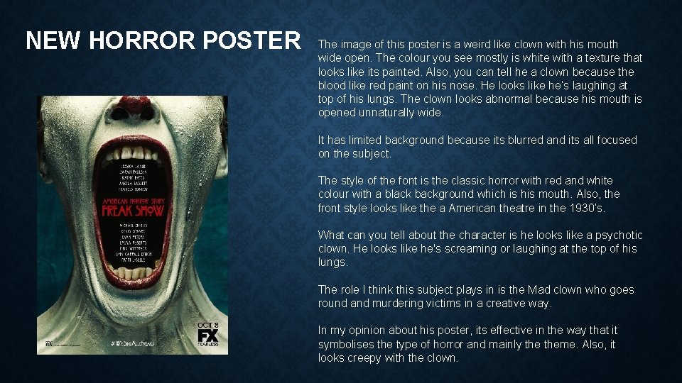
NEW HORROR POSTER The image of this poster is a weird like clown with his mouth wide open. The colour you see mostly is white with a texture that looks like its painted. Also, you can tell he a clown because the blood like red paint on his nose. He looks like he’s laughing at top of his lungs. The clown looks abnormal because his mouth is opened unnaturally wide. It has limited background because its blurred and its all focused on the subject. The style of the font is the classic horror with red and white colour with a black background which is his mouth. Also, the front style looks like the a American theatre in the 1930’s. What can you tell about the character is he looks like a psychotic clown. He looks like he's screaming or laughing at the top of his lungs. The role I think this subject plays in is the Mad clown who goes round and murdering victims in a creative way. In my opinion about his poster, its effective in the way that it symbolises the type of horror and mainly theme. Also, it looks creepy with the clown.

HOW THOSE TWO POSTERS HAVE SIMILAR STYLE & TECHNIQUE Out of retro and modern horror poster, the similarity of these two posters they used the specific colours, i. e. red, white and black. The subjects of these posters are similar, in the that the subjects are close up camera techniques. The reason being is because it boldly shows creepiness by seeing the full detail of their facial expressions. They have super-naturalness to it and its limited with information which I think is because the picture is worth a thousand words.