Horror Film Poster Mood board Similarities of poster

Horror Film Poster Mood board
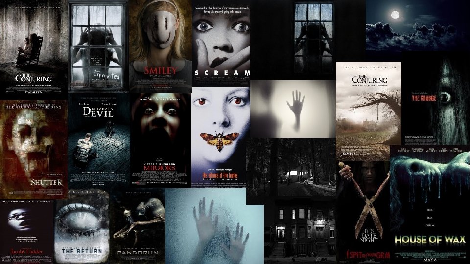

Similarities of poster elements • All film posters are marketing strategies in order to get the consumer to buy the product. Posters use a marketing technique known as AIDA in order to make them effective. A stands for awareness, this is the awareness of the consumer understanding about the film e. g. the genre. I is interest, the consumer will build an interest to the film based upon what they are looking at. D is desire, the consumer develops a desire, allow the audience to understand what they are looking at and make them want the product. Finally A stands for action, get the consumer to buy the product. • All of the posters in the first slide show this. They instantly show to the audience what genre the film fits in, mainly doing this through the main image and colour scheme of the poster. All of the covers showed an image which caused questioning or uncertainty for example ‘Mirrors’ ‘the Uninvited’ all cause the audience to want answers. The colour scheme is a convention shared by all posters. In horror posters dark colour schemes and low key lighting are key in order to make it effective. Every poster used a dark colour scheme in order to portray darkness and death. • They all caused the audience to become interested, this is through the mast head and taglines. For example ‘Pandorum’ uses the tagline ‘FEAR WHAT HAPPENS NEXT. ’ in block capitals, drawing the attention and causing interest as we don’t know anything about the film. This is a good effect to entice the reader in. • Enticing the audience in will make the audience desire to want to watch it. Through the conventions of the image and masthead, these crate interest for the viewer to be hooked. This will ultimately cause them to want to buy the film and watch it.

Examples • 1. All of the film share the colour scheme, using dark colours and contrasting colours such as red to connote emotions such as blood, death and fear. • 2. An impactful main image. They haven’t given a lot away with the image, however it is enough for it to allow the audience to be interested and want to know more. • 3. The masthead used on all of the posters are eye catching in block capitals. Most of the poster use a distorted font in order to link with the genre of horror. • 4. Simple. All of the posters are simple, and aren’t too busy, they have a masthead, image and tagline, which don’t take up a lot of space and allow for the main image to stand out and make it eye catching. • 5. Direct address is common in all of the posters. Using direct address includes the audience, and makes the audience feel like its aimed at them to watch it, making them relate and feel more attached to it.
- Slides: 4