HISTOGRAM STEM AND LEAF PLOT and DOT PLOTS


- Slides: 17

HISTOGRAM , STEM AND LEAF PLOT and DOT PLOTS Lecture-4 21/03/2016

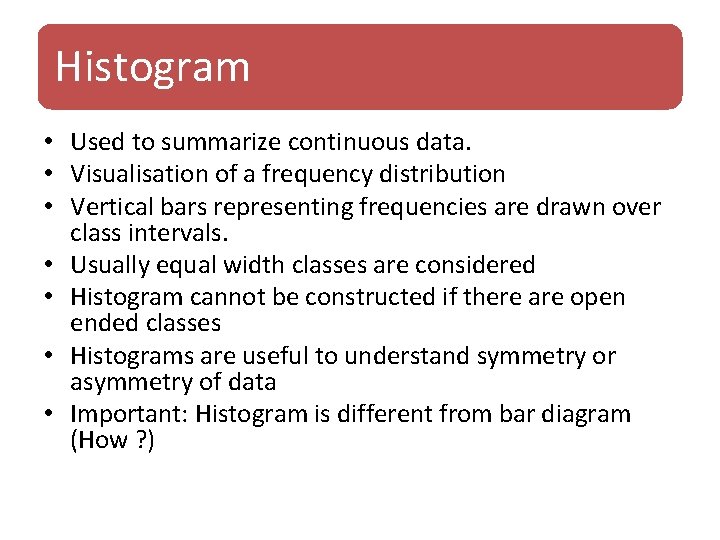
Histogram • Used to summarize continuous data. • Visualisation of a frequency distribution • Vertical bars representing frequencies are drawn over class intervals. • Usually equal width classes are considered • Histogram cannot be constructed if there are open ended classes • Histograms are useful to understand symmetry or asymmetry of data • Important: Histogram is different from bar diagram (How ? )

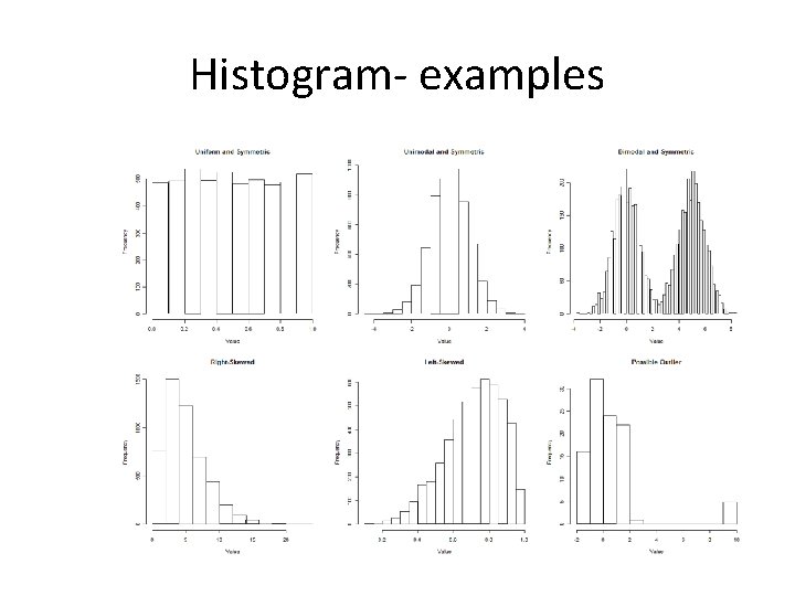
Histogram- examples

• Interactive histogram

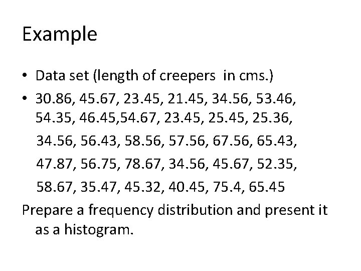
Example • Data set (length of creepers in cms. ) • 30. 86, 45. 67, 23. 45, 21. 45, 34. 56, 53. 46, 54. 35, 46. 45, 54. 67, 23. 45, 25. 36, 34. 56, 56. 43, 58. 56, 57. 56, 65. 43, 47. 87, 56. 75, 78. 67, 34. 56, 45. 67, 52. 35, 58. 67, 35. 47, 45. 32, 40. 45, 75. 4, 65. 45 Prepare a frequency distribution and present it as a histogram.

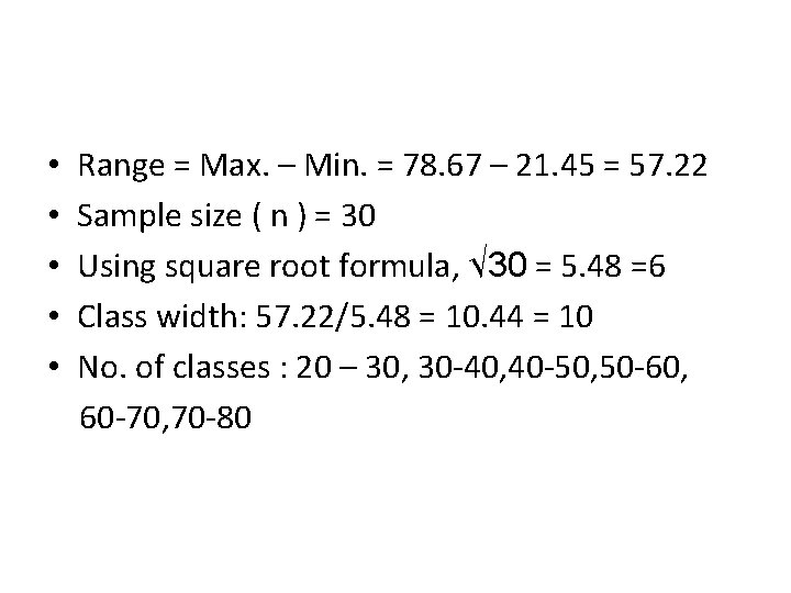
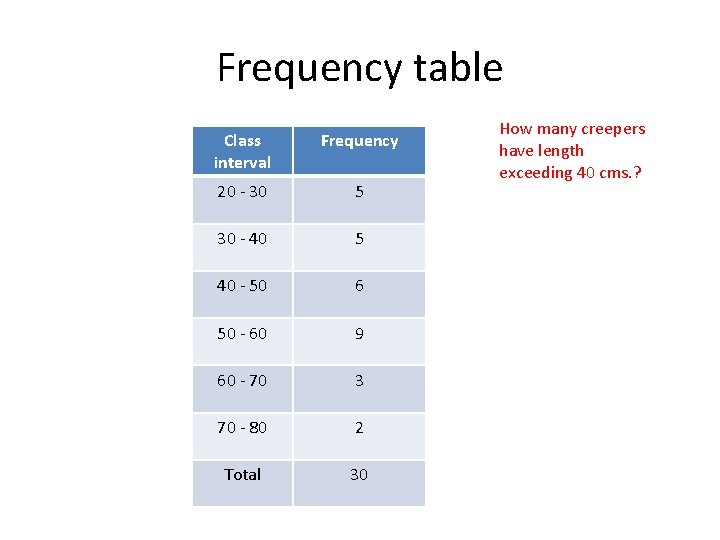
• • • Range = Max. – Min. = 78. 67 – 21. 45 = 57. 22 Sample size ( n ) = 30 Using square root formula, √ 30 = 5. 48 =6 Class width: 57. 22/5. 48 = 10. 44 = 10 No. of classes : 20 – 30, 30 -40, 40 -50, 50 -60, 60 -70, 70 -80

Frequency table Class interval Frequency 20 - 30 5 30 - 40 5 40 - 50 6 50 - 60 9 60 - 70 3 70 - 80 2 Total 30 How many creepers have length exceeding 40 cms. ?

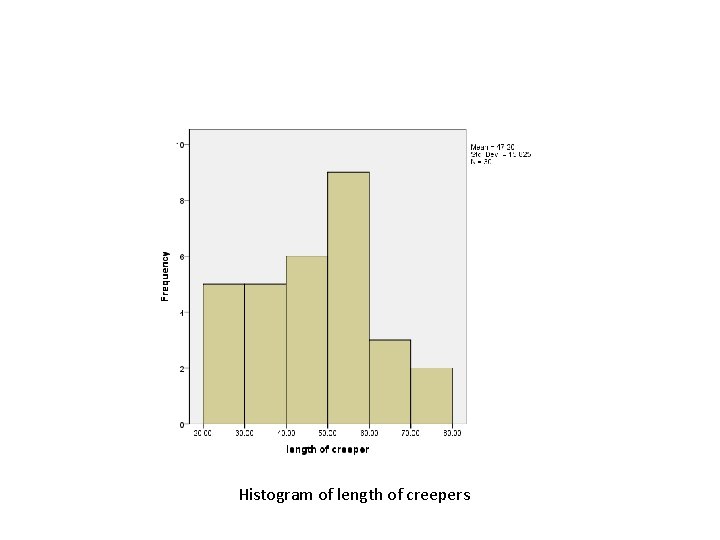
Histogram of length of creepers

Home work example-1 • People were asked to state the number of hours they exercise in a seven day period. The results of the survey are listed below. Make a frequency table and histogram to display the data. • 8, 2, 4, 7. 5, 10, 11, 5, 6, 8, 12, 11, 9, 6. 5, 10. 5, 13 , 8. 5 , 3 , 4. 5, 6, 5. 5, 7. 5, 8, 10, 11, 10. 5, 4. 5, 8, 7, 5, 6. 5, 4. 5, 6. 5 , 7. 5, 8, 10, 13, 9. 5, 3. 5, 4. 5, 5, 5. 5 , 6. 5, 7. 5, 8, 10

Stem and leaf plot • Bears strong resemblance to a histogram and serves the same purpose • Used to show the distributional structure of quantitative data • It preserves the information contained in individual observations • It can be constructed along with the tallying process when a frequency distribution is constructed

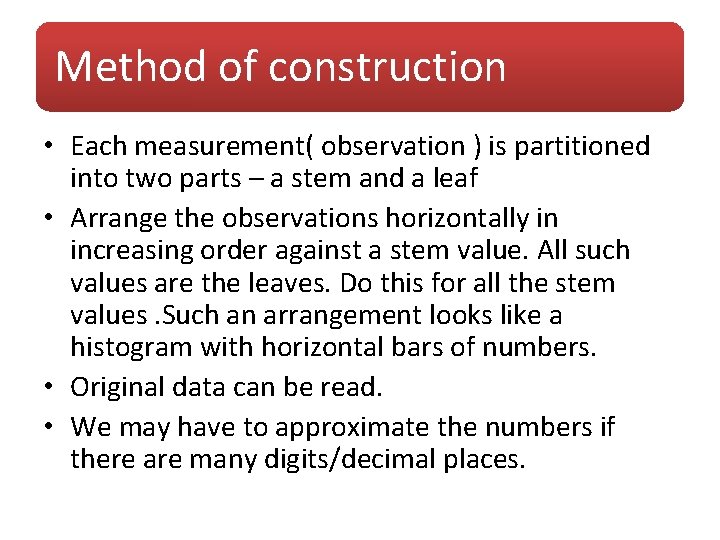
Method of construction • Each measurement( observation ) is partitioned into two parts – a stem and a leaf • Arrange the observations horizontally in increasing order against a stem value. All such values are the leaves. Do this for all the stem values. Such an arrangement looks like a histogram with horizontal bars of numbers. • Original data can be read. • We may have to approximate the numbers if there are many digits/decimal places.

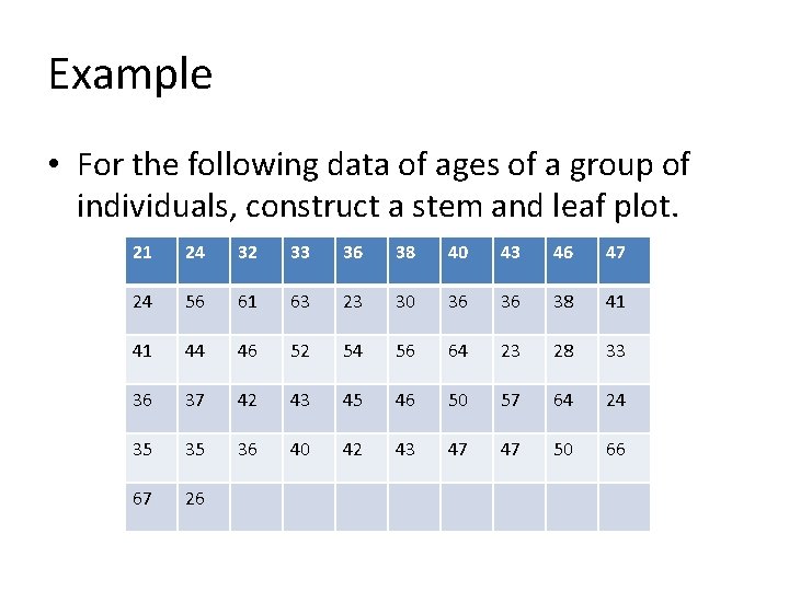
Example • For the following data of ages of a group of individuals, construct a stem and leaf plot. 21 24 32 33 36 38 40 43 46 47 24 56 61 63 23 30 36 36 38 41 41 44 46 52 54 56 64 23 28 33 36 37 42 43 45 46 50 57 64 24 35 35 36 40 42 43 47 47 50 66 67 26

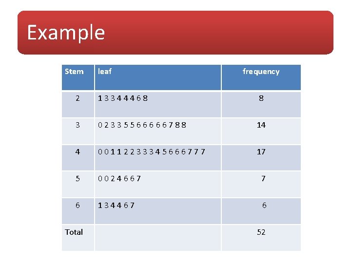
Example Stem leaf frequency 2 13344468 8 3 02335566666788 14 4 00112233345666777 17 5 0024667 7 6 134467 6 Total 52

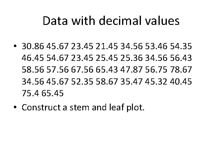
Data with decimal values • 30. 86 45. 67 23. 45 21. 45 34. 56 53. 46 54. 35 46. 45 54. 67 23. 45 25. 36 34. 56 56. 43 58. 56 57. 56 65. 43 47. 87 56. 75 78. 67 34. 56 45. 67 52. 35 58. 67 35. 47 45. 32 40. 45 75. 4 65. 45 • Construct a stem and leaf plot.

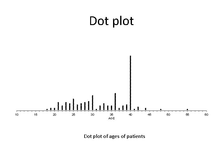
Dot plots • A dot plot is another kind of visual representation of data. Here the frequency of each data point is shown as a dot on the xaxis. When a value repeats, the dots are repeated to give a column of dots. This resembles a stem and leaf chart with the numbers in the leaf part replaced by dots.

Dot plot 10 15 20 25 30 35 AGE 40 Dot plot of ages of patients 45 50 55 60

Home work • Draw the dot plot for ‘length of creepers’ data.