HIAS Blended Learning Resource Year 9 Statistics Bivariate
HIAS Blended Learning Resource Year 9 Statistics: Bivariate data – scattergraphs (unit 9. 7) Describe simple mathematical relationships between two variables (bivariate data) in observational and experimental contexts and illustrate using scatter graphs. Describe and interpret correlation. HIAS maths Team Spring 2021 Final version © Hampshire County Council
HIAS Blended Learning Resource These slides are intended to support teachers and students with a blended approach to learning, either in-class or online. The tasks are intended to form part of a learning journey and could be the basis of either one lesson or a short sequence of connected lessons. Teachers should delete, change and add slides to suit the needs of their students. Extra slides with personalised prompts and appropriate examples based on previous teaching may be suitable. When changing the slide-deck, teachers should consider: – Their expectations for the use of representations such as bar models, number lines, arrays and geometric diagrams. – Which strategies and methods students should use and record when solving problems or identifying solutions. This could include a range of informal jottings and diagrams, the use of tables to record solutions systematically and formal or informal calculation methods. Teachers may also wish to record a ‘voice over’ to talk students through the slides.
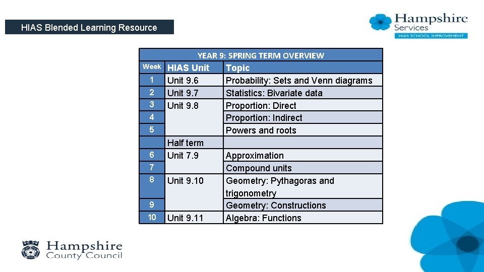
HIAS Blended Learning Resource Week 1 2 3 4 5 6 7 8 9 10 YEAR 9: SPRING TERM OVERVIEW HIAS Unit Topic Unit 9. 6 Probability: Sets and Venn diagrams Unit 9. 7 Statistics: Bivariate data Unit 9. 8 Proportion: Direct Proportion: Indirect Powers and roots Half term Unit 7. 9 Approximation Compound units Unit 9. 10 Geometry: Pythagoras and trigonometry Geometry: Constructions Unit 9. 11 Algebra: Functions
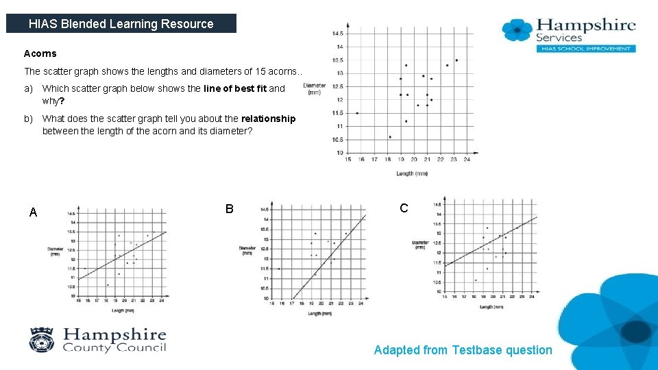
HIAS Blended Learning Resource Acorns The scatter graph shows the lengths and diameters of 15 acorns. . a) Which scatter graph below shows the line of best fit and why? b) What does the scatter graph tell you about the relationship between the length of the acorn and its diameter? A B C Adapted from Testbase question
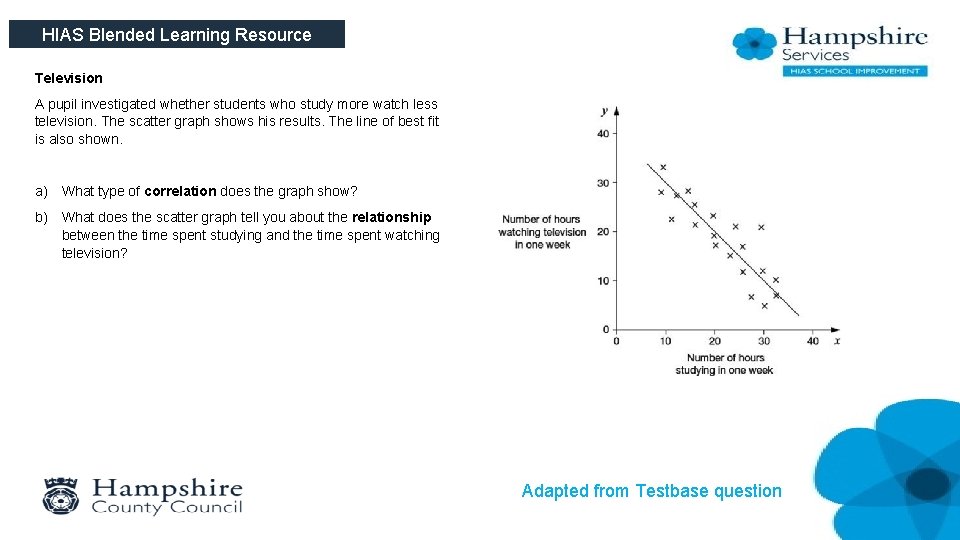
HIAS Blended Learning Resource Television A pupil investigated whether students who study more watch less television. The scatter graph shows his results. The line of best fit is also shown. a) What type of correlation does the graph show? b) What does the scatter graph tell you about the relationship between the time spent studying and the time spent watching television? Adapted from Testbase question
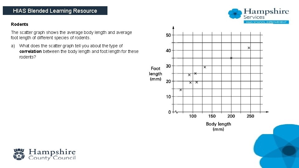
HIAS Blended Learning Resource Rodents The scatter graph shows the average body length and average foot length of different species of rodents. a) What does the scatter graph tell you about the type of correlation between the body length and foot length for these rodents?
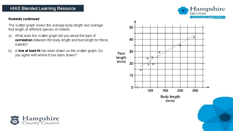
HIAS Blended Learning Resource Rodents continued The scatter graph shows the average body length and average foot length of different species of rodents. a) What does the scatter graph tell you about the type of correlation between the body length and foot length for these rodents? b) A line of best fit has been drawn on the scatter graph. Do you agree with where it has been drawn?
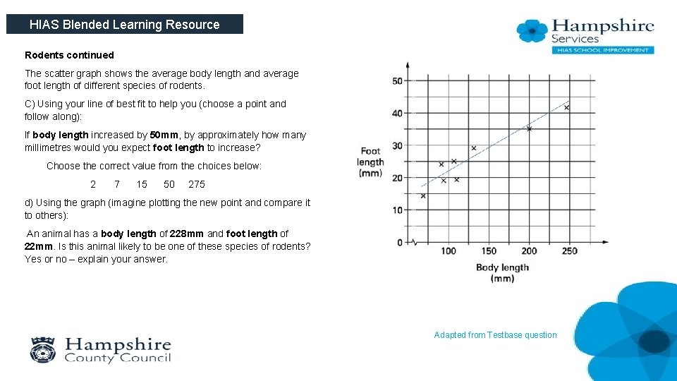
HIAS Blended Learning Resource Rodents continued The scatter graph shows the average body length and average foot length of different species of rodents. C) Using your line of best fit to help you (choose a point and follow along): If body length increased by 50 mm, by approximately how many millimetres would you expect foot length to increase? Choose the correct value from the choices below: 2 7 15 50 275 d) Using the graph (imagine plotting the new point and compare it to others): An animal has a body length of 228 mm and foot length of 22 mm. Is this animal likely to be one of these species of rodents? Yes or no – explain your answer. Adapted from Testbase question
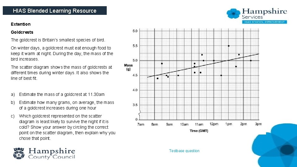
HIAS Blended Learning Resource Extention Goldcrests The goldcrest is Britain’s smallest species of bird. On winter days, a goldcrest must eat enough food to keep it warm at night. During the day, the mass of the bird increases. The scatter diagram shows the mass of goldcrests at different times during winter days. It also shows the line of best fit. a) Estimate the mass of a goldcrest at 11. 30 am b) Estimate how many grams, on average, the mass of a goldcrest increases during one hour c) Which goldcrest represented on the scatter diagram is least likely to survive the night if it is cold? Show your answer by circling the correct point on the scatter diagram, then explain why you chose that point. Testbase question

HIAS Blended Learning Resource HIAS Maths team The HIAS maths team offer a wide range of high-quality services to support schools in improving outcomes for learners, including courses, bespoke consultancy and in-house training. For further details, please contact any member of the secondary maths team: Jo Lees: Jo. Lees@hants. gov. uk Jenny Burn: Jenny. Burn@hants. gov. uk Tessa Ingrey: Tessa. Ingrey@hants. gov. uk For further details on the full range of services available please contact us using the following details: Tel: 01962 874820 or email: hias. enquiries@hants. gov. uk
- Slides: 10