Health Care Data Analytics Unit 4 Communicating Data
- Slides: 24

Health Care Data Analytics Unit 4: Communicating Data Analysis Results This material (Comp 24 Unit 4) was developed by The University of Texas Health Science Center at Houston, funded by the Department of Health and Human Services, Office of the National Coordinator for Health Information Technology under Award Number 90 WT 0006. This work is licensed under the Creative Commons Attribution-Non. Commercial-Share. Alike 4. 0 International License. To view a copy of this license, visit http: //creativecommons. org/licenses/by-nc-sa/4. 0/.

Communicating Data Analysis Results Lecture – Learning Objectives • Select the best data communication mode, given the analysis goals and results • Interpret data analysis results • Present solutions for a variety of technical data communication challenges. • Prepare a simple data visualization using open-source tools • Participate in the design and development of a complex data visualization 2

Communication Basics • • • Delineate the Problem Define Your Audience Choose the Right Mode Choose the Right Words Choose Supporting Visuals Have an “Elevator” Speech 3

Delineate the Problem • What are you trying to do with this communication? • Is there a particular timeframe involved? • Does the number of people matter? 4

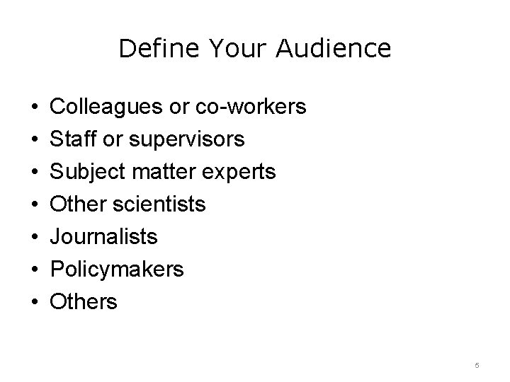
Define Your Audience • • Colleagues or co-workers Staff or supervisors Subject matter experts Other scientists Journalists Policymakers Others 5

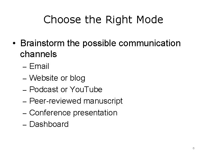
Choose the Right Mode • Brainstorm the possible communication channels – Email – Website or blog – Podcast or You. Tube – Peer-reviewed manuscript – Conference presentation – Dashboard 6

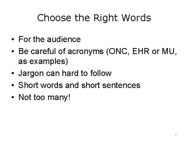
Choose the Right Words • For the audience • Be careful of acronyms (ONC, EHR or MU, as examples) • Jargon can hard to follow • Short words and short sentences • Not too many! 7

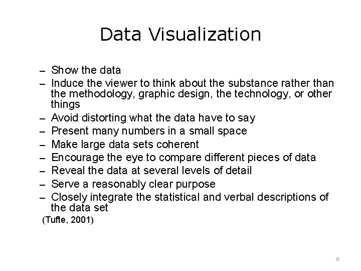
Data Visualization – Show the data – Induce the viewer to think about the substance rather than – – – – the methodology, graphic design, the technology, or other things Avoid distorting what the data have to say Present many numbers in a small space Make large data sets coherent Encourage the eye to compare different pieces of data Reveal the data at several levels of detail Serve a reasonably clear purpose Closely integrate the statistical and verbal descriptions of the data set (Tufte, 2001) 8

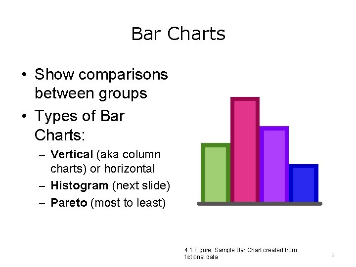
Bar Charts • Show comparisons between groups • Types of Bar Charts: – Vertical (aka column charts) or horizontal – Histogram (next slide) – Pareto (most to least) 4. 1 Figure: Sample Bar Chart created from fictional data 9

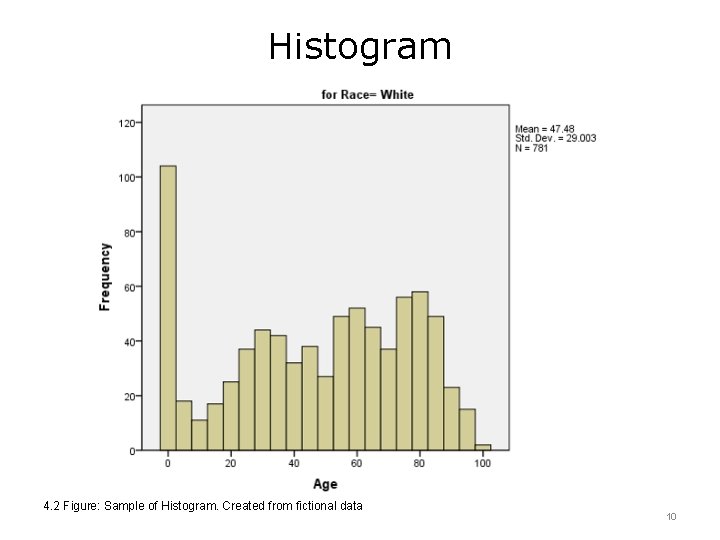
Histogram 4. 2 Figure: Sample of Histogram. Created from fictional data 10

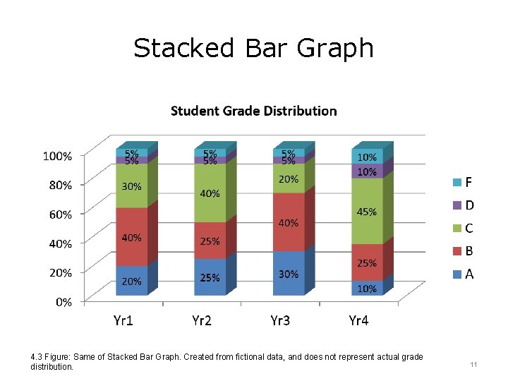
Stacked Bar Graph 4. 3 Figure: Same of Stacked Bar Graph. Created from fictional data, and does not represent actual grade distribution. 11

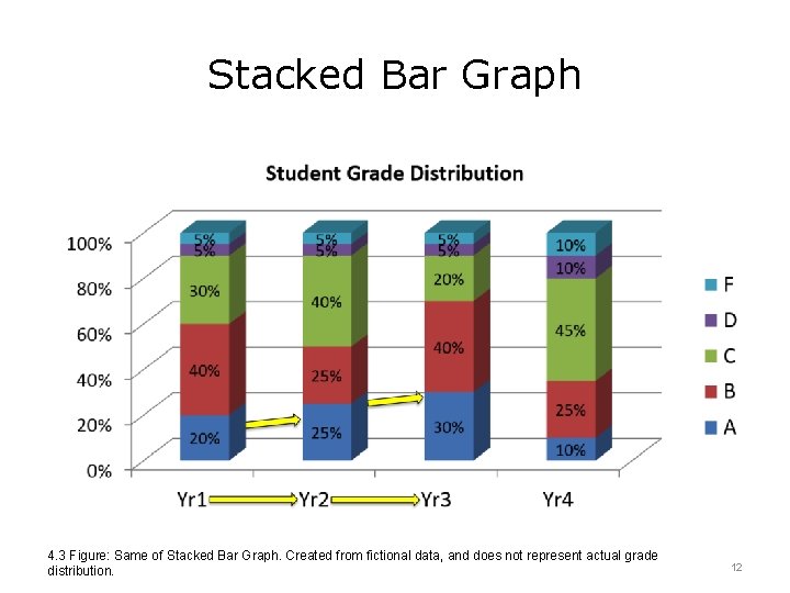
Stacked Bar Graph 4. 3 Figure: Same of Stacked Bar Graph. Created from fictional data, and does not represent actual grade distribution. 12

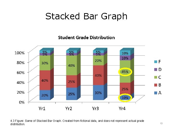
Stacked Bar Graph 4. 3 Figure: Same of Stacked Bar Graph. Created from fictional data, and does not represent actual grade distribution. 13

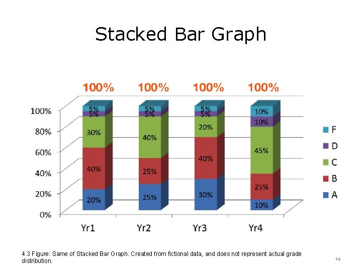
Stacked Bar Graph 4. 3 Figure: Same of Stacked Bar Graph. Created from fictional data, and does not represent actual grade distribution. 14

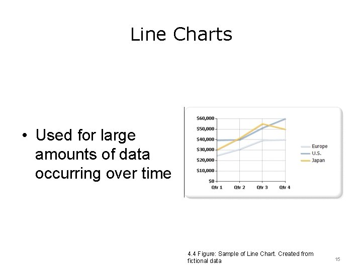
Line Charts • Used for large amounts of data occurring over time 4. 4 Figure: Sample of Line Chart. Created from fictional data 15

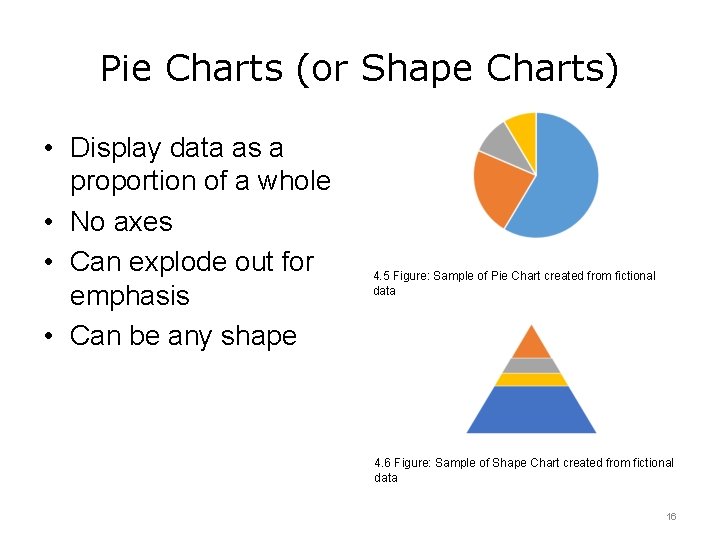
Pie Charts (or Shape Charts) • Display data as a proportion of a whole • No axes • Can explode out for emphasis • Can be any shape 4. 5 Figure: Sample of Pie Chart created from fictional data 4. 6 Figure: Sample of Shape Chart created from fictional data 16

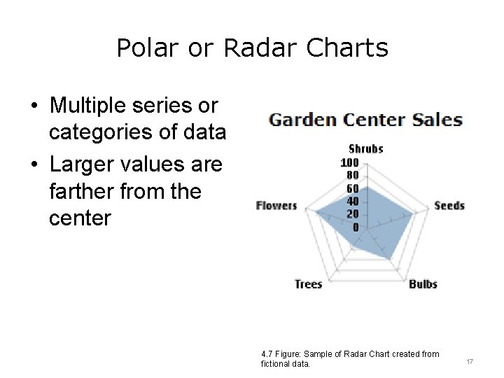
Polar or Radar Charts • Multiple series or categories of data • Larger values are farther from the center 4. 7 Figure: Sample of Radar Chart created from fictional data. 17

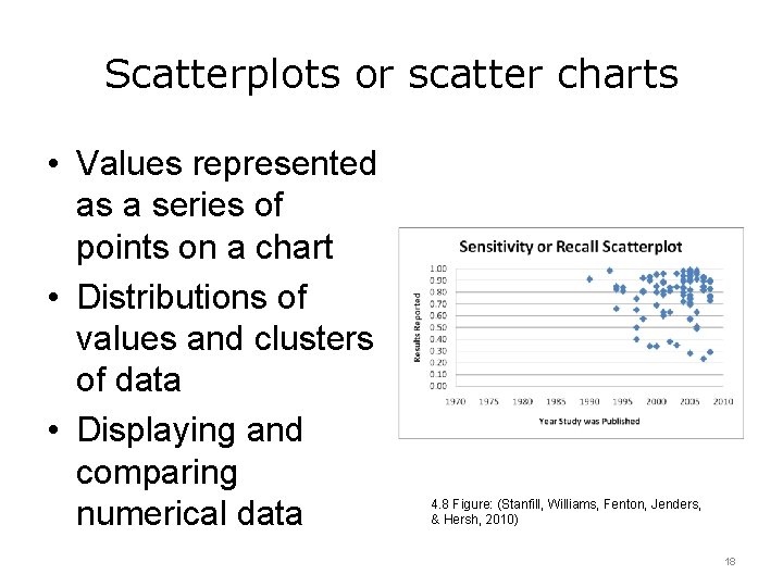
Scatterplots or scatter charts • Values represented as a series of points on a chart • Distributions of values and clusters of data • Displaying and comparing numerical data 4. 8 Figure: (Stanfill, Williams, Fenton, Jenders, & Hersh, 2010) 18

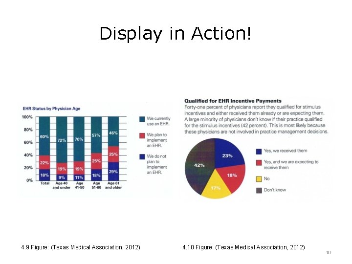
Display in Action! 4. 9 Figure: (Texas Medical Association, 2012) 4. 10 Figure: (Texas Medical Association, 2012) 19

Practice Creating Visualizations • Component 24, Unit 2 – more basic visualization • Component 24, Unit 10 – more complex visualization 20

The “Elevator” Speech • Can you tell the story in the time it takes to ride the elevator? • Three main points • Meaningful • Easy to understand 21

Unit 4 Summary: Communicating Data Analysis Results • Effective data communication requires thought and planning • All communication is not equal for all audiences • The visual presentation is particularly important, but can be more difficult • Have an “elevator” speech 22

Unit 4: Communicating Data Analysis Results References Communication 101: Communication Basics for Scientists and Engineers. (2013). Retrieved May 16, 2016, from http: //www. aaas. org/pes/communication-101 -communication-basics-scientists-andengineers Stanfill, M. , Williams, M. , Fenton, S. , Jenders, R. , & Hersh, W. (2010). A systematic literature review of automated clinical coding and classification systems. Journal Of The American Medical Informatics Association, 17(6), 646 -651. http: //dx. doi. org/10. 1136/jamia. 2009. 001024 Texas Medical Association, . (2012). TMA April 2012 Survey of Texas Physicians Preliminary Research Findings. Retrieved from http: //www. texmed. org/Work. Area/Download. Asset. aspx? id=24815 Tufte, E. (2001). The visual display of quantitative information. Cheshire, Conn. : Graphics Press. Charts, Tables and Figures 4. 8 Figure: Stanfill, M. , Williams, M. , Fenton, S. , Jenders, R. , & Hersh, W. (2010). A systematic literature review of automated clinical coding and classification systems. Journal Of The American Medical Informatics Association, 17(6), 646 -651. http: //dx. doi. org/10. 1136/jamia. 2009. 001024 4. 9 Figure and 4. 10 Figure: Texas Medical Association. (2012). TMA April 2012 Survey of Texas Physicians Preliminary Research Findings. Retrieved from http: //www. texmed. org/Work. Area/Download. Asset. aspx? id=24815 23

Unit 4: Communicating Data Analysis Results This material was developed by The University of Texas Health Science Center at Houston, funded by the Department of Health and Human Services, Office of the National Coordinator for Health Information Technology under Award Number 90 WT 0006. 24