Happy Tuesday Scientists Today DQ Which type of




- Slides: 27

Happy Tuesday Scientists! Today: DQ: Which type of graph would be best for graphing your rocket data? Graphing Study Guide and Graphing Rocket Data More Time and Distance Graphs

Graphing Study Guide Are you ready to go? Complete the handout!

• There are 4 major types of graphs we’ll use this year. I can emember that

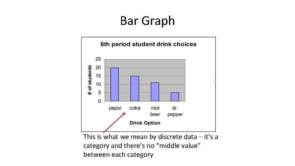
Types of Data 1. Discrete data = consist of categories (days of the week, kind of animal, color) 2. Continuous data = consist of measurements involving a scale with equal measurements; a range of values (temperature, length of time in hours, height in centimeters)

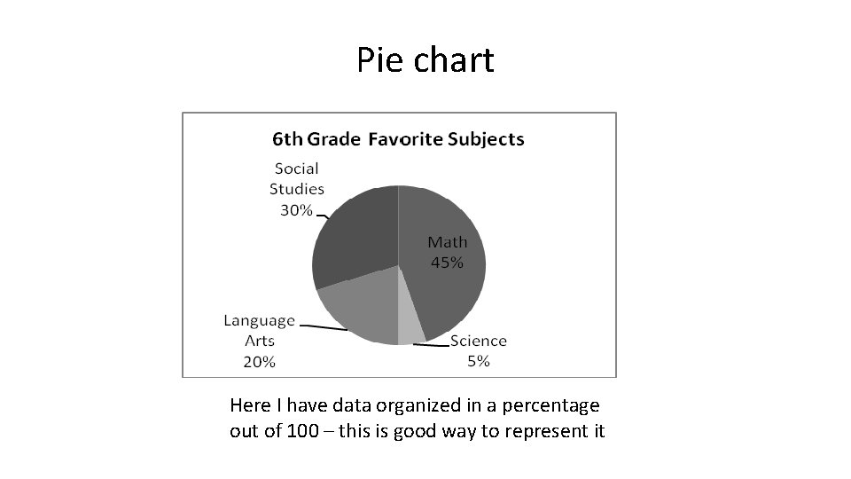
Four major types of graphs 1. Pie chart/graph = consist of categories (display percentages) 2. Bar graph = used to represent discrete data; the IV is typically qualitative and DV is typically quantitative

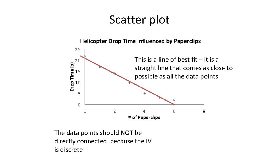
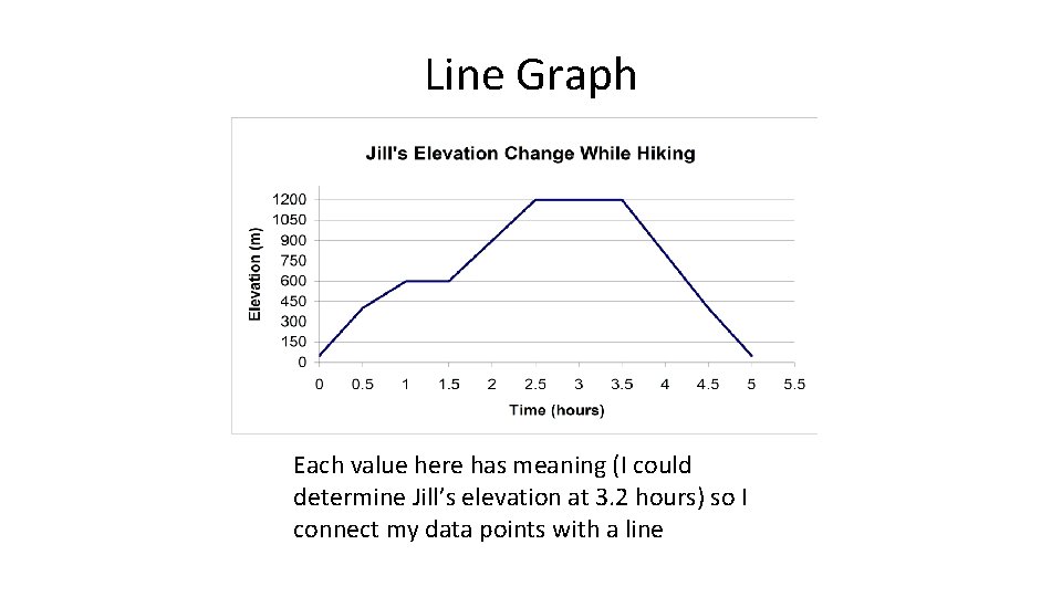
Four major types of graphing 3. Line graph = used to represent continuous data, usually tracking changes over time; the IV and DV are both quantitative and the line connecting the points has meaning 4. Scatter plot = similar to a line graph, but the data points are NOT connected because a connecting line would have no meaning; a line of best fit might be constructed to show a trend in the data; IV and DV are typically both quantitative

Scatter plot Helicopter Drop Time Influenced by Paperclips Drop Time (s) 25 This is a line of best fit – it is a straight line that comes as close to possible as all the data points 20 15 10 5 0 0 2 4 # of Paperclips The data points should NOT be directly connected because the IV is discrete 6 8

Bar Graph This is what we mean by discrete data – it’s a category and there’s no “middle value” between each category

Line Graph Each value here has meaning (I could determine Jill’s elevation at 3. 2 hours) so I connect my data points with a line

Pie chart Here I have data organized in a percentage out of 100 – this is good way to represent it

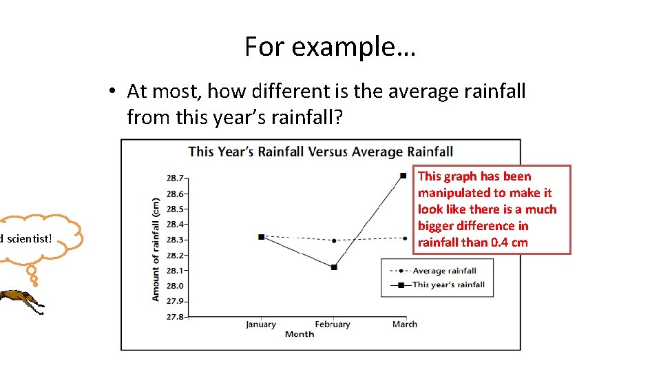
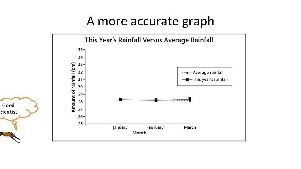
A few final thoughts • Scientists must represent their data graphically in a fair way that tells the most accurate story • It is possible to change the scale of a graph to make it look like the data tells a much different story than the numbers actually show • Additional labels might also be used to make the reader infer certain things from the same set of data

d scientist! For example… • At most, how different is the average rainfall from this year’s rainfall? This graph has been manipulated to make it look like there is a much bigger difference in rainfall than 0. 4 cm

Good scientist! A more accurate graph

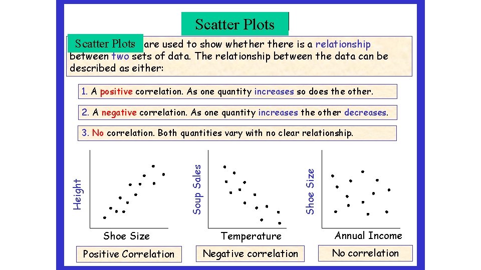
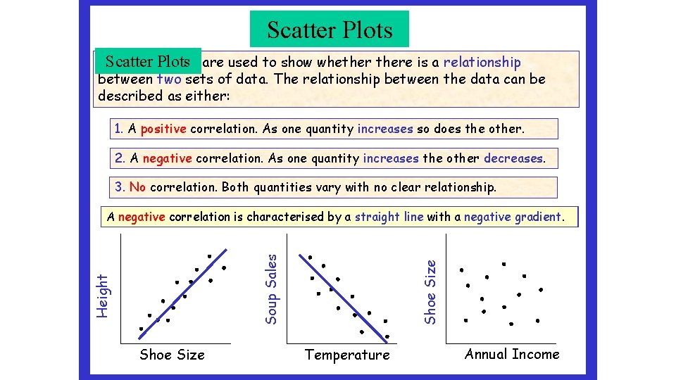
Scatter Graphs Plots Scatter graphs Plots are used to show whethere is a relationship between two sets of data. The relationship between the data can be described as either: 1. A positive correlation. As one quantity increases so does the other. 2. A negative correlation. As one quantity increases the other decreases. Shoe Size Height Soup Sales 3. No correlation. Both quantities vary with no clear relationship. Shoe Size Temperature Positive Correlation Negative correlation Annual Income No correlation

Scatter Graphs Scatter Plots Scatter graphs Plots are used to show whethere is a relationship between two sets of data. The relationship between the data can be described as either: 1. A positive correlation. As one quantity increases so does the other. 2. A negative correlation. As one quantity increases the other decreases. 3. No correlation. Both quantities vary with no clear relationship. Shoe Size Height Soup Sales A negative positive correlation is is characterised by by aa straight line with aa positive negativegradient. Temperature Annual Income

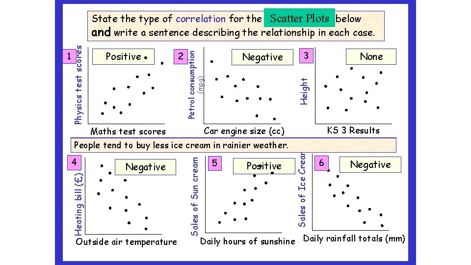
Negative 3 None Height (mpg) 2 Petrol consumption Positive Negative Outside air temperature 5 Positive Sales of Ice Cream 4 Sales of Sun cream KS 3 Results Car engine size (cc) Maths test scores There with no relationship higher maths between scores tend KS 3 to results get higher and the physics scores. of students. As People theis tend engine outside tosize buy air temperature of less more cars ice sun increase, cream increases, inwhen rainier they the use heating weather more bills petrol. isheight will sunnier. (Less be lower. mpg) Heating bill (£) 1 Physics test scores Scattergraphs Plots below State the type of correlation for the scatter and write a sentence describing the relationship in each case. 6 Negative Daily hours of sunshine Daily rainfall totals (mm)

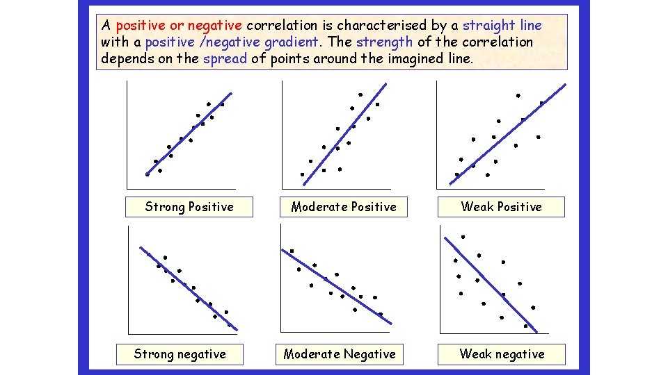
A positive or negative correlation is characterised by a straight line with a positive /negative gradient. The strength of the correlation depends on the spread of points around the imagined line. Strong Positive Strong negative Moderate Positive Weak Positive Moderate Negative Weak negative

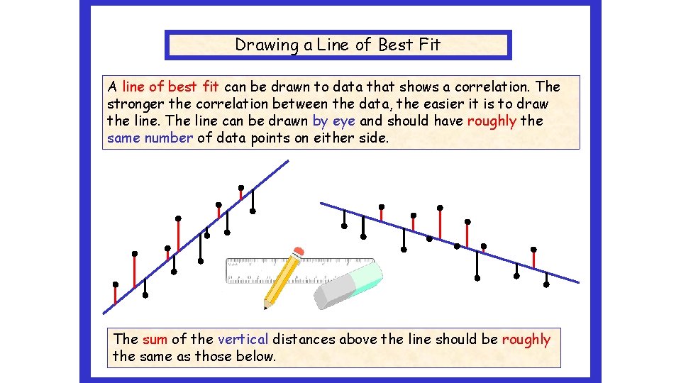
Drawing a Line of Best Fit A line of best fit can be drawn to data that shows a correlation. The stronger the correlation between the data, the easier it is to draw the line. The line can be drawn by eye and should have roughly the same number of data points on either side. Lobf The sum of the vertical distances above the line should be roughly the same as those below.

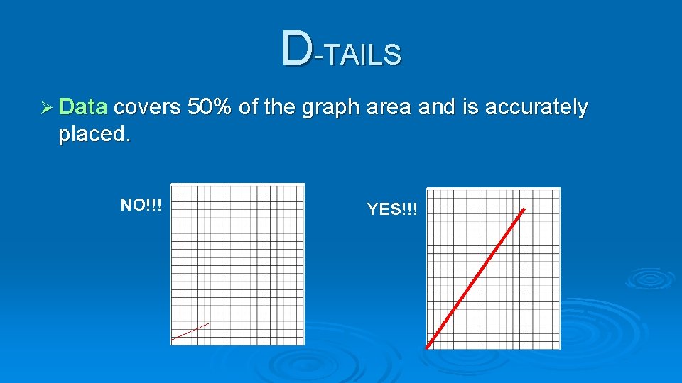
D-TAILS is an acronym used to help you remember everything you need to create a successful graph.

D-TAILS Ø Data covers 50% of the graph area and is accurately placed. NO!!! YES!!!

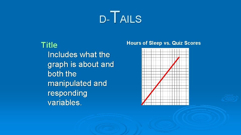
T D- AILS Title Includes what the graph is about and both the manipulated and responding variables. Hours of Sleep vs. Quiz Scores

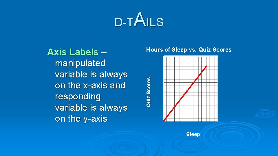
AILS D-T Hours of Sleep vs. Quiz Scores Axis Labels – manipulated variable is always on the x-axis and responding variable is always on the y-axis Sleep

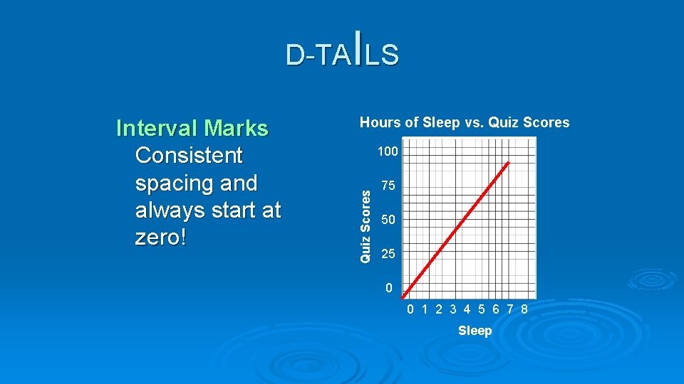
I D-TA LS Hours of Sleep vs. Quiz Scores 100 Quiz Scores Interval Marks Consistent spacing and always start at zero! 75 50 25 0 0 1 2 3 4 5 6 7 8 Sleep

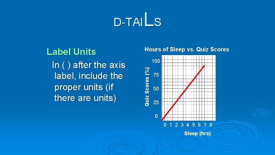
L D-TAI S Hours of Sleep vs. Quiz Scores 100 Quiz Scores (%) Label Units In ( ) after the axis label, include the proper units (if there are units) 75 50 25 0 0 1 2 3 4 5 6 7 8 Sleep (hrs)

S D-TAIL Hours of Sleep vs. Quiz Scores 100 Quiz Scores (%) Scale Always go by an even scale. Ex: 1, 2, 3, 4 NOT 1, 2, 4, 8 75 50 25 0 0 1 2 3 4 5 6 7 8 Sleep (hrs)

Graphing check list Appropriate type of graph for your data Title with IV and DV Labels on each axis Axes have consistent intervals

Graph your rocket data Use the average distance for each rocket You may graph your data using the computer (excel or google sheets) You may graph your data by hand on graph paper