Hand Drawn Lettering Good typeograpy is meant to


- Slides: 28
Hand Drawn Lettering • Good typeograpy is meant to be clear and easy to read – lettering has some wiggle room • Lettering often acts as a work of art on it’s own • Spend some time tracing/copying existing typefaces. Getting used to drawing the shapes and curves, thicks and thins will help you when creating your own. • It’s important to learn the rules before you break them!
• It is helpful to map out the words in a composition to use as a loose guideline for your illustration • Create an outline of the space you have to work with and design within – figure out how the words fit into the space
• Letters and words of different shapes and sizes can live in harmony when placed strategically in relation to each other • Always have some sort of unifying feature no matter how diverse your letterforms are
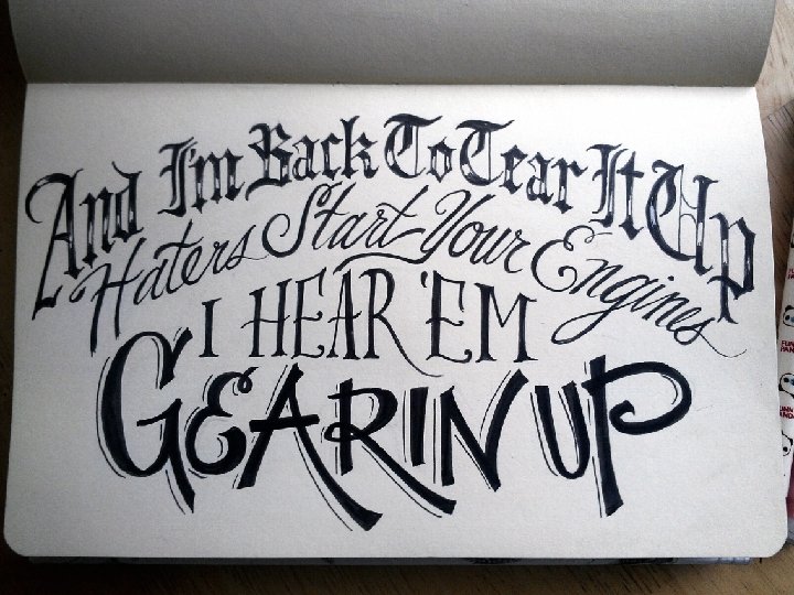
• Look at a letter, not as you were taught, but as a shape? – Does the letter ‘j’ look like an upside down candy-cane? • Does the shape of a word look like or form something else? – Is the body of text really someone’s face? • Weather you are dealing with a single letter, a word, or a block text; everything is shape or a combination of shapes. – Dealing with shape is the single most important aspect of illustrating letters. – Once you find a shape solution, everything else seems to fall in place. And since letters are just shapes, the possibilities are endless.
Experimentation • Draw anything. Go crazy; do weird stuff, the weirder the better. Experiment with different drawing tools, techniques, objects, colors, etc… Draw upside down, draw a grandma, use dirt to draw, anything goes. You can learn from anything, and learn from everything. • Letting your mind free of thinking is one of the best exercises you can do to help you think. As cheesy as it sounds, having these visual experiences will allow you to access this visual database later down the line. The best designer/illustrator/letterers are the people that create work that surprises people. This doesn’t mean do something stupidly shocking, just create refreshing, unexpected, smart solutions that will pleasantly surprise the viewer. Veggie letters?
Readability • Because the intention, most often, is for lettering to be read, legibility is a fundamental aspect. • Just because you think the letters makes sense and are readable, doesn’t necessarily mean the majority of people will agree. • Being able to step back from your work for an moment, and look at it subjectively, is a valuable skill. • The fact of the matter is, even the most brilliant idea of all time has to be conveyed in some way. • If most people don’t receive the message, then it’s useless.
Hand Lettering process • First, simply write out your phrase in simple handwriting. • Then, draw a number of small thumbnails to help get a general direction for the composition
• Start to formulate a rough composition • Come up with a tentative arrangement and contemplating which words should be in which lines • Try to stack lines in a comprehensible way that gives important words the necessary focus
• Next begin to incorporate some vague indications of style for the various words • As you start to get a decent idea of your composition, and you can begin to pay attention to potential letter interactions and overall balance.
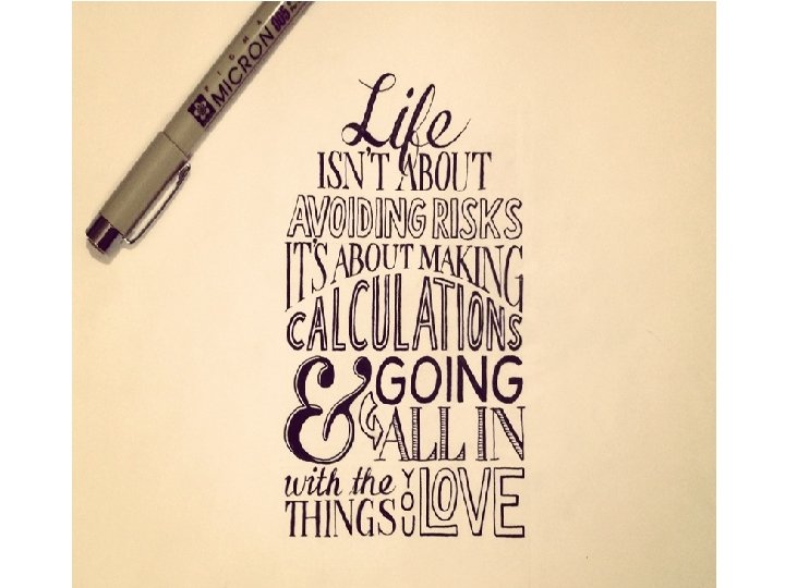
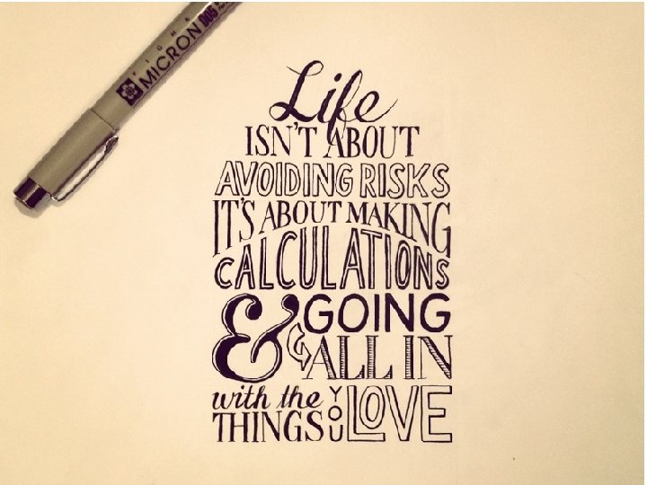
• This improvement is subtle, but one that is the start of tightening things up. • The first three words are now all in one line. • We start to see the first interaction of the ‘f’ descender in ‘Life’ interacting with the second line.
• With the ‘f’ descender presenting a unique opportunity, how could it descend without interrupting the flow and legibility of the words in the second line. • The highlighted solution is what ended up being in the final piece. • The ‘f’ swoops down to completed the cross bar of the ‘A’ for a smart fit that prevents any awkward extra space. • It’s almost unnoticeable if you don’t know what to look for, but that’s the beauty of it.
• Going off of the rough pencil guides from a couple steps ago, create a much more precise and even pencil sketch. • Render the previously chosen styles with detail and pay close attention to spacing, balance, and legibility.
• A lot of time is spent in the pencil stages. Typically you should start out lightly, and gradually press in harder with the pencil to create the darker lines to be inked once you’re quite certain of their shape. • When you go to ink, you don’t want there to be any thinking left to do. Only rendering.
• The pencil sketch is complete. The primary thing you want to nail in this stage are the styles, spacing, alignment and balance. • It’s ok if your pencil lines aren’t perfect, but the closer you are to perfect, the easier the inking will be, so take your time.
• Now, we finally begin the exhilaratingly dangerous stage of inking! • There’s no going back at this point, so just relax, and get in the zone where it’s just you, the pen and the paper. • There’s nothing else in the world you’re thinking about but the very line you are drawing at this precise moment. • There will be time for the zoomed out look later, but now is for the macro detail.