Guidelines Principles and Theories Human Computer Interaction CIS

- Slides: 50

Guidelines, Principles, and Theories Human Computer Interaction CIS 6930/4930

Reading ► Chapter 2 - Shneiderman

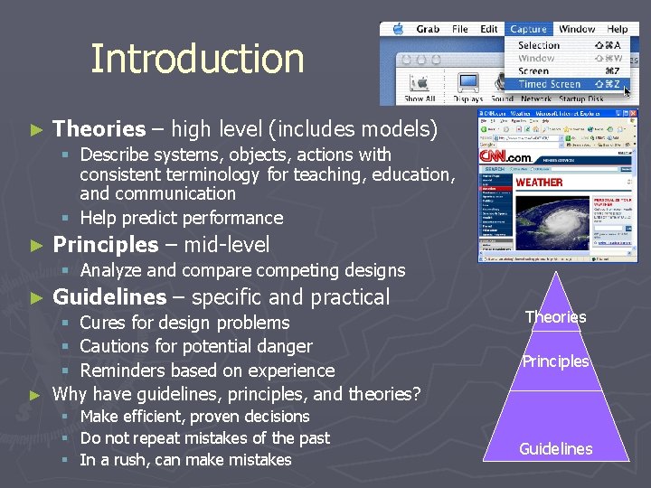
Introduction ► Theories – high level (includes models) § Describe systems, objects, actions with consistent terminology for teaching, education, and communication § Help predict performance ► Principles – mid-level § Analyze and compare competing designs ► Guidelines – specific and practical § Cures for design problems § Cautions for potential danger § Reminders based on experience ► Why have guidelines, principles, and theories? § § § Make efficient, proven decisions Do not repeat mistakes of the past In a rush, can make mistakes Theories Principles Guidelines

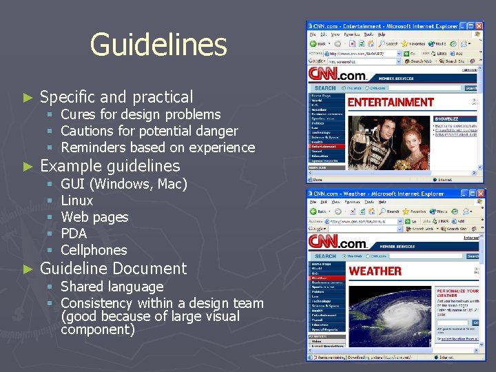
Guidelines ► Specific and practical ► Example guidelines § Cures for design problems § Cautions for potential danger § Reminders based on experience § § § ► GUI (Windows, Mac) Linux Web pages PDA Cellphones Guideline Document § Shared language § Consistency within a design team (good because of large visual component)

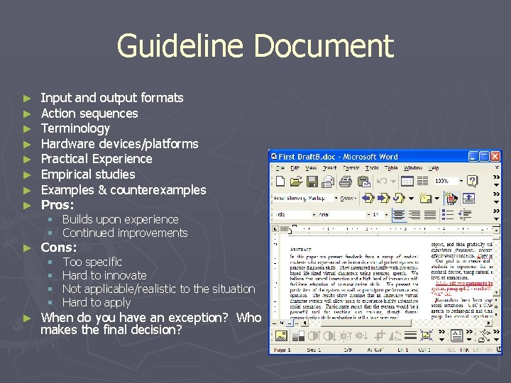
Guideline Document ► ► ► ► Input and output formats Action sequences Terminology Hardware devices/platforms Practical Experience Empirical studies Examples & counterexamples Pros: ► Cons: § Builds upon experience § Continued improvements § § ► Too specific Hard to innovate Not applicable/realistic to the situation Hard to apply When do you have an exception? Who makes the final decision?

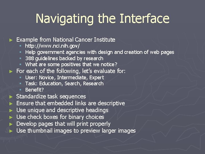
Navigating the Interface ► ► ► ► Example from National Cancer Institute § § http: //www. nci. nih. gov/ Help government agencies with design and creation of web pages 388 guidelines backed by research What are some positives that we notice? § § § User: Novice, Intermediate, Expert Task: Education, Search, Research Benefit? For each of the following, let’s evaluate for: Standardize task sequences Ensure that embedded links are descriptive Use unique and descriptive headings Use check boxes for binary choices Develop pages that will print properly Use thumbnail images to preview larger images

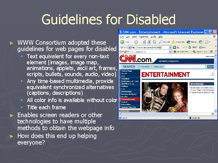
Guidelines for Disabled ► WWW Consortium adopted these guidelines for web pages for disabled § Text equivalent for every non-text element [images, image map, animations, applets, ascii art, frames, scripts, bullets, sounds, audio, video] § Any time-based multimedia, provide equivalent synchronized alternatives (captions, descriptions) § All color info is available without color § Title each frame Enables screen readers or other technologies to have multiple methods to obtain the webpage info ► How does this end up helping everyone? ►

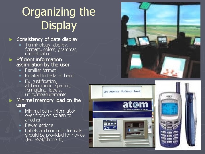
Organizing the Display ► Consistency of data display ► Efficient information assimilation by the user § Terminology, abbrev. , formats, colors, grammar, capitalization § § § ► Familiar format Related to tasks at hand Ex. justification, alphanumeric, spacing, formatting, labels, units/measurements Minimal memory load on the user § Minimal carry information over from on screen to another § Fewer actions § Labels and common formats should be provided for novice (Ex. SSN/phone #)

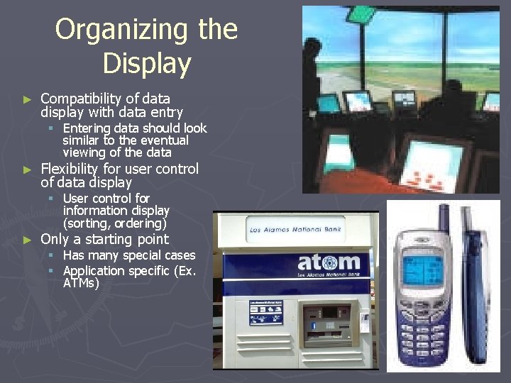
Organizing the Display ► Compatibility of data display with data entry § Entering data should look similar to the eventual viewing of the data ► Flexibility for user control of data display § User control for information display (sorting, ordering) ► Only a starting point § Has many special cases § Application specific (Ex. ATMs)

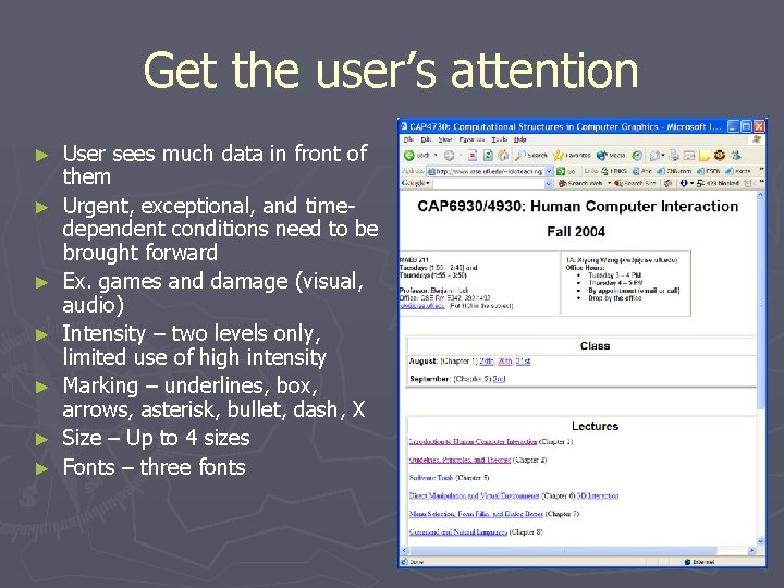
Get the user’s attention ► ► ► ► User sees much data in front of them Urgent, exceptional, and timedependent conditions need to be brought forward Ex. games and damage (visual, audio) Intensity – two levels only, limited use of high intensity Marking – underlines, box, arrows, asterisk, bullet, dash, X Size – Up to 4 sizes Fonts – three fonts

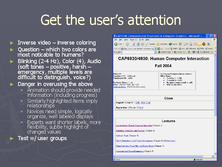
Get the user’s attention Inverse video – inverse coloring Question – which two colors are most noticable to humans? ► Blinking (2 -4 Hz), Color (4), Audio (soft tones – positive, harsh – emergency, multiple levels are difficult to distinguish, voice? ) ► Danger in overusing the above ► ► § Animation should provide needed information (including progress) § Similarly highlighted items imply relationships § Novices need simple, logically organize, well labeled displays § Experts want shorter labels, more flexibility, subtle highlight of changed values ► Test w/ user groups

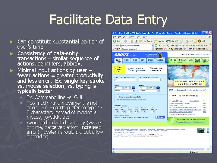
Facilitate Data Entry Can constitute substantial portion of user’s time ► Consistency of data-entry transactions – similar sequence of actions, delimiters, abbrev. ► Minimal input actions by user – fewer actions = greater productivity and less error. Ex. single key-stroke vs. mouse selection, vs. typing is typically better ► § Ex. Command line vs. GUI § Too much hand movement is not good. Experts prefer to type 68 characters instead of moving a mouse, joystick, etc. § Avoid redundant data entry (waste of time, perceived effort, increased error). System should aid but allow overriding

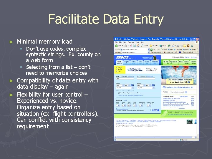
Facilitate Data Entry ► Minimal memory load § Don’t use codes, complex syntactic strings. Ex. county on a web form § Selecting from a list – don’t need to memorize choices Compatibility of data entry with data display – again ► Flexibility for user control – Experienced vs. novice. Organize entry based on situation (ex. flight controllers). Can conflict with consistency requirement ►

Principles ► More fundamental and applicable than guidelines ► Ex. how important is diversity ► Consider § Expertise § Task requirements

Determine User Skill Levels ► ► ► Know thy user - Wilfred Hansen (1971) Many assume they understand users and their tasks Many think differently than you Graphs vs. Tables, words vs. numbers, open-ended vs. structure Start with a population profile § Primary: age, gender, physical and cognitive abilities, education, motivation, training, goals, personality § Secondary: location, economics, attitudes

Novice/First-Time Users ► What would you need to consider for § Grandparents sending first email § Airport check-in kiosks ► ► ► Inexperience with interface Anxiety Solutions § Restrict vocabulary § Instructions, dialog boxes, know who to turn to for help, multiple languages, consistent terms § Small number of actions § Positive reinforcement § Feedback (Ex. BOA ATM often does not give you any feedback) § Good Error messages § Video demonstrations, online tutorials, good manuals

Knowledge-able Intermittent Users ► ► Ex. Frequent travelers, managers and code/word processors. Me and the UF travel forms Understand task concepts, and interface basics Retaining menu structure, location of features Solutions: Consistent sequences of actions Meaningful messages Guides to frequent patterns of usage § Protection from danger (encourage exploration) § Context dependent help § § §

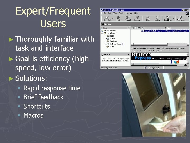
Expert/Frequent Users ► Thoroughly familiar with task and interface ► Goal is efficiency (high speed, low error) ► Solutions: § § Rapid response time Brief feedback Shortcuts Macros

Multiple Classes You might be designing for more than one of these classes ► Approach is typically a multi-layer (aka level-structured or spiral) ► § Novices use a subset of commands, actions, and objects § Can move up when they feel comfortable ► Ex. Cellphones § Novices: phone calls easy to make § Experts: store #s, web, contact info Also involves manuals, help screens, errors messages, tutorials, feedback ► Most games ►

Identify the Tasks ► How? § § ► Brainstorm Observe and interview users (esp. newer versions) Ex. Palm Pilot § Limited functionality = universal usability ► Atomicity of tasks is important to consider § § § ► Ex. making a left turn Too small = too many steps (inefficient, frustrating) Too many = need special cases, inflexible, frustrating Task frequency § High frequency = simple, quick, even if it slows other tasks down § Special keys vs. Ctrl + key vs. menu selections Task vs. Job Frequency Matrix (Fig. 2. 1 in book) ► Task analysis and task objects and objects defined ►

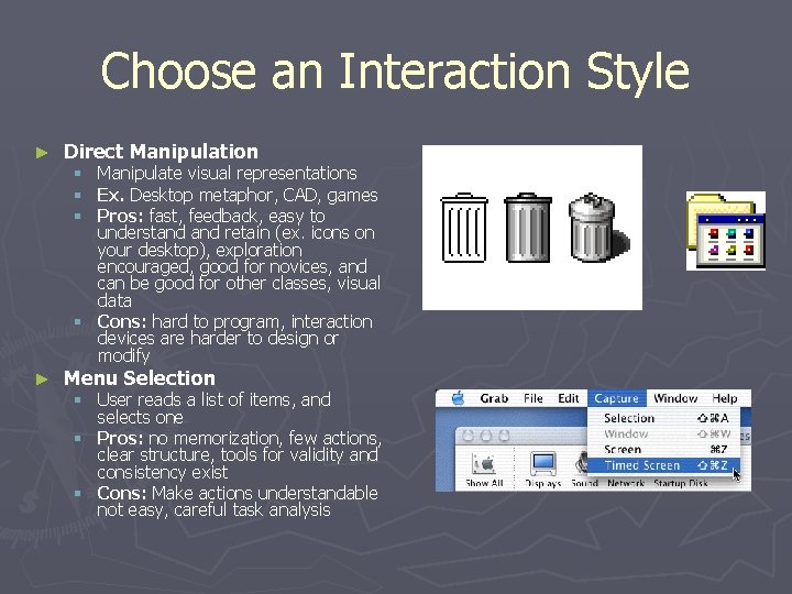
Choose an Interaction Style ► Direct Manipulation Manipulate visual representations Ex. Desktop metaphor, CAD, games Pros: fast, feedback, easy to understand retain (ex. icons on your desktop), exploration encouraged, good for novices, and can be good for other classes, visual data § Cons: hard to program, interaction devices are harder to design or modify § § § ► Menu Selection § User reads a list of items, and selects one § Pros: no memorization, few actions, clear structure, tools for validity and consistency exist § Cons: Make actions understandable not easy, careful task analysis

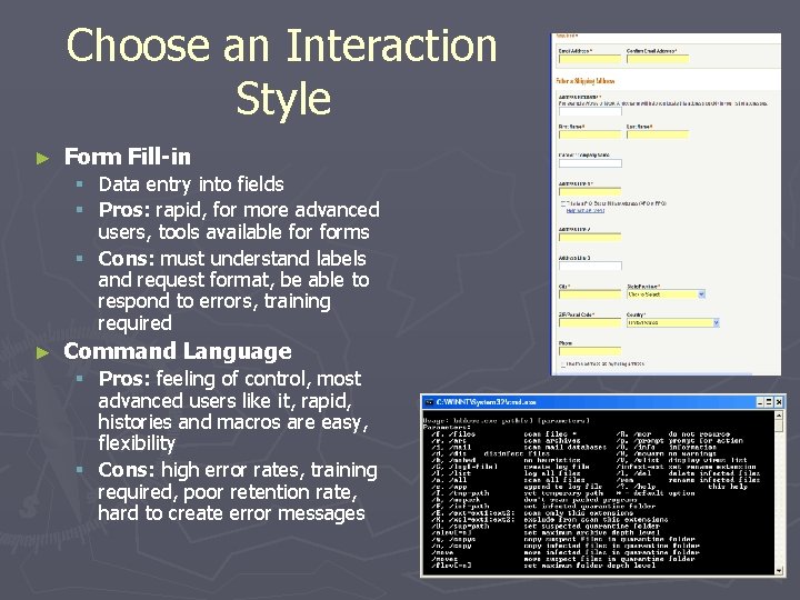
Choose an Interaction Style ► Form Fill-in Data entry into fields Pros: rapid, for more advanced users, tools available forms § Cons: must understand labels and request format, be able to respond to errors, training required § § ► Command Language § Pros: feeling of control, most advanced users like it, rapid, histories and macros are easy, flexibility § Cons: high error rates, training required, poor retention rate, hard to create error messages

Choose an Interaction Style ► Natural Language § Pros: easy to learn § Cons: unpredictable, requires clarification dialog, require more work to clean up Ex. let’s figure out how to specify the date in each of the above methods. ► Could use more than one ►

Eight Golden Rules of Interface Design 1. Strive for Consistency ► 2. Cater to universal Usability ► 3. Offer informative feedback ► 4. Design dialogs to yield closure ► 5. Prevent errors ► 6. Permit easy reversal of actions ► 7. Support internal locus of control. ► 8. Reduce short-term memory load. ► Homework 2: Find an example of a UI that conforms to each of the above, and one that does not. ►

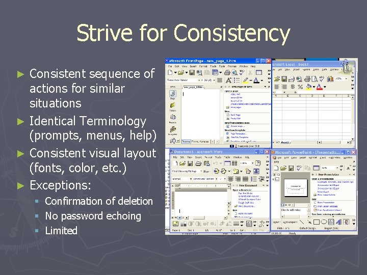
Strive for Consistency Consistent sequence of actions for similar situations ► Identical Terminology (prompts, menus, help) ► Consistent visual layout (fonts, color, etc. ) ► Exceptions: ► § § § Confirmation of deletion No password echoing Limited

Cater to Universal Usability ► Recognize the needs of a diverse user group ► Design for plasticity (transformation of content) ► Novice -> Expert ► Disabled ► Ex. cnn. com

Offer Informative Feedback ► For every user action, the system should provide feedback ► Frequency of task affects feedback type § Common tasks – modest feedback § Errors/uncommon tasks – substantial feedback ► Visual approaches make ► Funny error messages: feedback easy http: //digilander. libero. it/chiediloapippo/Engineerin g/iarchitect/errormsg. htm ► What’s wrong the message when you type in a wrong web address?

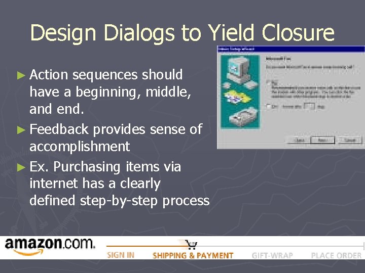
Design Dialogs to Yield Closure ► Action sequences should have a beginning, middle, and end. ► Feedback provides sense of accomplishment ► Ex. Purchasing items via internet has a clearly defined step-by-step process

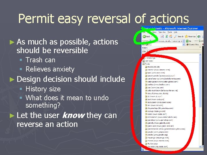
Permit easy reversal of actions ► As much as possible, actions should be reversible § Trash can § Relieves anxiety ► Design decision should include § History size § What does it mean to undo something? the user know they can reverse an action ► Let

Support Internal Locus of Control ► Experiences operators want to feel in control § User is in charge of the interface § Interface rapidly responds to the user ► Builds anxiety and dissatisfaction § § § ► Surprising interface actions Tedious actions Difficulty in obtaining necessary ability Difficulty in producing action Ex. Lag Good rules: Avoid acausality, make users initiators rather than responders § Ex. Sound when clicking on a link

Reduce Short-term Memory Load ► Rule of thumb: Humans can remember 7 +/ - 2 chunks of information ► Displays kept simple ► Multiple page displays should be consolidated ► Training if using codes, mnemonics, long sequence of actions ► Online access to command-syntax, abbreviations, codes, etc.

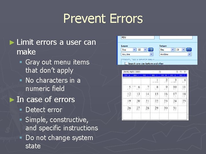
Prevent Errors ► Limit make errors a user can § Gray out menu items that don’t apply § No characters in a numeric field ► In case of errors § Detect error § Simple, constructive, and specific instructions § Do not change system state

Prevent Errors ► Error rate is typically higher than expected § What are common errors for us? ► Coding, ► typing, dialing, grammar How can we design software to reduce them? § Better error messages ► Helps fix current error ► Helps reduce similar errors ► Increases satisfaction ► Specific, positive, and constructive § “Printer is off, please turn on” instead of “Illegal Operation” § Reduce chance for error ► Organizing info, screens, menus ► Commands and menu choices should be distinctive ► State of the interface should be known (change cursor ► Consistency of actions (Yes/No order of buttons) when busy)

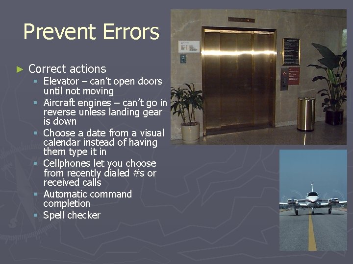
Prevent Errors ► Correct actions § Elevator – can’t open doors until not moving § Aircraft engines – can’t go in reverse unless landing gear is down § Choose a date from a visual calendar instead of having them type it in § Cellphones let you choose from recently dialed #s or received calls § Automatic command completion § Spell checker

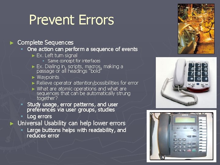
Prevent Errors ► Complete Sequences § One action can perform a sequence of events ► Ex. Left turn signal § Same concept for interfaces Ex. Dialing in, scripts, macros, making a passage or all headings “bold” ► Waypoints ► Relieve operator attention/possibilities for error ► What are atomic operations and what are sequences that can be automatically strung together? ► § Study usage, error patterns, and user preferences via user groups, studies § Log errors ► Universal Usability can help lower errors § Large buttons helps with readability, and reduces error

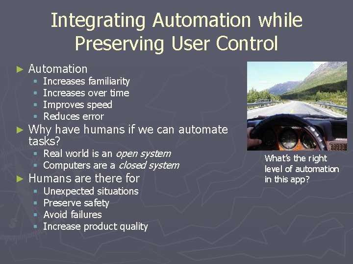
Integrating Automation while Preserving User Control ► Automation § § ► Increases familiarity Increases over time Improves speed Reduces error Why have humans if we can automate tasks? § Real world is an open system § Computers are a closed system ► Humans are there for § § Unexpected situations Preserve safety Avoid failures Increase product quality What’s the right level of automation in this app?

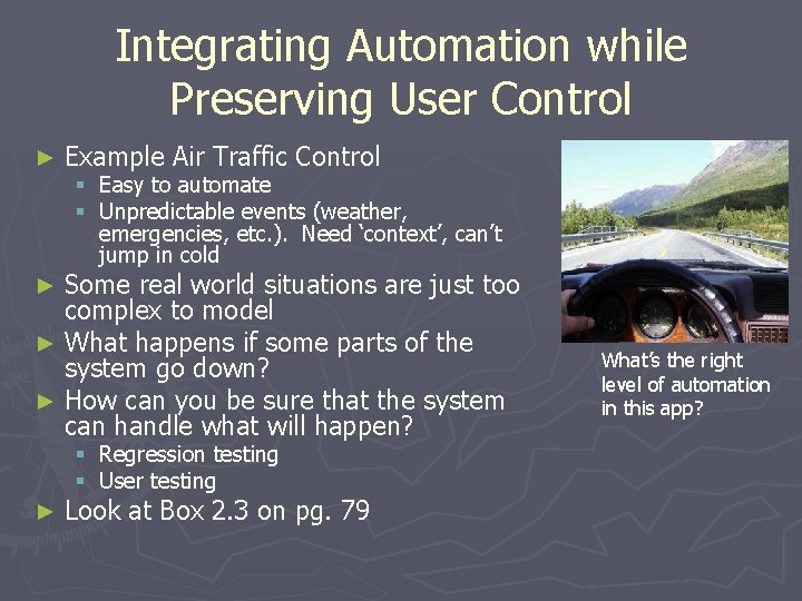
Integrating Automation while Preserving User Control ► Example Air Traffic Control § Easy to automate § Unpredictable events (weather, emergencies, etc. ). Need ‘context’, can’t jump in cold Some real world situations are just too complex to model ► What happens if some parts of the system go down? ► How can you be sure that the system can handle what will happen? ► § § ► Regression testing User testing Look at Box 2. 3 on pg. 79 What’s the right level of automation in this app?

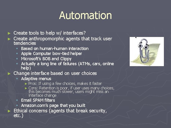
Automation ► ► Create tools to help w/ interfaces? Create anthropomorphic agents that track user tendencies § § ► Based on human-human interaction Apple Computer bow-tied helper Microsoft’s BOB and Clippy Actually a long line of failures (ATMs, cars, online help) Change interface based on user choices § Adaptive menus ► ► Pros: If using a few choices, makes it faster Cons: Retention is poor, if user uses many choices, this becomes much slower, users might miss an interface change § Email SPAM filters § Amazon. com’s page that you built ► Ethical concerns (agents that break security, etc. )

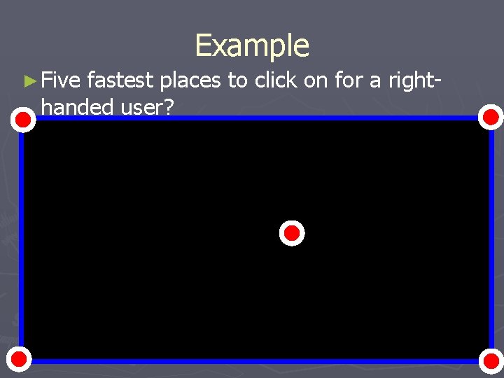
Example ► Five fastest places to click on for a righthanded user?

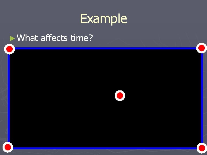
Example ► What affects time?

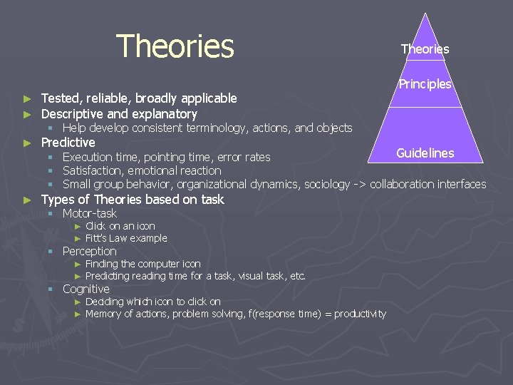
Theories ► ► Tested, reliable, broadly applicable Descriptive and explanatory ► Predictive ► Types of Theories based on task Theories Principles § Help develop consistent terminology, actions, and objects Guidelines § Execution time, pointing time, error rates § Satisfaction, emotional reaction § Small group behavior, organizational dynamics, sociology -> collaboration interfaces § Motor-task ► Click on an icon ► Fitt’s Law example § Perception ► Finding the computer icon ► Predicting reading time for a task, visual task, etc. § Cognitive ► Deciding which icon to click on ► Memory of actions, problem solving, f(response time) = productivity

What makes good Design so Important ► Ratio completion time of novice to expert users can be as high as: ► 100 ► Not to 1 many other fields or problems have this disparity (Try to think of a comparable task!)

Web design theory ► Information-architecture model with navigation ► Users typically forage for information, and thus designers leave information scents (via links) to help users find what they want. ► ex. download demo ► Information-foraging theory attempts to predict user success rates given a set of tasks and a web site.

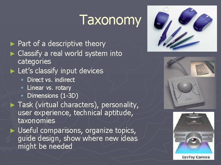
Taxonomy Part of a descriptive theory ► Classify a real world system into categories ► Let’s classify input devices ► § § § Direct vs. indirect Linear vs. rotary Dimensions (1 -3 D) Task (virtual characters), personality, user experience, technical aptitude, taxonomies ► Useful comparisons, organize topics, guide design, show where new ideas might be needed ►

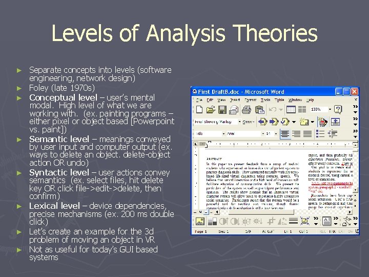
Levels of Analysis Theories ► ► ► ► Separate concepts into levels (software engineering, network design) Foley (late 1970 s) Conceptual level – user’s mental modal. High level of what we are working with. (ex. painting programs – either pixel or object based [Powerpoint vs. paint]) Semantic level – meanings conveyed by user input and computer output (ex. ways to delete an object. delete-object action OR undo) Syntactic level – user actions convey semantics (ex. select files, hit delete key OR click file->edit->delete, then confirm) Lexical level – device dependencies, precise mechanisms (ex. 200 ms double click) Let’s create an example for the 3 d problem of moving an object in VR Not as useful for today’s GUI based systems

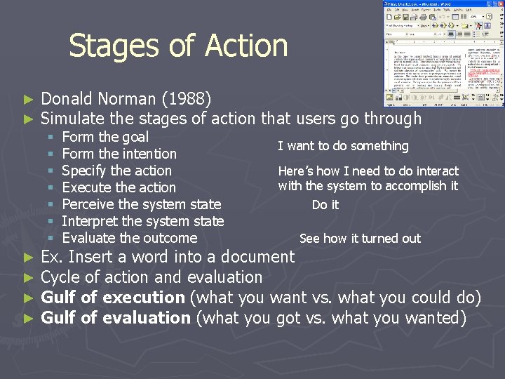
Stages of Action ► ► Donald Norman (1988) Simulate the stages of action that users go through § § § § ► ► Form the goal Form the intention Specify the action Execute the action Perceive the system state Interpret the system state Evaluate the outcome I want to do something Here’s how I need to do interact with the system to accomplish it Do it See how it turned out Ex. Insert a word into a document Cycle of action and evaluation Gulf of execution (what you want vs. what you could do) Gulf of evaluation (what you got vs. what you wanted)

Stages of Action ► Four Components of Good Design § § ► Errors occur when transitioning from goals->intentions>actions->outcome § § ► 1. Make the system state and all action alternatives visible 2. Good conceptual model with consistent system image 3. Interface should have good mappings between stages 4. Continuous feedback User forms inadequate goals Cannot find the correct interface action to accomplish goal Do not know how to specify correct set of actions User receives poor feedback Which of them can be affected by good design?

Stages of Action ► Other domains § Information-seeking ► Recognize and accept an ► Define the problem ► Choose a search system ► Form a query ► Execute the search ► Examine the results ► Make judgments ► Extra info ► Iterate/stop information problem § Think about searching on the internet for a document or looking for a restaurant

GOMS and Keystroke-Level Model ► ► CMU (1980 -1983) Two models § GOMS – goals, operators, methods, and selection rules ► User forms goals and subgoals (write a paper, insert word) ► User develop a series of operators – elementary acts (hit delete key, move hand to mouse, etc. ) ► User executes methods – highlights text, hits a key ► Selection relates to how the user selects between several methods (several ways to delete a paragraph) § Keystroke-Level ► Predicts time for error-free expert performance ► Sum up times for keystrokes, pointing, homing, drawing, thinking, and waiting for the system ► Mainly for experts, otherwise variance gets too large to be useful ► Does not say how useful the system is to accomplish a goal (problem solving, cognitive amplification, satisfaction, etc. ) ► ► Let’s look at a GOMS sheet on Pg. 89 Advances include conditional statements, incorporating judgment calls Breaking things down like this allows for tools to be built to evaluate systems Case study: Using CPM-GOMS [cognitive, perceptual, motor] modeling, a telephone company saved $2 million per year in operating costs.

Challenges to HCI Theories ► Theories practice § § § should be more central to research and Understand relationship between concepts and results Help designers understand tradeoffs Short term for predictive theories, long term for descriptive ► Theories practice should lead rather than lag behind § Help design, refine, and suggest new products