GUI Basics SWING AWT Windows Fundamentals Component At

GUI Basics SWING

AWT Windows Fundamentals

Component At the top of the AWT hierarchy is the Component class. Component is an abstract class that encapsulates all of the attributes of a visual component. All user interface elements that are displayed on the screen and that interact with the user are subclasses of Component. An instance of Component can be displayed on the screen. A Component object is responsible for remembering the current foreground and background colors and the currently selected text font. Container The Container class is a subclass of Component. It has additional methods that allow other Component objects to be nested within it. An instance of Container can hold instances of Component. Container classes are GUI components that are used to contain other GUI components. A container is responsible for laying out (that is, positioning) any components that it contains. It does this through the use of various layout managers.

AWT provides many ready-made and reusable GUI components. These GUI components are also called controls. The frequently-used are: Button, Text. Field, Label, Checkbox. Group (radio buttons), List, and Choice, as illustrated below.

So we can say There are two types of GUI elements: Components are elementary GUI entities (such as Button, Label, and Text. Field. ) Container: Containers (such as Frame, Panel and Applet) are used to hold components in a specific layout.
 Window Panel Frame Button Label Text")
Component Class Hierarchy of AWT Component Container (Non-Container) Window Panel Frame Button Label Text Field Applet Check-Box Text Area etc.

Introduction AWT is fine for developing simple graphical user interfaces, but not for developing comprehensive GUI projects. Swing components depend less on the target platform and use less of the native GUI resource. Swing GUI component classes are named with a prefixed J.

Why AWT and Swing? Although Swing eliminates a number of the limitations inherent in the AWT, Swing does not replace it. Swing is built on the foundation of the AWT. This is why the AWT is still a crucial part of Java. Swing also uses the same event handling mechanism as the AWT.

Key Features of Swing Components Are Lightweight Means that they are written entirely in Java and do not map directly to platformspecific peers. Internationalization Allows developers to build applications that can interact with users worldwide in their own languages and cultural conventions.

Key Features of Swing Supports a Pluggable Look and Feel The look and feel of Swing applications is pluggable, allowing a choice of look and feel. For example, the same program can use either the Java or the Windows look and feel. Additionally, the Java platform supports the GTK+ look and feel, which makes hundreds of existing look and feels available to Swing programs. The Synth package allows you to create your own look and feel.

AWT vs Swing

Which Swing Packages Should I Use? The Swing API has 18 public packages: javax. accessibility javax. swing. plaf javax. swing. text javax. swing. plaf. basic javax. swing. text. html javax. swing. border javax. swing. plaf. metal javax. swing. text. html. parser javax. swing. colorchooser javax. swing. plaf. multi javax. swing. text. rtf javax. swing. event javax. swing. plaf. synth javax. swing. tree javax. swing. filechooser javax. swing. table javax. swing. undo

Classes Required for GUI Programming

Swing Components: ØIn general, Swing components are derived from the Jcomponent class. ØAll Swing components whose names begin with "J" descend from the JComponent class. For example, JPanel, JScroll. Pane, JButton, and JTable all inherit from JComponent. Swing Containers: ØSwing defines two types of containers. The first are top-level containers: JFrame, JApplet, and JDialog. ØThese containers do not inherit JComponent. They do, however, inherit the AWT classes Component and Container. Unlike Swing’s other components, which are lightweight, the top-level containers are heavyweight. A top-level container is not contained within any other container. ØThe second type of containers supported by Swing are lightweight containers (e. g. JPanel, JScroll. Pane). ØLightweight containers do inherit JComponent. Ø Lightweight containers are used to organize and manage groups of related components because a lightweight container can be contained within another container.

Container classes

Helper classes

Compiling and Running Swing Programs Install the latest release of the Java SE platform, if you haven't already done so. http: //www. oracle. com/technetwork/javase/downloads/index. html. Create a program that uses Swing components. Compile the program. Run the program.

Using Top-Level Containers Swing provides three generally useful top-level container classes: JFrame, JDialog, and JApplet. When using these classes, you should keep these facts in mind: To appear onscreen, every GUI component must be part of a containment hierarchy. A containment hierarchy is a tree of components that has a top-level container as its root. We'll show you one in a bit. Each GUI component can be contained only once. If a component is already in a container and you try to add it to another container, the component will be removed from the first container and then added to the second. Each top-level container has a content pane that, generally speaking, contains (directly or indirectly) the visible components in that top-level container's GUI. You can optionally add a menu bar to a top-level container. The menu bar is by convention positioned within the top-level container, but outside the content pane. Some look and feels, such as the Mac OS look and feel, give you the option of placing the menu bar in another place more appropriate for the look and feel, such as at the top of the screen.

Using Top-Level Containers

Using Top-Level Containers
. add(yellow. Label, Border. Layout.")
Adding Components to the Content Pane frame. get. Content. Pane(). add(yellow. Label, Border. Layout. CENTER); OR frame. add(yellow. Label, Border. Layout. CENTER);

JFrame
 is used for setting")
Setting Default operations in a JFrame set. Default. Close. Operation() is used for setting the default operation for close button of a JFrame. void set. Default. Close. Operation (int what) These constants are declared in Window. Constants, which is an interface declared in javax. swing that is implemented by JFrame. HIDE_ON_CLOSE JFrame. DO_NOTHING_ON_CLOSE JFrame. EXIT_ON_CLOSE Jframe. DISPOSE_ON_CLOSE

DO_NOTHING_ON_CLOSE Do not do anything when the user requests that the window close. Instead, the program should probably use a window listener that performs some other action in its window. Closing method. HIDE_ON_CLOSE (the default for JDialog and JFrame) Hide the window when the user closes it. This removes the window from the screen but leaves it displayable. DISPOSE_ON_CLOSE (the default for JInternal. Frame) Hide and dispose of the window when the user closes it. This removes the window from the screen and frees up any resources used by it. EXIT_ON_CLOSE (defined in the JFrame class) Exit the application, using System. exit(0). This is recommended for applications only. If used within an applet, a Security. Exception may be thrown.

Programs To demonstrate JFrame. To add components on JFrame.
 Creates a new JPanel with default")
JPanel is a generic lightweight container. Constructors: JPanel() Creates a new JPanel with default flow layout. JPanel(Layout. Manager layout) Create a new JPanel with the specified layout manager.

Components

JLabel A label is a display area for a short text, an image, or both. It is a passive component in that it does not respond to user input. JLabel() JLabel(String str) JLabel(Icon icon) JLabel(String str, int align) JLabel(Icon icon, int align) JLabel(String str, Icon icon, int align) The align argument specifies the horizontal alignment of the text and/or icon within the dimensions of the label. It must be one of the following values: LEFT, RIGHT, CENTER. Such constants are defined in the Swing. Constants interface and JLabel.

JLabel The icon and text associated with the label can be obtained by the following methods: Icon get. Icon( ) String get. Text( ) The icon and text associated with a label can be set by these methods: void set. Icon(Icon icon) void set. Text(String str)

Image Icons An icon is a fixed-size picture; typically it is small and used to decorate components. Java supports three image formats: GIF, JPEG, and PNG. The image file names for these types end with. gif, . jpg, and. png, respectively. To display an image icon, first create an javax. swing. Image. Icon(filename). Image. Icon object using new Image. Icon icon = new Image. Icon (“temp. jpg"); An image icon can be displayed in a label or a button using new JLabel(image. Icon) or new JButton(image. Icon).
 JText.")
JText. Field allows us to edit one line of text. JText. Field(int cols) JText. Field(String str, int cols) JText. Field(String str) The integer argument passed to the JText. Field constructor, indicates the number of columns in the field (Minimum number of characters displayed in the Text. Field). This number is used along with metrics provided by the field's current font to calculate the field's preferred width. It does not limit the number of characters the user can enter. JText. Field generates events in response to user interaction. For example, an Action. Event is fired when the user presses ENTER.
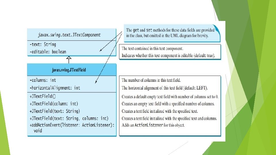

JPassword. Field The JPassword. Field class, a subclass of JText. Field, provides specialized text fields for password entry. JPassword. Field pf = new JPassword. Field(10); For security reasons, a password field does not show the characters that the user types. Instead, the field displays a character different from the one typed, such as an asterisk ‘*’. As another security precaution, a password field stores its value as an array of characters, rather than as a string.
![JPassword. Field Reading the Password: char[] input = password. Field. get. Password(); Setting and](http://slidetodoc.com/presentation_image_h2/42172f27fcf686ac64048da967674b96/image-34.jpg "JPassword. Field Reading the Password: char[] input = password. Field. get. Password(); Setting and")
JPassword. Field Reading the Password: char[] input = password. Field. get. Password(); Setting and Getting Echo-char: void set. Echo. Char(char) char get. Echo. Char()

JText. Area A JText. Area is a multi-line area that displays plain text. JText. Area () JText. Area (String str) JText. Area (int rows, int cols) JText. Field (String str, int rows, int cols) Like JText. Field, JText. Area contains the methods get. Text, set. Text, is. Editable, and set. Editable.

Swing Buttons Swing defines four types of buttons, all are subclasses of the Abstract. Button class, which extends JComponent. JButton, JToggle. Button, JCheck. Box, and JRadio. Button Ø The text associated with a button can be read and written via the following methods: String get. Text( ) void set. Text(String str) Here, str is the text to be associated with the button.

JButton class provides the functionality of a push button. JButton allows an icon, a string, or both to be associated with the push button. JButton(Icon i) JButton(String str, Icon i) The text associated with a button can be read and written via the following methods: String get. Text( ) void set. Text(String str) When the button is pressed, an Action. Event is generated. We can obtain the action command by calling get. Action. Command( ) on the event object.

Event Handling Most events to which our program will respond are generated when the user interacts with a GUIbased program. • The modern approach to handling events is based on the delegation event model. Its concept is: • A source: which generates an event. • A listener is an object that is notified when an event occurs. • When a source generates and event sends it to one or more listeners. • In this scheme, the listener simply waits until it receives an event. Once an event is received, the listener processes the event and then returns. • In the delegation event model, listeners must register with a source in order to receive an event notification. This provides an important benefit: notifications are sent only to listeners that want to receive them. • Each type of event has its own registration method. Here is the general form: public void add. Type. Listener( Type. Listener el)
method that is invoked")
The Action. Listener Interface This interface defines the action. Performed( )method that is invoked when an action event occurs. Its general form is shown here: void action. Performed(Action. Event ae) The Action. Event class: • You can obtain the command name for the invoking Action. Event object by using the get. Action. Command( ) method, shown here: String get. Action. Command( ) • For example, when a button is pressed, an action event is generated that has a command name equal to the label on that button.
 that is")
The Item. Listener Interface This interface defines the item. State. Changed( ) that is invoked when the state of an item changes. Its general form is shown here: void item. State. Changed(Item. Event ie) The • Item. Event Class: The get. Item( ) method can be used to obtain a reference to the item that generated an event. Often this is a String containing the text on the selected item. Its signature is shown here: Object get. Item( )

JToggle. Button A toggle button looks just like a push button, but it acts differently because it has two states: pushed and released. Toggle buttons are objects of the JToggle. Button class. JToggle. Button is a super-class for two other Swing components that also represent two-state controls. These are: JCheck. Box and JRadio. Button JToggle. Button(String str) By default, the button is in the off position.

JCheck. Box class provides the functionality of a check box. Its immediate super class is JToggle. Button, which provides support for two -state buttons. JCheck. Box(String str) When a check box is clicked (checked or unchecked), it fires an Item. Event and then an Action. Event. To see if a check box is selected, use the is. Selected()method. To change state of check box, use set. Selected(boolean );
 Creates an initially unselected check box button with no text,")
JCheck. Box JCheck. Box() Creates an initially unselected check box button with no text, no icon. JCheck. Box(String text) Creates an initially unselected check box with text JCheck. Box(String text, boolean selected) Creates a check box with text and specifies whether or not it is initially selected.

JRadio. Button Radio buttons are a group of mutually exclusive buttons, in which only one button can be selected at any one time. They are supported by the JRadio. Button class, which extends JToggle. Button. To group radio buttons, you need to create an instance of Button. Group and use add method to add your radio button. Its default constructor is invoked for this purpose. Button. Group is not a subclass of java. awt. Component, so a Button. Group object cannot be added to a container. When a radio button is changed (selected or deselected), it fires an Item. Event and then an Action. Event.
 Creates an initially unselected radio button with no set text.")
JRadio. Button JRadio. Button() Creates an initially unselected radio button with no set text. JRadio. Button(String text) Creates an unselected radio button with the specified text. JRadio. Button(String text, boolean selected) Creates a radio button with the specified text and selection state.

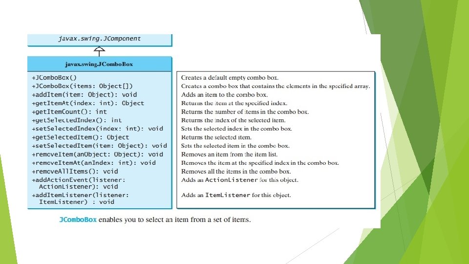
JCombo. Box A combo box, also known as a choice list or drop-down list, contains a list of items from which the user can choose Combo box is a combination of a text field and a drop-down list. A combo box normally displays one entry, but it will also display a drop-down list that allows a user to select a different entry. JCombo. Box(Object[ ]items) Items can be dynamically added to the list of choices via the add. Item( ) method. void add. Item(Object obj) Ø JCombo. Boxcan fire Action. Event and Item. Event, among many other events. Whenever an item is selected, an Action. Event is fired. To limit the maximum number of items displayed in the drop-down list: jcb. set. Maximum. Row. Count(5);

JList A list is a component that basically performs the same function as a combo box but enables the user to choose a single value or multiple values. A JList generates a List. Selection. Event when the user makes or changes a selection.

JList allows the user to select multiple ranges of items within the list, but we can change this behavior by calling set. Selection. Mode( ), which is defined by JList. void set. Selection. Mode(int mode) Here, mode specifies the selection mode. It must be one of these values defined by SINGLE_SELECTION SINGLE_INTERVAL_SELECTION MULTIPLE_INTERVAL_SELECTION The default, multiple-interval selection, lets the user select multiple ranges of items within a list. These constant are present in List. Selection. Model interface

JScroll. Pane Often you need to use a scroll bar to scroll the contents of an object that does not fit completely into the viewing area. JScroll. Pane is a lightweight container that automatically handles the scrolling of another component. A JScroll. Pane can be viewed as a specialized container with a view port for displaying the contained component. JScroll. Pane(Component comp)

Steps to create JScroll. Pane Create the component to be scrolled. Create an instance of JScroll. Pane, passing to it the object to scroll. Add the scroll pane to the content pane.
 JScroll. Pane(int, int) You can also")
Setting the Scroll Bar Policy JScroll. Pane(Component, int) JScroll. Pane(int, int) You can also set the policies dynamically with the set. Horizontal. Scroll. Bar. Policy and set. Vertical. Scroll. Bar. Policy methods. VERTICAL_SCROLLBAR_AS_NEEDED HORIZONTAL_SCROLLBAR_AS_NEEDED VERTICAL_SCROLLBAR_ALWAYS HORIZONTAL_SCROLLBAR_ALWAYS VERTICAL_SCROLLBAR_NEVER HORIZONTAL_SCROLLBAR_NEVER Ex: JScroll. Pane(Component , Scroll. Pane. Constants. VERTICAL_SCROLLBAR_ALWAYS, Scroll. Pane. Constants. HORIZONTAL_SCROLLBAR_ ALWAYS);

JMenu A menu provides a space-saving way to let the user choose one of several options. A menu usually appears either in a menu bar or as a popup menu. A menu bar contains one or more menus. A popup menu is a menu that is invisible until the user makes a platform-specific mouse action, such as pressing the right mouse button, over a popup-enabled component.
;")
Creating JMenu Create a Menu. Bar JMenu. Bar menu. Bar = new JMenu. Bar(); Create Menus Create Menu. Items Add Menu. Items to Menu. Add Menus to Menu. Bar menu. Bar. add(menu); Set the Menu. Bar to the Container set. JMenu. Bar(menu. Bar); The menu. add. Separator() method adds a separator bar in the menu. The menu items generate Action. Event. Your listener class must implement the Action. Listener and the action. Performed handler to respond to the menu selection. JMenu menu = new JMenu("File"); JMenu. Item mi = new JMenu. Item(“Open"); menu. add(mi);

Layout Managers Flow. Layout Grid. Layout Border. Layout Card. Layout

Layout Manager classes

FLow. Layout

Flow. Layout • Default layout manager of JPanel. • Implements a simple layout style, similar to words in a text editor. • Components are laid out from the upper-left corner, L R, T B • Constructors. Flow. Layout( ) Flow. Layout(int how, int horz, int vert) • 1 st creates default layout, which centers components and leaves 5 pixels space between each component. • 2 nd specify how each line is aligned. Values for how– • Flow. Layout. LEFT or Flow. Layout. CENTER 3 rd specifies horizontal and vertical space. or Flow. Layout. RIGHT

Grid. Layout

Grid. Layout • Lays out components in 2 -D grid. • We can define no. of rows, columns in constructors– Grid. Layout( ) – Grid. Layout(int num. Rows, int num. Columns, int horz, int vert) • 1 st creates a single-row grid. • 2 nd specifies no. of rows and columns. – – • If num. Rows =0 means unlimited-length columns. If num. Columns=0 means unlimited-length rows. 3 rd specifies horizontal and vertical space between components.

Border. Layout

Border. Layout Default layout of Jframe. 4 narrow, fixed-width components at the edges and one large area in the center. 4 sides referred as north, south, east, west. Middle area called as center. Constructors Border. Layout( ) Border. Layout(int horz, int vert) 1 st creates a default border layout. 2 nd specifies the horizontal and vertical space between components Following constants specify the regions: Border. Layout. CENTER or Border. Layout. SOUTH or Border. Layout. EAST or Border. Layout. WEST or Border. Layout. NORTH Use these constants with add( ) asvoid add(Component comp. Obj, Object region) Here, comp. Obj is the component to be added, and region specifies where the component will be added.

Card. Layout It is used to arrange containers in the form of deck of cards. Methods: first() / last()/ next()/ previous(): is used to make the first/ last/ next/ previous card visible. show(): is used to make a specified card visible. public void show ( Container deck, String Card. Name) To give a name to the container while it is added to the deck: public void add ( Container card, String Card. Name)

Sample GUI Applications

Sample GUI Applications
 (50, 0) (0, 20) (50, 20) (w-1, h-1) Java")
Java’s coordinate system (0, 0) (50, 0) (0, 20) (50, 20) (w-1, h-1) Java uses an (x, y) coordinate system (0, 0) is the top left corner (50, 0) is 50 pixels to the right of (0, 0) (0, 20) is 20 pixels down from (0, 0) (w - 1, h - 1) is just inside the bottom right corner, where w is the width of the window and h is its height 66

Graphics The Graphics class is the abstract class. You can apply the methods in the Graphics class to draw things on a GUI component. The Graphics class provides the methods for drawing strings, lines, rectangles, ovals, arcs, polygons. Whenever a component (e. g. , a button, a label, a panel) is displayed, the JVM automatically creates a Graphics object for the component on the native platform and passes this object to invoke the paint. Component method to display the drawings. The signature of the paint. Component method is as follows: protected void paint. Component(Graphics g) This method, defined in the Jcomponent class, is invoked whenever a component is first displayed or redisplayed. In order to draw things on a component, you need to define a class that extends JPanel and overrides its paint. Component method to specify what to draw.
")
Graphics Drawing Text To Draw texts on the graphics screen we use draw. String() method, shown here: draw. String(String str, int x. Baseline. Left, int y. Baseline. Left); Drawing Lines void Lines are drawn by means of the draw. Line( )method, shown here: draw. Line(int start. X, int start. Y, int end. X, int end. Y) draw. Line( )displays a line in the current drawing color that begins atstart. X, start. Yand ends at end. X, end. Y.
and fill. Rect( )methods display an outlined and")
Drawing Rectangles The draw. Rect( )and fill. Rect( )methods display an outlined and filled rectangle, respectively. They are shown here: void draw. Rect(int top, int left, int width, int height) void fill. Rect(int top, int left, int width, int height) The upper-left corner of the rectangle is at top, left. The dimensions of the rectangle are specified by width and height. To draw a rounded rectangle, use draw. Round. Rect( )or fill. Round. Rect( ), both shown here: void draw. Round. Rect(int top, int left, int width, int height, int x. Diam, int y. Diam) void fill. Round. Rect(int top, int left, int width, int height, int x. Diam, int y. Diam) A rounded rectangle has rounded corners. The diameter of the rounding arc along the X axis is specified by x. Diam. The diameter of the rounding arc along the Y axis is specified by y. Diam.
. To")
Drawing Ellipses and Circles To draw an ellipse, use draw. Oval( ). To fill an ellipse, use fill. Oval( ). These methods are shown here. void draw. Oval(int top, int left, int width, int height) void fill. Oval(int top, int left, int width, int height) The ellipse is drawn within a bounding rectangle whose upper-left corner is specified by top, leftand whose width and height are specified by width and height. To draw a circle, specify a square as the bounding rectangle. Drawing Arcs can be drawn with draw. Arc( ) and fill. Arc( ), shown here: void draw. Arc(int top, int left, int width, int height, int start. Angle, int sweep. Angle) void fill. Arc(int top, int left, int width, int height, int start. Angle, int sweep. Angle) The arc is bounded by the rectangle whose upper-left corner is specified by top, left and whose width and height are specified by width and height. The arc is drawn from start. Angle through the angular distance specified by sweep. Angles are specified in degrees. Zero degrees is on the horizontal, at the three o’clock position. The arc is drawn counterclockwise if sweep. Angle is positive, and clockwise if sweep. Angle is negative.

Drawing Polygons It is possible to draw arbitrarily shaped figures using draw. Polygon( )and fill. Polygon( ), shown here: void draw. Polygon(int x[ ], int y[ ], int num. Points) void fill. Polygon(int x[ ], int y[ ], int num. Points) The polygon’s endpoints are specified by the coordinate pairs contained within thexandy arrays. The number of points defined by x and y is specified by num. Points.

Color class The java. awt package defines a class named Color. There are 13 predefined colors: Color. BLACK Color. DARK_GRAY Color. LIGHT_GRAY Color. WHITE Java Color. PINK Color. RED Color. ORANGE Color. YELLOW Color. MAGENTA Color. GREEN Color. CYAN Color. BLUE also allows color names in lowercase: Color. black, Color. dark. Gray, etc. 72

Color • You can also create your own colors, one of the color constructors shown here: forms is Color(int red, int green, int blue) The first constructor takes three integers that specify the color as a mix of red, green, and blue. These values must be between 0 and 255, as in this example: new Color(255, 100); // light red Colors are made of red, green, and blue components, each represented by an int value that describes its intensity, ranging from 0(darkest shade) to 255 (lightest shade). This is known as the RGB model The arguments r, g, b are between 0 and 255. If a value beyond this range is passed to the argument, an Illegal. Argument. Exception will occur. Example: JButton jb 1 = new JButton("OK"); jb 1. set. Foreground (new Color(100, 1, 1)); 73

Font class We can create a font using the java. awt. Font class and set fonts for the components using the set. Font method in the Component class. The constructor for Font is: public Font (String name, int style, int size); You can choose a font name from Sans. Serif, Monospaced, Dialog, or Dialog. Input. Choose a style from Font. PLAIN(0), Font. BOLD(1), Font. ITALIC(2), and Font. BOLD+Font. ITALIC(3), and specify a font size of any positive integer.
; Font")
Font class Example: Font font 1 = new Font("Sans. Serif", Font. BOLD, 16); Font font 2 = new Font("Serif", Font. BOLD + Font. ITALIC, 12); JButton jbt. OK = new JButton("OK"); jbt. OK. set. Font(font 1);

What Does "Pluggable Look and Feel" Mean? Swing-based applications can appear as if they are native Windows, Mac OS X, GTK+, or Motif applications, or they can have a unique Java look and feel through the "Metal" package. "Pluggable" means that both visual representation and (physical) behaviour of a GUI element can change.
 approach is a way of developing components by separating")
MVC Architecture The model-view-controller (MVC) approach is a way of developing components by separating data storage and handling from the visual representation of the data. The component for storing and handling data, known as a model, contains the actual contents of the component. The component for presenting the data, known as a view, handles all essential component behaviours. The controller is a component that is usually responsible for obtaining data, as shown in Figure.
- Slides: 77