Group Data and Histograms Raw Data Grouped Data
- Slides: 9

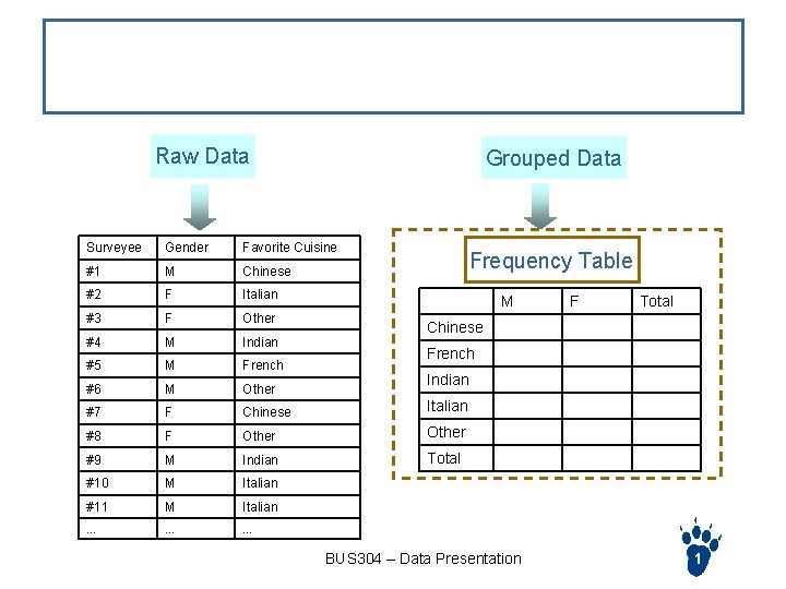
Group Data and Histograms Raw Data Grouped Data Surveyee Gender Favorite Cuisine #1 M Chinese #2 F Italian #3 F Other #4 M Indian #5 M French #6 M Other #7 F Chinese Italian #8 F Other #9 M Indian Total #10 M Italian #11 M Italian … … … Frequency Table M F Total Chinese French Indian BUS 304 – Data Presentation 1

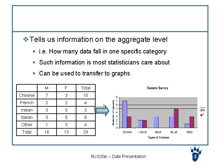
Frequency Table v Tells us information on the aggregate level § i. e. How many data fall in one specific category § Such information is most statisticians care about § Can be used to transfer to graphs M F Total Chinese 7 3 10 French 2 2 4 Indian 3 0 3 Italian 3 5 8 Other 1 3 4 Total 16 13 29 BUS 304 – Data Presentation 2

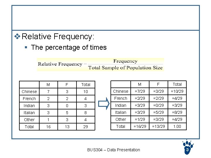
Relative Frequency v Relative Frequency: § The percentage of times M F Total Chinese =7/29 =3/29 =10/29 4 French =2/29 =4/29 0 3 Indian =3/29 =0/29 =3/29 3 5 8 Italian =3/29 =5/29 =8/29 Other 1 3 4 Other =1/29 =3/29 =4/29 Total 16 13 29 Total =16/29 =13/29 1. 00 M F Total Chinese 7 3 10 French 2 2 Indian 3 Italian BUS 304 – Data Presentation 3

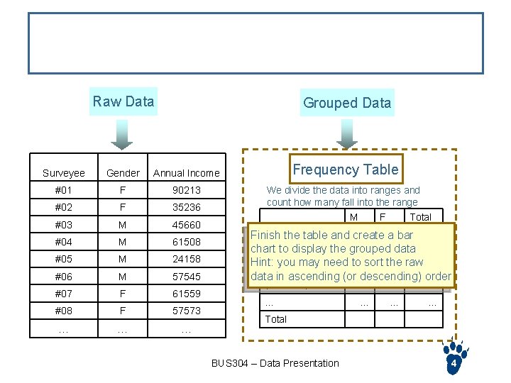
When data spread to a wide range Raw Data Grouped Data Surveyee Gender Annual Income Frequency Table #01 F 90213 #02 F 35236 #03 M 45660 #04 M 61508 #05 M 24158 #06 M 57545 #07 F 61559 #08 F 57573 … … … We divide the data into ranges and count how many fall into the range M F Total 0~$10000 Finish the table and create a bar chart to display the grouped data $10000~$20000 Hint: you may need to sort the raw $20000~$30000 data in ascending (or descending) order $30000~$40000 … … Total BUS 304 – Data Presentation 4

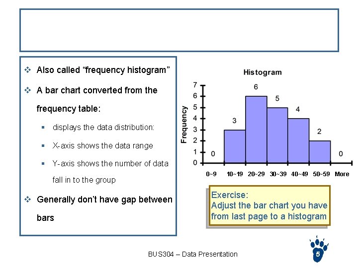
Histogram v Also called “frequency histogram” v A bar chart converted from the frequency table: § displays the data distribution: § X-axis shows the data range § Y-axis shows the number of data 0~9 fall in to the group v Generally don’t have gap between bars 10~19 20~29 30~39 40~49 50~59 More Exercise: Adjust the bar chart you have from last page to a histogram BUS 304 – Data Presentation 5

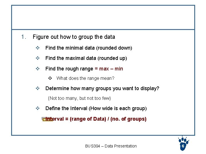
Steps to create a histogram 1. Figure out how to group the data v Find the minimal data (rounded down) v Find the maximal data (rounded up) v Find the rough range = max – min v What does the range mean? v Determine how many groups you want to display? (Not too many, but not too few) v Define the Interval (How wide is each group) Interval = (range of Data) / (no. of groups) BUS 304 – Data Presentation 6

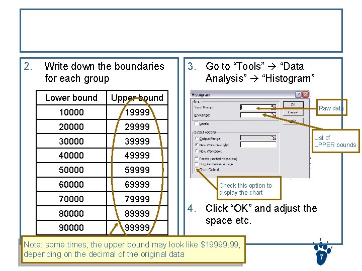
Steps to create a histogram (cont) 2. Write down the boundaries for each group Lower bound Upper bound 10000 19999 20000 29999 30000 39999 40000 49999 50000 59999 60000 69999 70000 79999 80000 89999 90000 99999 3. Go to “Tools” “Data Analysis” “Histogram” Raw data List of UPPER bounds Check this option to display the chart 4. Click “OK” and adjust the space etc. Note: some times, the upper bound may look like $19999. 99, depending on the decimal of the original data BUS 304 – Data Presentation 7

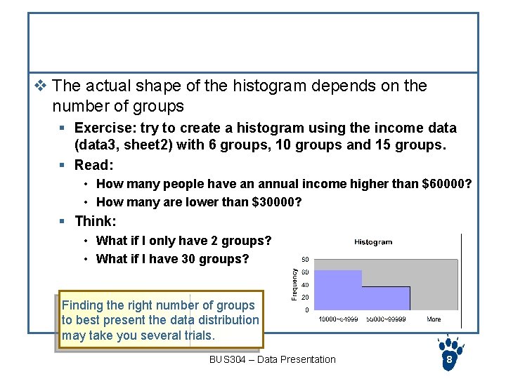
Extra Notes v The actual shape of the histogram depends on the number of groups § Exercise: try to create a histogram using the income data (data 3, sheet 2) with 6 groups, 10 groups and 15 groups. § Read: • How many people have an annual income higher than $60000? • How many are lower than $30000? § Think: • What if I only have 2 groups? • What if I have 30 groups? Finding the right number of groups to best present the data distribution may take you several trials. BUS 304 – Data Presentation 8

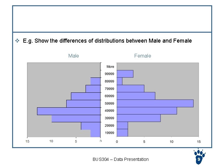
Compare two histograms v E. g. Show the differences of distributions between Male and Female Male Female BUS 304 – Data Presentation 9