Graphs How to set up successful graphs How


- Slides: 31

Graphs How to set up successful graphs

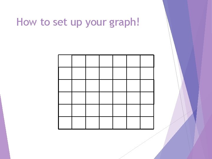
How to set up your graph!

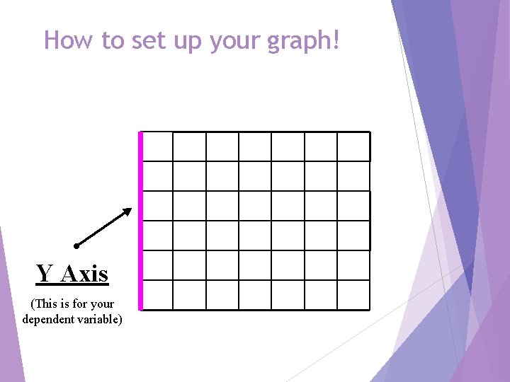
How to set up your graph! Y Axis (This is for your dependent variable)

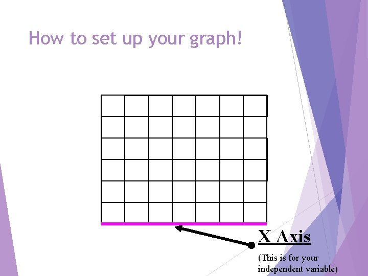
How to set up your graph! X Axis (This is for your independent variable)

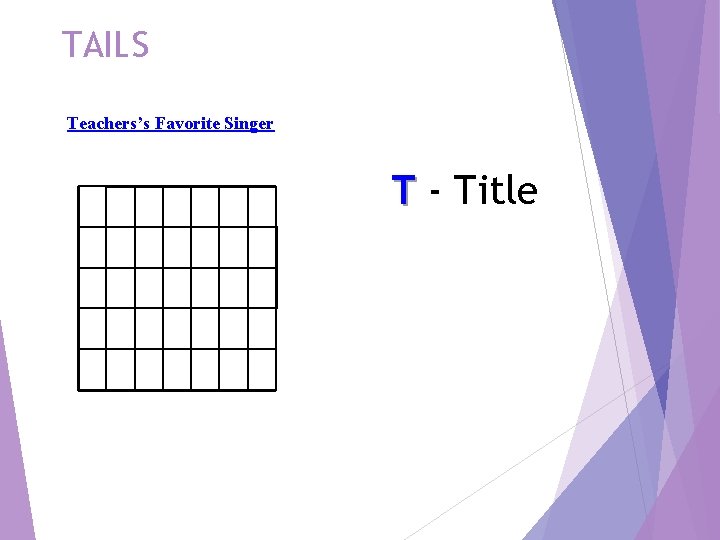
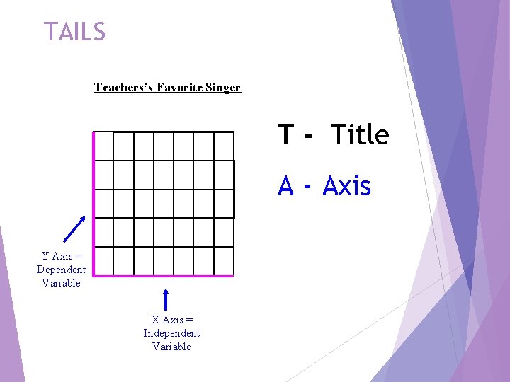
TAILS Teachers’s Favorite Singer T - Title

TAILS Teachers’s Favorite Singer T - Title A - Axis Y Axis = Dependent Variable X Axis = Independent Variable

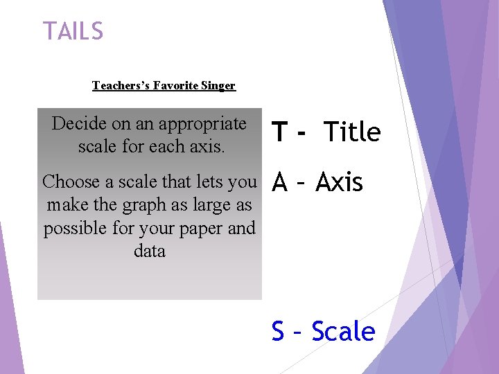
TAILS Teachers’s Favorite Singer Decide on an appropriate scale for each axis. Choose a scale that lets you make the graph as large as possible for your paper and data T - Title A – Axis S – Scale

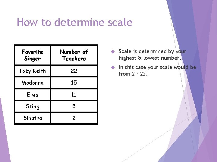
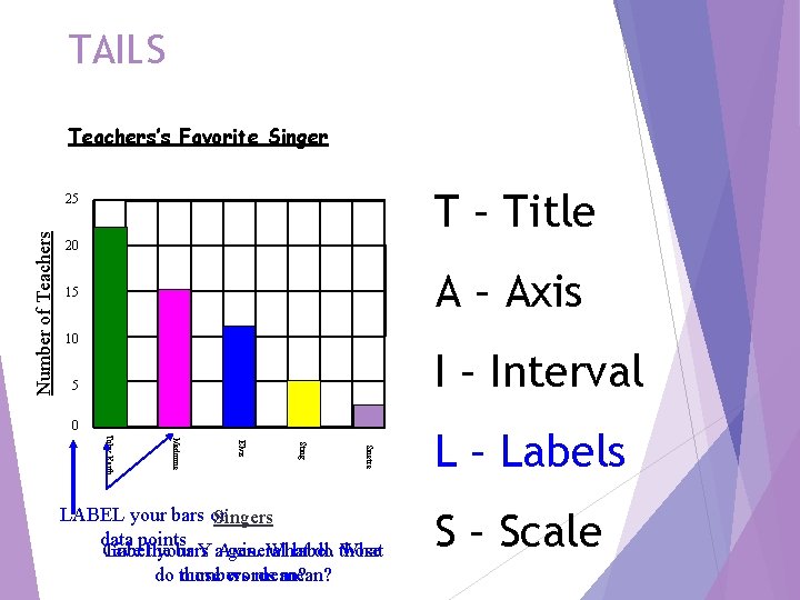
How to determine scale Favorite Singer Number of Teachers Scale is determined by your highest & lowest number. Toby Keith 22 In this case your scale would be from 2 – 22. Madonna 15 Elvis 11 Sting 5 Sinatra 2

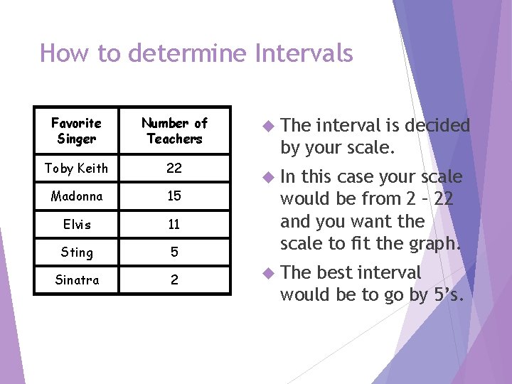
How to determine Intervals Favorite Singer Number of Teachers Toby Keith 22 Madonna 15 Elvis 11 Sting 5 Sinatra 2 The interval is decided by your scale. In this case your scale would be from 2 – 22 and you want the scale to fit the graph. The best interval would be to go by 5’s.

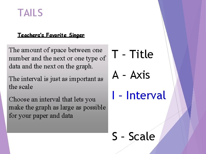
TAILS Teachers’s Favorite Singer The amount of space between one number and the next or one type of data and the next on the graph. The interval is just as important as the scale Choose an interval that lets you make the graph as large as possible for your paper and data T – Title A – Axis I – Interval S – Scale

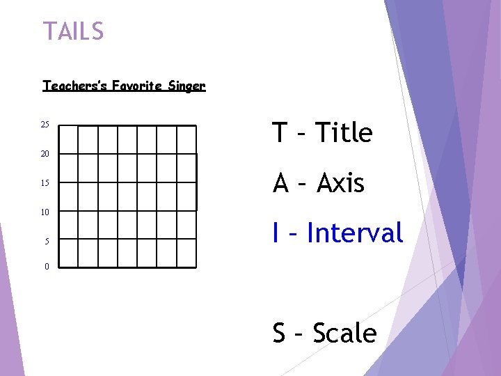
TAILS Teachers’s Favorite Singer 25 20 15 10 5 T – Title A – Axis I – Interval 0 S – Scale

TAILS Teachers’s Favorite Singer T – Title Number of Teachers 25 20 A – Axis 15 10 I – Interval 5 0 Sinatra Sting Elvis Madonna Toby Keith LABEL your bars or Singers data points Give Labelthe your bars Y a. Axis. general What label. do those What do those numbers words mean? L – Labels S – Scale

When to use… Bar graphs Used to show data that are not continuous. Allows us to compare data like amounts or frequency or categories Allow us to make generalizations about the data Help us see differences in data Line Graphs For continuous data useful for showing trends over time

Title & Axes § Title: “The Effects of the IV on the DV” § X axis: Independent variable § Y axis: Dependent variable § Use all available space § Scale axis evenly

What is wrong? Look at the following slides and determine what is wrong with each graph.

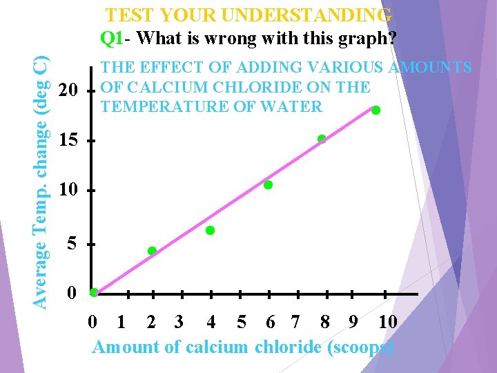
Average Temp. change (deg C) TEST YOUR UNDERSTANDING Q 1 - What is wrong with this graph? 20 THE EFFECT OF ADDING VARIOUS AMOUNTS OF CALCIUM CHLORIDE ON THE TEMPERATURE OF WATER 15 10 5 0 . . . 0 1 2 3 4 5 6 7 8 9 10 Amount of calcium chloride (scoops)

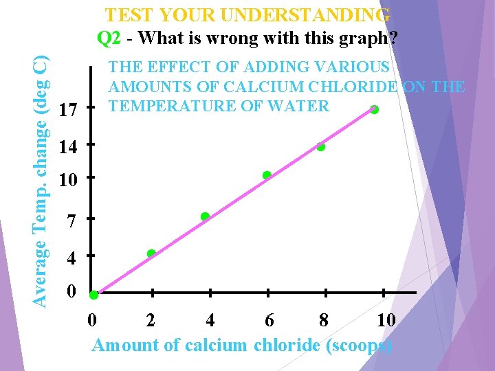
Average Temp. change (deg C) TEST YOUR UNDERSTANDING Q 2 - What is wrong with this graph? THE EFFECT OF ADDING VARIOUS AMOUNTS OF CALCIUM CHLORIDE ON THE TEMPERATURE OF WATER 17 14 10 7 4 0 . . . 0 2 4 6 8 10 Amount of calcium chloride (scoops)

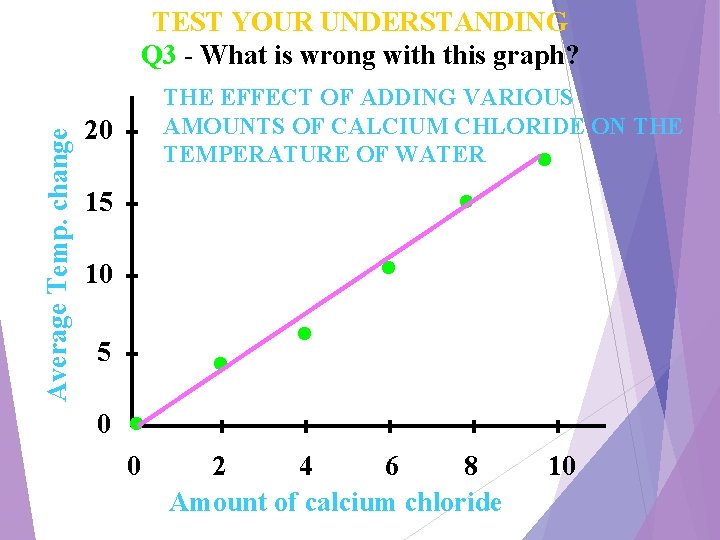
Average Temp. change TEST YOUR UNDERSTANDING Q 3 - What is wrong with this graph? THE EFFECT OF ADDING VARIOUS AMOUNTS OF CALCIUM CHLORIDE ON THE TEMPERATURE OF WATER 20 15 10 5 0 . . . . 2 4 6 8 Amount of calcium chloride . 10

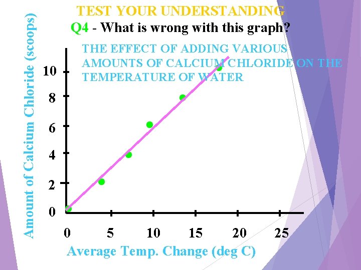
Amount of Calcium Chloride (scoops) TEST YOUR UNDERSTANDING Q 4 - What is wrong with this graph? 10 8 6 4 2 0 . THE EFFECT OF ADDING VARIOUS AMOUNTS OF CALCIUM CHLORIDE ON THE TEMPERATURE OF WATER . . . 0 5 10 15 20 Average Temp. Change (deg C) 25

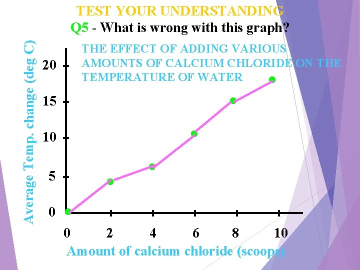
Average Temp. change (deg C) TEST YOUR UNDERSTANDING Q 5 - What is wrong with this graph? THE EFFECT OF ADDING VARIOUS AMOUNTS OF CALCIUM CHLORIDE ON THE TEMPERATURE OF WATER 20 15 10 5 0 . . . 0 2 4 6 8 10 Amount of calcium chloride (scoops)

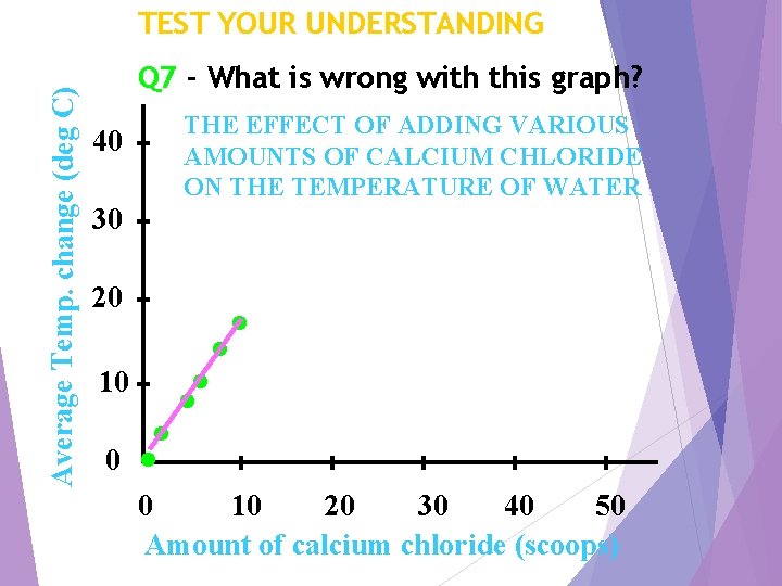
Average Temp. change (deg C) TEST YOUR UNDERSTANDING Q 7 - What is wrong with this graph? 40 THE EFFECT OF ADDING VARIOUS AMOUNTS OF CALCIUM CHLORIDE ON THE TEMPERATURE OF WATER 30 20 10 0 . . . 0 10 20 30 40 50 Amount of calcium chloride (scoops)

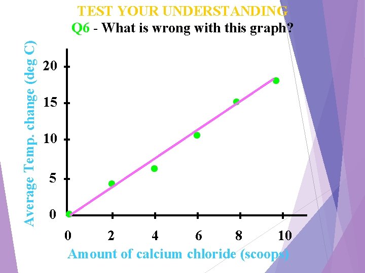
Average Temp. change (deg C) TEST YOUR UNDERSTANDING Q 6 - What is wrong with this graph? 20 15 10 5 0 . . . 0 2 4 6 8 10 Amount of calcium chloride (scoops)

g n i h p a Gr i w ph? o a l r l g of e fo type h h t h rap G 2. . a t a ng d rap hat g t a e s t ga hoo le? n c b i a k u t o o of lo r a data did y s y e h g W ove anta v 1. d a he t e r a What

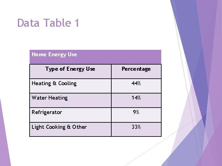
Data Table 1 Home Energy Use Type of Energy Use Percentage Heating & Cooling 44% Water Heating 14% Refrigerator 9% Light Cooking & Other 33%

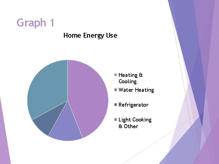
Graph 1 Home Energy Use Heating & Cooling Water Heating Refrigerator Light Cooking & Other

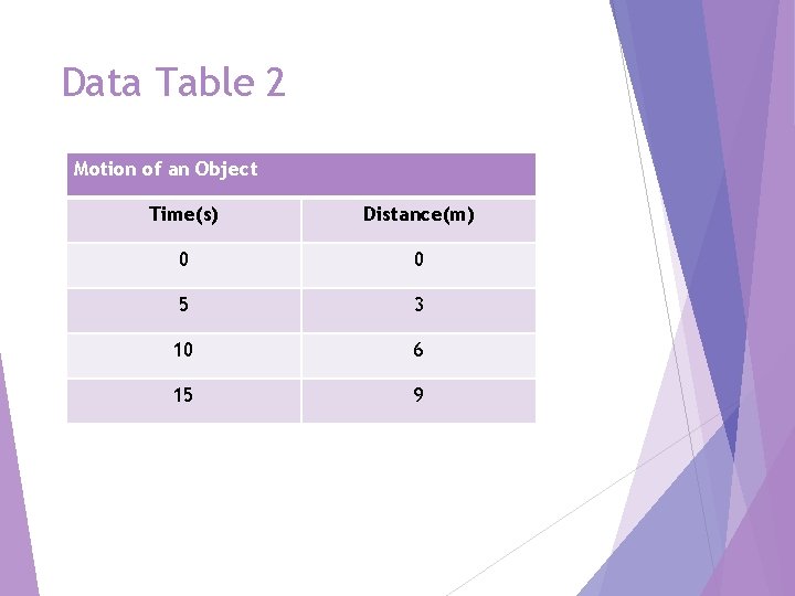
Data Table 2 Motion of an Object Time(s) Distance(m) 0 0 5 3 10 6 15 9

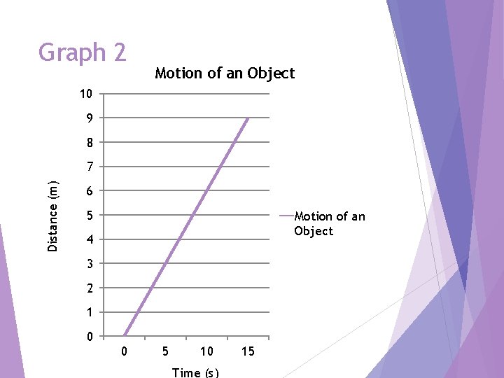
Graph 2 Motion of an Object 10 9 8 Distance (m) 7 6 5 Motion of an Object 4 3 2 1 0 0 5 10 Time (s) 15

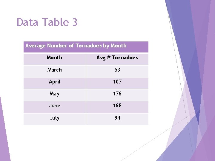
Data Table 3 Average Number of Tornadoes by Month Avg # Tornadoes March 53 April 107 May 176 June 168 July 94

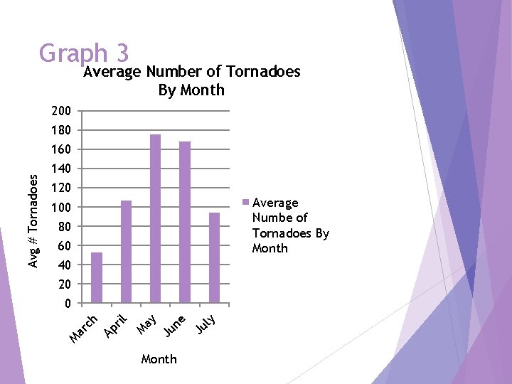
Graph 3 Average Number of Tornadoes By Month 200 180 140 120 Average Numbe of Tornadoes By Month 100 80 60 40 20 Month Ju ly Ju ne ay M Ap ril ar ch 0 M Avg # Tornadoes 160

Why did you choose that type of graph? 1. 2. 3.

What are the advantages of looking at a graph over a data table? Advantages include……