Graphs Grade 8 Mr Arthur Stem and Leaf


")
")


")


- Slides: 34
Graphs Grade 8 Mr. Arthur
Stem and Leaf Plot • Arranges data quickly • Prepares data to put into a histogram possibly
Stem and Leaf Plot
Stem and Leaf Plot
A bakery collected the following data about the # of loaves of bread sold each of the 24 business days: 53, 49, 27, 48, 60, 52, 44, 38, 47, 52, 82, 46, 55, 31, 39, 54, 51, 47, 50, 45, 50, 61, 43, and 64. Make a stem-and-leaf plot of the data. Find the median and mode(s) of the data. How can the owner use the stem-and-leaf plot to make plans for baking bread? Stem Leaf
Bar Graph
Double Bar Graph (Grade 4)
Multi-Bar Graph (Grade 5)
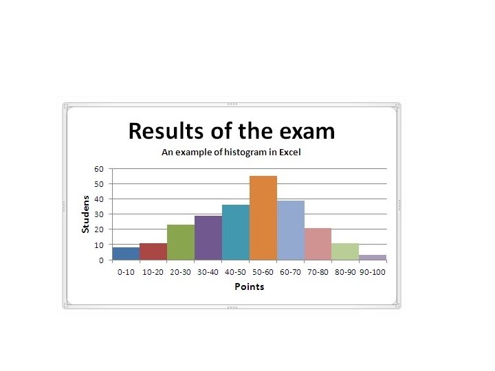
Histogram
Histogram
Bar Graphs vs. Histograms
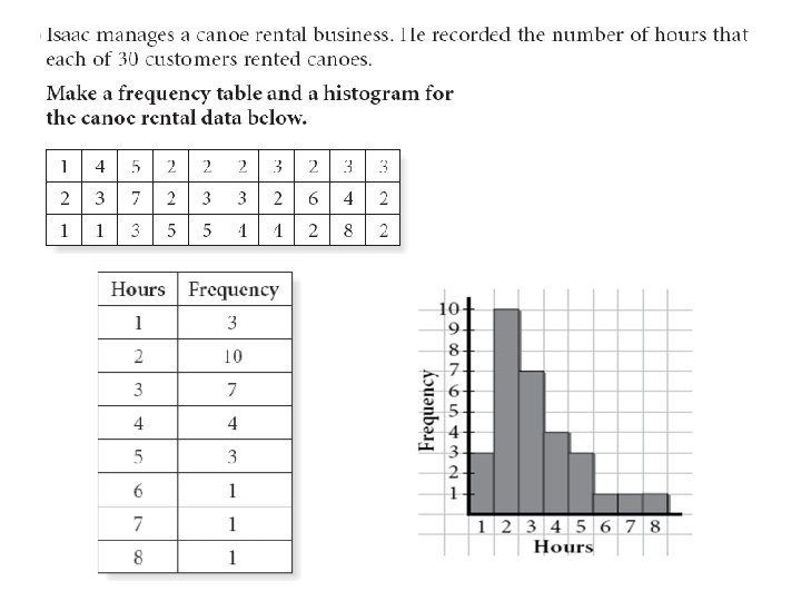
*Ex 2. The given data shows the # of people in 24 vehicles hat passed a designated checkpoint. 1, 4, 1, 2, 2, 1, 3, 2, 2, 6, 4, 2, 1, 1, 2, 4, 3, 1, 2, 4, 2, 3. Make a frequency table for these data. Make a histogram from the frequency table. # 1 2 3 4 5 6 Frequency
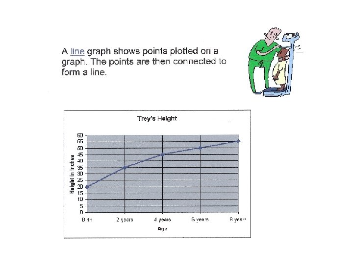
Line Graph Line graph Advantages Disadvantages A line graph plots continuous data as points and then joins them with a line. Multiple data sets can be graphed together, but a key must be used. • Can compare multiple continuous data sets easily • Use only with continuous data Shows change over time (e. g. temperature change, income change, Kalyani’s change in speed while running a given distance) • Interim data can be inferred from graph line.
Single Line Graph
Double Line Graph (Grade 5)
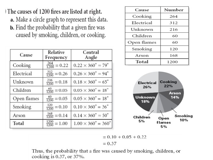
Circle Graphs
Pie Chart – Circle Graph Example
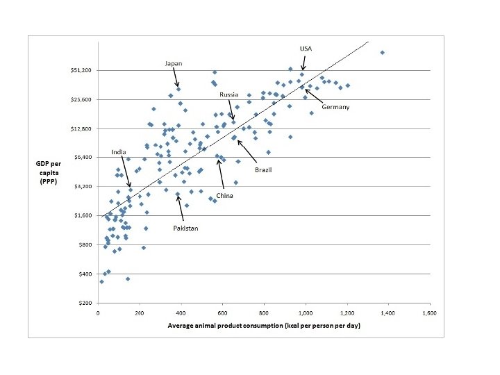
Scatter Plot Scatter plot Advantages Disadvantages A scatter plot displays the relationship between two factors of the experiment. A trend line is used to determine positive, negative or no correlation. • Shows a trend in the data relationship • Hard to visualize results in large data sets • Retains exact data values and sample size. • Flat trend line gives inconclusive results. • Shows minimum/maximum and outliers • Data on both axes should be continuous.
Scatter Plot Example
Outliers
No Correlation If there is absolutely no correlation present, the value given is 0.
Perfect linear correlation: A perfect positive correlation is given the value of 1. A perfect negative correlation is given the value of -1.
Strong linear correlation: The closer the number is to 1 or -1, the stronger the correlation, or the stronger the relationship between the variables.
Weak linear correlation: The closer the number is to 0, the weaker the correlation.
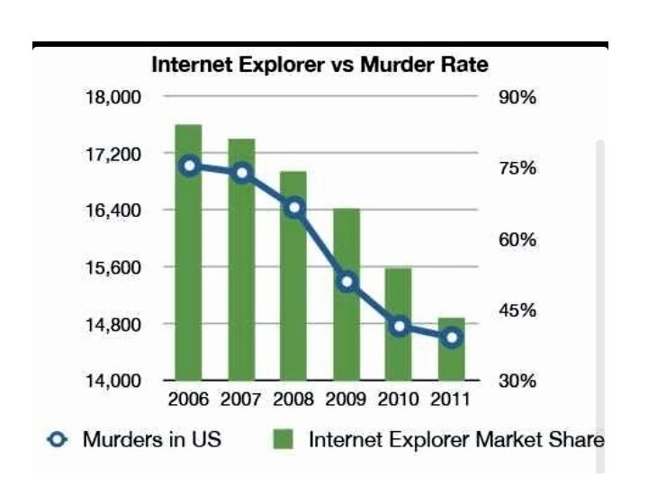
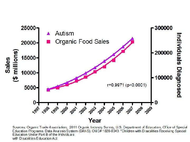
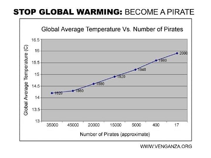
What is the correlation? What could this be a chart of?
Correlation AND Causation? ?