Graphs figures and tables visual presentation Wellchosen illustrations
Graphs, figures, and tables
visual presentation • Well-chosen illustrations breathe life into a paper, giving the reader interesting visual elements to browse and highlighting the central results and ideas. • A typical figure is of visual matter such as a graph or diagram • or of textual matter such as a table, algorithm, or, less commonly, complex mathematics. • Some information is best presented in a pictorial form, such as a graph or figure, to show trends and relationships.
Graphs • Graphs are usually the best way to present numerical result • Don't flood your paper with statistics, even in graphical form avoid repetition; each graph should convey interesting new information.
Graphs • Graphs should be simple • The horizontal or x-axis should be used for the parameter being varied, or the input • the vertical or y-axis is for the function of the parameter, or the output. • Plotted lines of discrete data should always have points marked by distinctive marks such as circles, boxes, or triangles.
Distinguishing lines • Consider using greys and line thickness rather than dots and dashes to distinguish between lines. • If you use shades of grey to distinguish different elements in the graph, ensure that the shades are sufficiently distinct; • lines in lighter grey sometimes need to be a little thicker than other lines. • Only use color in a write-up if color printing is used to produce the final version.
Minimize use of unnecessary elements • Are the secondary ticks on the axes useful? If not, discard them. • Is a legend necessary? If not, remove it, and label the lines directly. • Do the captions have to be in a large font? If not, diminish them. • Gridlines and boxing are other forms of unnecessary ornamentation. • Secondary marks, such as axis ticks, should be a little lighter than the other elements. • The lines and other elements should be of similar weight
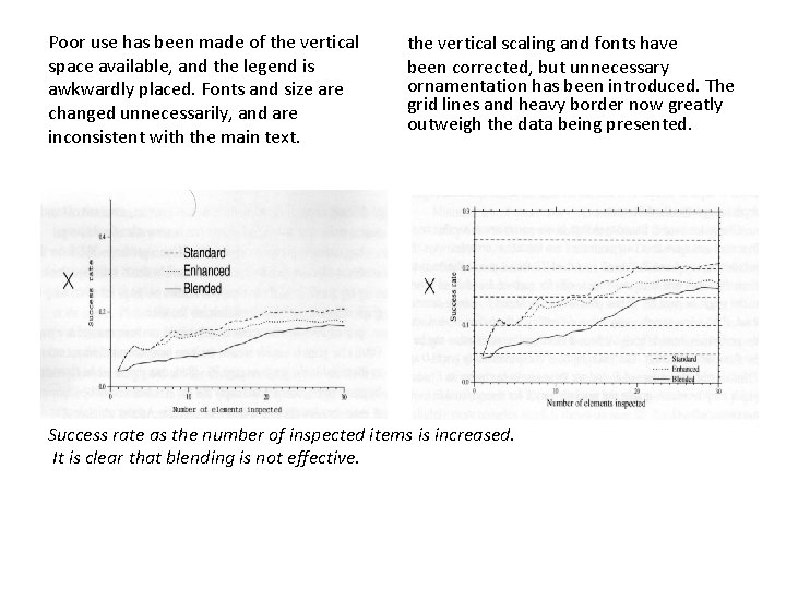
Poor use has been made of the vertical space available, and the legend is awkwardly placed. Fonts and size are changed unnecessarily, and are inconsistent with the main text. the vertical scaling and fonts have been corrected, but unnecessary ornamentation has been introduced. The grid lines and heavy border now greatly outweigh the data being presented. Success rate as the number of inspected items is increased. It is clear that blending is not effective.
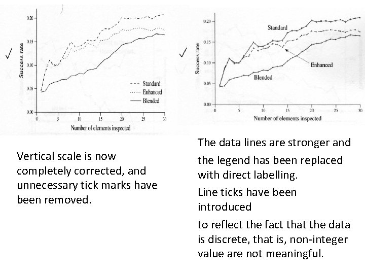
Vertical scale is now completely corrected, and unnecessary tick marks have been removed. The data lines are stronger and the legend has been replaced with direct labelling. Line ticks have been introduced to reflect the fact that the data is discrete, that is, non-integer value are not meaningful.
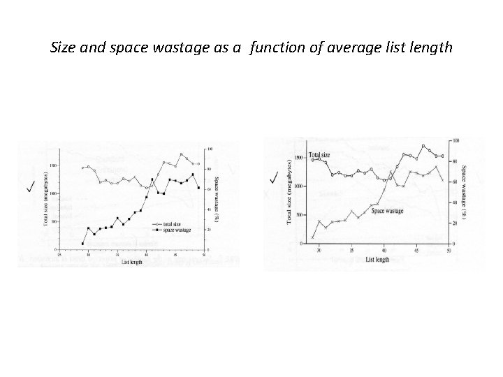
Size and space wastage as a function of average list length
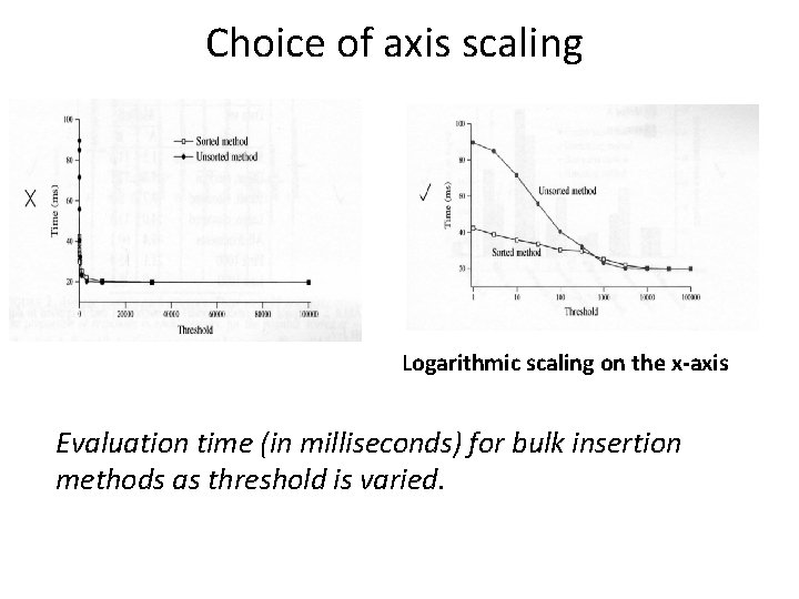
Choice of axis scaling Logarithmic scaling on the x-axis Evaluation time (in milliseconds) for bulk insertion methods as threshold is varied.
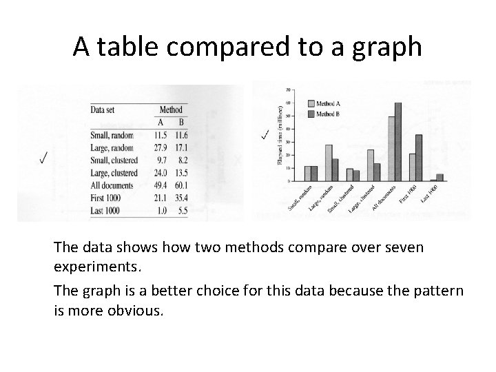
A table compared to a graph The data shows how two methods compare over seven experiments. The graph is a better choice for this data because the pattern is more obvious.
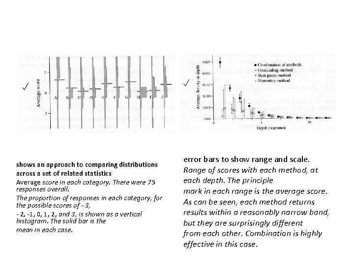
shows an approach to comparing distributions across a set of related statistics Average score in each category. There were 75 responses overall. The proportion of responses in each category, for the possible scores of - 3, - 2, -1, 0, 1, 2, and 3, is shown as a vertical histogram. The solid bar is the mean in each case. error bars to show range and scale. Range of scores with each method, at each depth. The principle mark in each range is the average score. As can be seen, each method returns results within a reasonably narrow band, but they are surprisingly different from each other. Combination is highly effective in this case.
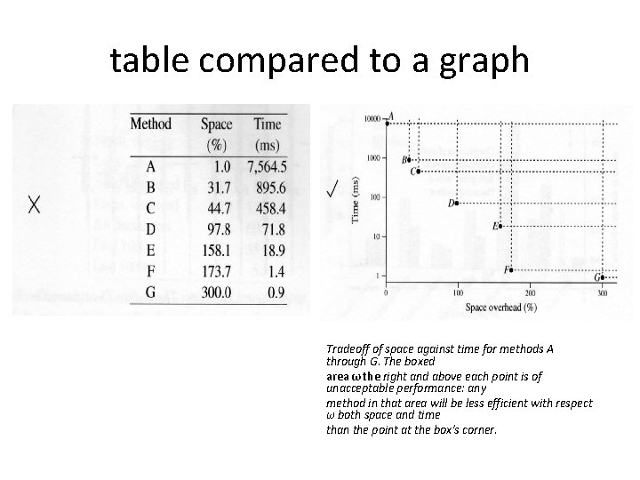
table compared to a graph Tradeoff of space against time for methods A through G. The boxed area ω the right and above each point is of unacceptable performance: any method in that area will be less efficient with respect ω both space and time than the point at the box's corner.
Software packages for drawing graphs Placing of several lines on one graph. A range of symbols (such as crosses, squares, and triangles) for marking points. The ability to create custom symbols of custom size for marking points. Optional connection of points with solid, dotted, or dashed lines, and optional omission of the point marks. • The ability to place text at specified places in the graph. • Multiple font sizes and line thicknesses. • Availability of greys and colours. • Optional logarithmic or exponentia 1 scaling on both axes. • Axis editing, to specify where the ticks are placed, how many digits of precision to use, and what range to cover. • The ability to move and rotate the legend or key, line labels, axis labels, and the graph label. • The ability to apply simple functions or extemal programs to (x, y) va 1 ues. • •
Visualization of results • Apply statistics • To use visualization
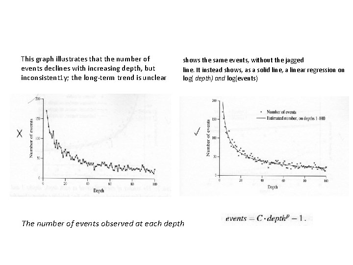
This graph illustrates that the number of events declines with increasing depth, but inconsistent 1 y; the long-term trend is unclear shows the same events, without the jagged line. It instead shows, as a solid line, a linear regression on log( depth) and log(events) The number of events observed at each depth
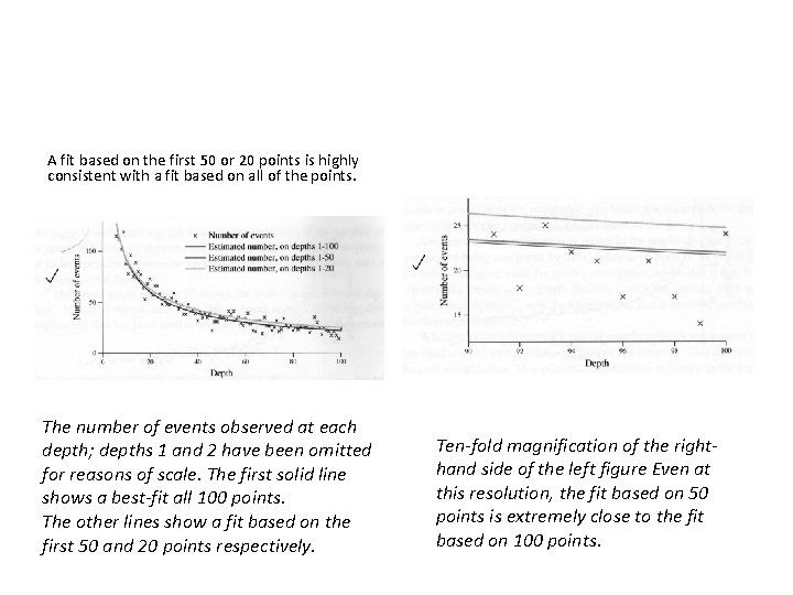
A fit based on the first 50 or 20 points is highly consistent with a fit based on all of the points. The number of events observed at each depth; depths 1 and 2 have been omitted for reasons of scale. The first solid line shows a best-fit all 100 points. The other lines show a fit based on the first 50 and 20 points respectively. Ten-fold magnification of the righthand side of the left figure Even at this resolution, the fit based on 50 points is extremely close to the fit based on 100 points.
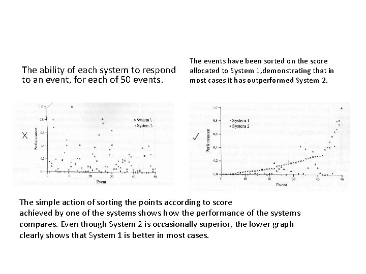
The ability of each system to respond to an event, for each of 50 events. The events have been sorted on the score allocated to System 1, demonstrating that in most cases it has outperformed System 2. The simple action of sorting the points according to score achieved by one of the systems shows how the performance of the systems compares. Even though System 2 is occasionally superior, the lower graph clearly shows that System 1 is better in most cases.
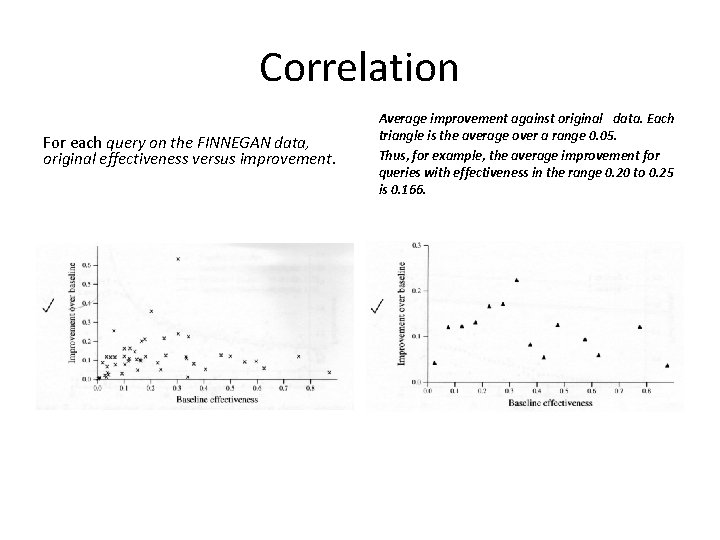
Correlation For each query on the FINNEGAN data, original effectiveness versus improvement. Average improvement against original data. Each triangle is the average over a range 0. 05. Thus, for example, the average improvement for queries with effectiveness in the range 0. 20 to 0. 25 is 0. 166.
Diagrams • • illustrate processes or architectures explain data structures and algorithms present relationships show examples of interfaces.
Diagrams • A diagram should not be too dark; keep it as open as possible. This is best achieved by eliminating all clutter. • A diagram does not have to be too faithful to every detail of the concept being illustrated • Use meaningful labels, which should be displayed horizontally, and make the • point size and font of the labels similar to that of the other text.
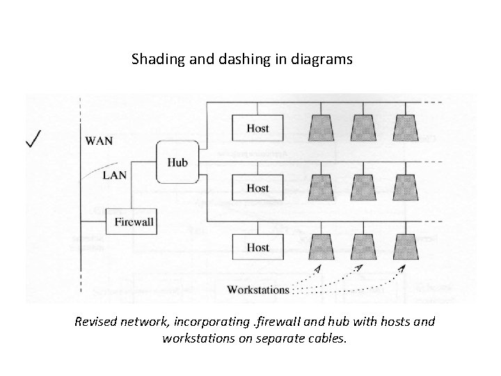
Shading and dashing in diagrams Revised network, incorporating. firewαII and hub with hosts and workstations on separate cables.
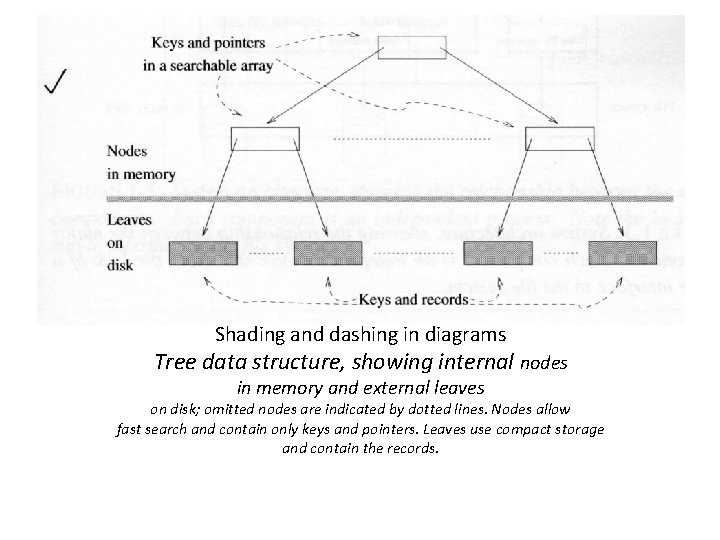
Shading and dashing in diagrams Tree data structure, showing internal nodes in memory and external leaves on disk; omitted nodes are indicated by dotted lines. Nodes allow fast search and contain only keys and pointers. Leaves use compact storage and contain the records.
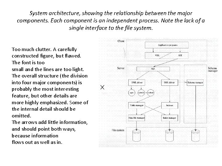
System architecture, showing the relationship between the major components. Each component is an independent process. Note the lack of a single interface to the file system. Too much clutter. A carefully constructed figure, but flawed. The font is too small and the lines are too light. The overall structure (the division into four major components) is probably the most interesting feature, but other details are more highly emphasized. Some of the internal detail should be omitted. The arrows add little information, and should point both ways, because information flows out as well as in.
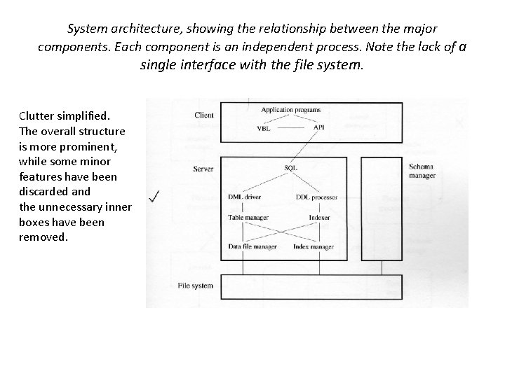
System architecture, showing the relationship between the major components. Each component is an independent process. Note the lack of a single interface with the file system. Clutter simplified. The overall structure is more prominent, while some minor features have been discarded and the unnecessary inner boxes have been removed.
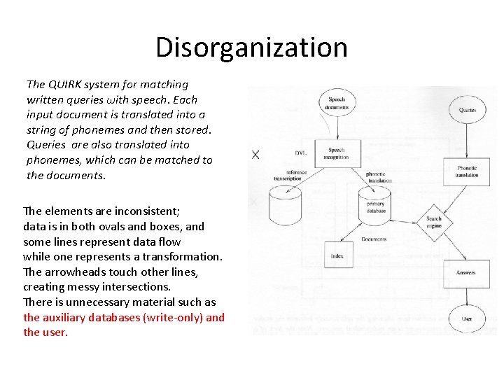
Disorganization The QUIRK system for matching written queries ωith speech. Each input document is translated into a string of phonemes and then stored. Queries are also translated into phonemes, which can be matched to the documents. The elements are inconsistent; data is in both ovals and boxes, and some lines represent data flow while one represents a transformation. The arrowheads touch other lines, creating messy intersections. There is unnecessary material such as the auxiliary databases (write-only) and the user.
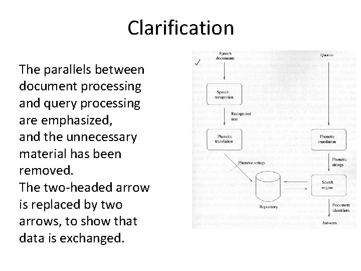
Clarification The parallels between document processing and query processing are emphasized, and the unnecessary material has been removed. The two-headed arrow is replaced by two arrows, to show that data is exchanged.
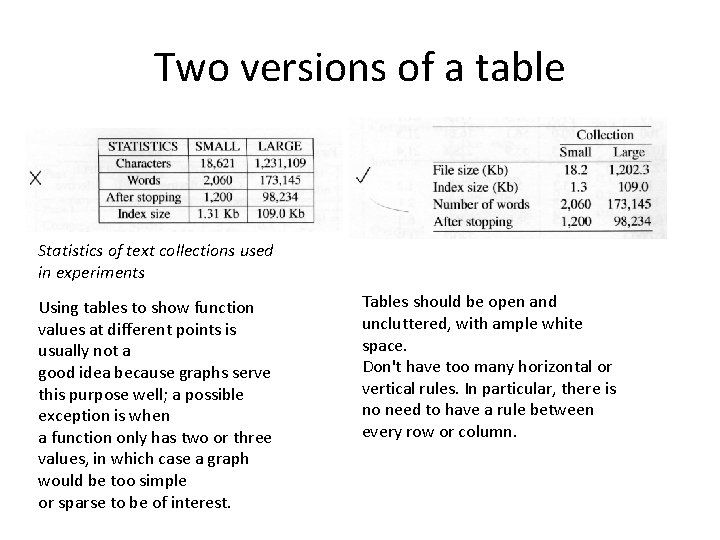
Two versions of a table Statistics of text collections used in experiments Using tables to show function values at different points is usually not a good idea because graphs serve this purpose well; a possible exception is when a function only has two or three values, in which case a graph would be too simple or sparse to be of interest. Tables should be open and uncluttered, with ample white space. Don't have too many horizontal or vertical rules. In particular, there is no need to have a rule between every row or column.
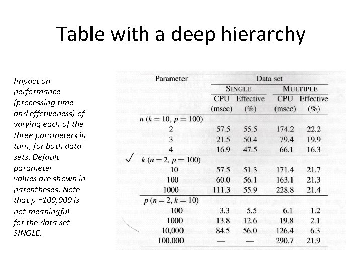
Table with a deep hierarchy Impact on performance (processing time and effctiveness) of varying each of the three parameters in turn, for both data sets. Default parameter values are shown in parentheses. Note that p =100, 000 is not meaningful for the data set SINGLE.
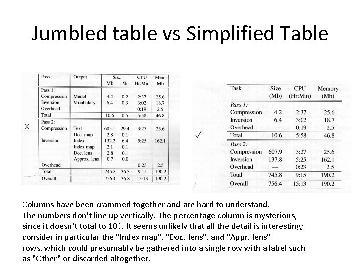
Jumbled table vs Simplified Table Columns have been crammed together and are hard to understand. The numbers don't line up vertically. The percentage column is mysterious, since it doesn't total to 100. It seems unlikely that all the detail is interesting; consider in particular the "Index map", "Doc. lens", and "Appr. lens" rows, which could presumably be gathered into a single row with a label such as "Other" or discarded altogether.
Captions and labels • It is common in computer science papers for captions to be only a few words • but is it preferable for captions to fully describe the figure's major elements. • Since figures and tables should be fairly selfcontained, the caption is an appropriate place to explain important details.
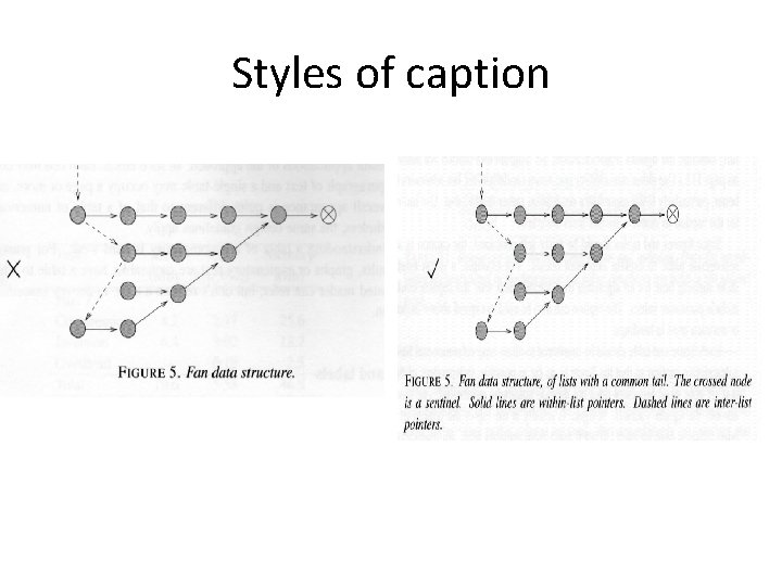
Styles of caption
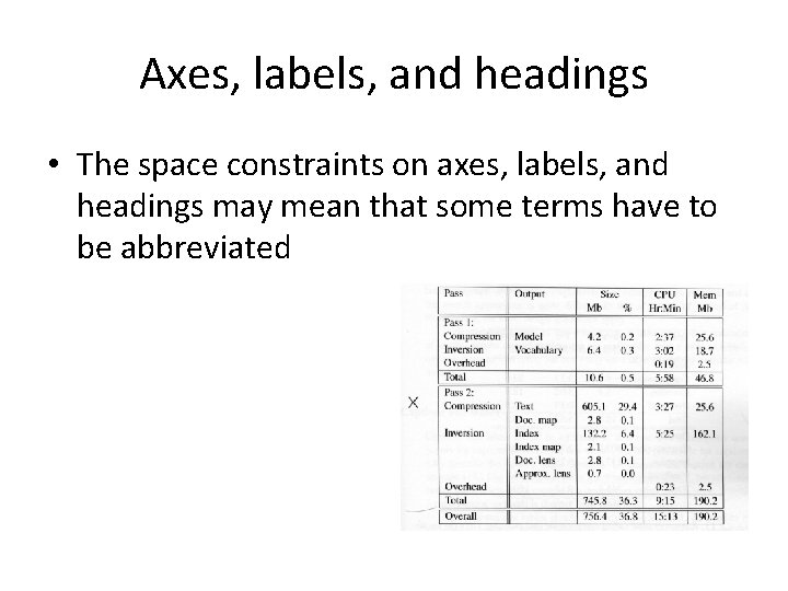
Axes, labels, and headings • The space constraints on axes, labels, and headings may mean that some terms have to be abbreviated
Axes, labels, and headings • X The abbreviations "comp. ", "doc. ", and "map. " stand for "compression", "document", and "mapping table" respectively. • √ The effect of compression on the documents and the mapping table is illustrated in the second and third rows.
- Slides: 34