Graphs Charts and Tables Describing Your Data Frequency
Graphs, Charts, and Tables - Describing Your Data ©
Frequency Distributions A frequency distribution is the sum of a set of data that displays the number of observations in each of the distributions distinct categories or classes.
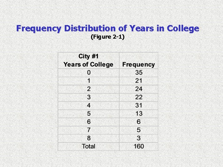
Frequency Distribution of Years in College (Figure 2 -1)
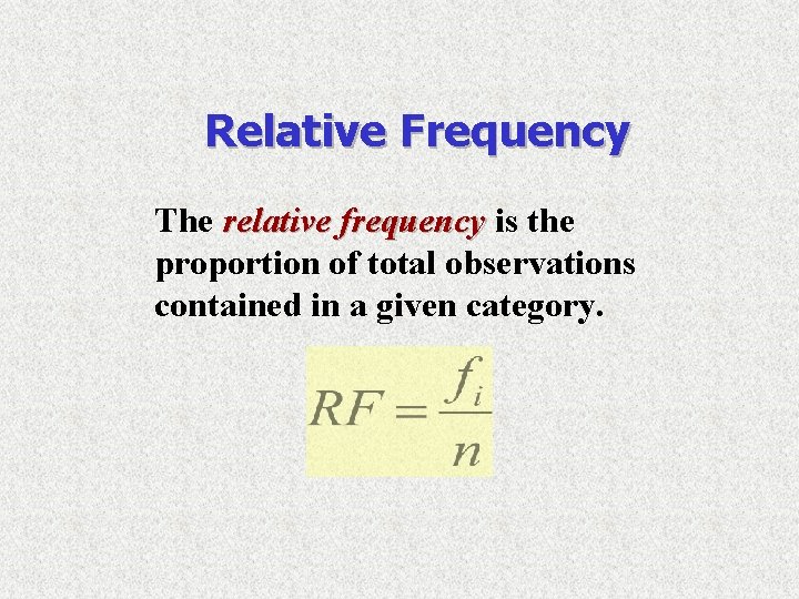
Relative Frequency The relative frequency is the proportion of total observations contained in a given category.
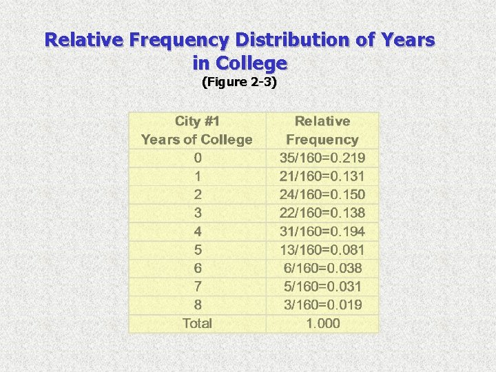
Relative Frequency Distribution of Years in College (Figure 2 -3)
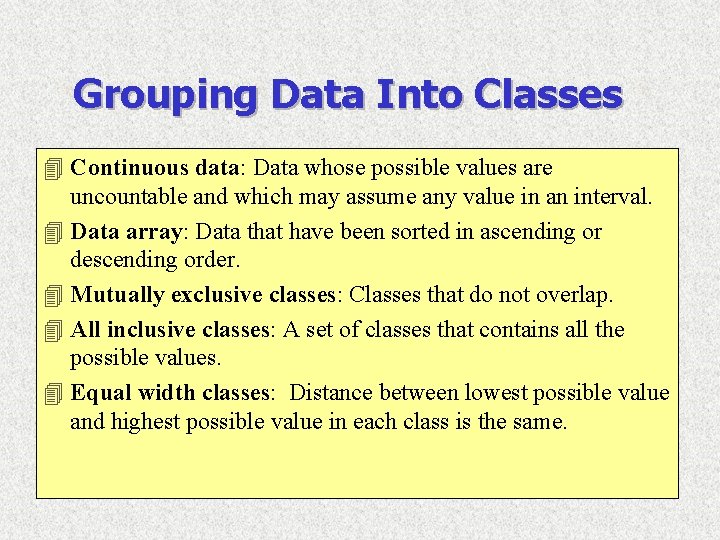
Grouping Data Into Classes 4 Continuous data: Data whose possible values are uncountable and which may assume any value in an interval. 4 Data array: Data that have been sorted in ascending or descending order. 4 Mutually exclusive classes: Classes that do not overlap. 4 All inclusive classes: A set of classes that contains all the possible values. 4 Equal width classes: Distance between lowest possible value and highest possible value in each class is the same.
Steps for Grouping Data Into Classes 4 Step 1: Determine the number of groups or classes to use. 4 Step 2: Establish the class width.
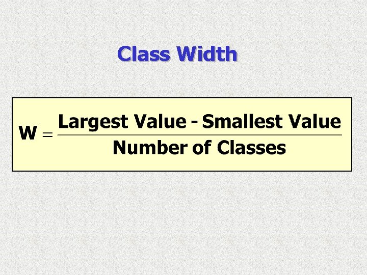
Class Width
Steps for Grouping Data Into Classes 4 Step 1: Determine the number of groups or classes to use. 4 Step 2: Establish the class width. 4 Step 3: Determine the class boundaries for each class.
Steps for Grouping Data Into Classes 4 Step 1: Determine the number of groups or classes to use. 4 Step 2: Establish the class width. 4 Step 3: Determine the class boundaries for each class. 4 Step 4: Count the number of values in each class.
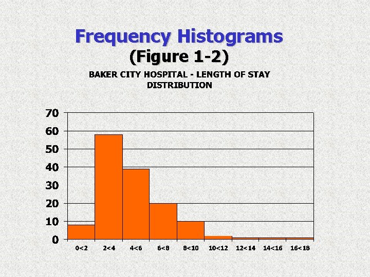
Frequency Histograms (Figure 1 -2)
Frequency Histograms A histogram shows three general types of information: 4 It provides visual indication of where the approximate center if the data is. 4 We can gain an understanding of the degree of spread, or variation, in the data. 4 We can observe the shape of the distribution.
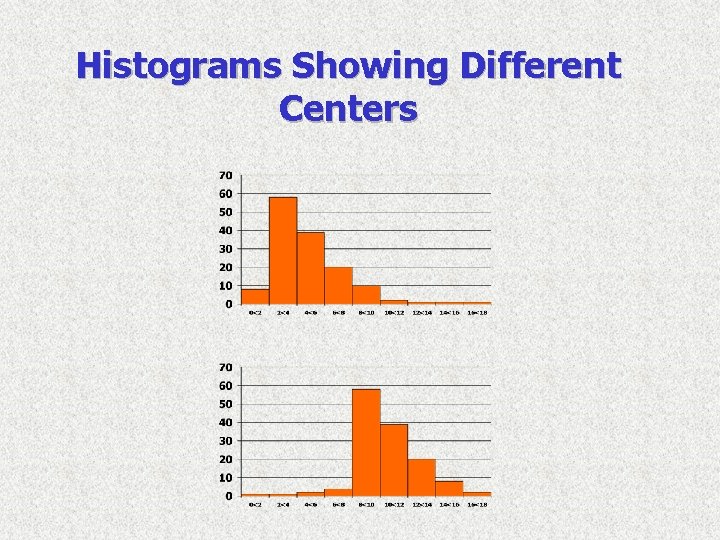
Histograms Showing Different Centers
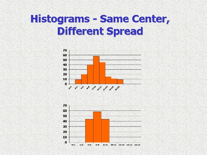
Histograms - Same Center, Different Spread
- Slides: 14