Graphs and Descriptive Stats Center of a distribution
Graphs and Descriptive Stats Center of a distribution Spread of a distribution Quartiles 5 -Number Summary and Boxplot Outliers
Learning Objectives By the end of this lecture, you should be able to: – Recognize how scales, mislabeled axes, etc on charts can be misleading – Describe the two most common statistics to describe the center of a dataset, and when they should be used – Describe two common statistics used to describe the spread of a dataset, and when they should be used – Understand boxplots and the 5 -number summary – Describe what is meant by an outlier and describe two techniques for identifying outliers. – Describe and apply the 1. 5*IQR rule for outliers
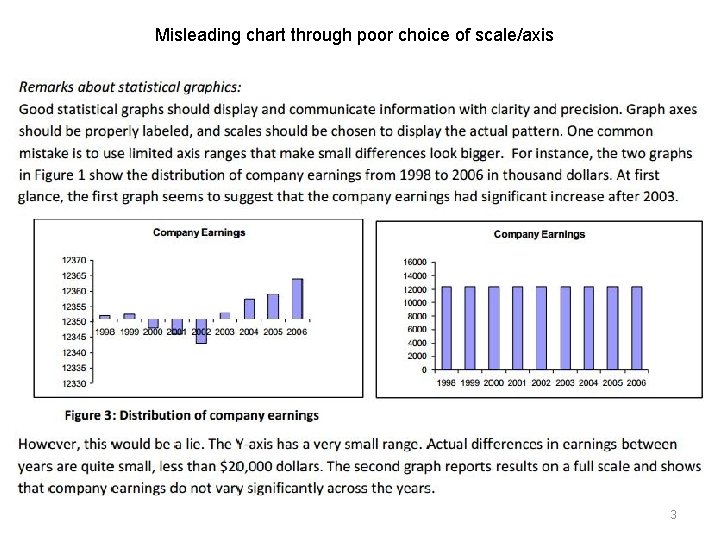
Misleading chart through poor choice of scale/axis 3
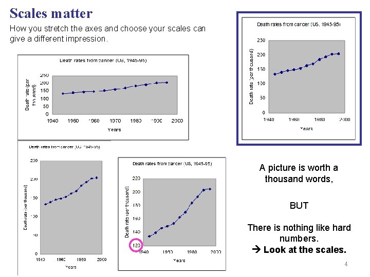
Scales matter How you stretch the axes and choose your scales can give a different impression. A picture is worth a thousand words, BUT There is nothing like hard numbers. Look at the scales. 4
Outliers • This is a very important topic. • Outliers refer to values that seem somehow ‘extreme’ or well outside the typical range of values in your dataset. • How to deal with outliers is a very involved subject, and while it certainly merits much discussion, we will not delve into it too much today. • Your goal for today is to identify outliers. That is, to develop some ability to look at a number and make a reasonably educated decision as to whether or not that value is an outlier. • We will discuss two techniques for doing so shortly: – Examination of a histogram – Using the “ 1. 5 * IQR” Rule 5
Describing the center and spread of a distribution • A distribution is best described through a combination of visuals (e. g. graphs), and numbers. • Two key numeric descriptions are: – Center: e. g. the mean – Spread (aka “Variation”) • Center: – Statistics for describing the center: Mean, Median, Mode • Mean: Most of us are familiar with the ‘mean’ (average). However, we should typically only use the mean if the dataset has no outliers, and is not highly skewed. • Median: a better choice for the center of a distribution that has outliers, or is skewed • Mode: Will discuss later • Spread (Variation) – Statistics for describing the spread: Percentiles, Quartiles, Standard Deviation – We will discuss these shortly 6
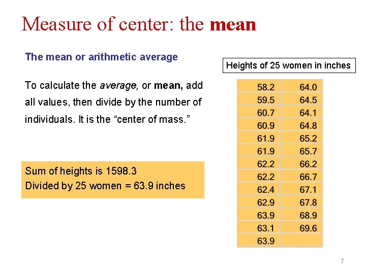
Measure of center: the mean The mean or arithmetic average Heights of 25 women in inches To calculate the average, or mean, add all values, then divide by the number of individuals. It is the “center of mass. ” Sum of heights is 1598. 3 Divided by 25 women = 63. 9 inches 7
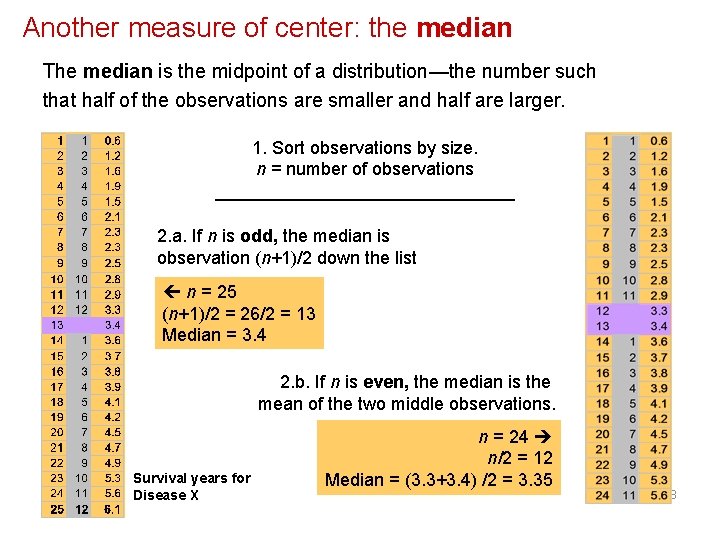
Another measure of center: the median The median is the midpoint of a distribution—the number such that half of the observations are smaller and half are larger. 1. Sort observations by size. n = number of observations _______________ 2. a. If n is odd, the median is observation (n+1)/2 down the list n = 25 (n+1)/2 = 26/2 = 13 Median = 3. 4 2. b. If n is even, the median is the mean of the two middle observations. Survival years for Disease X n = 24 n/2 = 12 Median = (3. 3+3. 4) /2 = 3. 35 8
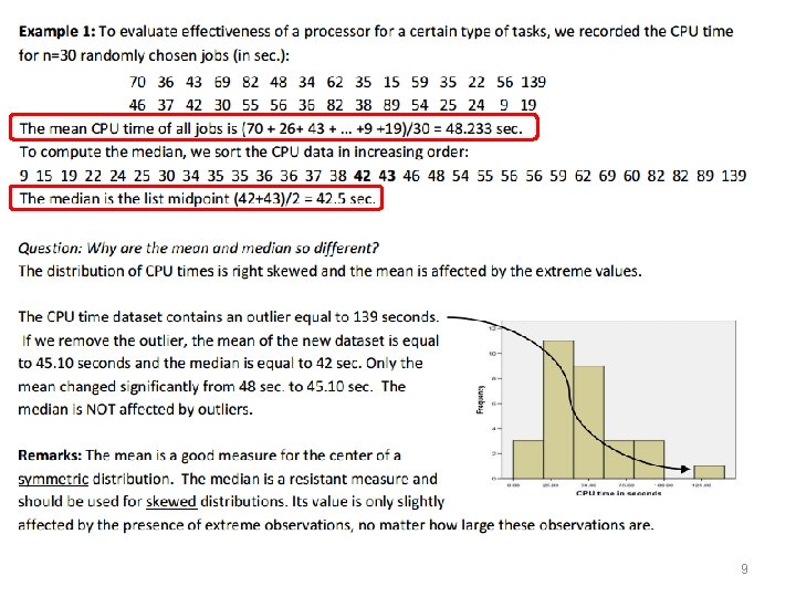
9
‘Resistant’ is an important term. We say that the median is ‘resistant’ to outliers because the presence of 1 or 2 outliers does not affect the median dramatically. Conversely, the mean is not resistant to outliers. Example: Consider a series of incomes (in thousands) taken from a graduate classroom: 18, 24, 37, 41, 62, 63, 2000 The median income is the middle value in the dataset: $41, 000 However, the mean is dramatically higher: $320, 000 since the one individual who made $2 million dollars pulls the mean disproportionally in the high direction. As a result, we end up with a ‘center’ value that probably does not truly represent the ‘average’ income of our sample. In other words, we say that: • The median is resistant to outliers • The mean is not resistant to outliers 10
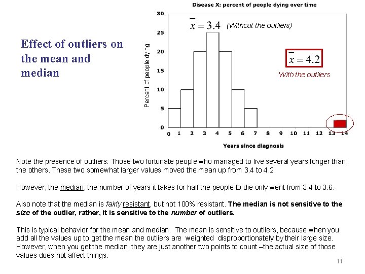
Effect of outliers on the mean and median Percent of people dying (Without the outliers) With the outliers Note the presence of outliers: Those two fortunate people who managed to live several years longer than the others. These two somewhat larger values moved the mean up from 3. 4 to 4. 2 However, the median, the number of years it takes for half the people to die only went from 3. 4 to 3. 6. Also note that the median is fairly resistant, but not 100% resistant. The median is not sensitive to the size of the outlier, rather, it is sensitive to the number of outliers. This is typical behavior for the mean and median. The mean is sensitive to outliers, because when you add all the values up to get the mean the outliers are weighted disproportionately by their large size. However, when you get the median, they are just another two points to count –the actual size of those values does not affect things. 11
Measures of spread / variation p p Most people intuitively ‘get’ the benefit of knowing the center of a distribution (e. g. the ‘average’ salary of first-year doctors). However, a piece of data that is sadly neglected but is EVERY bit as important, is the spread of the data (also known as the variation). Just as there are different ways of describing the center of a distribution (e. g. mean, median, mode), there are different techniques for describing the spread of a distribution. As with the center, you must know which description of the spread is the best of the most accurate tool for describing the spread. Common techniques for describing the variation in a dataset: p Range: the highest and lowest values in the dataset. Important, but outliers can give people a highly inaccurate picture (imagine if you looked at the range of salaries). p Quartiles – dividing the range into four p Standard Deviation / Variance: this is one of the most effective means of describing the spread, and a tool that we will come back to constantly throughout this course. 12
Percentiles and Quartiles • The xth percentile (e. g. the 38 th percentile) is the value at which ‘x’ percent of observations fall below it. – Example: If your height is said to be in the 80 th percentile, it means that 80% of the people measured were shorter than you. • Two commonly used percentiles are the first quartile and the third quartile. These refer to the 25 th and 75 th percentiles respectively. – Q 1 (first quartile): Refers to the 25 th percentile. Ie: 25% of observations are below this value. – Q 2 (second quartile): Refers to the 50 th percentile. In other words, the median! – Q 3 (third quartile): Refers to the 75 th percentile. Ie: 75% of observations fall below this value. 13
5 -Number Summary and Box Plot • Once you have divided your dataset into quartiles, you now have one very widely-used technique for creating a neat little summary of the data. It is called the ‘ 5 Number Summary’ and is made up of: – – – Lowest number First (lower) quartile Median (not the mean!) Third (upper) quartile Highest number • Once you have this summary in hand, you can even ‘draw’ it using a simple (but very convenient) plot known as a box plot.
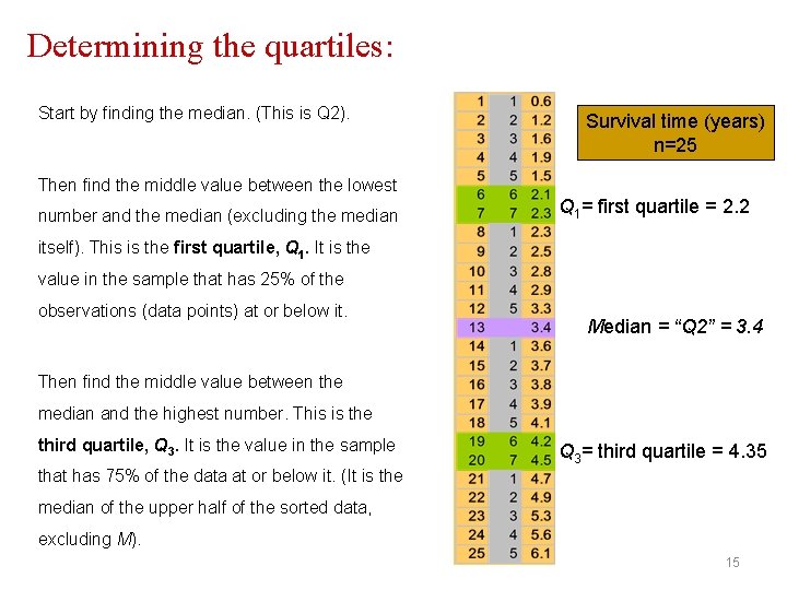
Determining the quartiles: Start by finding the median. (This is Q 2). Survival time (years) n=25 Then find the middle value between the lowest number and the median (excluding the median Q 1= first quartile = 2. 2 itself). This is the first quartile, Q 1. It is the value in the sample that has 25% of the observations (data points) at or below it. Median = “Q 2” = 3. 4 Then find the middle value between the median and the highest number. This is the third quartile, Q 3. It is the value in the sample Q 3= third quartile = 4. 35 that has 75% of the data at or below it. (It is the median of the upper half of the sorted data, excluding M). 15
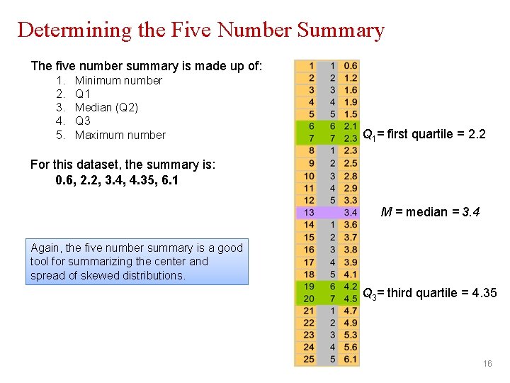
Determining the Five Number Summary The five number summary is made up of: 1. 2. 3. 4. 5. Minimum number Q 1 Median (Q 2) Q 3 Maximum number Q 1= first quartile = 2. 2 For this dataset, the summary is: 0. 6, 2. 2, 3. 4, 4. 35, 6. 1 M = median = 3. 4 Again, the five number summary is a good tool for summarizing the center and spread of skewed distributions. Q 3= third quartile = 4. 35 16
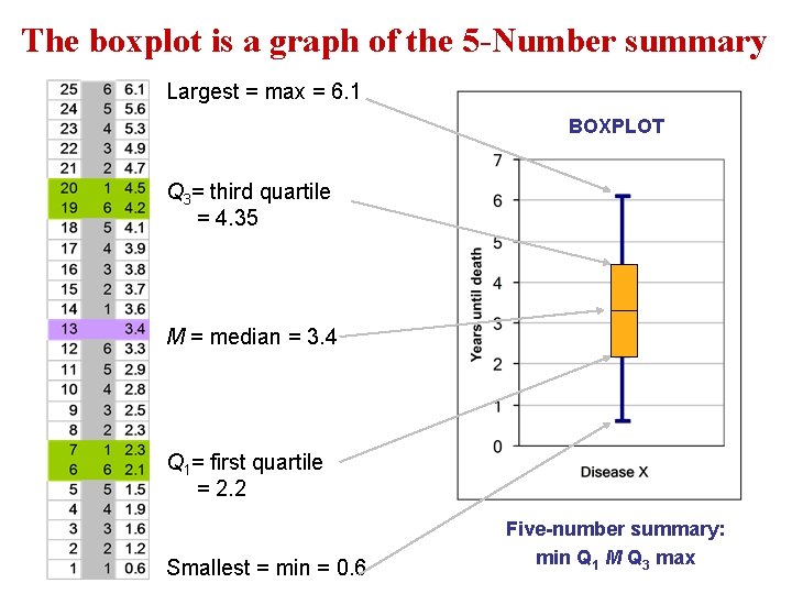
The boxplot is a graph of the 5 -Number summary Largest = max = 6. 1 BOXPLOT Q 3= third quartile = 4. 35 M = median = 3. 4 Q 1= first quartile = 2. 2 Smallest = min = 0. 6 Five-number summary: min Q 1 M Q 3 max
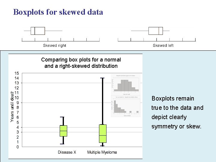
Boxplots for skewed data Comparing box plots for a normal and a right-skewed distribution Boxplots remain true to the data and depict clearly symmetry or skew.
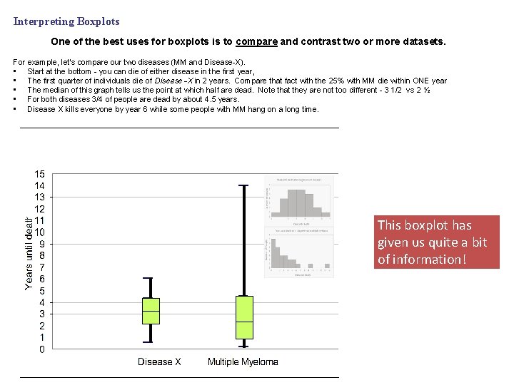
Interpreting Boxplots One of the best uses for boxplots is to compare and contrast two or more datasets. For example, let’s compare our two diseases (MM and Disease-X). • Start at the bottom - you can die of either disease in the first year, • The first quarter of individuals die of Disease -X in 2 years. Compare that fact with the 25% with MM die within ONE year • The median of this graph tells us the point at which half are dead. Note that they are not too different - 3 1/2 vs 2 ½ • For both diseases 3/4 of people are dead by about 4. 5 years. • Disease X kills everyone by year 6 while some people with MM hang on a long time. This boxplot has given us quite a bit of information!
OUTLIERS – Identification of the Outlier At what point do we typically label a datapoint as an outlier? We will discuss two methods here: 1. One way is to look at a chart and see if any values appear to be “off the chart” relative to the large majority of values. 2. Another tool is the “ 1. 5 IQR” Rule for outliers.
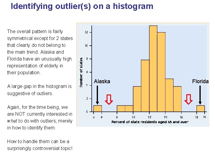
Identifying outlier(s) on a histogram The overall pattern is fairly symmetrical except for 2 states that clearly do not belong to the main trend. Alaska and Florida have an unusually high representation of elderly in their population. A large gap in the histogram is suggestive of outliers. Again, for the time being, we are NOT currently interested in what to do with outliers; merely in how to identify them. How to handle them can be a surprisingly controversial topic! Alaska Florida 21
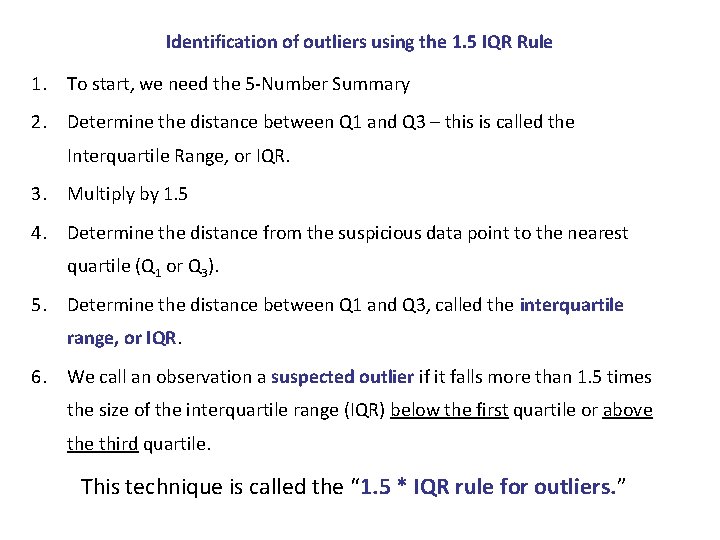
Identification of outliers using the 1. 5 IQR Rule 1. To start, we need the 5 -Number Summary 2. Determine the distance between Q 1 and Q 3 – this is called the Interquartile Range, or IQR. 3. Multiply by 1. 5 4. Determine the distance from the suspicious data point to the nearest quartile (Q 1 or Q 3). 5. Determine the distance between Q 1 and Q 3, called the interquartile range, or IQR. 6. We call an observation a suspected outlier if it falls more than 1. 5 times the size of the interquartile range (IQR) below the first quartile or above third quartile. This technique is called the “ 1. 5 * IQR rule for outliers. ”
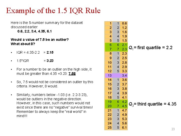
Example of the 1. 5 IQR Rule Here is the 5 -number summary for the dataset discussed earlier: 0. 6, 2. 2, 3. 4, 4. 35, 6. 1 Would a value of 7. 5 be an outlier? What about 8? • IQR = 4. 35 -2. 2 = 2. 15 • 1. 5*IQR = 3. 23 • For a number to be an outlier on the high side, it must be greater than 4. 35 +3. 23: 7. 58 • So, 7. 5 would not be considered an outlier by this criteria. However, 8 would. • Similarly, numbers below -1. 03 (i. e. 2. 2 -3. 23), would be outliers in the negative direction. However, in this case, such numbers would not exist since there are no “negative” survival times! Remember to always keep the “real world” in mind!!! Q 1= first quartile = 2. 2 Q 3= third quartile = 4. 35 23
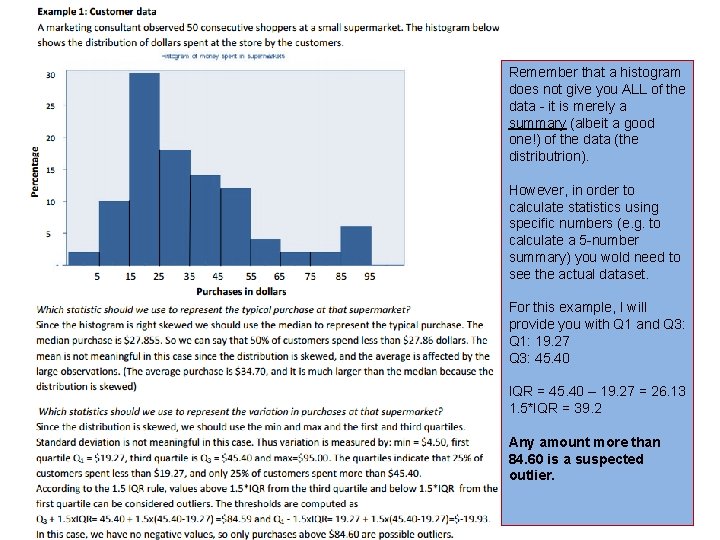
Remember that a histogram does not give you ALL of the data - it is merely a summary (albeit a good one!) of the data (the distributrion). However, in order to calculate statistics using specific numbers (e. g. to calculate a 5 -number summary) you wold need to see the actual dataset. For this example, I will provide you with Q 1 and Q 3: Q 1: 19. 27 Q 3: 45. 40 IQR = 45. 40 – 19. 27 = 26. 13 1. 5*IQR = 39. 2 Any amount more than 84. 60 is a suspected outlier. 24
How to deal with OUTLIERS Outliers require thought. The first step is to decide whether a data point should indeed be labeled as an outlier. Once you have decided that it is an outlier, the next question is what you want to do with it. There are two options for dealing with outliers – you can include them in your analysis, or you can leave them out. • Exclude outliers: Suppose you have a datapoint that is extremely high – and you think it was recorded in error. In this case, you would not want to include this value in your calculations since values like mean and standard deviation would be thrown off by this bad datapoint. • However, if you choose to leave out a datapoint, you MUST include in your paper a discussion of your reasons for doing so. • Include outliers: The other option, of course, is to include the outlier(s) in your calculations and analysis. In this case, you have to decide which statistics to use (mean vs median, etc) • Discussion question: Suppose we wanted to determine the average height of De. Paul students and we use our class as a sample. However, that particular day, we are being visited by an incoming freshman who just happens to be the tallest person in the world. Would you include him/her in your analysis? – I would probably leave him out of the analysis since he does not represent the ‘typical’ De. Paul student. – However, when reporting my decision, I MUST report that I did so, and explain my decision.
- Slides: 25