Graphs and Data Tables How to represent data

Graphs and Data Tables How to represent data in a useful manner
What Is Data? In science, data is information gathered during an experiment or investigation. For example: A fifth grade class took a pizza lovers survey. They learned that ten kids liked pepperoni pizza best. Nine kids liked sausage pizza best. Seven kids liked cheese pizza best. This information is called DATA.

What Is Data? If a mom was planning a pizza party for the class, she would need the pizza lovers survey DATA. I need to order 10 pepperoni, 9 sausage and 7 cheese pizzas.
What Is Data? Your report card is another example of DATA. Math: 88% Reading: 94% Science: 75% Social Studies: 80% Language Arts: 55% My Language Arts teacher may not like me.
Data Is Everywhere. TV Books Newspaper There is way too much data in school!

How Do People Use Data? The data from the test will help us cure your disease. We use data to make money. Data is needed to build things.
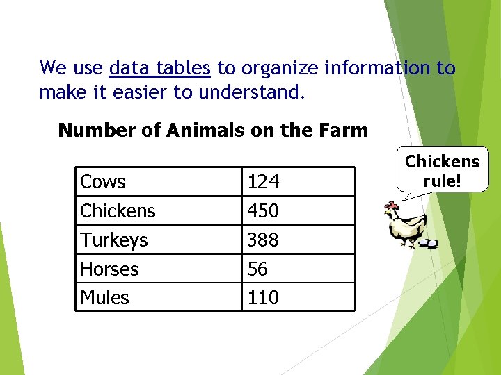
We use data tables to organize information to make it easier to understand. Number of Animals on the Farm Cows 124 Chickens 450 Turkeys 388 Horses Mules 56 110 Chickens rule!
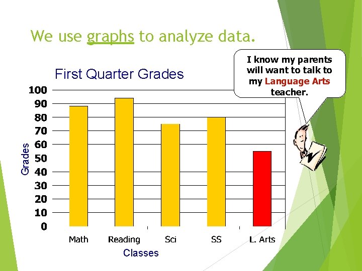
We use graphs to analyze data. Grades First Quarter Grades Classes I know my parents will want to talk to my Language Arts teacher.
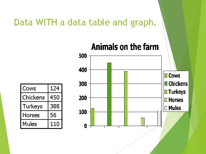
Data WITH a data table and graph. Cows 124 Chickens 450 Turkeys 388 Horses 56 Mules 110
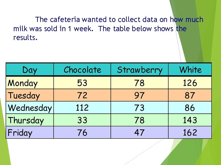
The cafeteria wanted to collect data on how much milk was sold in 1 week. The table below shows the results.
There are three basic graph forms. üNotice how each of the following examples are used to illustrate the data. üChoose the best graph form to express your results. Bar Graph Circle (or Pie) Graph Line Graph
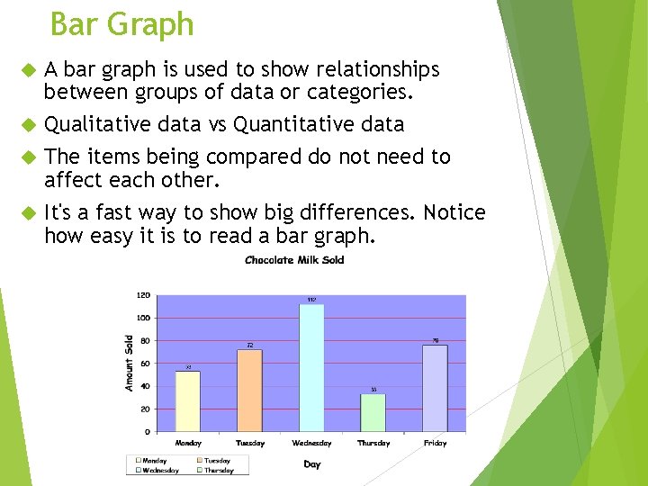
Bar Graph A bar graph is used to show relationships between groups of data or categories. Qualitative data vs Quantitative data The items being compared do not need to affect each other. It's a fast way to show big differences. Notice how easy it is to read a bar graph.
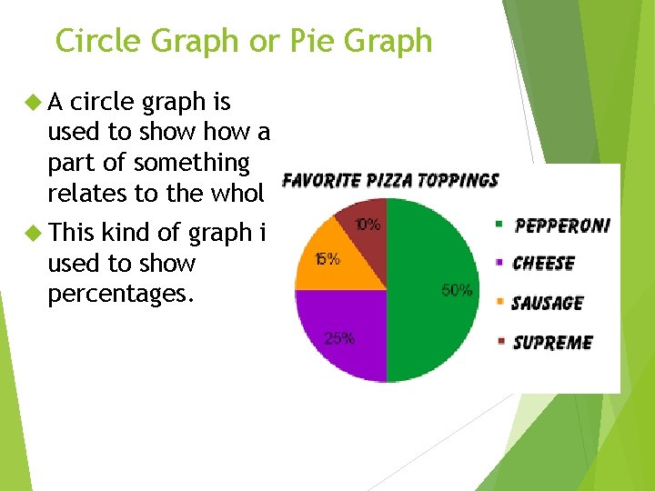
Circle Graph or Pie Graph A circle graph is used to show a part of something relates to the whole. This kind of graph is used to show percentages.
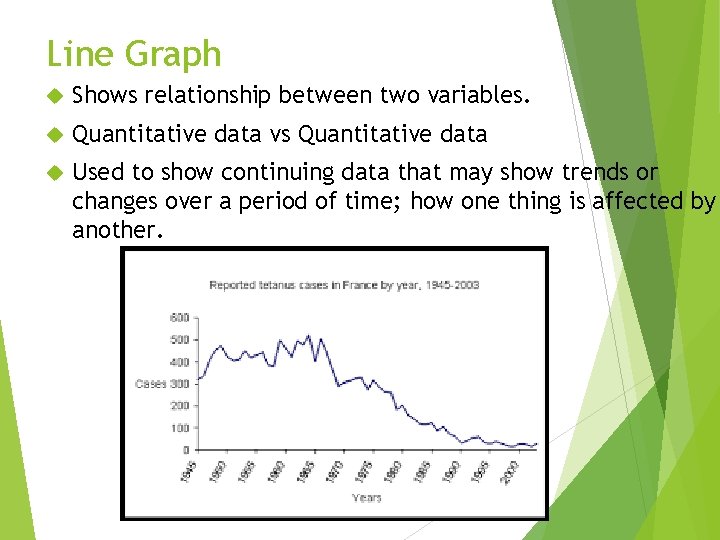
Line Graph Shows relationship between two variables. Quantitative data vs Quantitative data Used to show continuing data that may show trends or changes over a period of time; how one thing is affected by another.
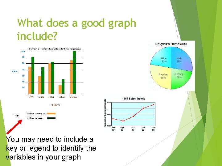
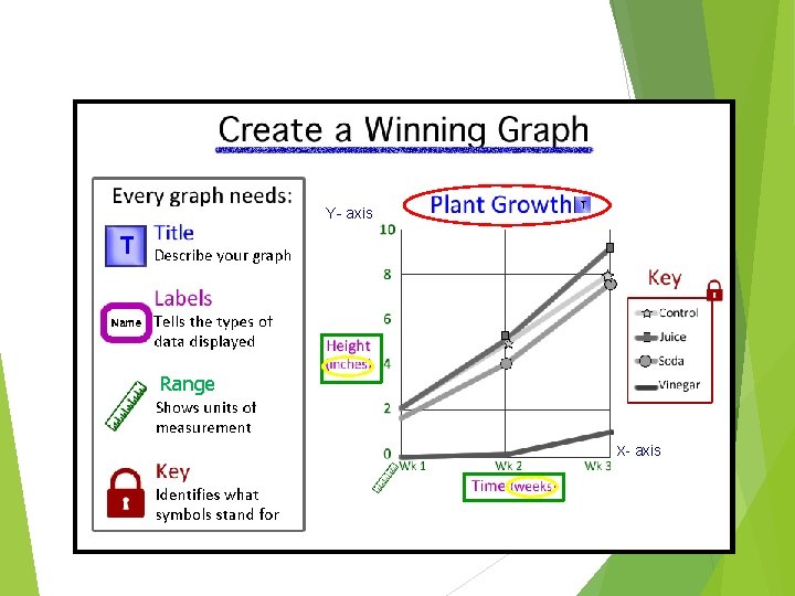
What does a good graph include? You may need to include a key or legend to identify the variables in your graph

Title Write an appropriate title for the graph at the top. The title should contain both the independent and dependent variables.
Labels Both axes need to be labeled so the reader knows exactly what the independent and dependent variables are. The labels must be specific and include the units used to measure the data (such as “number of drops”).
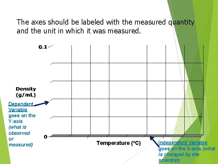
The axes should be labeled with the measured quantity and the unit in which it was measured. Dependent Variable goes on the Y-axis (what is observed or measured) Temperature (ºC) Independent Variable goes on the X-axis (what is changed by the scientist)
Range Decide on an appropriate range for each axis that allows you to spread the data evenly across the entire graphing area. The range refers to the minimum and maximum numbers used on each axis. They may or may not begin at zero. This is determined by your data. The minimum and maximum numbers should be a little lower than the lowest value (unless it is 0) and a little higher than the highest value.
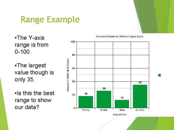
Range Example • The Y-axis range is from 0 -100. • The largest value though is only 35. • Is this the best range to show our data?
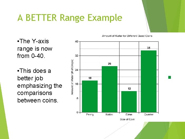
A BETTER Range Example • The Y-axis range is now from 0 -40. • This does a better job emphasizing the comparisons between coins.
Intervals The interval is the amount of space between one value and the next. Look at the minimum and maximum values for both the X-axis and Y-axis. (Bar graphs may not have numerical data). Decide on an appropriate interval for each axis that best represents your range of data. It is highly recommended to use a common number for an interval such as 0. 5, 1, 2, 5, 10, 25, 100, etc.
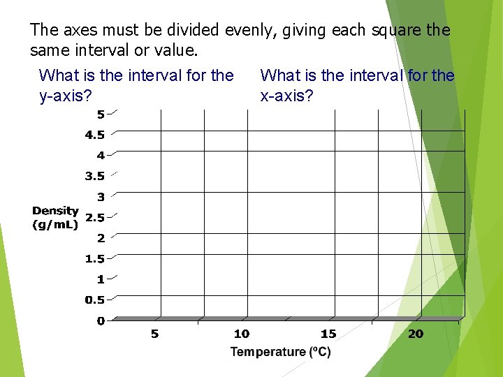
The axes must be divided evenly, giving each square the same interval or value. What is the interval for the y-axis? What is the interval for the x-axis?
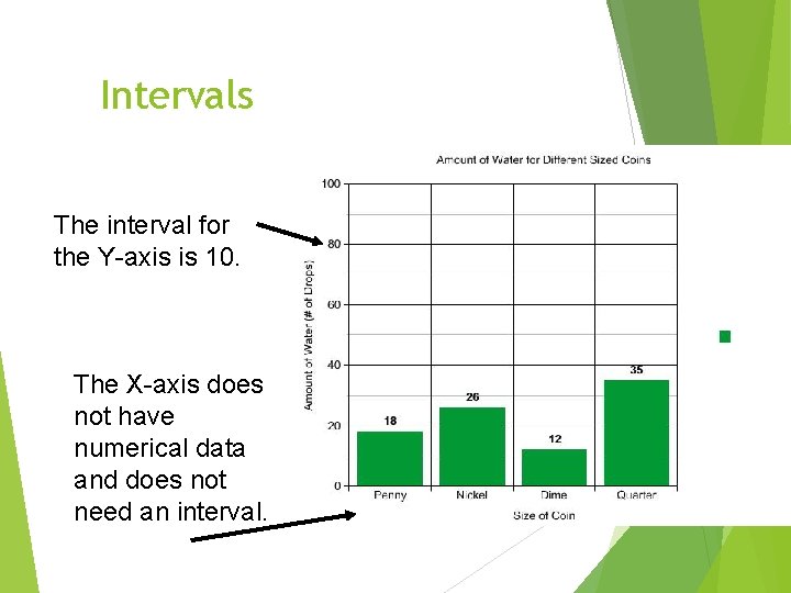
Intervals The interval for the Y-axis is 10. The X-axis does not have numerical data and does not need an interval.
Remember a good graph includes: Title Label each axis (include the units) and produce a legend (key) if necessary Independent Variable is on the X-axis Dependent Variable is on the Y-axis A range that evenly spaces your data in increments (intervals) and uses the whole graphing area. Don’t squeeze your graph in one little corner!
Y- axis Range X- axis
- Slides: 26