Graphing Types of Graphs Line graphs Show change


 is plotted")


- Slides: 23
Graphing
Types of Graphs • Line graphs: Show change over time. Time is usually the independent variable. • Bar graphs: Show comparisons. • Scatter Plots: Used to graph a number of points to show relationships.
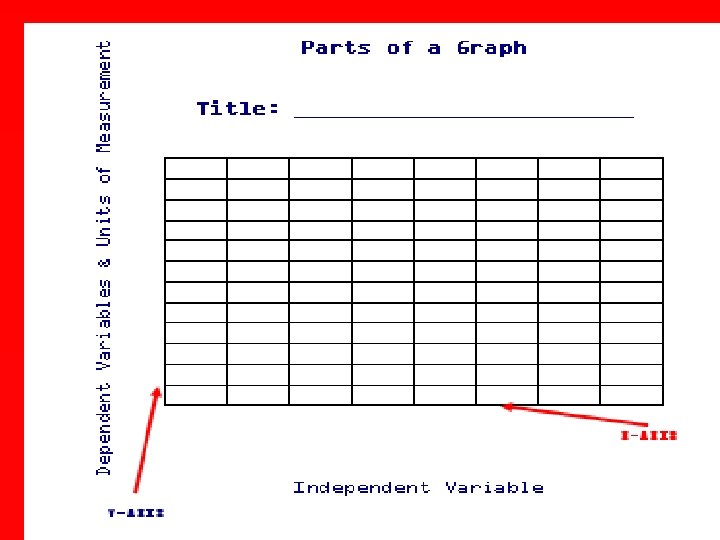
Parts of a Graph • • • Remember TAILS T= Title A= Axis (X and Y need to be labeled) I= Interval L= Labels (Independent and Dependent Variables) • S= Scale • You must include all of these things when creating a graph!
Where do our variables go on the graph? • • Remember DRY MIX D= DEPENDENT or R= Responding Y= Y axis • M= Manipulated or • I= Independent • X= X axis
Examine each graph carefully. What was tested, changed, or compared (INDEPENDENT VARIABLE) is plotted on the X-axis. The data that was observed & measured (DEPENDENT VARIABLE) is plotted on the Y-axis.
Create a graph using the given data table… First decide what kind of graph would be best for this data… Are we showing a change over time? Comparing things? Or trying to show a relationship between two variables? Then identify your variables. Lastly make sure you include all parts of TAILS.
Create a graph using the given data table…
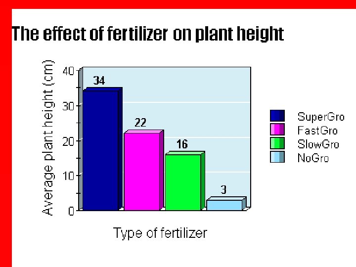
• The title and the label on the X-axis tells us that the amount of fertilizer was tested in this experiment (Independent variable). • The Y-axis tells us that plant height was measured in centimeters in this experiment (Dependent variable).
• Since there is a difference in the heights of the plants that received different fertilizers, we can say that there seems to be a relationship between plant height and type of fertilizer. • The independent variable (type of fertilizer) affected the dependent variable (plant height).
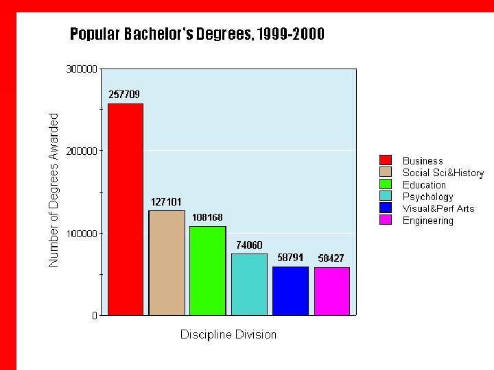
• The title and the X-axis tells us that the types of degrees earned at colleges and universities between 1999 and 2000 were compared. • The Y-axis tells us the number of people earning these degrees was measured. Counting is a type of measurement.
• There is a significant difference between the number of people graduating with business degrees and the number of people graduating with other types of degrees. • We can say that the type of degree (independent variable) affects the number of people that get that degree (dependent variable).
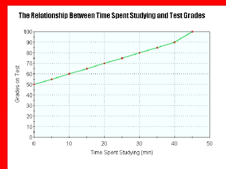
• The title and the X-axis tells us that the independent variable (what was tested by the scientist) was time spent studying. • The Y-axis tells us that the dependent variable (what was measured by the scientist) was grades on a test.
• We can see that the time spent studying increases along the X-axis. • We can see that tests grades increases along the Y-axis. • As time spent studying increases, so do tests grades. • There seems to be a relationship between time spent studying and test grades. • The more time spent studying, the higher the test grade.
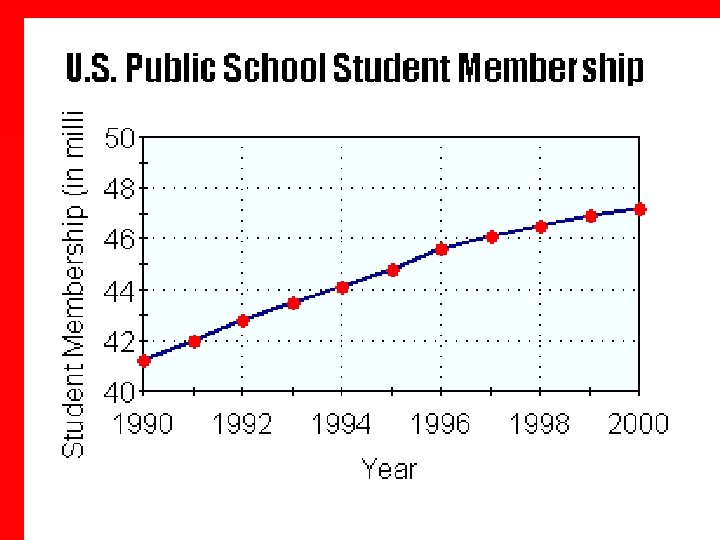
• The title and the X-axis tells us years were being compared (independent variable) by the scientist. When time is a variable, it is plotted on the X-axis. • The Y-axis tells us that the number of students [in millions] was measured by the scientist (dependent variable).
• We can see that the time in years increases along the X-axis. • We can see that the number of students in millions increases along the Y-axis. • As time increases, so does the number of students. • There seems to be a relationship between time and the number of students. • The more time increases, the more students are enrolled in public schools.
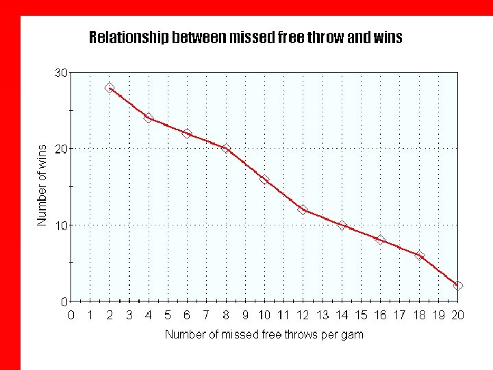
• The title and the X-axis tells us that the independent variable is the number of missed free throws per game. This is what was tested by the scientist. • The Y-axis tells us that the dependent variable is the number of wins. This is what was measured by the scientist.
• We can see that the number of free throws increases along the X-axis. • We can see that the number of wins decreases along the Y-axis. • As the number missed free throws increases, the number of wins decreases. . • There seems to be a relationship between number of missed free throws and the number of games won. • The more free throws that are missed, the more games that are lost.