Graphing slide 1 Graphing Part 1 Write this



- Slides: 40

Graphing slide 1

Graphing, Part 1 Write this in your notes SWBAT read graphs and make conclusions about the relationships between variables slide 2

REVIEW The Scientific Method • This unit will cover some basic skills you will need in chemistry this year 1) Measurement 2) Significant Digits 3) Units 4) Dimensional Analysis 5) Scientific Notation 6) Graphing Part 1 slide 3

What is a Graph? Write this in your notes A diagram showing the relationship between two or more variables slide 4

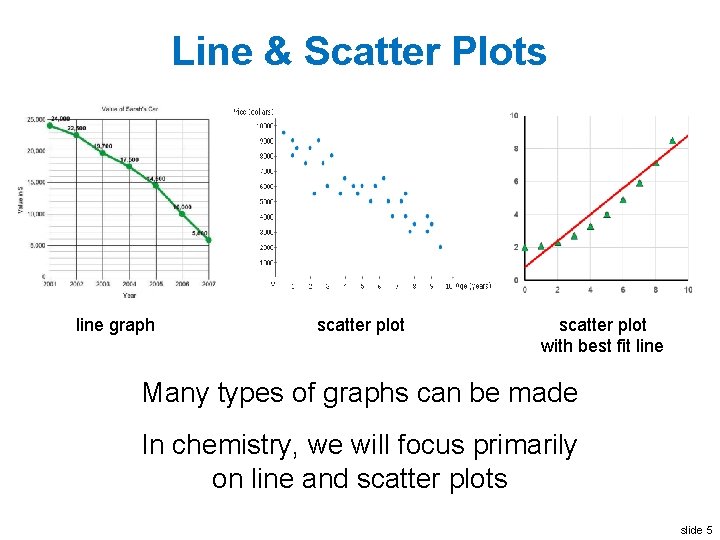
Line & Scatter Plots line graph scatter plot with best fit line Many types of graphs can be made In chemistry, we will focus primarily on line and scatter plots slide 5

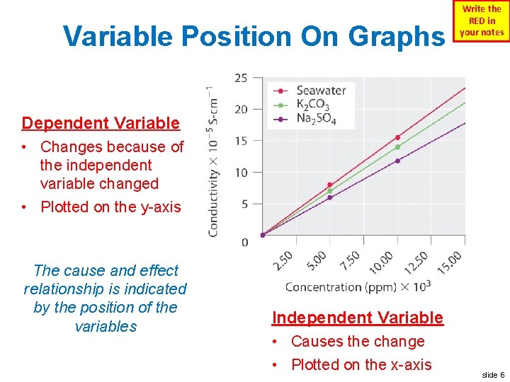
Variable Position On Graphs Write the RED in your notes Dependent Variable • Changes because of the independent variable changed • Plotted on the y-axis The cause and effect relationship is indicated by the position of the variables Independent Variable • Causes the change • Plotted on the x-axis slide 6

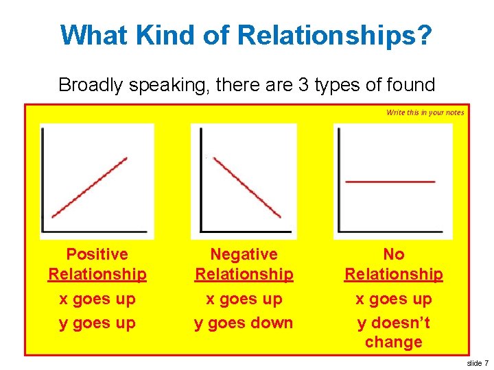
What Kind of Relationships? Broadly speaking, there are 3 types of found Write this in your notes Positive Relationship x goes up y goes up Negative Relationship x goes up y goes down No Relationship x goes up y doesn’t change slide 7

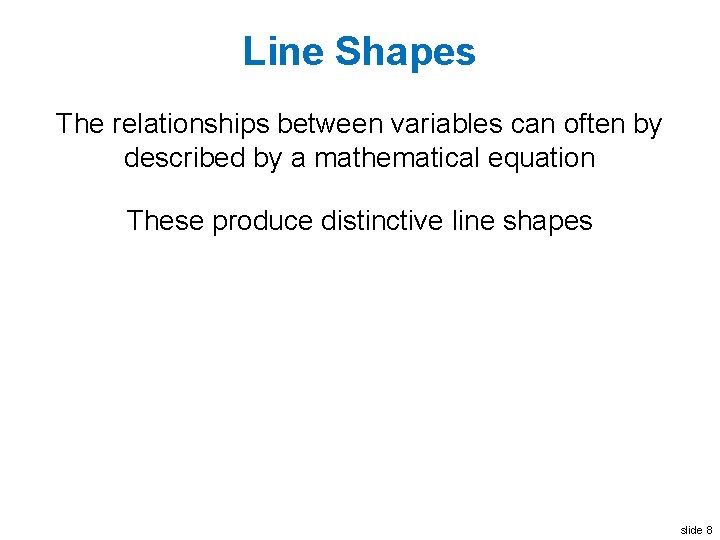
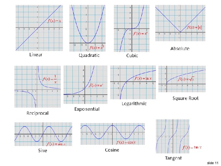
Line Shapes The relationships between variables can often by described by a mathematical equation These produce distinctive line shapes slide 8

slide 9

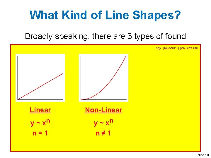
What Kind of Line Shapes? Broadly speaking, there are 3 types of found Say “popcorn” if you read this Linear Non-Linear y ~ xn n=1 y ~ xn n≠ 1 slide 10

slide 11

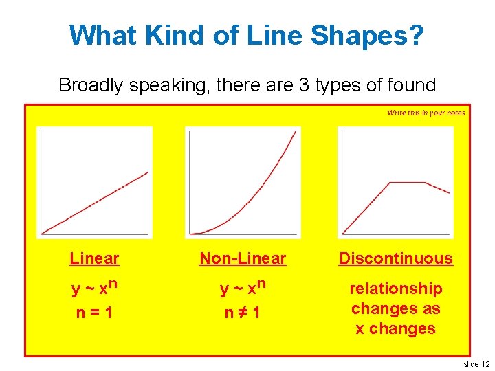
What Kind of Line Shapes? Broadly speaking, there are 3 types of found Write this in your notes Linear Non-Linear Discontinuous y ~ xn n=1 y ~ xn n≠ 1 relationship changes as x changes slide 12

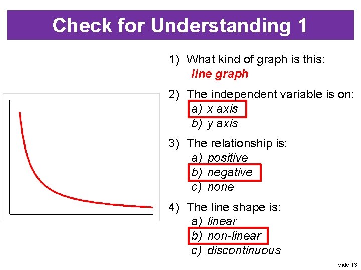
Check for Understanding 1 1) What kind of graph is this: line graph 2) The independent variable is on: a) x axis b) y axis 3) The relationship is: a) positive b) negative c) none 4) The line shape is: a) linear b) non-linear c) discontinuous slide 13

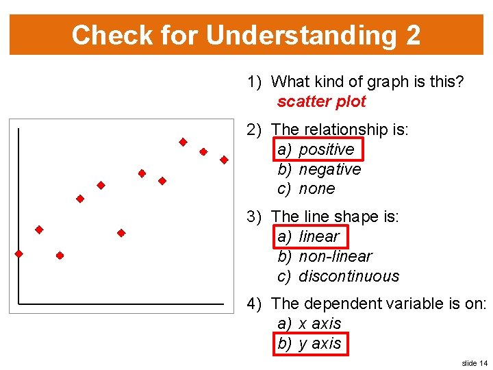
Check for Understanding 2 1) What kind of graph is this? scatter plot 2) The relationship is: a) positive b) negative c) none 3) The line shape is: a) linear b) non-linear c) discontinuous 4) The dependent variable is on: a) x axis b) y axis slide 14

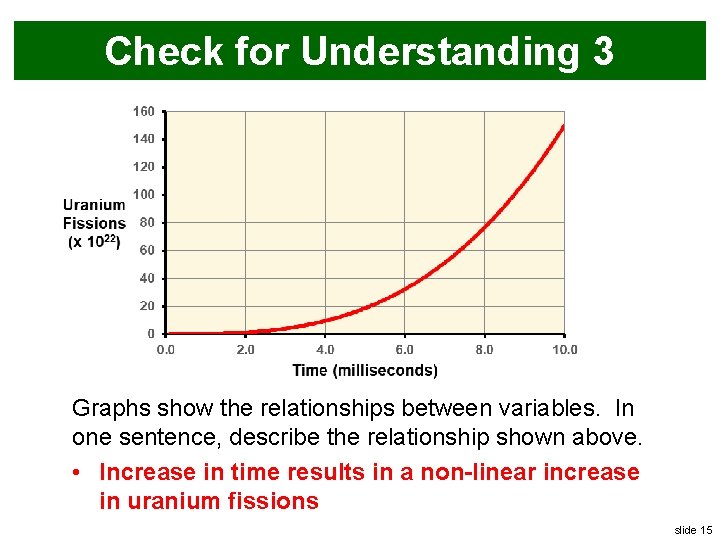
Check for Understanding 3 Graphs show the relationships between variables. In one sentence, describe the relationship shown above. • Increase in time results in a non-linear increase in uranium fissions slide 15

Quantitative Analysis & Prediction 1) Best fit line & goodness of fit 2) Slope 3) Interpolation and extrapolation slide 16

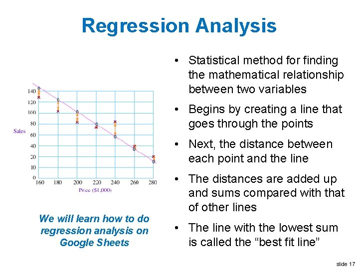
Regression Analysis • Statistical method for finding the mathematical relationship between two variables • Begins by creating a line that goes through the points • Next, the distance between each point and the line We will learn how to do regression analysis on Google Sheets • The distances are added up and sums compared with that of other lines • The line with the lowest sum is called the “best fit line” slide 17

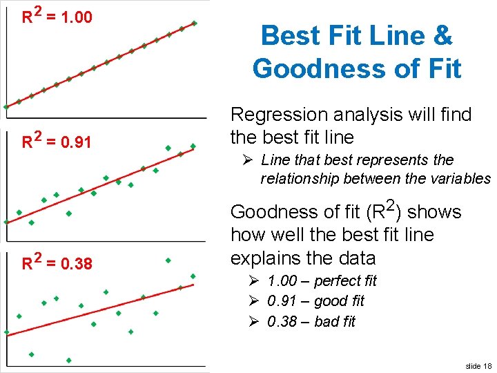
R 2 = 1. 00 R 2 = 0. 91 Best Fit Line & Goodness of Fit • Regression analysis will find the best fit line Ø Line that best represents the relationship between the variables R 2 = 0. 38 • Goodness of fit (R 2) shows how well the best fit line explains the data Ø 1. 00 – perfect fit Ø 0. 91 – good fit Ø 0. 38 – bad fit slide 18

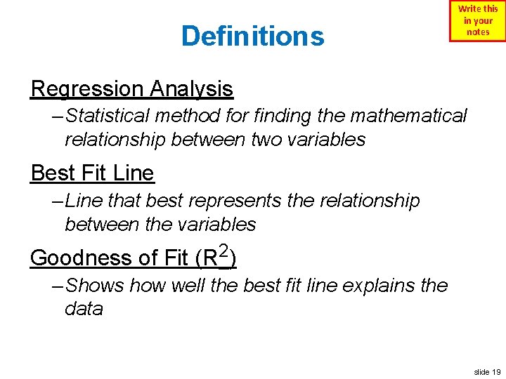
Definitions Write this in your notes Regression Analysis – Statistical method for finding the mathematical relationship between two variables Best Fit Line – Line that best represents the relationship between the variables Goodness of Fit (R 2) – Shows how well the best fit line explains the data slide 19

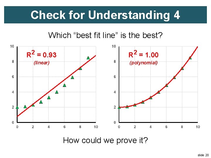
Check for Understanding 4 Which “best fit line” is the best? R 2 = 0. 93 R 2 = 1. 00 (linear) (polynomial) How could we prove it? slide 20

Quantitative Analysis & Prediction 1) Best fit line & goodness of fit 2) Slope 3) Interpolation and extrapolation slide 21

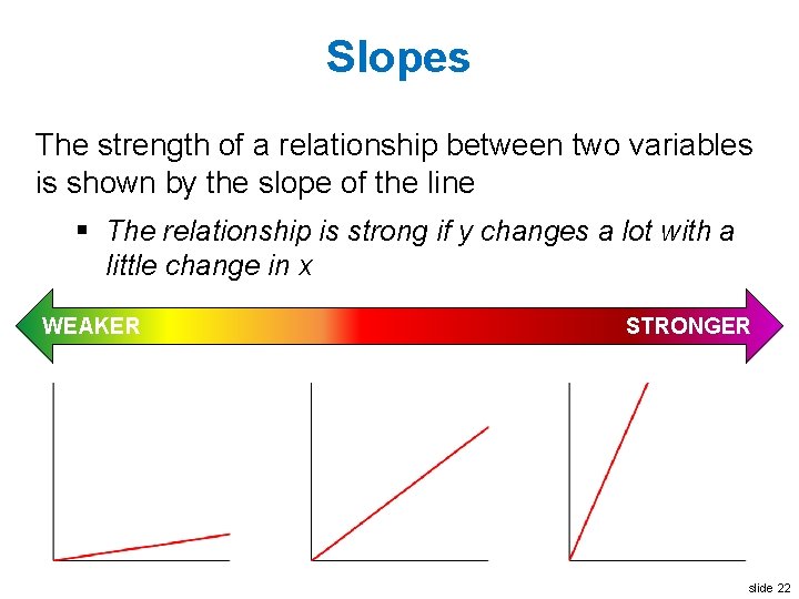
Slopes The strength of a relationship between two variables is shown by the slope of the line § The relationship is strong if y changes a lot with a little change in x WEAKER STRONGER slide 22

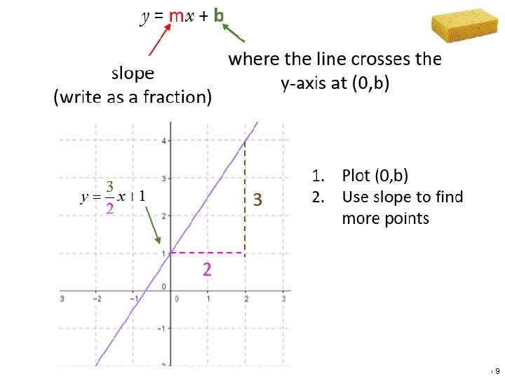
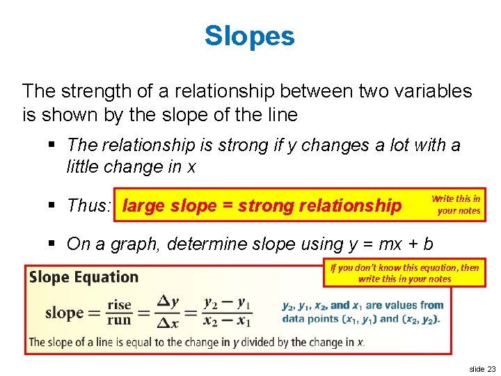
Slopes The strength of a relationship between two variables is shown by the slope of the line § The relationship is strong if y changes a lot with a little change in x § Thus: large slope = strong relationship Write this in your notes § On a graph, determine slope using y = mx + b If you don’t know this equation, then write this in your notes slide 23

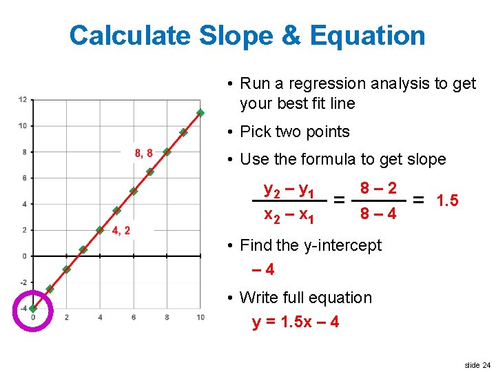
Calculate Slope & Equation • Run a regression analysis to get your best fit line • Pick two points • Use the formula to get slope y 2 – y 1 x 2 – x 1 = 8– 2 8– 4 = 1. 5 • Find the y-intercept – 4 • Write full equation y = 1. 5 x – 4 slide 24

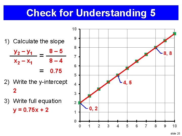
Check for Understanding 5 1) Calculate the slope y 2 – y 1 x 2 – x 1 = = 8– 5 8– 4 0. 75 2) Write the y-intercept 2 3) Write full equation y = 0. 75 x + 2 slide 25

Quantitative Analysis & Prediction 1) Best fit line & goodness of fit 2) Slope 3) Interpolation and extrapolation slide 26

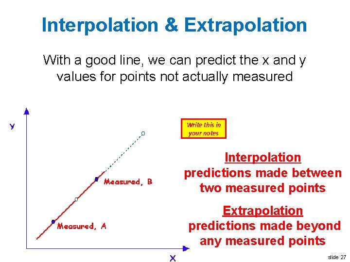
Interpolation & Extrapolation With a good line, we can predict the x and y values for points not actually measured Write this in your notes Interpolation predictions made between two measured points Extrapolation predictions made beyond any measured points slide 27

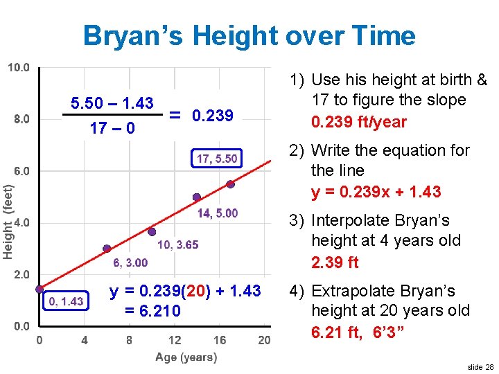
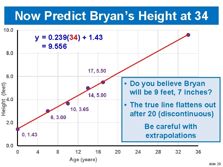
Bryan’s Height over Time 5. 50 – 1. 43 17 – 0 = 0. 239 1) Use his height at birth & 17 to figure the slope 0. 239 ft/year 2) Write the equation for the line y = 0. 239 x + 1. 43 3) Interpolate Bryan’s height at 4 years old 2. 39 ft y = 0. 239(4) 0. 239(20)++1. 43 = 2. 386 6. 210 4) Extrapolate Bryan’s height at 20 years old 6. 21 ft, 6’ 3” slide 28

Now Predict Bryan’s Height at 34 y = 0. 239(34) + 1. 43 = 9. 556 • Do you believe Bryan will be 9 feet, 7 inches? • The true line flattens out after 20 (discontinuous) Be careful with extrapolations slide 29

Back-Up Slides slide 30

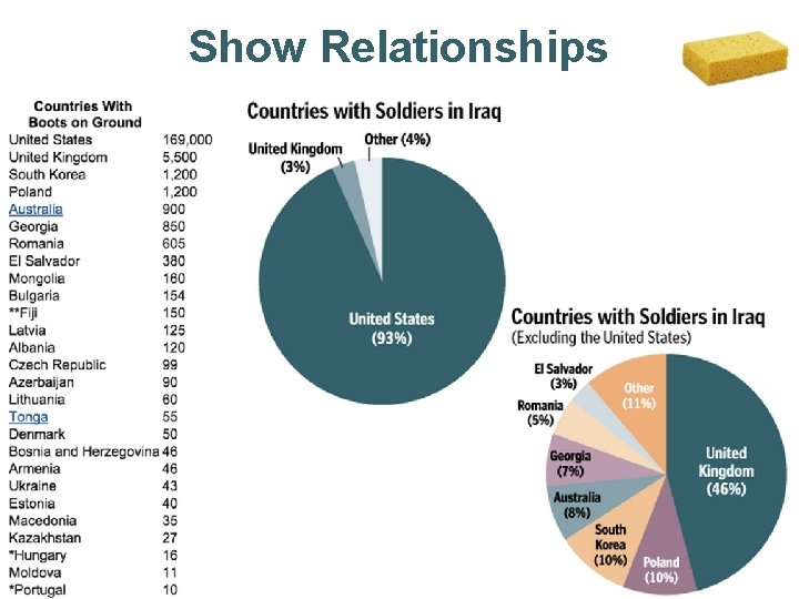
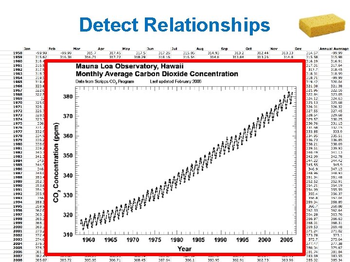
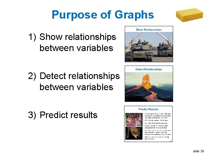
Purpose of Graphs 1) Show relationships between variables 2) Detect relationships between variables 3) Predict results slide 31

Show Relationships Two US M 1 Abrams tanks pass under The Swords of Qādisīyah Baghdad, 2003 slide 32

Show Relationships slide 33

Detect Relationships Mona Loa, Hawaii, 1984 Eruption Kilauea erupted in May, slide 201834

Detect Relationships slide 35

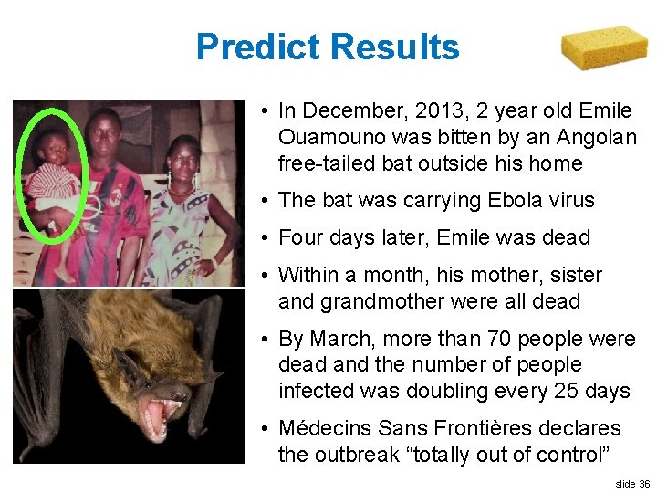
Predict Results • In December, 2013, 2 year old Emile Ouamouno was bitten by an Angolan free-tailed bat outside his home • The bat was carrying Ebola virus • Four days later, Emile was dead • Within a month, his mother, sister and grandmother were all dead • By March, more than 70 people were dead and the number of people infected was doubling every 25 days • Médecins Sans Frontières declares the outbreak “totally out of control” slide 36

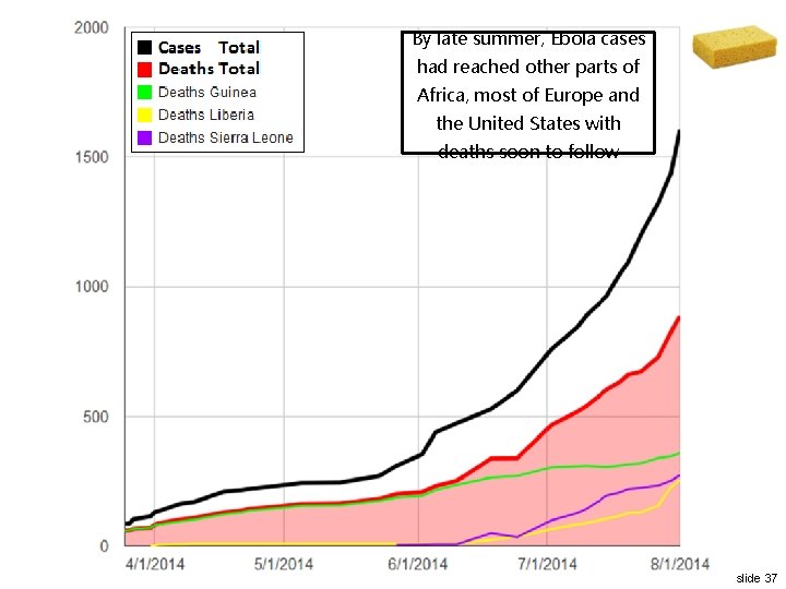
By late summer, Ebola cases had reached other parts of Africa, most of Europe and the United States with deaths soon to follow slide 37

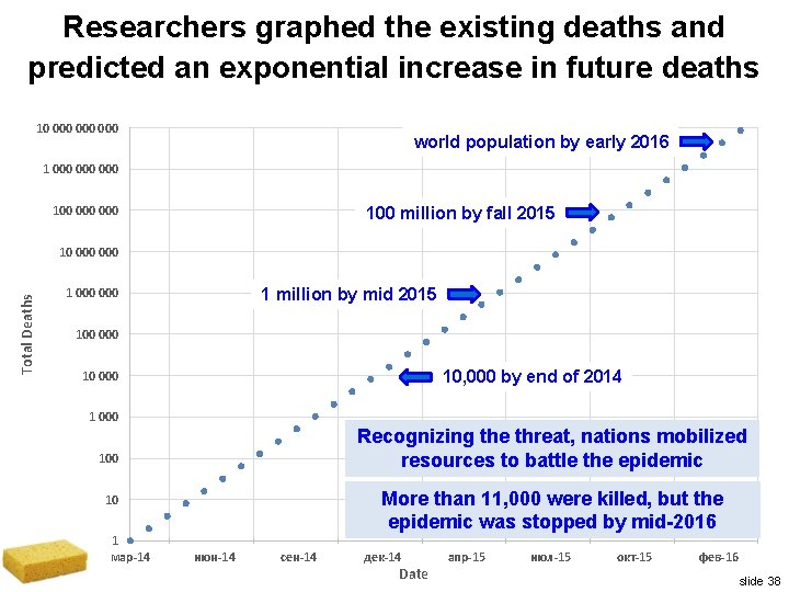
Researchers graphed the existing deaths and predicted an exponential increase in future deaths 10 000 000 world population by early 2016 1 000 000 100 million by fall 2015 Total Deaths 10 000 1 million by mid 2015 1 000 100 000 10, 000 by end of 2014 10 000 1 000 Recognizing the threat, nations mobilized resources to battle the epidemic 100 More than 11, 000 were killed, but the epidemic was stopped by mid-2016 10 1 мар-14 июн-14 сен-14 дек-14 Date апр-15 июл-15 окт-15 фев-16 slide 38

Purpose of Graphs 1) Show relationships between variables 2) Detect relationships between variables 3) Predict results slide 39

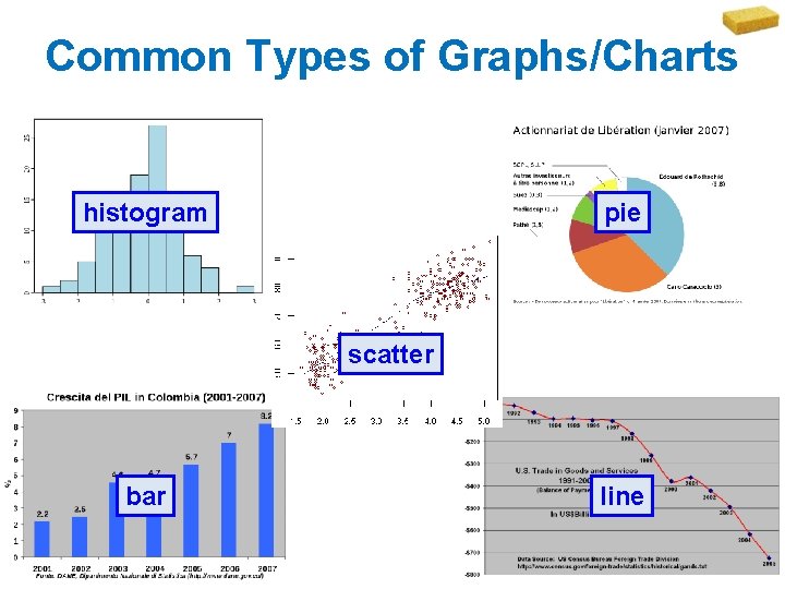
Common Types of Graphs/Charts histogram pie scatter bar line slide 40