GRAPHING RULES GRAPHING RULES The purposes of creating





- Slides: 16

GRAPHING RULES

GRAPHING RULES • The purposes of creating graphs are to: – Display data in a different format – Make it easier for you to see patterns, trends and relationships. • While are there are several types of graphs; we will focus on: – bar graphs – line graphs

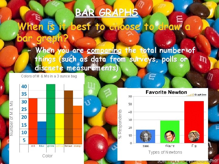
BAR GRAPHS When is it best to choose to draw a bar graph? – When you are comparing the total number of things (such as data from surveys, polls or discrete measurements) % Respondents Number of M & Ms Colors of M & Ms in a 3 ounce bag Color Types of Newtons

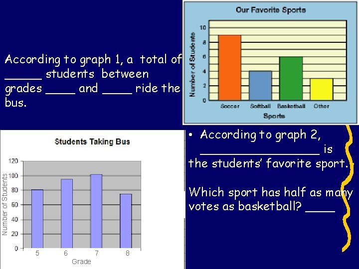
According to graph 1, a total of _____ students between grades ____ and ____ ride the bus. Number of Students • According to graph 2, ________ is the students’ favorite sport. Which sport has half as many votes as basketball? ____ 5 6 7 Grade 8

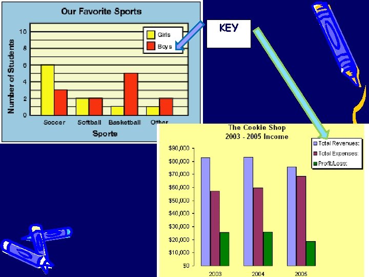
Multiple Bar Graph • Double (or triple) bar graphs are also used to show and compare total number of things, but each group of data is divided into two (or three) • Because you are comparing more than one group of data, you should have a key or legend.

KEY

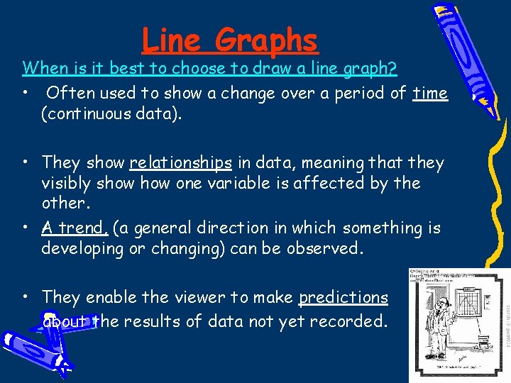
Line Graphs When is it best to choose to draw a line graph? • Often used to show a change over a period of time (continuous data). • They show relationships in data, meaning that they visibly show one variable is affected by the other. • A trend, (a general direction in which something is developing or changing) can be observed. • They enable the viewer to make predictions about the results of data not yet recorded.

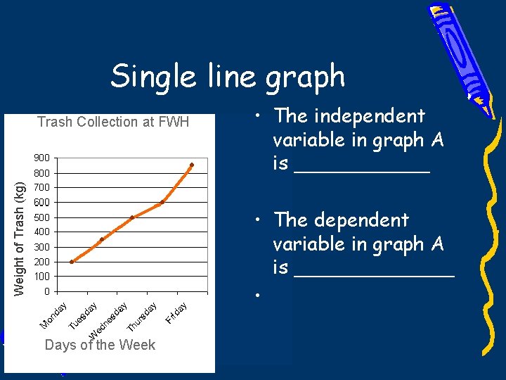
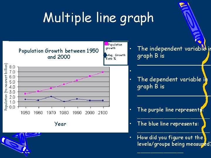
Single or multiple line graphs • use a single line when you are showing only one variable level • Multiple line graphs can be used if there are multiple trials or variables shown. Each line is drawn on one graph. – Because you are displaying more than one group of data, you should have a key.

Single line graph Weight of Trash (kg) Trash Collection at FWH • The independent variable in graph A is ______ • The dependent variable in graph A is _______ • Days of the Week

Multiple line graph Population (to nearest billion) Population Growth between 1950 and 2000 Population growth Avg. Growth Rate % • The independent variable in graph B is __________ • • The dependent variable in graph B is __________ • Year • • The purple line represents: ___________ The blue line represents: ___________ How did you figure out the levels/groups being measured? _______

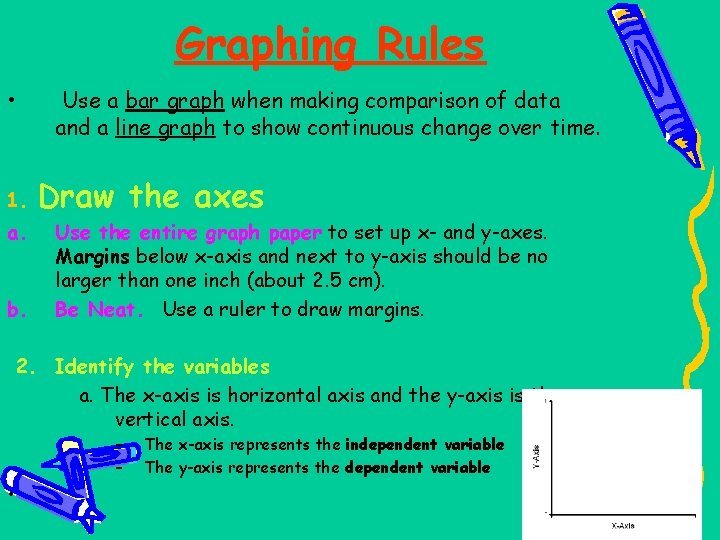
Graphing Rules • 1. a. b. Use a bar graph when making comparison of data and a line graph to show continuous change over time. Draw the axes Use the entire graph paper to set up x- and y-axes. Margins below x-axis and next to y-axis should be no larger than one inch (about 2. 5 cm). Be Neat. Use a ruler to draw margins. 2. Identify the variables a. The x-axis is horizontal axis and the y-axis is the vertical axis. – – • The x-axis represents the independent variable The y-axis represents the dependent variable

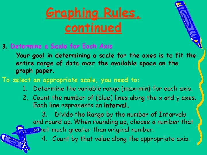
Graphing Rules, continued 3. Determine a Scale for Each Axis Your goal in determining a scale for the axes is to fit the entire range of data over the available space on the graph paper. To select an appropriate scale, you need to: 1. Determine the variable range (max-min) for each axis. 2. Count the number of (blue) lines along the x and y axes. Each line represents an interval. 3. Divide the Range by the number of Intervals and round up. When rounding up, choose a number that is not much greater than original number. 4. Count by that value along the appropriate axis.

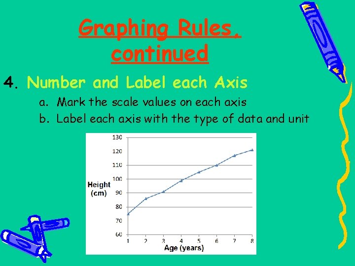
Graphing Rules, continued 4. Number and Label each Axis a. Mark the scale values on each axis b. Label each axis with the type of data and unit

5. Plot the data points and Draw the Graph • On a line graph: 1) plot each pair of data values (dependent-independent pair) on the graph with a dot 2) draw a curve or line that best fits the data points (using a ruler). 3) you may have multiple sets of dependent-independent data. If so, use a different color to plot each set of data pairs. • On a bar graph: make all bars the same width, evenly space out the bars (not touching). If you are creating a multiple bar graph, the sets of data which belong to each category on x-axis can touch the bars in the same set. color or shade the bars differently for each category on x-axis

6. Include a Key, if necessary • Place in upper right or left hand corner of graph; use when graphing two or more sets of data (multiple bar or line graph) to identify all of the groups or variable levels. • Use different colored pencils to represent the different groups or variable levels.

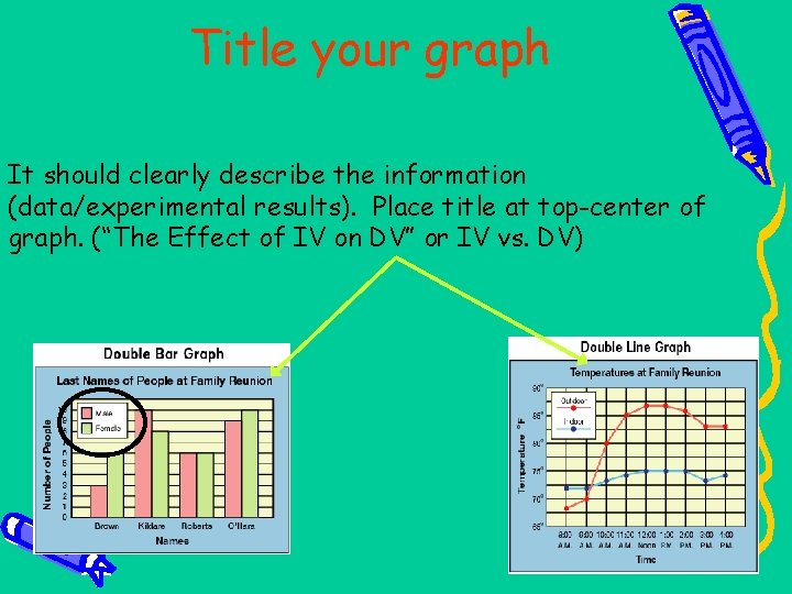
Title your graph It should clearly describe the information (data/experimental results). Place title at top-center of graph. (“The Effect of IV on DV” or IV vs. DV)