GRAPHING NOTES Part 1 TYPES OF GRAPHS Graphs


- Slides: 16
GRAPHING NOTES Part 1
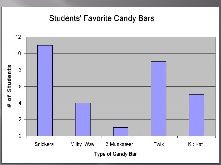
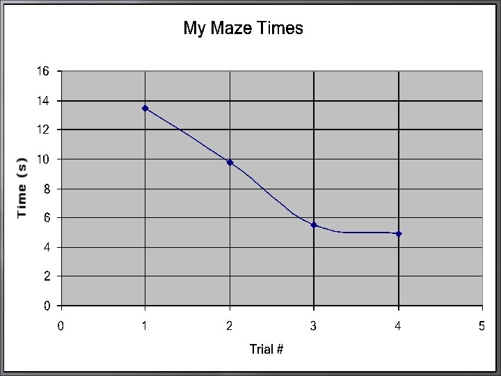
TYPES OF GRAPHS Graphs are used to illustrate what happens during an experiment. Bar graph - used for comparing data. Pie graph - used to show percentages. Line graph - used to show continuous change, usually change over time.
CREATING A DATA TABLE A data table has 2 columns. The first column is the independent variable. The second column is the dependent variable. INDEPENDENT VARIABLE
Independent Variable This is the factor that we can change. Example: How long thermometer is in the water, or how far the runner races.
Dependent Variable These are the results we get. Example: The water temperature, or how fast the runner ran.
Variable & Controlled Parameters Controlled parameters are the factors that stay constant during the experiment. Example: The amount of salt used or the material used. Variable Parameters are factors that change during the experiment. Example: The mass or volume of the gummy bear in water.
Creating a Graph Data tables help you organize data. Graphs help you understand use data.
AXES An axis is a line that forms one side of the graph. X-axis: the horizontal line that represents the independent variable. Y-axis: the vertical line that represents the dependent variable.
Range & Scale To find the range of each axis, subtract the smallest value on the data table from the largest value. Scale: Each axis has its own scale, or how many spaces between numbers.
Data Points You plot the data points by putting a dot on the graph for each pair of data on the data table.
Labels Title: The title tells people what the graph describes. Do NOT use the word graph in your title. Label axes: Also label the x-axis and y-axis. Include the name and unit label if necessary, like “distance (m)” or “time (sec. )”.
STEPS FOR MAKING A GRAPH ALWAYS USE A RULER! ALWAYS MAKE AS LARGE AS POSSIBLE! 1) Draw the x and y axes. 2) Label the axes. Include units if needed. 1 st column of data table = x-axis 2 nd column of data table = y-axis 3) Decide - line graph or bar graph? 4) Choose a scale and fill in numbers. 5) Plot your data. 6) Write a title for your graph.
Remember To Check For: T Title L Labels U Units D Data
LET’S TRY IT!