Graphing Notes 1 Choosing the Right Graph Data




- Slides: 20

Graphing Notes

1. Choosing the Right Graph • • • Data tables provide an organized _____ way of viewing information, and graphs are pictures of the ______ information in a data table. Can be _____ to faster and easier interpret data by looking at a graph. Must choose the _____ correct type of graph to illustrate your data.

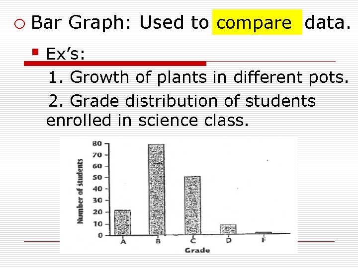
compare data. o Bar Graph: Used to _______ § Ex’s: 1. Growth of plants in different pots. 2. Grade distribution of students enrolled in science class.

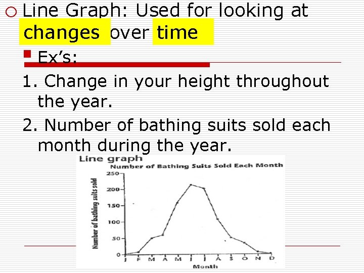
o Line Graph: Used for looking at _______ changes over ____. time § Ex’s: 1. Change in your height throughout the year. 2. Number of bathing suits sold each month during the year.

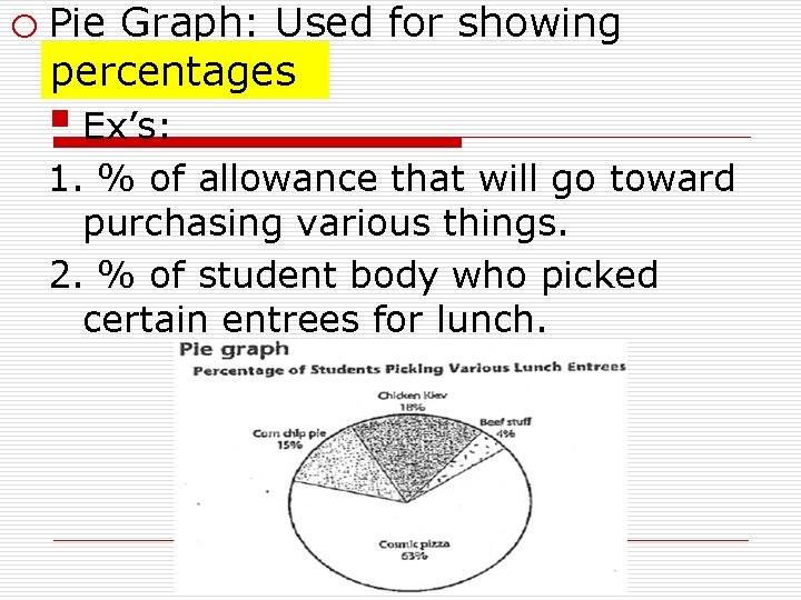
o Pie Graph: Used for showing _____. percentages § Ex’s: 1. % of allowance that will go toward purchasing various things. 2. % of student body who picked certain entrees for lunch.

Let’s Practice! Choose the Graph: What graph type do you think best presents each set of data? Why?

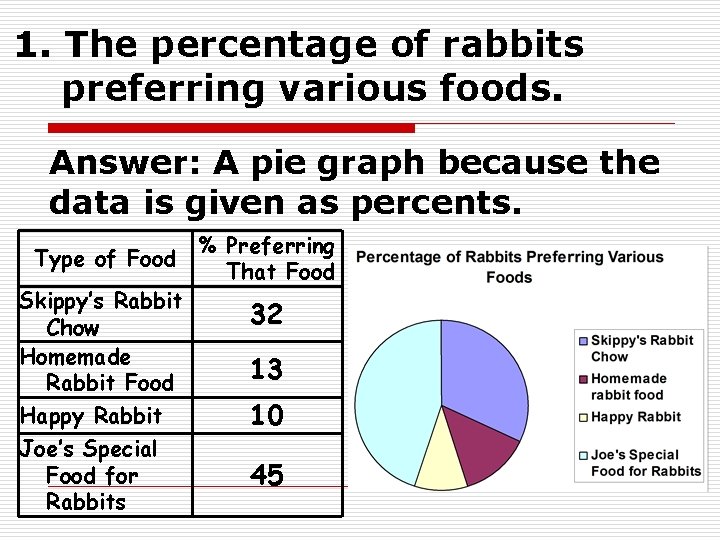
1. The percentage of rabbits preferring various foods. Answer: A pie graph because the data is given as percents. Type of Food Skippy’s Rabbit Chow Homemade Rabbit Food Happy Rabbit Joe’s Special Food for Rabbits % Preferring That Food 32 13 10 45

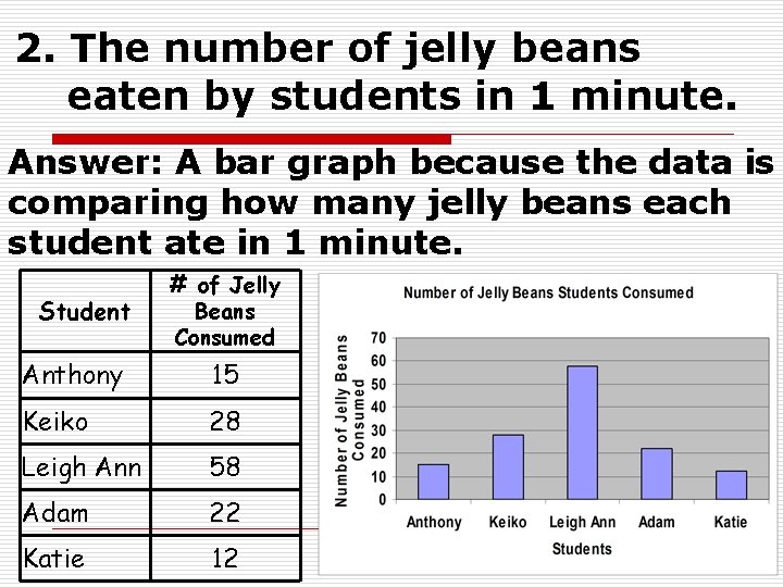
2. The number of jelly beans eaten by students in 1 minute. Answer: A bar graph because the data is comparing how many jelly beans each student ate in 1 minute. Student # of Jelly Beans Consumed Anthony 15 Keiko 28 Leigh Ann 58 Adam 22 Katie 12

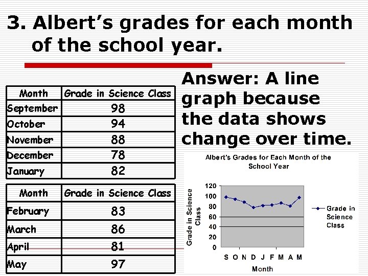
3. Albert’s grades for each month of the school year. Month Grade in Science Class September 98 94 88 78 82 October November December January Month Grade in Science Class February 83 March 86 81 97 April May Answer: A line graph because the data shows change over time.

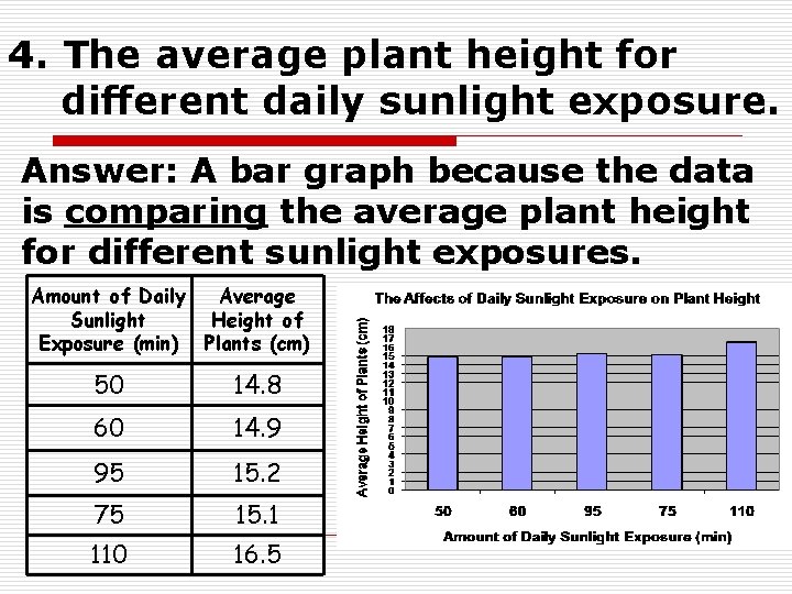
4. The average plant height for different daily sunlight exposure. Answer: A bar graph because the data is comparing the average plant height for different sunlight exposures. Amount of Daily Average Sunlight Height of Exposure (min) Plants (cm) 50 14. 8 60 14. 9 95 15. 2 75 15. 1 110 16. 5

2. Steps to Making Bar and Line Graphs graph with an • Step 1: Set up your _____ x -axis and y-axis. horizontal and o The x-axis is _____ independent variable. represents the ______ § Variable being tested. o The y-axis is vertical ______ and represents dependent variable. the _____ § What is measured to see if there is a change.

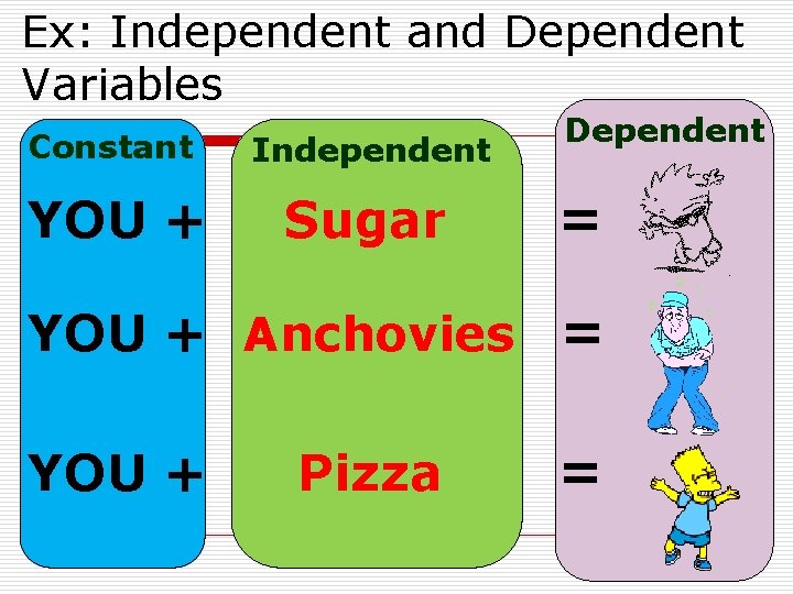
Ex: Independent and Dependent Variables Constant Independent YOU + Sugar Dependent = YOU + Anchovies = YOU + Pizza =

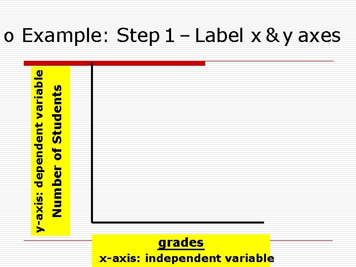
Number numberof of. Students students y-axis: dependent variable o Example: Step 1 – Label x & y axes grades x-axis: independent variable

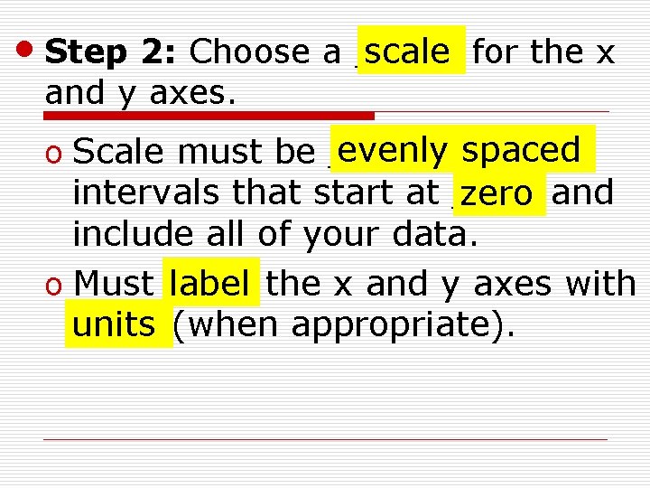
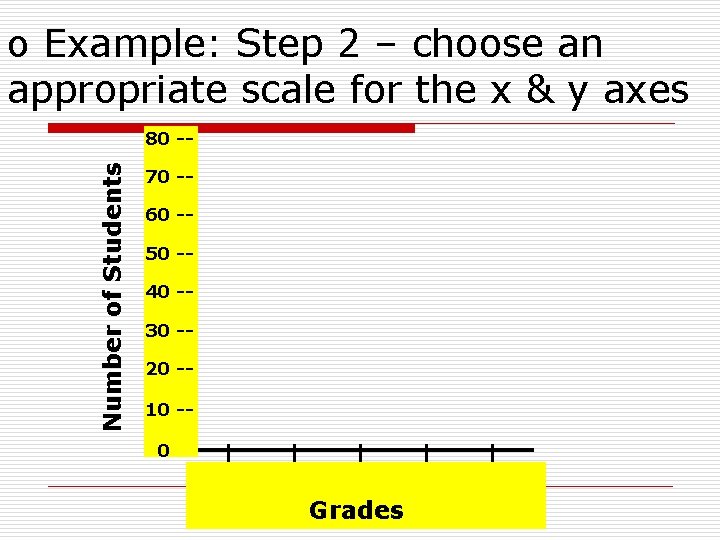
scale for the x • Step 2: Choose a _____ and y axes. evenly spaced o Scale must be ______ intervals that start at ____ zero and include all of your data. o Must ____ label the x and y axes with ____ (when appropriate). units

o Example: Step 2 – choose an appropriate scale for the x & y axes Number of Students 80 -70 -60 -50 -40 -30 -20 -10 -0 A B C D Grades F

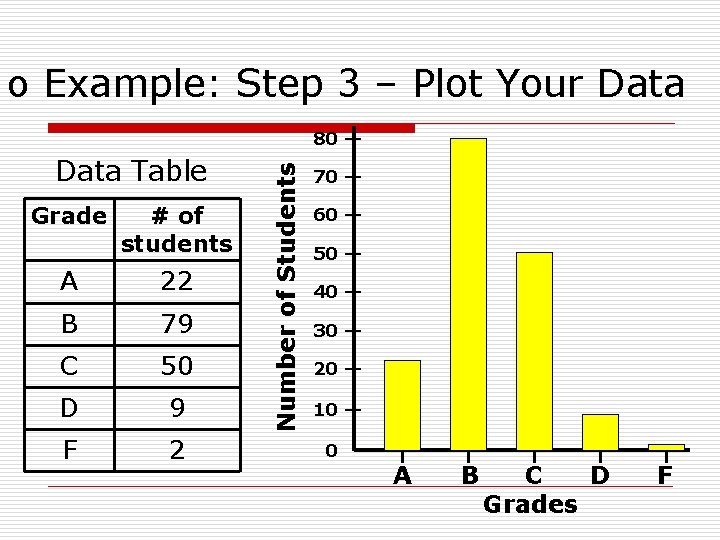
• Step 3: Determine what _____ plot graph to make and ____ your ____ data from data table on the graph.

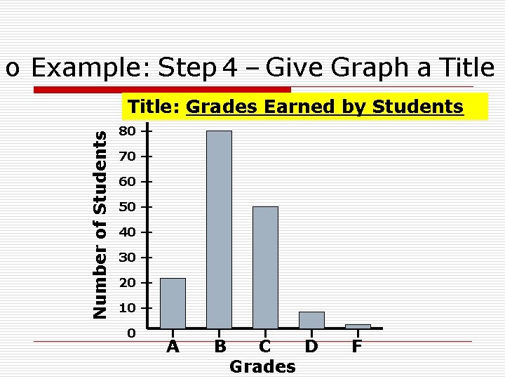
o Example: Step 3 – Plot Your Data Table Grade # of students A 22 B 79 C 50 D 9 F 2 Number of Students 80 -70 -60 -50 -40 -30 -20 -10 -0 A B C D Grades F

• Step 4: Give your graph a ____. title Title should include the independent and dependent _______. variable

o Example: Step 4 – Give Graph a Title Number of Students Title: Grades Earned by Students 80 -70 -60 -50 -40 -30 -20 -10 -0 A B C D Grades F
