Graphing Categorical Data CHAPTER 2 The Three Rules

- Slides: 10

Graphing Categorical Data CHAPTER 2

The Three Rules of Data Analysis 1. Make a picture—things may be revealed that are not obvious in the raw data. These will be things to think about. 2. Make a picture—important features of and patterns in the data will show up. You may also see things that you did not expect. 3. Make a picture—the best way to tell others about your data is with a well-chosen picture.

Two Types of Graphs for Categorial Data § BAR GRAPHS (CHARTS) § PIE GRAPHS (CHARTS)

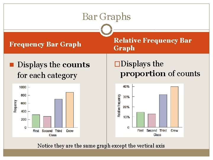
Bar Graphs Frequency Bar Graph Relative Frequency Bar Graph n Displays the counts �Displays the for each category proportion of counts Notice they are the same graph except the vertical axis

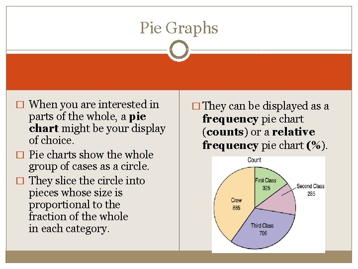
Pie Graphs � When you are interested in parts of the whole, a pie chart might be your display of choice. � Pie charts show the whole group of cases as a circle. � They slice the circle into pieces whose size is proportional to the fraction of the whole in each category. � They can be displayed as a frequency pie chart (counts) or a relative frequency pie chart (%).

Think before you draw! � Our first rule of data analysis is make a picture. But what kind of picture? � Knowing when to use each type of graph is a critical first step in data analysis. � That decision depends in part on what type of data we have. � It’s important to check that the data are appropriate for whatever method of analysis you choose. � Before you make a bar chart or a pie chart, always check the categorical data condition: the data are counts or percentages of individuals in non-overlapping categories.

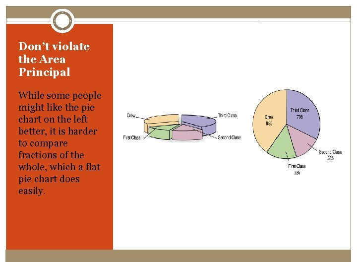
Don’t violate the Area Principal While some people might like the pie chart on the left better, it is harder to compare fractions of the whole, which a flat pie chart does easily.

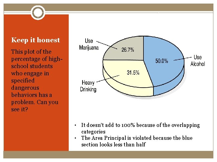
Keep it honest This plot of the percentage of highschool students who engage in specified dangerous behaviors has a problem. Can you see it? • It doesn’t add to 100% because of the overlapping categories • The Area Principal is violated because the blue section looks less than half

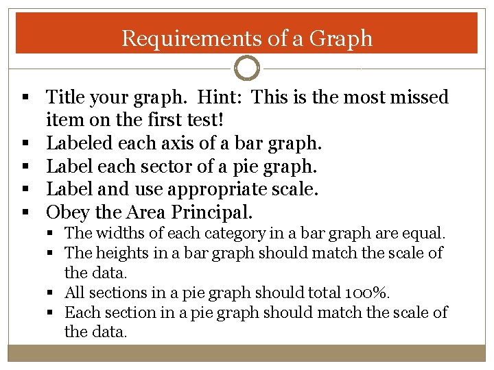
Requirements of a Graph § Title your graph. Hint: This is the most missed item on the first test! § Labeled each axis of a bar graph. § Label each sector of a pie graph. § Label and use appropriate scale. § Obey the Area Principal. § The widths of each category in a bar graph are equal. § The heights in a bar graph should match the scale of the data. § All sections in a pie graph should total 100%. § Each section in a pie graph should match the scale of the data.

Homework Week 1 üLog into Canvas Course üRead syllabus üConnect to My. Lab & Mastering (Pearson) following directions from syllabus üComplete HW Chapter 1 üRead Chapter 2 PP üComplete HW Chapter 2 Bring your graphing calculator to class!