Graphing 2 Types of DATA Quantitative data Data
- Slides: 15

Graphing

2 Types of DATA • Quantitative data Data reported in the form of numbers and statistics • Qualitative data Data reported in the form of words and written descriptions.

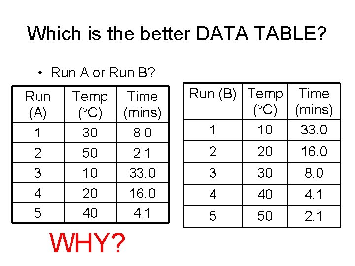
Which is the better DATA TABLE? • Run A or Run B? Run (A) 1 2 3 4 5 Temp ( C) 30 50 10 20 40 Time (mins) 8. 0 2. 1 33. 0 16. 0 4. 1 WHY? Run (B) Temp Time ( C) (mins) 1 10 33. 0 2 20 16. 0 3 30 8. 0 4 40 4. 1 5 50 2. 1

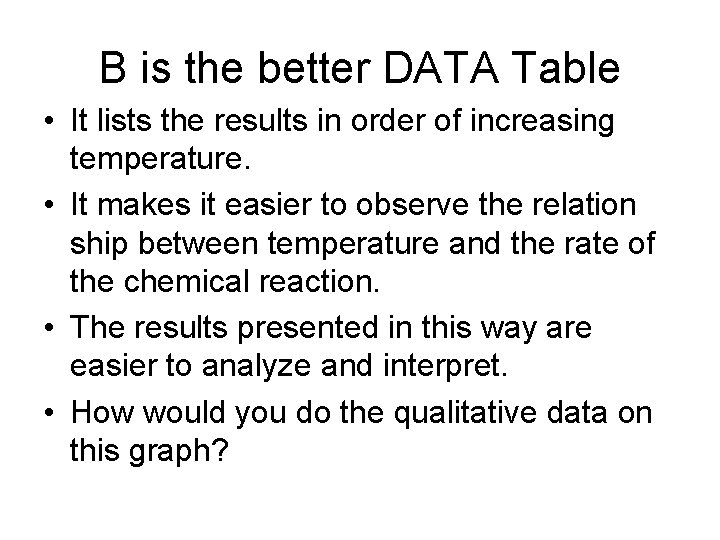
B is the better DATA Table • It lists the results in order of increasing temperature. • It makes it easier to observe the relation ship between temperature and the rate of the chemical reaction. • The results presented in this way are easier to analyze and interpret. • How would you do the qualitative data on this graph?

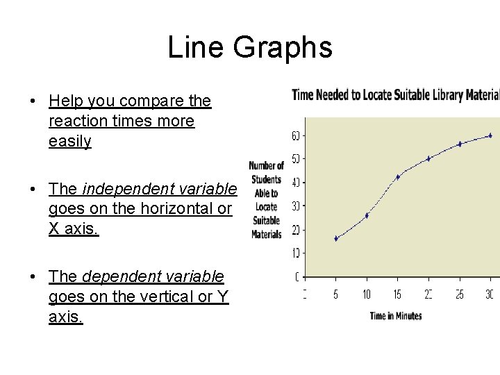
Line Graphs • Help you compare the reaction times more easily • The independent variable goes on the horizontal or X axis. • The dependent variable goes on the vertical or Y axis.

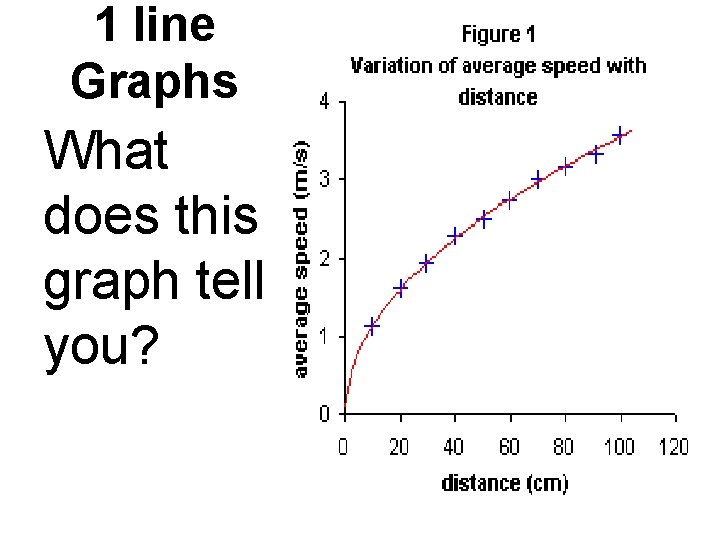
1 line Graphs What does this graph tell you?

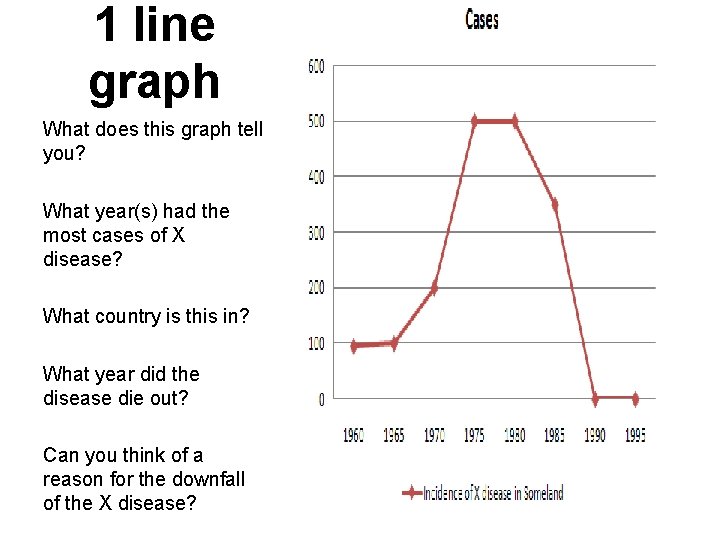
1 line graph What does this graph tell you? What year(s) had the most cases of X disease? What country is this in? What year did the disease die out? Can you think of a reason for the downfall of the X disease?

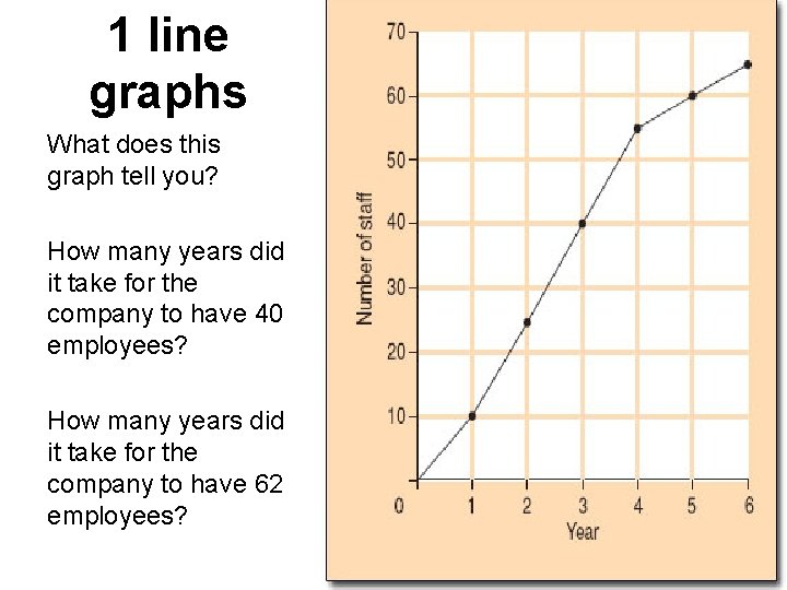
1 line graphs What does this graph tell you? How many years did it take for the company to have 40 employees? How many years did it take for the company to have 62 employees?

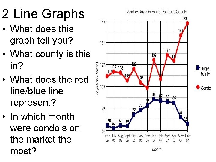
2 Line Graphs • What does this graph tell you? • What county is this in? • What does the red line/blue line represent? • In which month were condo’s on the market the most?

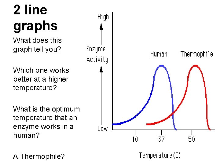
2 line graphs What does this graph tell you? Which one works better at a higher temperature? What is the optimum temperature that an enzyme works in a human? A Thermophile?

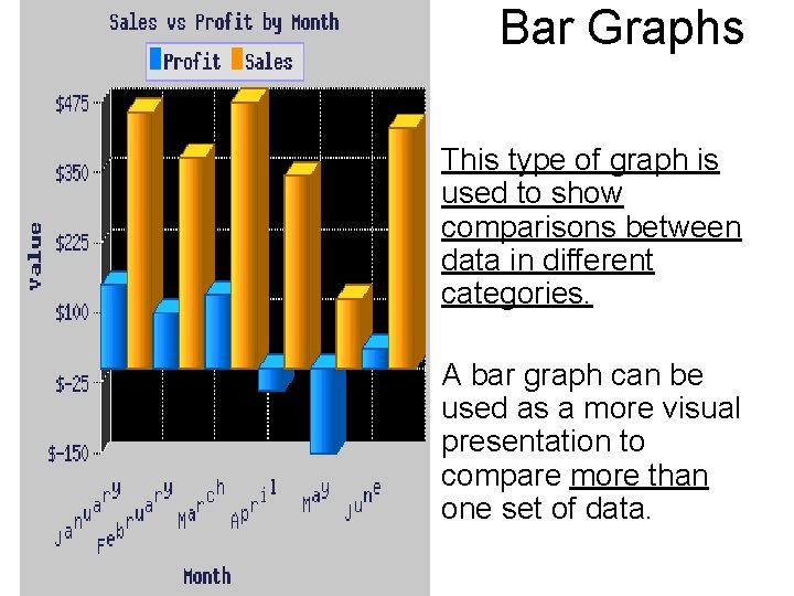
Bar Graphs • This type of graph is used to show comparisons between data in different categories. • A bar graph can be used as a more visual presentation to compare more than one set of data.

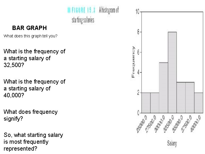
BAR GRAPH What does this graph tell you? What is the frequency of a starting salary of 32, 500? What is the frequency of a starting salary of 40, 000? What does frequency signify? So, what starting salary is most frequently represented?

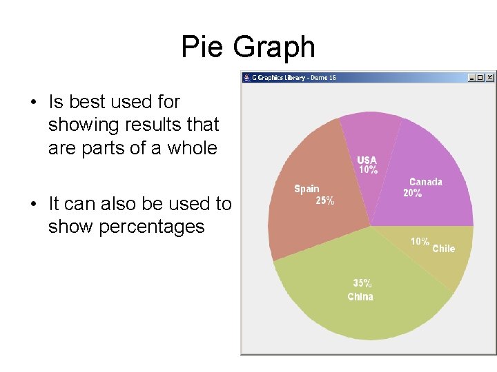
Pie Graph • Is best used for showing results that are parts of a whole • It can also be used to show percentages

Models • Scientists use models to understand real objects or events that may be too complex or too small to study directly. • Examples: Cell Models, DNA models, protein models etc.

A graph MUST contain 5 major parts: 1. 2. 3. 4. The title The Independent Variable The Dependent Variable The scales for each variable (This must also take up a conservative amount of space. ) 5. The Legend or Key (It should be short and concise and placed under the graph. )