Graphical Screen Design Important graphical design concepts include

- Slides: 61

Graphical Screen Design Important graphical design concepts include visual consistency visual organization navigational cues visual relationships legibility and readability appropriate imagery familiar idioms Sheelagh Carpendale

Graphical Design About guidelines: • using them leads to good design • inspired design transcends them • “Method helps intuition when it is not transformed into dictatorship. Intuition augments method if it does not instill anarchy. ” Mihai Nadin - Interface Design and Evaluation: Semiotic Implications • Not to have method is bad; to stop entirely at method is worse still” The Mustard Seed Garden Manual of Painting Sources: - Principle of Effective Visual Communication for GUI design Marcus in Baecker, Grudin, Buxton and Greenberg - Designing Visual Interfaces Mullet & Sano, Prentice Hall - Information Visualization: Perception for Design Colin Ware, Morgan Kaufmann Sheelagh Carpendale

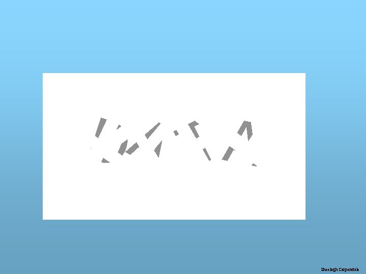
D A TA Sheelagh Carpendale

D A TA Similar to Ware’s adaptation of Nakayama et al. Sheelagh Carpendale

Form and Function a principle from the designing of usable objects - architecture and crafts Grouping: • by related functions • by task sequencing Fitts Law • The time to select a target is a function of the distance to the target and size of the target. Seven plus or minus two Visual richness Sheelagh Carpendale

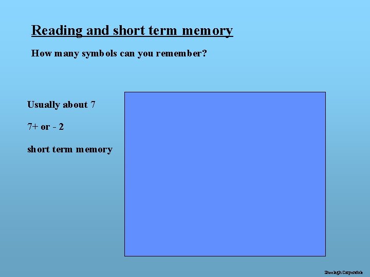
Reading and short term memory How many symbols can you remember? Usually about 7 # 7+ or - 2 short term memory @ 6 X as * 1 o $ ? Q & % 9 F Sheelagh Carpendale

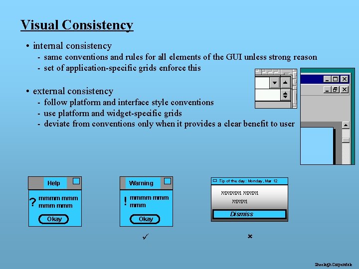
Visual Consistency • internal consistency - same conventions and rules for all elements of the GUI unless strong reason - set of application-specific grids enforce this • external consistency - follow platform and interface style conventions - use platform and widget-specific grids - deviate from conventions only when it provides a clear benefit to user Help ? mmmm mmm Okay Warning ! mmmm mmm Okay ü Tip of the day: Monday, Mar 12 mmmm mmm Dismiss û Sheelagh Carpendale

Creating a Layout One way to create structure is through use of a grid - these are guidelines only !!! • determine display size restrictions • identify external consistency elements • window style, margins, borders, standard controls • identify internal consistency elements • start with rough sketches of the series of layouts to be produced Sheelagh Carpendale

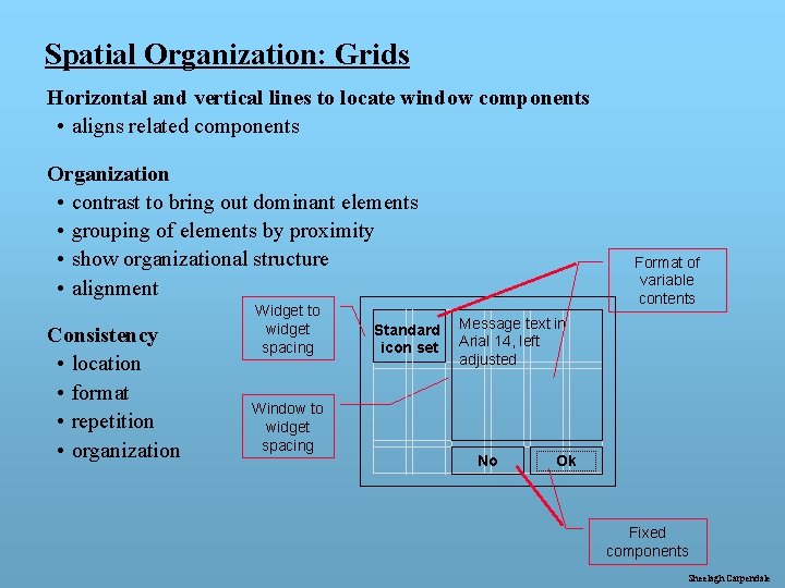
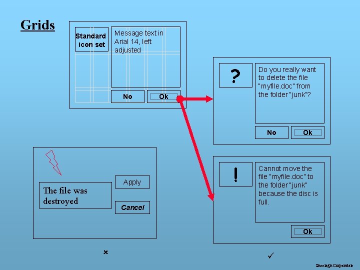
Spatial Organization: Grids Horizontal and vertical lines to locate window components • aligns related components Organization • contrast to bring out dominant elements • grouping of elements by proximity • show organizational structure • alignment Consistency • location • format • repetition • organization Widget to widget spacing Window to widget spacing Standard icon set Format of variable contents Message text in Arial 14, left adjusted No Ok Fixed components Sheelagh Carpendale

Grids Standard icon set Message text in Arial 14, left adjusted ? No Ok Do you really want to delete the file “myfile. doc” from the folder “junk”? No Apply The file was destroyed Cancel ! Ok Cannot move the file “myfile. doc” to the folder “junk” because the disc is full. Ok û ü Sheelagh Carpendale

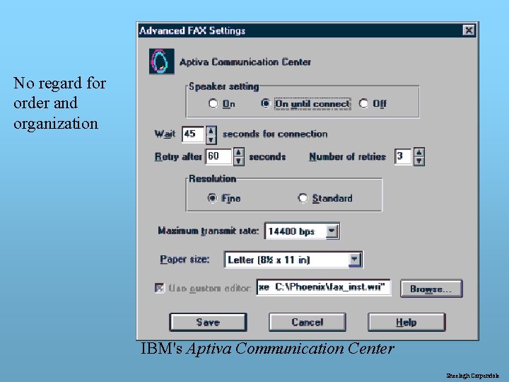
No regard for order and organization IBM's Aptiva Communication Center Sheelagh Carpendale

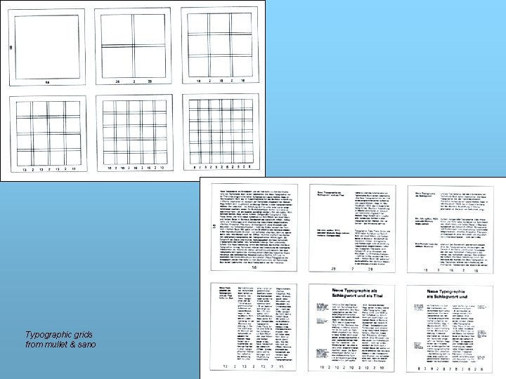
Grids Typographic grids from mullet & sano Sheelagh Carpendale

Creating a Layout (2) start with rough sketches of the series of layouts to be produced • determine module size requirements • minimize number of units - ensure units combine readily • establish a vertical unit • use givens from external consistency • the vertical unit must allow for control labels and spacing • establish a horizontal unit • often wider than vertical to allow for words (often 5 -7 in display width) • consider establishing an axis of symmetry (vertical or horizontal) • consider using vertical unit (or related unit) for horizontal spacing Sheelagh Carpendale

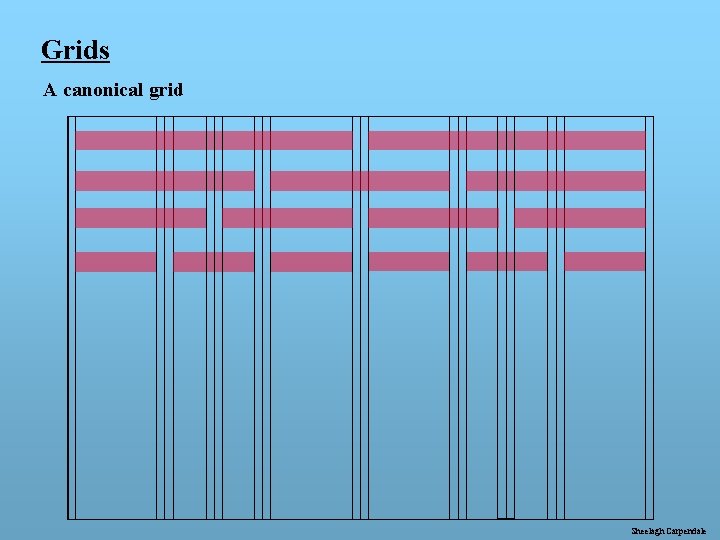
Grids A canonical grid Sheelagh Carpendale

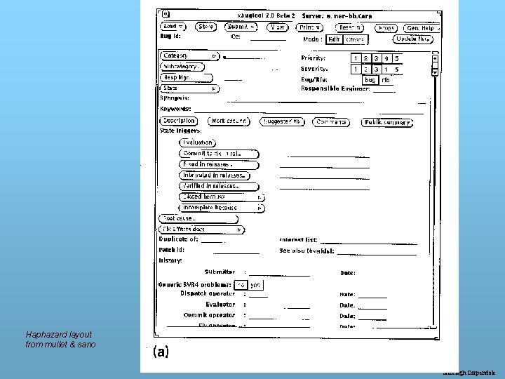
Haphazard layout from mullet & sano Sheelagh Carpendale

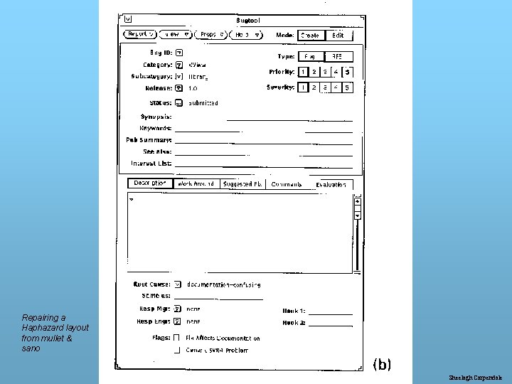
Repairing a Haphazard layout from mullet & sano Sheelagh Carpendale

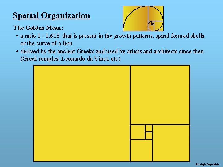
Spatial Organization The Golden Mean: • a ratio 1 : 1. 618 that is present in the growth patterns, spiral formed shells or the curve of a fern • derived by the ancient Greeks and used by artists and architects since then (Greek temples, Leonardo da Vinci, etc) Sheelagh Carpendale

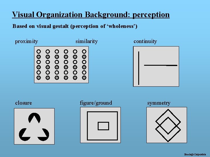
Visual Organization Background: perception Based on visual gestalt (perception of ‘wholeness’) proximity closure similarity figure/ground continuity symmetry Sheelagh Carpendale

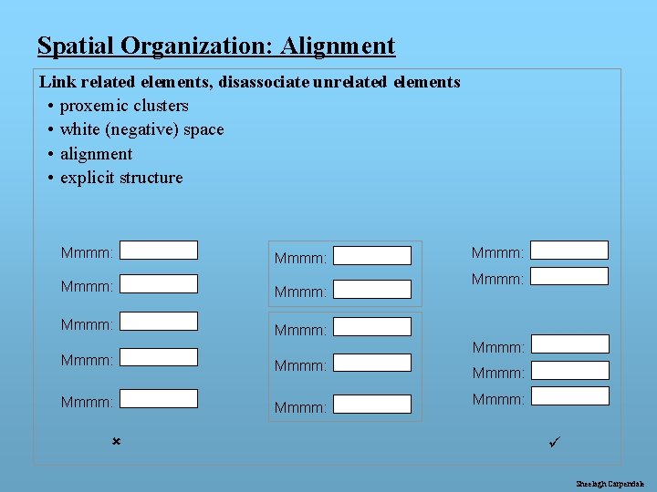
Spatial Organization: Alignment Link related elements, disassociate unrelated elements • proxemic clusters • white (negative) space • alignment • explicit structure Mmmm: Mmmm: Mmmm: û Mmmm: ü Sheelagh Carpendale

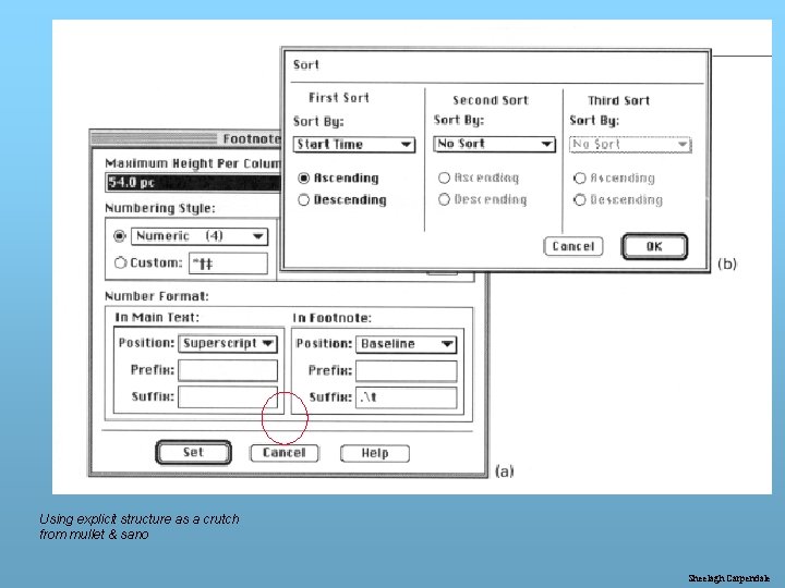
Using explicit structure as a crutch from mullet & sano Sheelagh Carpendale

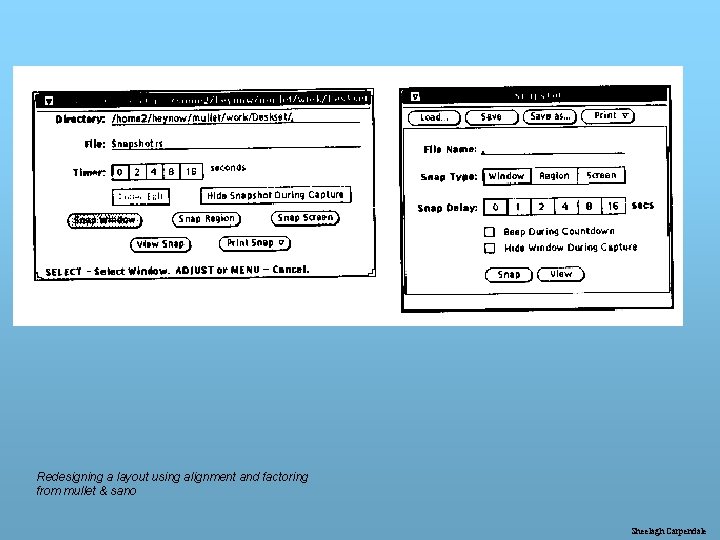
Redesigning a layout using alignment and factoring from mullet & sano Sheelagh Carpendale

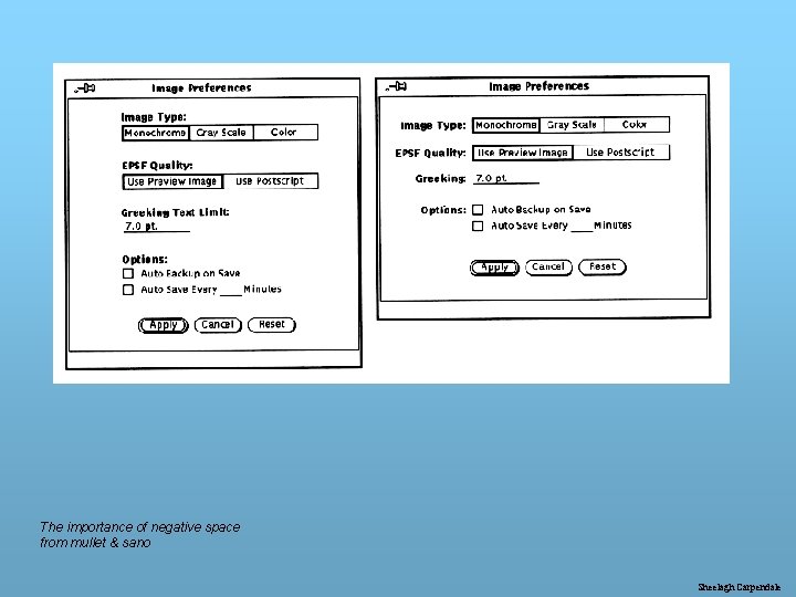
The importance of negative space from mullet & sano Sheelagh Carpendale

Creating a Structure (3) • draw the grid using vertical and horizontal units, paying attention to axis of symmetry and margins • layout the interface modules and components • adjust the sizes of these elements using the grid • adjust as possible to enhance symmetry and balance • consider dynamics of re-sizing (minimal acceptable size? ) Sheelagh Carpendale

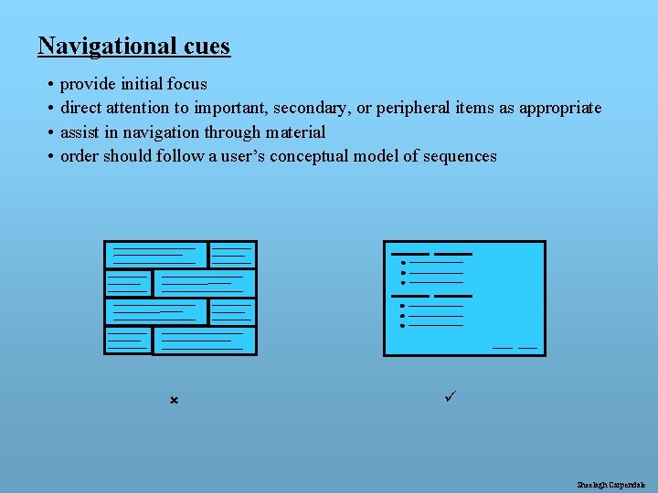
Navigational cues • • provide initial focus direct attention to important, secondary, or peripheral items as appropriate assist in navigation through material order should follow a user’s conceptual model of sequences û ü Sheelagh Carpendale

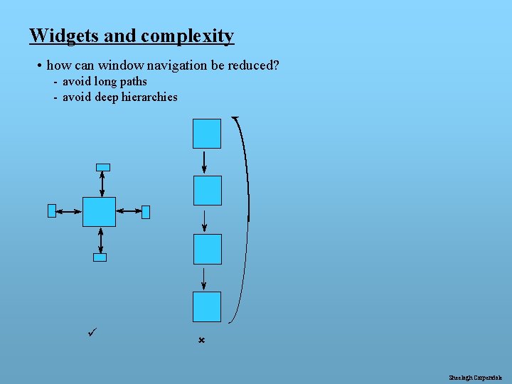
Widgets and complexity • how can window navigation be reduced? - avoid long paths - avoid deep hierarchies ü û Sheelagh Carpendale

Colour colour is a complex subject our understanding of it is incomplete and comes from many different subject areas - physics, physiology, psychology, art and design the colour of an object depends on - the object itself, the light source, the surrounding colour, and the way it is perceived it is heavily used, part of all cultures and as such has many different pre-assigned meanings Why use colour? - to make the display more attractive - to emphasize and draw attention - to increase readability - to encode meaning • http: //msdn. microsoft. com/workshop/design/color/hess 08142000. asp • http: //library. thinkquest. org/50065/art/effects. html • http: //www. colormatters. com/colortheory. html Sheelagh Carpendale

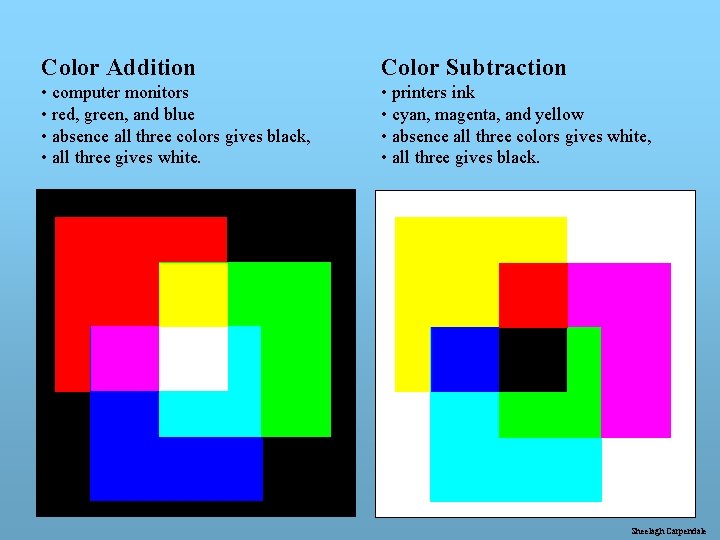
Color Addition Color Subtraction • computer monitors • red, green, and blue • absence all three colors gives black, • all three gives white. • printers ink • cyan, magenta, and yellow • absence all three colors gives white, • all three gives black. Sheelagh Carpendale

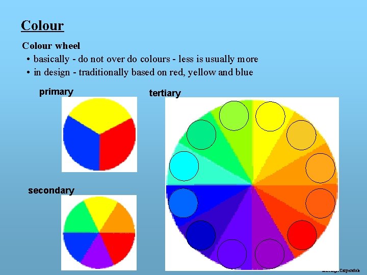
Colour wheel • basically - do not over do colours - less is usually more • in design - traditionally based on red, yellow and blue primary tertiary secondary Sheelagh Carpendale

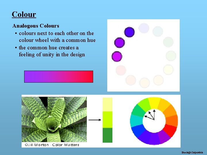
Colour Analogous Colours • colours next to each other on the colour wheel with a common hue • the common hue creates a feeling of unity in the design Sheelagh Carpendale

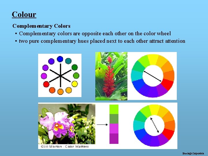
Colour Complementary Colors • Complementary colors are opposite each other on the color wheel • two pure complementary hues placed next to each other attract attention Sheelagh Carpendale

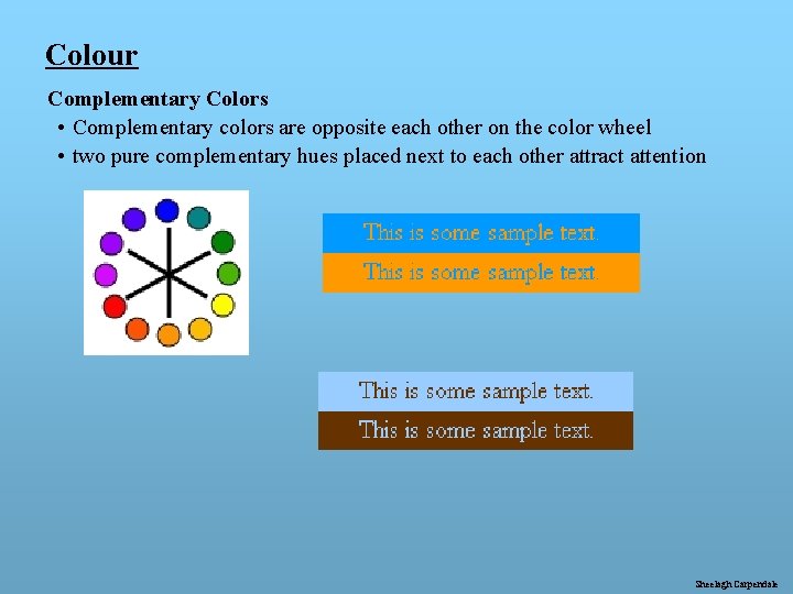
Colour Complementary Colors • Complementary colors are opposite each other on the color wheel • two pure complementary hues placed next to each other attract attention Sheelagh Carpendale

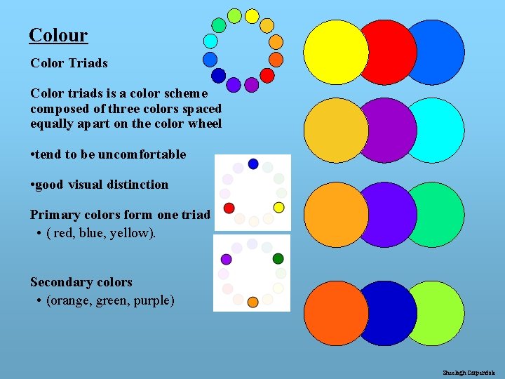
Colour Color Triads Color triads is a color scheme composed of three colors spaced equally apart on the color wheel • tend to be uncomfortable • good visual distinction Primary colors form one triad • ( red, blue, yellow). Secondary colors • (orange, green, purple) Sheelagh Carpendale

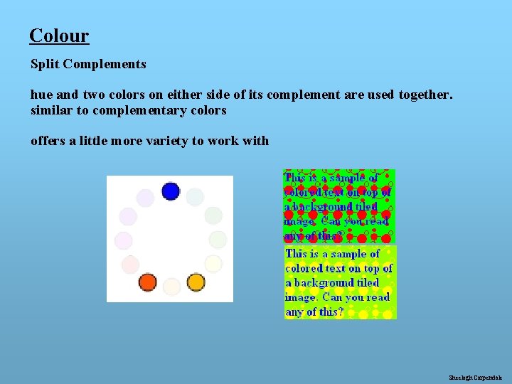
Colour Split Complements hue and two colors on either side of its complement are used together. similar to complementary colors offers a little more variety to work with Sheelagh Carpendale

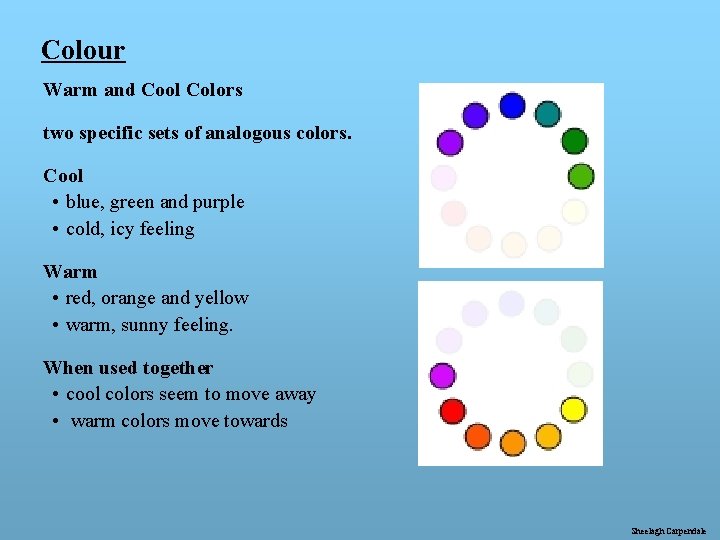
Colour Warm and Cool Colors two specific sets of analogous colors. Cool • blue, green and purple • cold, icy feeling Warm • red, orange and yellow • warm, sunny feeling. When used together • cool colors seem to move away • warm colors move towards Sheelagh Carpendale

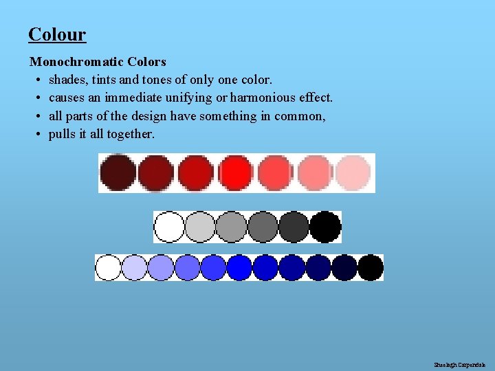
Colour Monochromatic Colors • shades, tints and tones of only one color. • causes an immediate unifying or harmonious effect. • all parts of the design have something in common, • pulls it all together. Sheelagh Carpendale

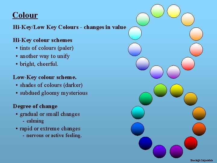
Colour Hi-Key/Low Key Colours - changes in value Hi-Key colour schemes • tints of colours (paler) • another way to unify • bright, cheerful. Low-Key colour scheme. • shades of colours (darker) • subdued gloomy mysterious Degree of change • gradual or small changes - calming • rapid or extreme changes - nervous or active feeling. Sheelagh Carpendale

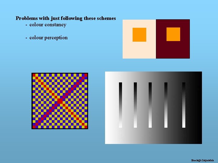
Problems with just following these schemes - colour constancy - colour perception Sheelagh Carpendale

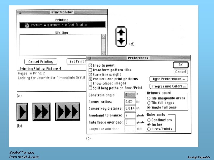
Spatial Tension from mullet & sano Sheelagh Carpendale

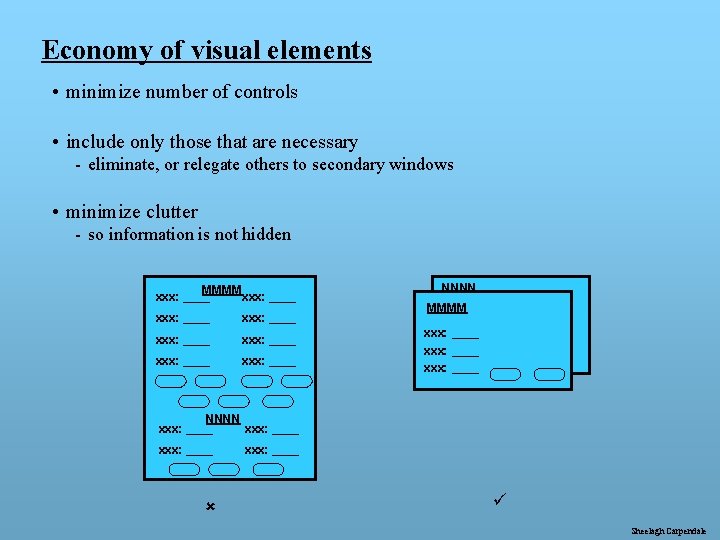
Economy of visual elements • minimize number of controls • include only those that are necessary - eliminate, or relegate others to secondary windows • minimize clutter - so information is not hidden MMMM xxx: ____ xxx: ____ NNNN MMMM xxx: ____ NNNN xxx: ____ û xxx: ____ ü Sheelagh Carpendale

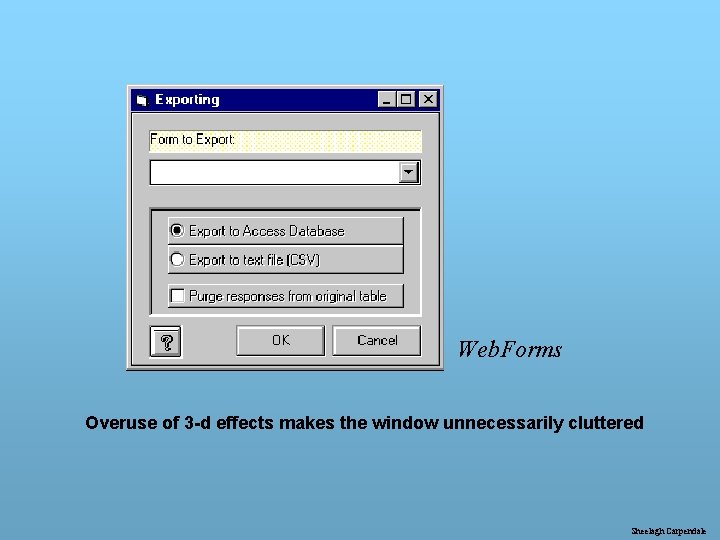
Web. Forms Overuse of 3 -d effects makes the window unnecessarily cluttered Sheelagh Carpendale

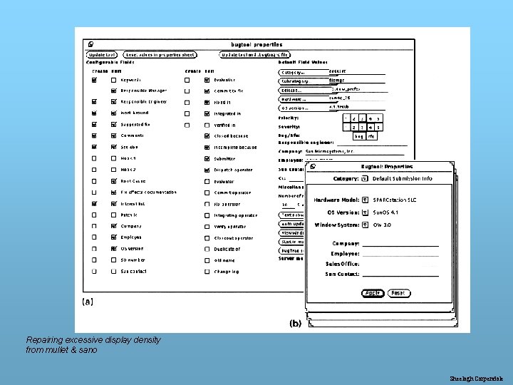
Repairing excessive display density from mullet & sano Sheelagh Carpendale

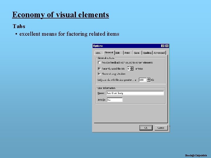
Economy of visual elements Tabs • excellent means for factoring related items Sheelagh Carpendale

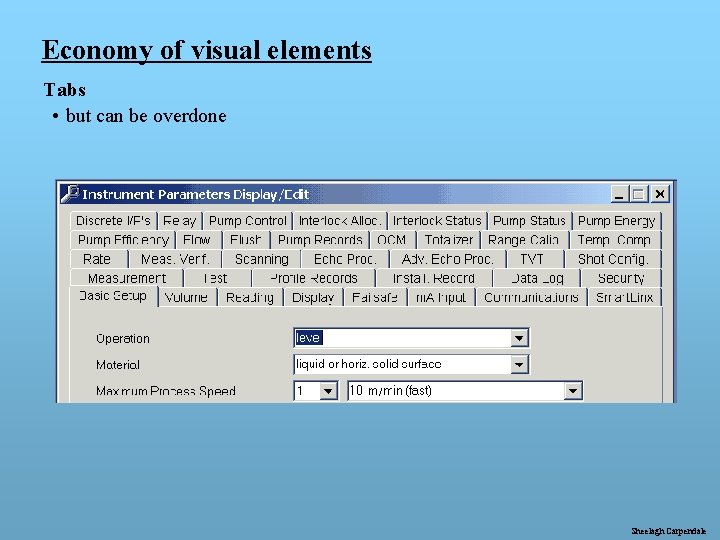
Economy of visual elements Tabs • but can be overdone Sheelagh Carpendale

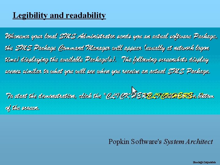
Legibility and readability Popkin Software's System Architect Sheelagh Carpendale

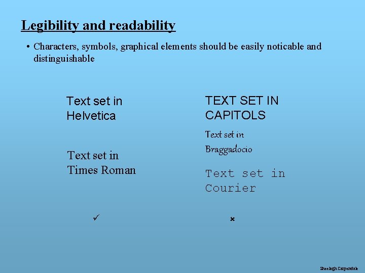
Legibility and readability • Characters, symbols, graphical elements should be easily noticable and distinguishable Text set in Helvetica Text set in Times Roman ü TEXT SET IN CAPITOLS Text set in Braggadocio Text set in Courier û Sheelagh Carpendale

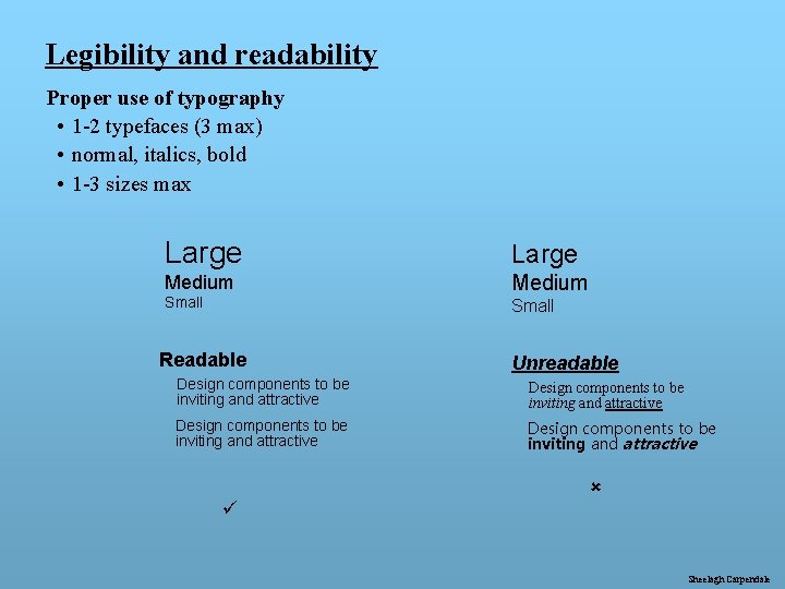
Legibility and readability Proper use of typography • 1 -2 typefaces (3 max) • normal, italics, bold • 1 -3 sizes max Large Medium Small Readable Unreadable Design components to be inviting and attractive ü û Sheelagh Carpendale

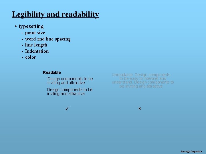
Legibility and readability • typesetting - point size word and line spacing line length Indentation color Readable Design components to be inviting and attractive ü Unreadable: Design components to be easy to interpret and understand. Design components to be inviting and attractive û Sheelagh Carpendale

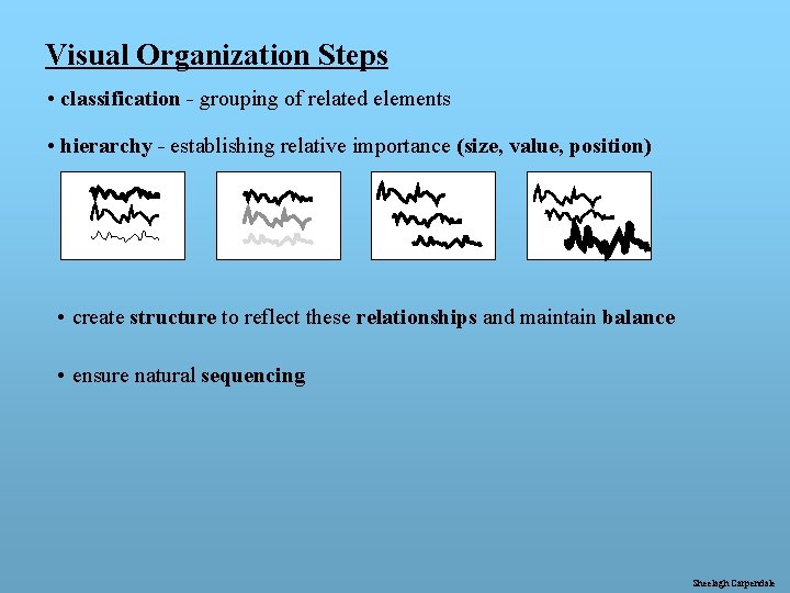
Visual Organization Steps • classification - grouping of related elements • hierarchy - establishing relative importance (size, value, position) • create structure to reflect these relationships and maintain balance • ensure natural sequencing Sheelagh Carpendale

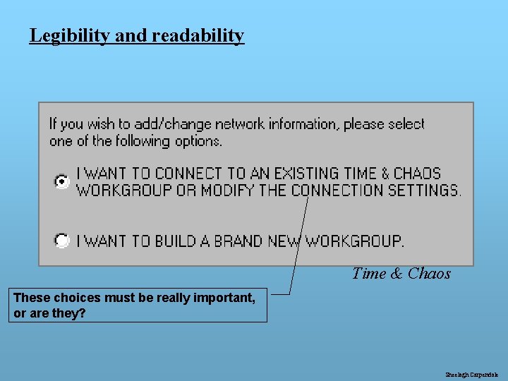
Legibility and readability Time & Chaos These choices must be really important, or are they? Sheelagh Carpendale

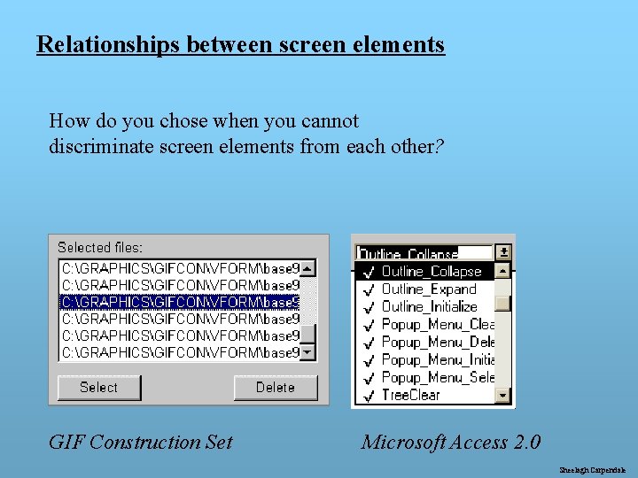
Relationships between screen elements How do you chose when you cannot discriminate screen elements from each other? GIF Construction Set Microsoft Access 2. 0 Sheelagh Carpendale

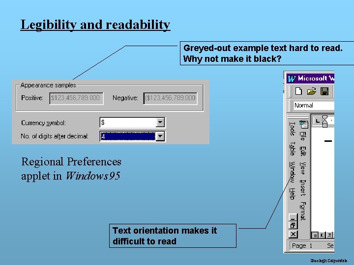
Legibility and readability Greyed-out example text hard to read. Why not make it black? Regional Preferences applet in Windows 95 Text orientation makes it difficult to read Sheelagh Carpendale

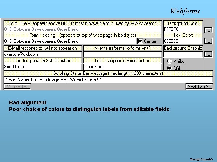
Webforms Bad alignment Poor choice of colors to distinguish labels from editable fields Sheelagh Carpendale

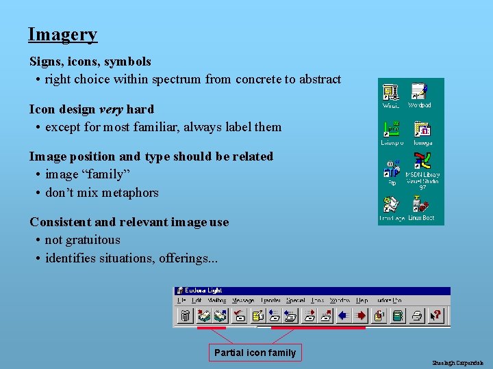
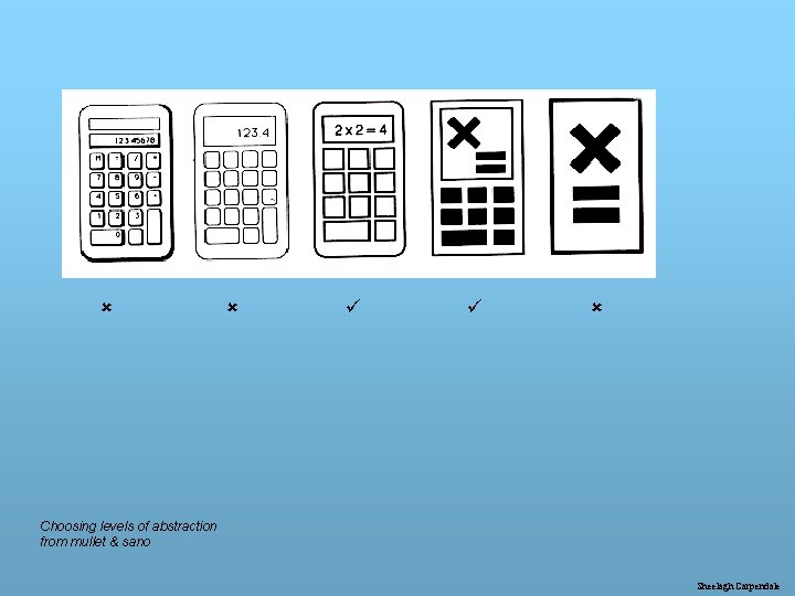
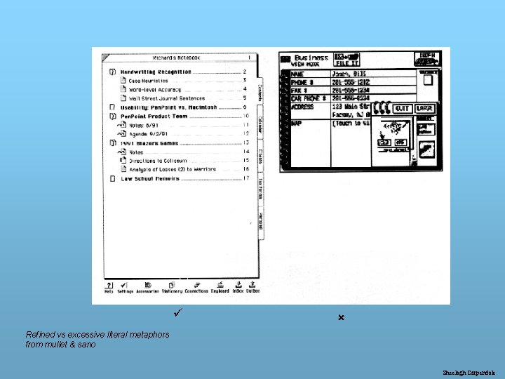
Imagery Signs, icons, symbols • right choice within spectrum from concrete to abstract Icon design very hard • except for most familiar, always label them Image position and type should be related • image “family” • don’t mix metaphors Consistent and relevant image use • not gratuitous • identifies situations, offerings. . . Partial icon family Sheelagh Carpendale

û û ü ü û Choosing levels of abstraction from mullet & sano Sheelagh Carpendale

ü û Refined vs excessive literal metaphors from mullet & sano Sheelagh Carpendale

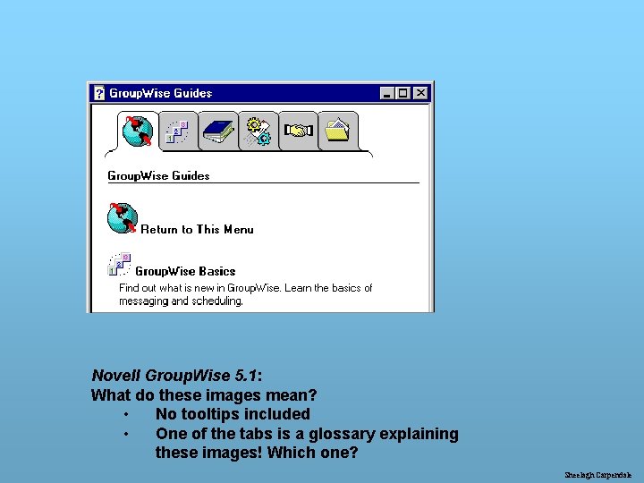
Novell Group. Wise 5. 1: What do these images mean? • No tooltips included • One of the tabs is a glossary explaining these images! Which one? Sheelagh Carpendale

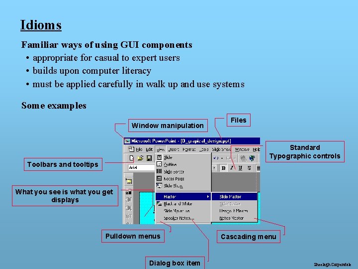
Idioms Familiar ways of using GUI components • appropriate for casual to expert users • builds upon computer literacy • must be applied carefully in walk up and use systems Some examples Window manipulation Files Standard Typographic controls Toolbars and tooltips What you see is what you get displays Pulldown menus Dialog box item Cascading menu Sheelagh Carpendale

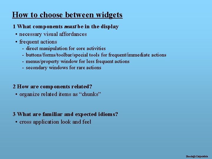
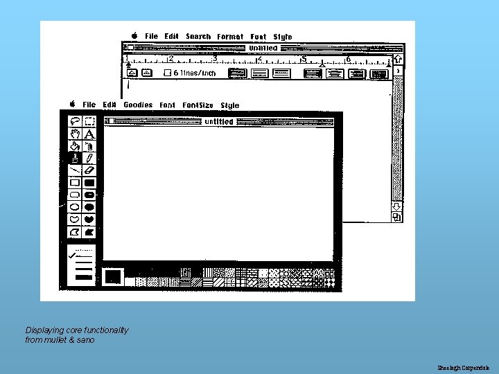
How to choose between widgets 1 What components must be in the display • necessary visual affordances • frequent actions - direct manipulation for core activities buttons/forms/toolbar/special tools for frequent/immediate actions menus/property window for less frequent actions secondary windows for rare actions 2 How are components related? • organize related items as “chunks” 3 What are familiar and expected idioms? • cross application look and feel Sheelagh Carpendale

Displaying core functionality from mullet & sano Sheelagh Carpendale

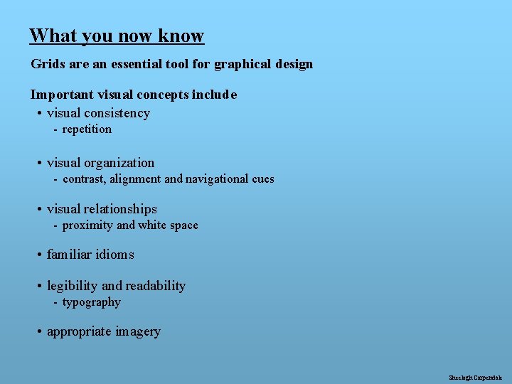
What you now know Grids are an essential tool for graphical design Important visual concepts include • visual consistency - repetition • visual organization - contrast, alignment and navigational cues • visual relationships - proximity and white space • familiar idioms • legibility and readability - typography • appropriate imagery Sheelagh Carpendale

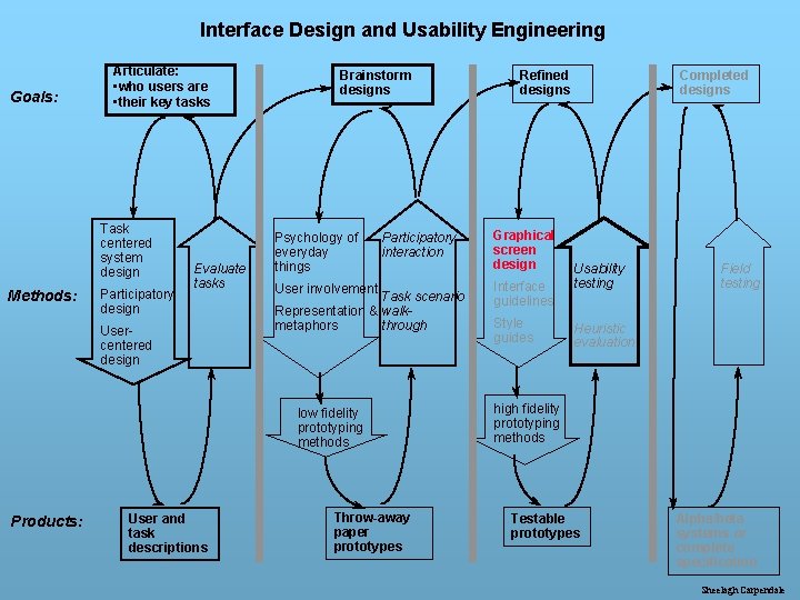
Interface Design and Usability Engineering Goals: Articulate: • who users are • their key tasks Task centered system design Methods: Participatory design Evaluate tasks Usercentered design Brainstorm designs Psychology of everyday things Participatory interaction User involvement Task scenario Representation & walkmetaphors through low fidelity prototyping methods Products: User and task descriptions Throw-away paper prototypes Refined designs Graphical screen design Interface guidelines Style guides Completed designs Usability testing Field testing Heuristic evaluation high fidelity prototyping methods Testable prototypes Alpha/beta systems or complete specification Sheelagh Carpendale