Graphical Screen Design CRAP Contrast repetition alignment proximity

- Slides: 61

Graphical Screen Design CRAP (Contrast, repetition, alignment, proximity) Grids An essential tool for graphical design Other important graphical screen design concepts Visual consistency Visual organization Appropriate imagery Familiar idioms Visual relationships Legibility and readability Navigational cues James Tam

The Squint Test Used to determine what stands out or what elements appear to belong together James Tam

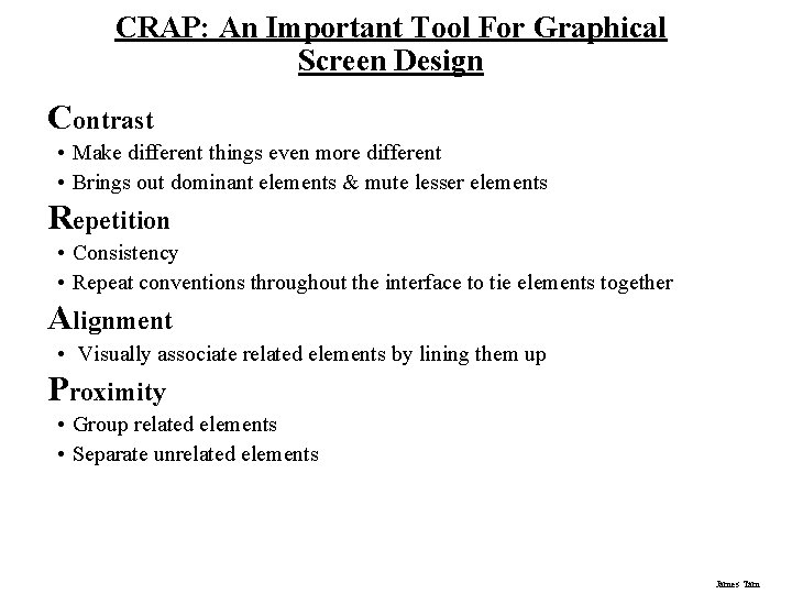
CRAP: An Important Tool For Graphical Screen Design Contrast • Make different things even more different • Brings out dominant elements & mute lesser elements Repetition • Consistency • Repeat conventions throughout the interface to tie elements together Alignment • Visually associate related elements by lining them up Proximity • Group related elements • Separate unrelated elements James Tam

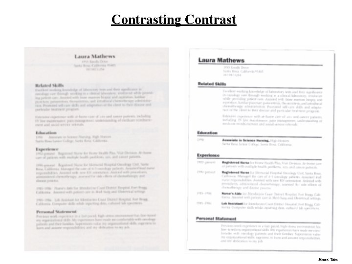
Contrasting Contrast James Tam

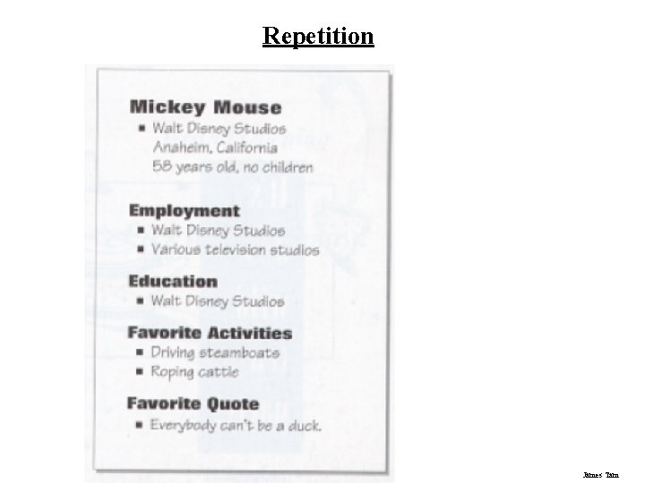
Repetition James Tam

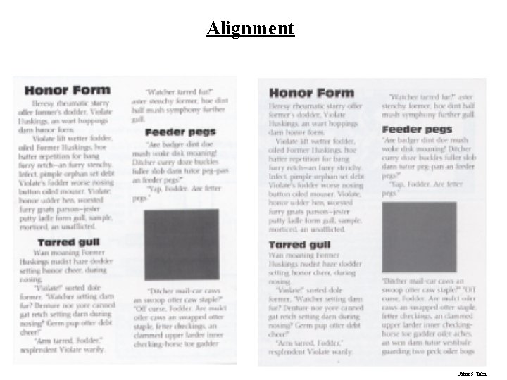
Alignment James Tam

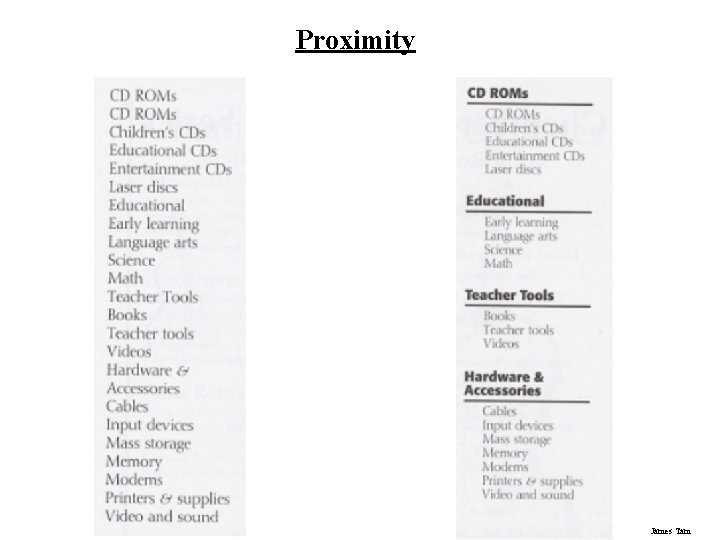
Proximity James Tam

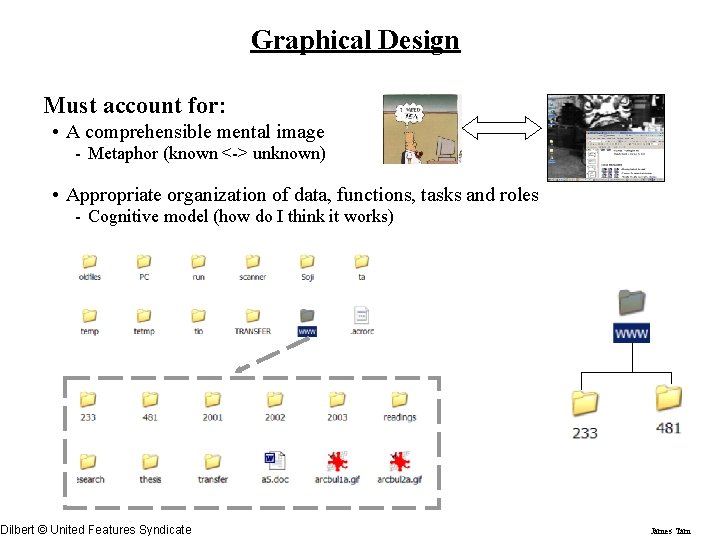
Graphical Design Must account for: • A comprehensible mental image - Metaphor (known <-> unknown) • Appropriate organization of data, functions, tasks and roles - Cognitive model (how do I think it works) Dilbert © United Features Syndicate James Tam

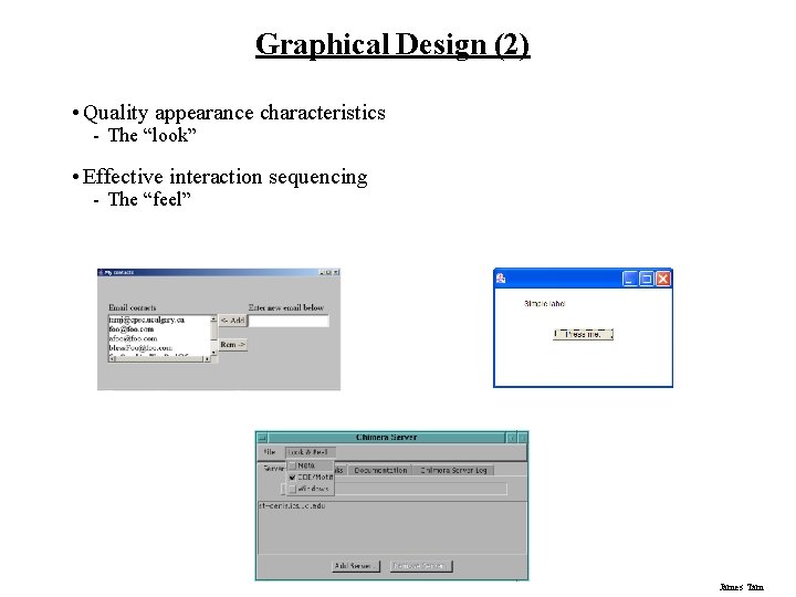
Graphical Design (2) • Quality appearance characteristics - The “look” • Effective interaction sequencing - The “feel” James Tam

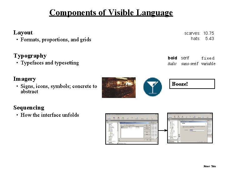
Components of Visible Language Layout • Formats, proportions, and grids Typography • Typefaces and typesetting Imagery • Signs, icons, symbols; concrete to abstract scarves: 10. 75 hats: 5. 43 bold serif fixed italic sans-serif variable Booze! Sequencing • How the interface unfolds James Tam

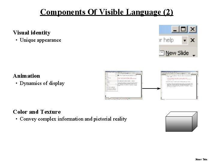
Components Of Visible Language (2) Visual identity • Unique appearance Animation • Dynamics of display Color and Texture • Convey complex information and pictorial reality James Tam

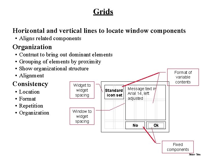
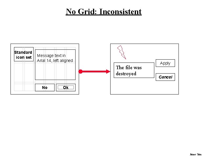
Grids Horizontal and vertical lines to locate window components • Aligns related components Organization • • Contrast to bring out dominant elements Grouping of elements by proximity Show organizational structure Alignment Consistency • • Location Format Repetition Organization Widget to widget spacing Window to widget spacing Standard icon set Format of variable contents Message text in Arial 14, left adjusted No Ok Fixed components James Tam

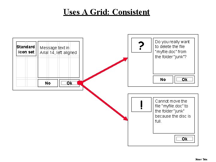
Uses A Grid: Consistent Standard icon set Message text in Arial 14, left aligned No ? Do you really want to delete the file “myfile. doc” from the folder “junk”? No Ok ! Ok Cannot move the file “myfile. doc” to the folder “junk” because the disc is full. Ok James Tam

No Grid: Inconsistent Standard icon set Message text in Arial 14, left aligned The file was destroyed No Apply Cancel Ok James Tam

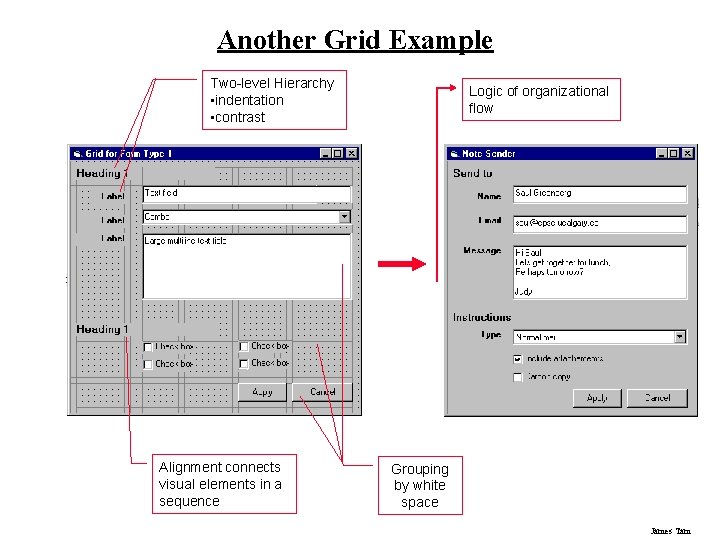
Another Grid Example Two-level Hierarchy • indentation • contrast Alignment connects visual elements in a sequence Logic of organizational flow Grouping by white space James Tam

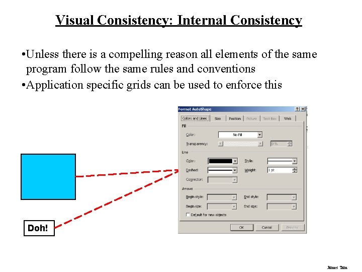
Visual Consistency: Internal Consistency • Unless there is a compelling reason all elements of the same program follow the same rules and conventions • Application specific grids can be used to enforce this Doh! James Tam

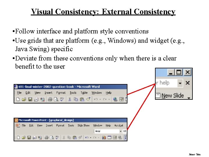
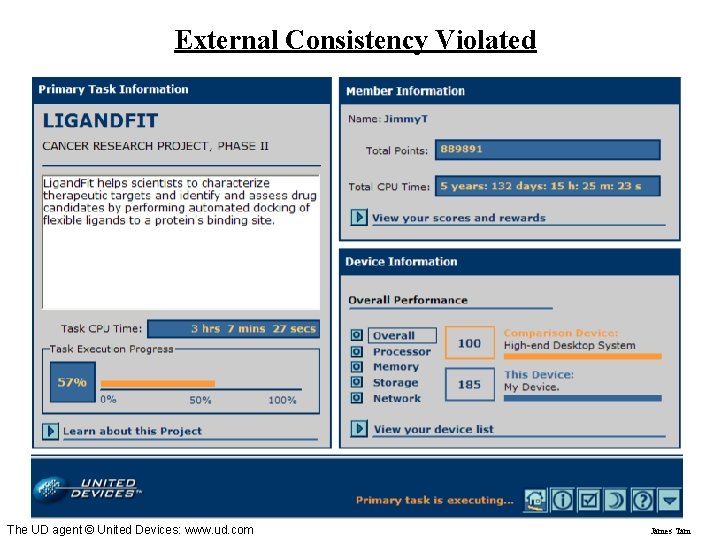
Visual Consistency: External Consistency • Follow interface and platform style conventions • Use grids that are platform (e. g. , Windows) and widget (e. g. , Java Swing) specific • Deviate from these conventions only when there is a clear benefit to the user James Tam

External Consistency Violated The UD agent © United Devices: www. ud. com James Tam

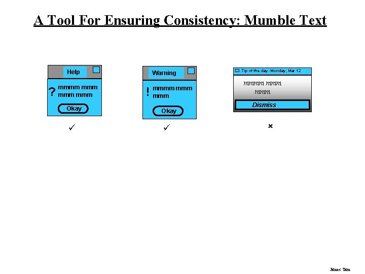
A Tool For Ensuring Consistency: Mumble Text Help ? mmmm mmm Warning ! mmmm mmm Okay ü ü Tip of the day: Monday, Mar 12 mmmm mmm Dismiss û James Tam

Structure Is Difficult To Ascertain sometimes be more a nuisance than a benefit. This was found to be the case in my own investigation of potential change display mechanisms summarized in Chapter 5 and published as Tam, Mc. Caffrey, Maurer, and Greenberg (2000). During this study, many test participants expressed a desire for useful abstractions that combine rudimentary change information into one higher-level conceptual change. For example, one participant noted while watching the animated replay of a class name being shown, “…I don’t need to see each and every character being typed just to see a name change!” Of course, care must be taken to make these abstractions understandable, e. g. , by using already familiar representations or notations. This minimizes the cost of acquiring information while maximizing its benefits due to the added structure and organization. Based upon my previous findings (to be discussed in Chapter 5), I add a third dimension, persistence, to Gutwin’s classification. Persistence refers to how long the information is displayed (Figure 4. 1 side pane). The display of information is permanent if it is always visible and passing if it only appears for a certain period. We noticed how study participants frequently complained when important information disappeared off the screen. Conversely, they also indicated that screen clutter might occur with the mechanisms that constantly displayed all changes. Thus, there’s a need to classify change information according to how long it should stay visible. With permanent persistence, the effort needed to find changes i. e. , the acquisition cost is low because the information is always there. Ideally, a person merely has to shift their gaze over to see the information. Because people can become accustomed to the occurrence of workspace events, they can also ignore things that do not interest them and pay closer attention to things that are of interest (Gutwin 1997). With passing persistence, information about changes is presented only for a limited duration. This is useful when the information applies only to a specific portion of the project (artifact or group of artifacts) being viewed, or when the change information otherwise becomes irrelevant. The matrix in Figure 4. 1 suggests that these dimensions can be combined, giving eight possibilities. For example, a literal, situated and passing display of changes is depicted in Figure 4. 2 a. The figure shows an animation of a changed circle (by using a ‘replay’ technique) where the circle literally retraces the path that it took as it was moved. It is situated because the animation occurs in the same place that the change actually happened. The persistence is ‘passing’ because once an animation has replayed a change, the information is gone. Figure 4. 2 b shows two other examples within a concept map editor. The first illustrates the symbolic, situated and permanent octant, where color value (shades of gray) is used to indicate changed ‘Jim’ and ‘Jack’ nodes. Thus, it is symbolic because changes are mapped to a gray scale value, situated because the shading is applied directly to the node that was changed, and permanent because the color values are always on. Figure 4. 2 b also portrays an example of the symbolic, separate, and passing octant, where a person can raise a node’s change details in a pop-up as a text description by mousing-over the node. Thus it is somewhat separate as the information appears outside the changed node, it is symbolic as it uses the text to describe the changes, and passing because the pop-up disappears when the person moves the mouse off the node (not quite on the node). In summary, these three dimensions provide the designer with a means of classifying change information. I now turn to other display issues, where we need to represent the change information in an easily understood and readily accessible fashion. James Tam

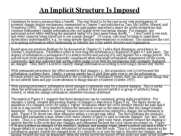
An Implicit Structure Is Imposed sometimes be more a nuisance than a benefit. This was found to be the case in my own investigation of potential change display mechanisms summarized in Chapter 5 and published as Tam, Mc. Caffrey, Maurer, and Greenberg (2000). During this study, many test participants expressed a desire for useful abstractions that combine rudimentary change information into one higher-level conceptual change. For example, one participant noted while watching the animated replay of a class name being shown, “…I don’t need to see each and every character being typed just to see a name change!” Of course, care must be taken to make these abstractions understandable, e. g. , by using already familiar representations or notations. This minimizes the cost of acquiring information while maximizing its benefits due to the added structure and organization. Based upon my previous findings (to be discussed in Chapter 5), I add a third dimension, persistence, to Gutwin’s classification. Persistence refers to how long the information is displayed (Figure 4. 1 side pane). The display of information is permanent if it is always visible and passing if it only appears for a certain period. We noticed how study participants frequently complained when important information disappeared off the screen. Conversely, they also indicated that screen clutter might occur with the mechanisms that constantly displayed all changes. Thus, there’s a need to classify change information according to how long it should stay visible. With permanent persistence, the effort needed to find changes i. e. , the acquisition cost is low because the information is always there. Ideally, a person merely has to shift their gaze over to see the information. Because people can become accustomed to the occurrence of workspace events, they can also ignore things that do not interest them and pay closer attention to things that are of interest (Gutwin 1997). With passing persistence, information about changes is presented only for a limited duration. This is useful when the information applies only to a specific portion of the project (artifact or group of artifacts) being viewed, or when the change information otherwise becomes irrelevant. The matrix in Figure 4. 1 suggests that these dimensions can be combined, giving eight possibilities. For example, a literal, situated and passing display of changes is depicted in Figure 4. 2 a. The figure shows an animation of a changed circle (by using a ‘replay’ technique) where the circle literally retraces the path that it took as it was moved. It is situated because the animation occurs in the same place that the change actually happened. The persistence is ‘passing’ because once an animation has replayed a change, the information is gone. Figure 4. 2 b shows two other examples within a concept map editor. The first illustrates the symbolic, situated and permanent octant, where color value (shades of gray) is used to indicate changed ‘Jim’ and ‘Jack’ nodes. Thus, it is symbolic because changes are mapped to a gray scale value, situated because the shading is applied directly to the node that was changed, and permanent because the color values are always on. Figure 4. 2 b also portrays an example of the symbolic, separate, and passing octant, where a person can raise a node’s change details in a pop-up as a text description by mousing-over the node. Thus it is somewhat separate as the information appears outside the changed node, it is symbolic as it uses the text to describe the changes, and James Tam passing because the pop-up disappears when the person moves the mouse off the node (not quite on the node).

Structure Is Implied With White Space With permanent persistence, the effort needed to find changes i. e. , the acquisition cost is low because the information is always there. Ideally, a person merely has to shift their gaze over to see the information. Because people can become accustomed to the occurrence of workspace events, they can also ignore things that do not interest them and pay closer attention to things that are of interest (Gutwin 1997). With passing persistence, information about changes is presented only for a limited duration. This is useful when the information applies only to a specific portion of the project (artifact or group of artifacts) being viewed, or when the change information otherwise becomes irrelevant. The matrix in Figure 4. 1 suggests that these dimensions can be combined, giving eight possibilities. For example, a literal, situated and passing display of changes is depicted in Figure 4. 2 a. The figure shows an animation of a changed circle (by using a ‘replay’ technique) where the circle literally retraces the path that it took as it was moved. It is situated because the animation occurs in the same place that the change actually happened. The persistence is ‘passing’ because once an animation has replayed a change, the information is gone. Figure 4. 2 b shows two other examples within a concept map editor. The first illustrates the symbolic, situated and permanent octant, where color value (shades of gray) is used to indicate changed ‘Jim’ and ‘Jack’ nodes. Thus, it is symbolic because changes are mapped to a gray scale value, situated because the shading is applied directly to the node that was changed, and permanent because the color values are always on. Figure 4. 2 b also portrays an example of the symbolic, separate, and passing octant, where a person can raise a node’s change details in a pop-up as a text description by mousing-over the node. Thus it is somewhat separate as the information appears outside the changed node, it is symbolic as it uses the text to describe the changes, and passing because the pop-up disappears when the person moves the mouse off the node (not quite on the node). In summary, these three dimensions provide the designer with a means of classifying change information. I now turn to other display issues, where we need to represent the change information in an easily understood and readily accessible fashion. James Tam

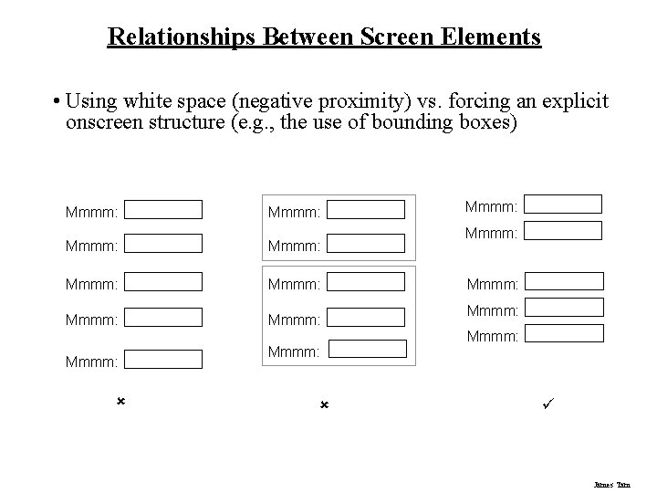
Relationships Between Screen Elements • Using white space (negative proximity) vs. forcing an explicit onscreen structure (e. g. , the use of bounding boxes) Mmmm: Mmmm: Mmmm: û Mmmm: Mmmm: ü James Tam

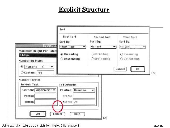
Explicit Structure Using explicit structure as a crutch from Mullet & Sano page 31 James Tam

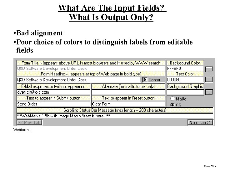
What Are The Input Fields? What Is Output Only? • Bad alignment • Poor choice of colors to distinguish labels from editable fields Webforms James Tam

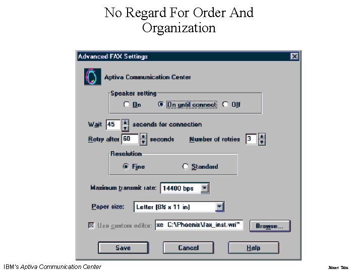
No Regard For Order And Organization IBM's Aptiva Communication Center James Tam

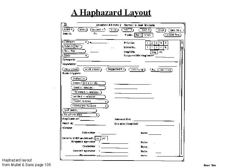
A Haphazard Layout Haphazard layout from Mullet & Sano page 105 James Tam

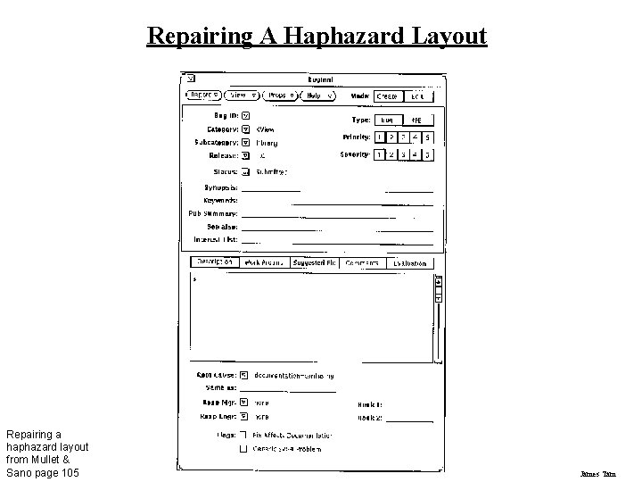
Repairing A Haphazard Layout Repairing a haphazard layout from Mullet & Sano page 105 James Tam

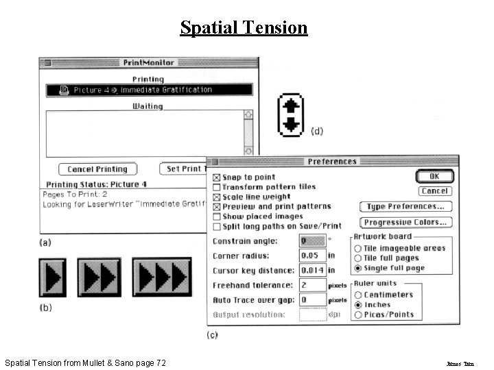
Spatial Tension from Mullet & Sano page 72 James Tam

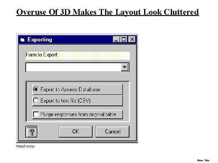
Overuse Of 3 D Makes The Layout Look Cluttered Web. Forms James Tam

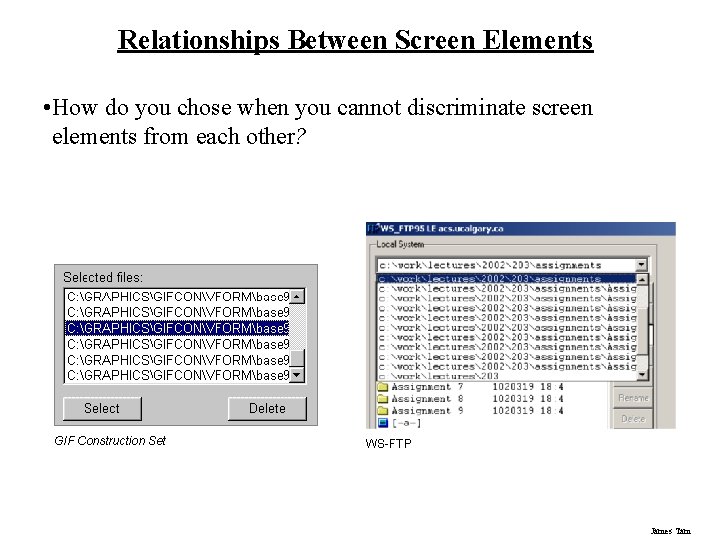
Relationships Between Screen Elements • How do you chose when you cannot discriminate screen elements from each other? GIF Construction Set WS-FTP James Tam

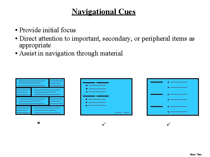
Navigational Cues • Provide initial focus • Direct attention to important, secondary, or peripheral items as appropriate • Assist in navigation through material û ü ü James Tam

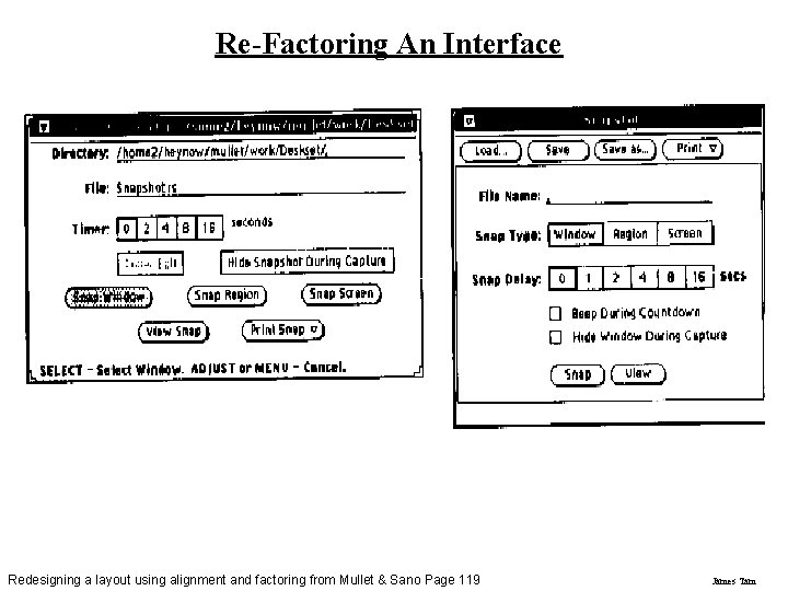
Re-Factoring An Interface Redesigning a layout using alignment and factoring from Mullet & Sano Page 119 James Tam

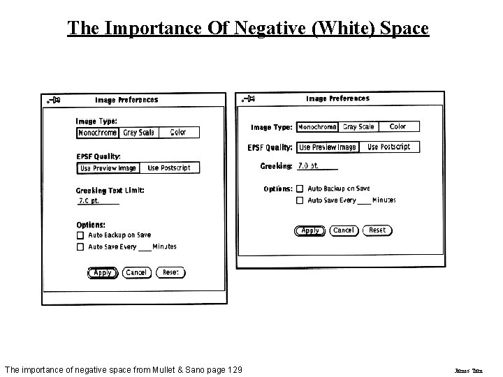
The Importance Of Negative (White) Space The importance of negative space from Mullet & Sano page 129 James Tam

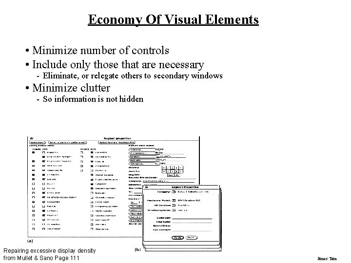
Economy Of Visual Elements • Minimize number of controls • Include only those that are necessary - Eliminate, or relegate others to secondary windows • Minimize clutter - So information is not hidden Repairing excessive display density from Mullet & Sano Page 111 James Tam

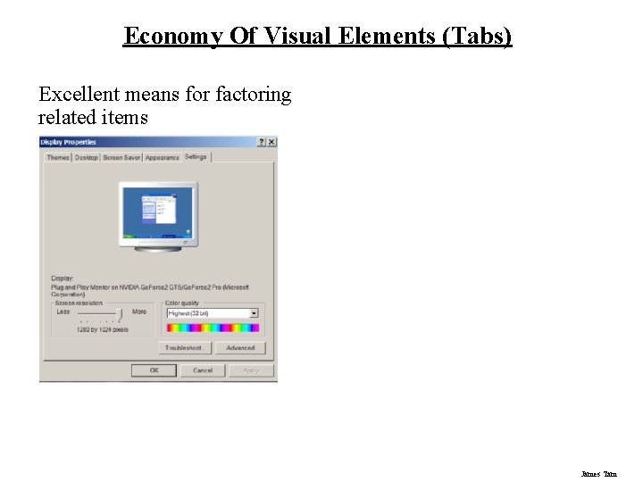
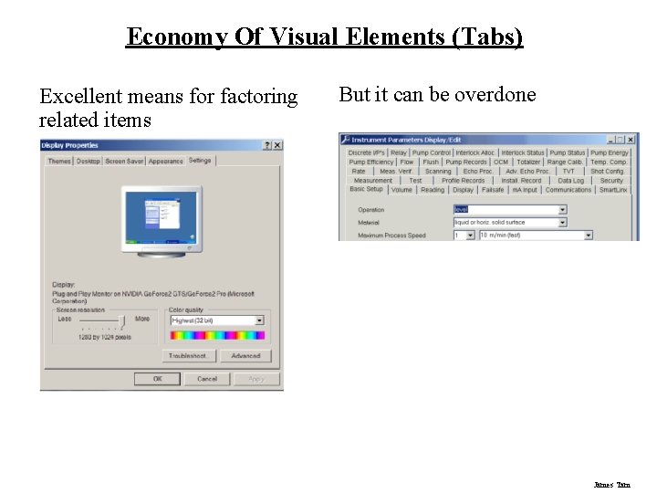
Economy Of Visual Elements (Tabs) Excellent means for factoring related items James Tam

Economy Of Visual Elements (Tabs) Excellent means for factoring related items But it can be overdone James Tam

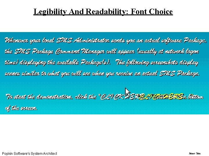
Legibility And Readability: Font Choice Popkin Software's System Architect James Tam

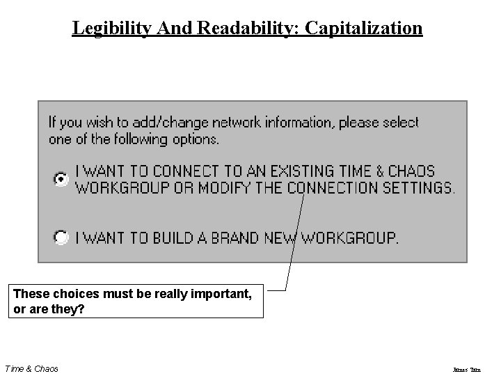
Legibility And Readability: Capitalization These choices must be really important, or are they? Time & Chaos James Tam

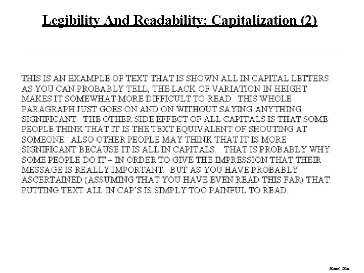
Legibility And Readability: Capitalization (2) James Tam

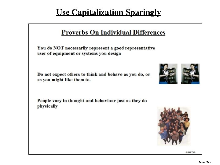
Use Capitalization Sparingly James Tam

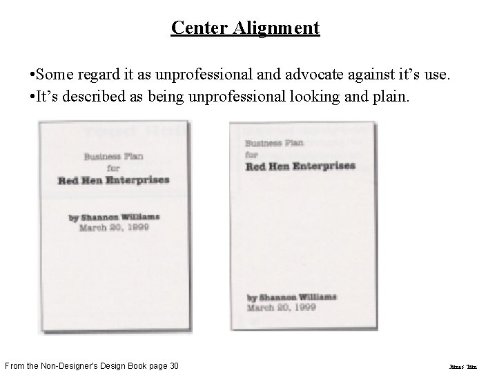
Center Alignment • Some regard it as unprofessional and advocate against it’s use. • It’s described as being unprofessional looking and plain. From the Non-Designer’s Design Book page 30 James Tam

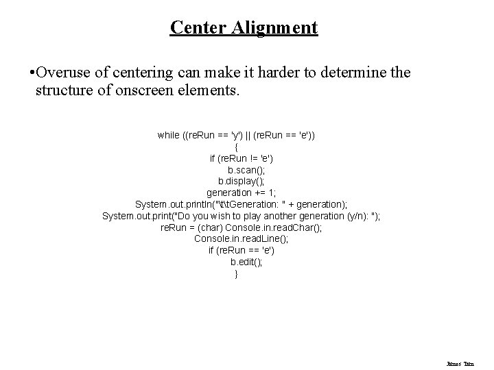
Center Alignment • Overuse of centering can make it harder to determine the structure of onscreen elements. while ((re. Run == 'y') || (re. Run == 'e')) { if (re. Run != 'e') b. scan(); b. display(); generation += 1; System. out. println("tt. Generation: " + generation); System. out. print("Do you wish to play another generation (y/n): "); re. Run = (char) Console. in. read. Char(); Console. in. read. Line(); if (re. Run == 'e') b. edit(); } James Tam

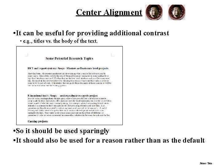
Center Alignment • It can be useful for providing additional contrast • e. g. , titles vs. the body of the text. l • So it should be used sparingly • It should also be used for a reason rather than as the default James Tam

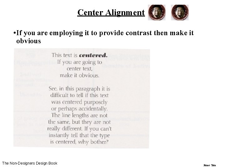
Center Alignment • If you are employing it to provide contrast then make it obvious l The Non-Designers Design Book James Tam

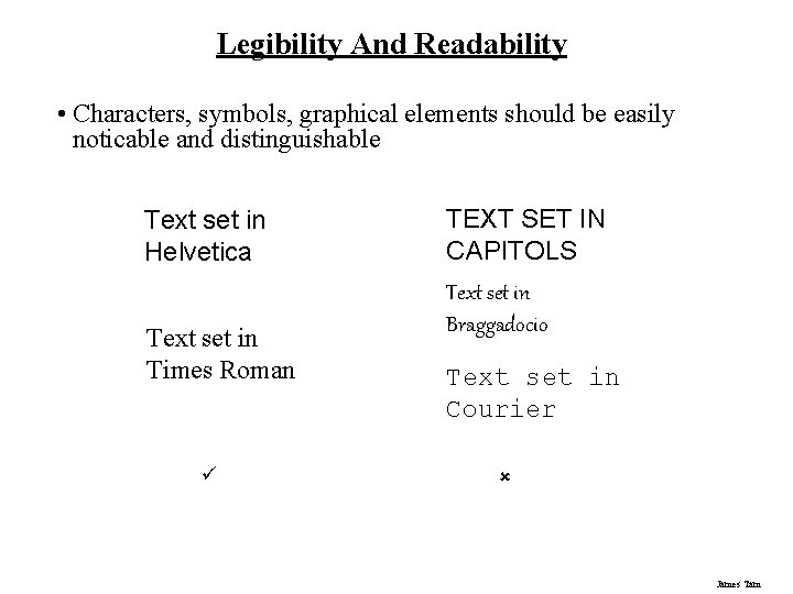
Legibility And Readability • Characters, symbols, graphical elements should be easily noticable and distinguishable Text set in Helvetica Text set in Times Roman ü TEXT SET IN CAPITOLS Text set in Braggadocio Text set in Courier û James Tam

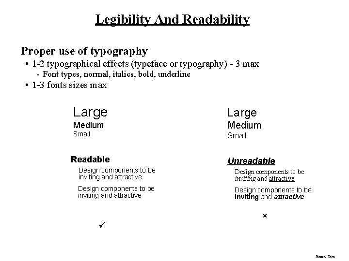
Legibility And Readability Proper use of typography • 1 -2 typographical effects (typeface or typography) - 3 max - Font types, normal, italics, bold, underline • 1 -3 fonts sizes max Large Medium Small Readable Unreadable Design components to be inviting and attractive ü û James Tam

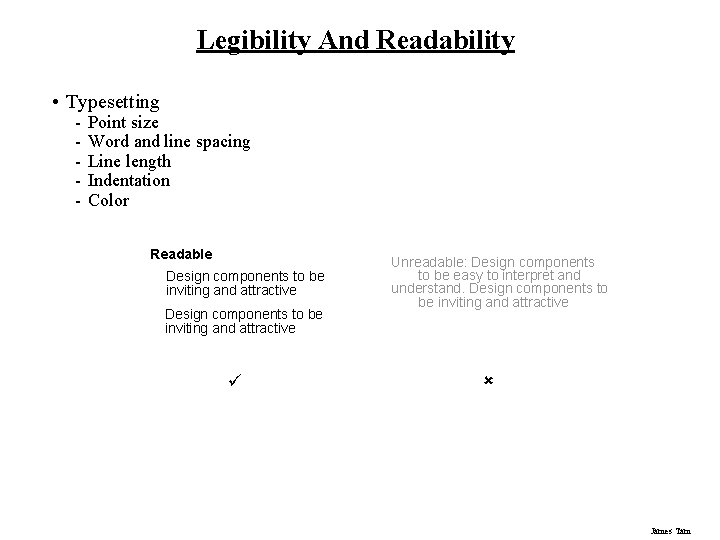
Legibility And Readability • Typesetting - Point size Word and line spacing Line length Indentation Color Readable Design components to be inviting and attractive ü Unreadable: Design components to be easy to interpret and understand. Design components to be inviting and attractive û James Tam

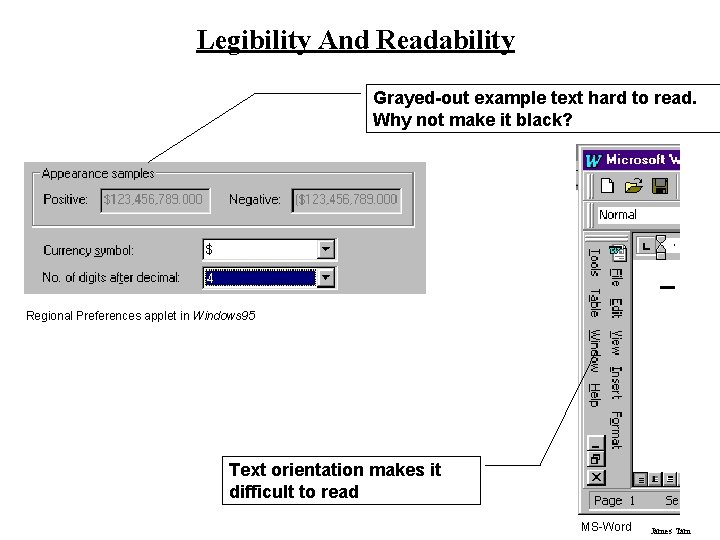
Legibility And Readability Grayed-out example text hard to read. Why not make it black? Regional Preferences applet in Windows 95 Text orientation makes it difficult to read MS-Word James Tam

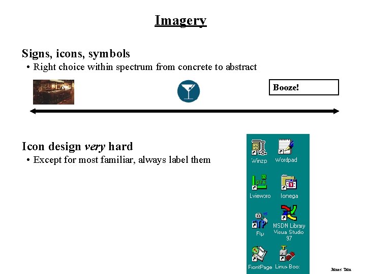
Imagery Signs, icons, symbols • Right choice within spectrum from concrete to abstract Booze! Icon design very hard • Except for most familiar, always label them James Tam

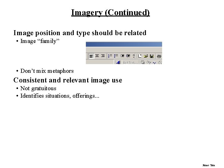
Imagery (Continued) Image position and type should be related • Image “family” • Don’t mix metaphors Consistent and relevant image use • Not gratuitous • Identifies situations, offerings. . . James Tam

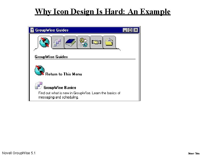
Why Icon Design Is Hard: An Example Novell Group. Wise 5. 1 James Tam

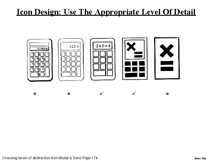
Icon Design: Use The Appropriate Level Of Detail û û Choosing levels of abstraction from Mullet & Sano Page 174 ü ü û James Tam

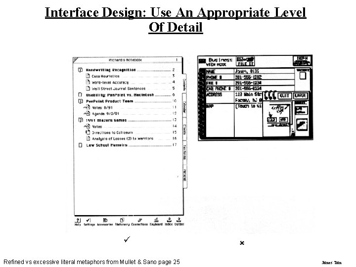
Interface Design: Use An Appropriate Level Of Detail ü Refined vs excessive literal metaphors from Mullet & Sano page 25 û James Tam

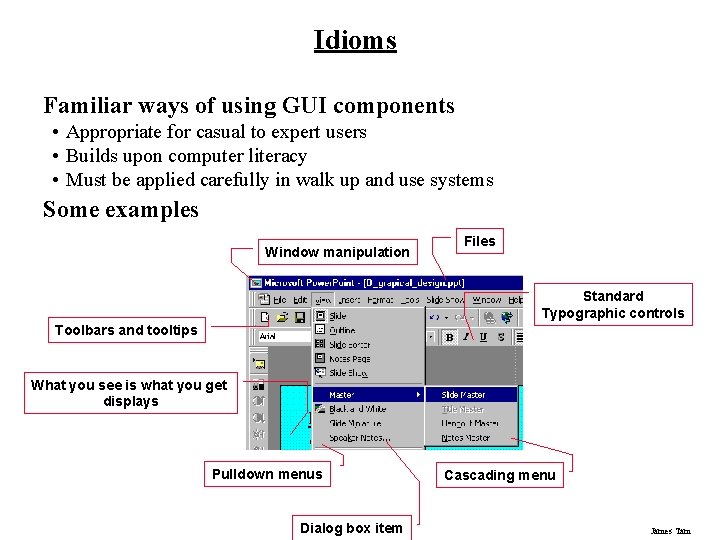
Idioms Familiar ways of using GUI components • Appropriate for casual to expert users • Builds upon computer literacy • Must be applied carefully in walk up and use systems Some examples Window manipulation Files Standard Typographic controls Toolbars and tooltips What you see is what you get displays Pulldown menus Dialog box item Cascading menu James Tam

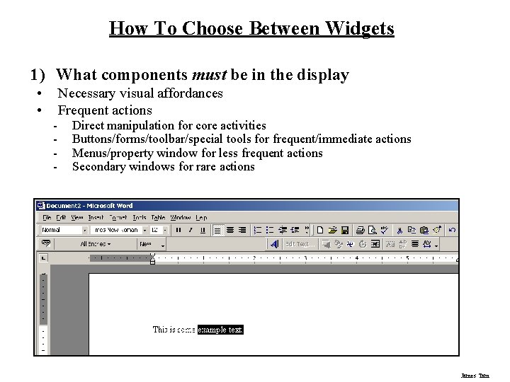
How To Choose Between Widgets 1) What components must be in the display • • - Necessary visual affordances Frequent actions Direct manipulation for core activities Buttons/forms/toolbar/special tools for frequent/immediate actions Menus/property window for less frequent actions Secondary windows for rare actions James Tam

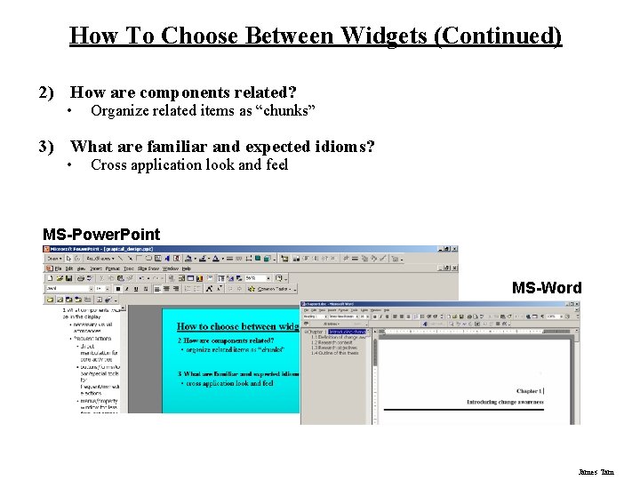
How To Choose Between Widgets (Continued) 2) How are components related? • Organize related items as “chunks” 3) What are familiar and expected idioms? • Cross application look and feel MS-Power. Point MS-Word James Tam

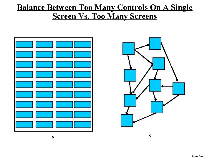
Balance Between Too Many Controls On A Single Screen Vs. Too Many Screens û û James Tam

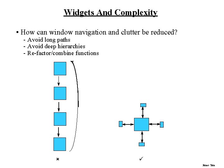
Widgets And Complexity • How can window navigation and clutter be reduced? - Avoid long paths - Avoid deep hierarchies - Re-factor/combine functions û ü James Tam

What You Now Know Grids and C. R. A. P. are essential tools for graphical design Important visual concepts include • Visual consistency - Repetition • Visual organization - Contrast, alignment and navigational cues • Visual relationships - Proximity and white space • Familiar idioms • Legibility and readability - Typography • Appropriate imagery James Tam

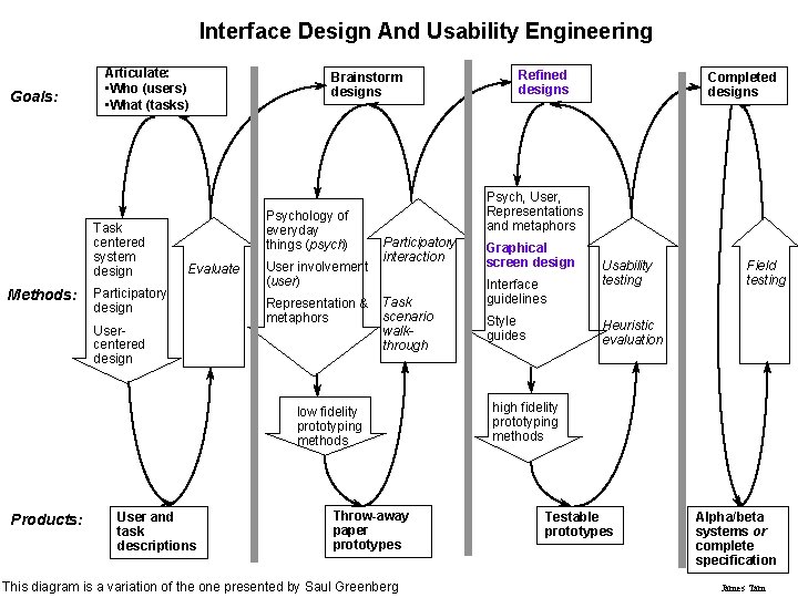
Interface Design And Usability Engineering Goals: Articulate: • Who (users) • What (tasks) Task centered system design Methods: Brainstorm designs Psychology of everyday things (psych) Evaluate Participatory design Usercentered design User involvement (user) Representation & metaphors User and task descriptions Completed designs Psych, User, Representations and metaphors Participatory interaction Task scenario walkthrough low fidelity prototyping methods Products: Refined designs Throw-away paper prototypes This diagram is a variation of the one presented by Saul Greenberg Graphical screen design Interface guidelines Style guides Usability testing Field testing Heuristic evaluation high fidelity prototyping methods Testable prototypes Alpha/beta systems or complete specification James Tam