Graphical Designs Multimedia Project Churchill Sixth Form Social
- Slides: 27

Graphical Designs: Multimedia Project: Churchill Sixth Form Social Life Project Manager: Huw Lawrence Hunt Client: Mr Branch Senior Manager: Mr Stephens Peer Reviewer: Thomas Wilson

Contents: • • • Slide 3 Site Map Design Slide 5 Colour Designs Slide 9 Page Layout Designs Slide 25 Font Selection Designs Slide 27 Logo Designs

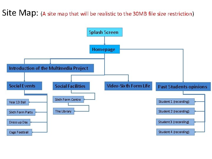
Site Map: (A site map that will be realistic to the 30 MB file size restriction) Splash Screen Homepage Introduction of the Multimedia Project Social Events Year 13 Ball Sixth Form Party Social Facilities Sixth Form Centre The Library Video-Sixth Form Life Past Students opinions Student 1 (recording) Student 2 (recording) Dress up Day Student 3 (recording) Cage Football Student 4 (recording)

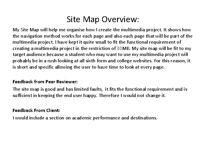
Site Map Overview: My Site Map will help me organise how I create the multimedia project. It shows how the navigation method works for each page and also each page that will be part of the multimedia project. I have kept it quite small to fit the functional requirement of creating a multimedia project in the restriction of 30 MB. My site map will be fit to my target audience because a student who may want to use my multimedia project will probably be in a rush looking at all sixth form and college websites. For this reason, it is short and specific allowing the user to have time to look at every page. Feedback from Peer Reviewer: The site map is good and has limited faults, it fits the functional requirement and is sufficient in keeping the end user happy. Therefore I would not change it. Feedback From Client: I would include a section on academic performance and destinations.

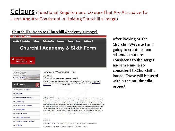
Colours (Functional Requirement: Colours That Are Attractive To Users And Are Consistent In Holding Churchill’s Image) Churchill’s Website (Churchill Academy's Image) After looking at The Churchill Website I am going to create colour schemes that are consistent to the target audience and also consistent to Churchill’s image. These will be used within the multimedia project.

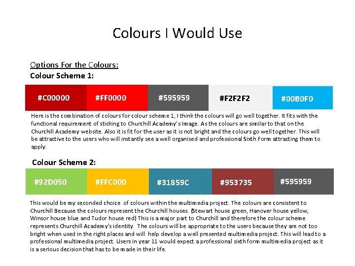
Colours I Would Use Options For the Colours: Colour Scheme 1: #C 00000 #FF 0000 #595959 #F 2 F 2 F 2 #00 B 0 F 0 Here is the combination of colours for colour scheme 1, I think the colours will go well together. It fits with the functional requirement of sticking to Churchill Academy’s Image. As the colours are similar to that on the Churchill Academy website. Also it is fit for the user as it is not bright and the colours go well together. This will be attractive to the users who will instantly see a well organised and professional Sixth Form attracting them to apply. Colour Scheme 2: #92 D 050 #FFC 000 #31859 C #953735 #595959 This would be my seconded choice of colours within the multimedia project. The colours are consistent to Churchill Because the colours represent the Churchill houses. (Stewart house green, Hanover house yellow, Winsor house blue and Tudor house red) This is a major part to Churchill and therefore the colour scheme represents Churchill Academy's identity. The colours will be appropriate to the users because they are not too bright when used in the right places and will help develop a well presented multimedia project. This will lead to a professional multimedia project. Users in year 11 would expect a professional sixth form multimedia project as it is a serious decision that has to be made in their life.

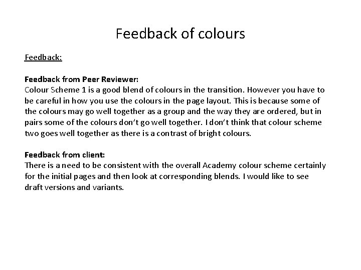
Feedback of colours Feedback: Feedback from Peer Reviewer: Colour Scheme 1 is a good blend of colours in the transition. However you have to be careful in how you use the colours in the page layout. This is because some of the colours may go well together as a group and the way they are ordered, but in pairs some of the colours don’t go well together. I don’t think that colour scheme two goes well together as there is a contrast of bright colours. Feedback from client: There is a need to be consistent with the overall Academy colour scheme certainly for the initial pages and then look at corresponding blends. I would like to see draft versions and variants.

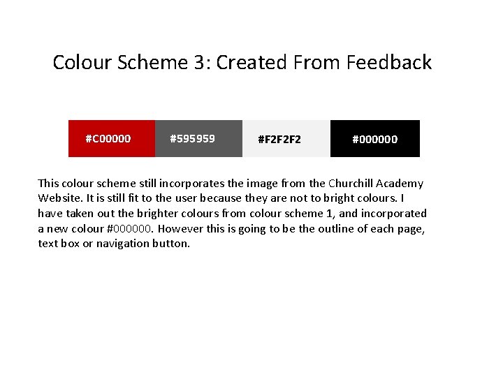
Colour Scheme 3: Created From Feedback #C 00000 #595959 #F 2 F 2 F 2 #000000 This colour scheme still incorporates the image from the Churchill Academy Website. It is still fit to the user because they are not to bright colours. I have taken out the brighter colours from colour scheme 1, and incorporated a new colour #000000. However this is going to be the outline of each page, text box or navigation button.

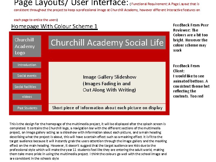
Page Layouts/ User Interface: ( Functional Requirement: A Page Layout that is consistent throughout the project to keep a professional image at Churchill Academy, however different interactive features on each page to entice the users) Homepage With Colour Scheme 1 Churchill Academy Logo Churchill Academy Social Life Introduction Social events Social facilities Image Gallery Slideshow (Images Fading in and Out Along With Writing) videos Past Students Short piece of Information about each picture on display This is the design for the homepage of the multimedia project, it will be displayed after the splash screen is completed. It contains the Churchill logo, a navigation bar with the different sections of the multimedia project, an image gallery acting as a slideshow with information about each picture, and a main heading describing what the project is about, this will have a certain effect such as a masking effect. It is fit to the target audience because it will instantly grab the users attention through the image gallery and the masking effect on the main heading. However, it doesn't suggest that the target audience are kids due to the professional style which will make the year 11 students feel like they are entering the adult world, making them take more pride in using the multimedia project. I think the colours go well with the school image and are consistent in the schools style. Feedback From Peer Reviewer: The Colours are a bit too bright. However the colour scheme may work Feedback From Client: I would like to see animated buttons. A consistent theme but reflecting the contents. Too red

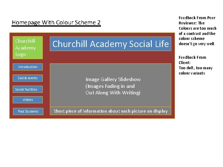
Homepage With Colour Scheme 2 Churchill Academy Logo Churchill Academy Social Life Feedback From Client: Too dull , too many colour variants Introduction Social events Social facilities Image Gallery Slideshow (Images Fading in and Out Along With Writing) videos Past Students Feedback From Peer Reviewer: The Colours are too much of a contrast and the colour scheme doesn't go very well. Short piece of Information about each picture on display

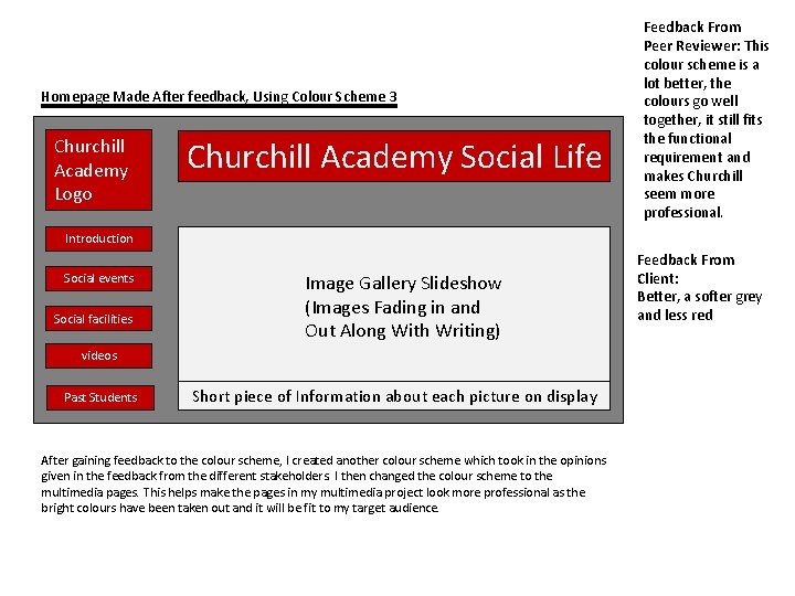
Homepage Made After feedback, Using Colour Scheme 3 Churchill Academy Logo Churchill Academy Social Life Feedback From Peer Reviewer: This colour scheme is a lot better, the colours go well together, it still fits the functional requirement and makes Churchill seem more professional. Introduction Social events Social facilities Image Gallery Slideshow (Images Fading in and Out Along With Writing) videos Past Students Short piece of Information about each picture on display After gaining feedback to the colour scheme, I created another colour scheme which took in the opinions given in the feedback from the different stakeholders. I then changed the colour scheme to the multimedia pages. This helps make the pages in my multimedia project look more professional as the bright colours have been taken out and it will be fit to my target audience. Feedback From Client: Better, a softer grey and less red

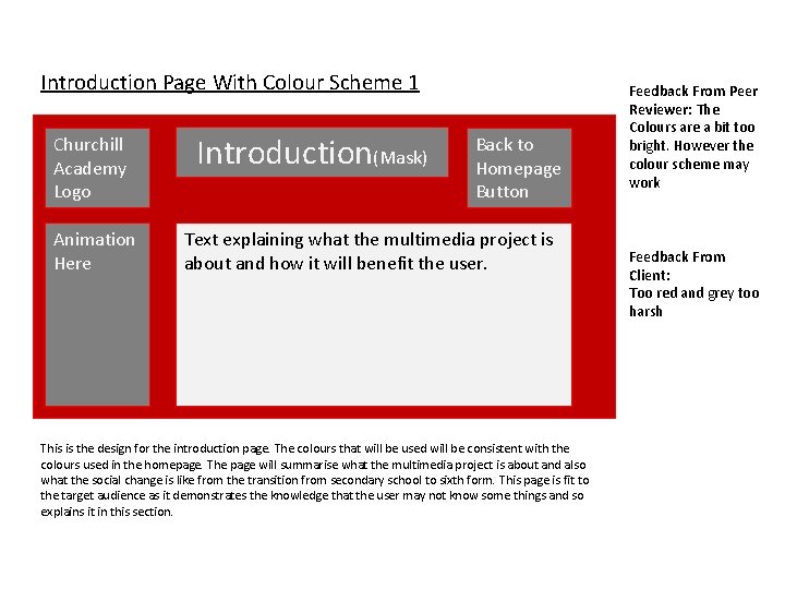
Introduction Page With Colour Scheme 1 Churchill Academy Logo Animation Here Introduction(Mask) Back to Homepage Button Text explaining what the multimedia project is about and how it will benefit the user. This is the design for the introduction page. The colours that will be used will be consistent with the colours used in the homepage. The page will summarise what the multimedia project is about and also what the social change is like from the transition from secondary school to sixth form. This page is fit to the target audience as it demonstrates the knowledge that the user may not know some things and so explains it in this section. Feedback From Peer Reviewer: The Colours are a bit too bright. However the colour scheme may work Feedback From Client: Too red and grey too harsh

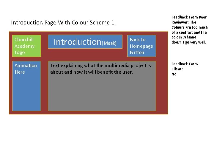
Introduction Page With Colour Scheme 1 Churchill Academy Logo Animation Here Introduction(Mask) Back to Homepage Button Text explaining what the multimedia project is about and how it will benefit the user. Feedback From Peer Reviewer: The Colours are too much of a contrast and the colour scheme doesn't go very well. Feedback From Client: No

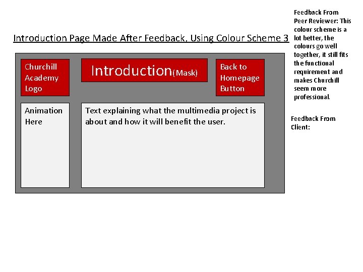
Introduction Page Made After Feedback, Using Colour Scheme 3 Churchill Academy Logo Animation Here Introduction(Mask) Back to Homepage Button Text explaining what the multimedia project is about and how it will benefit the user. Feedback From Peer Reviewer: This colour scheme is a lot better, the colours go well together, it still fits the functional requirement and makes Churchill seem more professional. Feedback From Client:

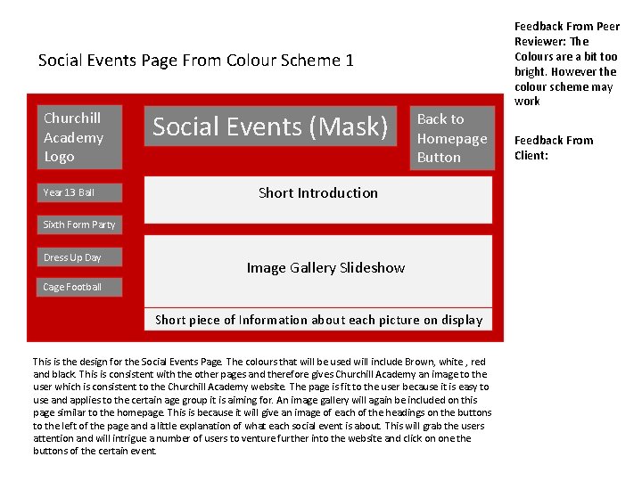
Social Events Page From Colour Scheme 1 Churchill Academy Logo Year 13 Ball Social Events (Mask) Back to Homepage Button Short Introduction Sixth Form Party Dress Up Day Image Gallery Slideshow Cage Football Short piece of Information about each picture on display This is the design for the Social Events Page. The colours that will be used will include Brown, white , red and black. This is consistent with the other pages and therefore gives Churchill Academy an image to the user which is consistent to the Churchill Academy website. The page is fit to the user because it is easy to use and applies to the certain age group it is aiming for. An image gallery will again be included on this page similar to the homepage. This is because it will give an image of each of the headings on the buttons to the left of the page and a little explanation of what each social event is about. This will grab the users attention and will intrigue a number of users to venture further into the website and click on one the buttons of the certain event. Feedback From Peer Reviewer: The Colours are a bit too bright. However the colour scheme may work Feedback From Client:

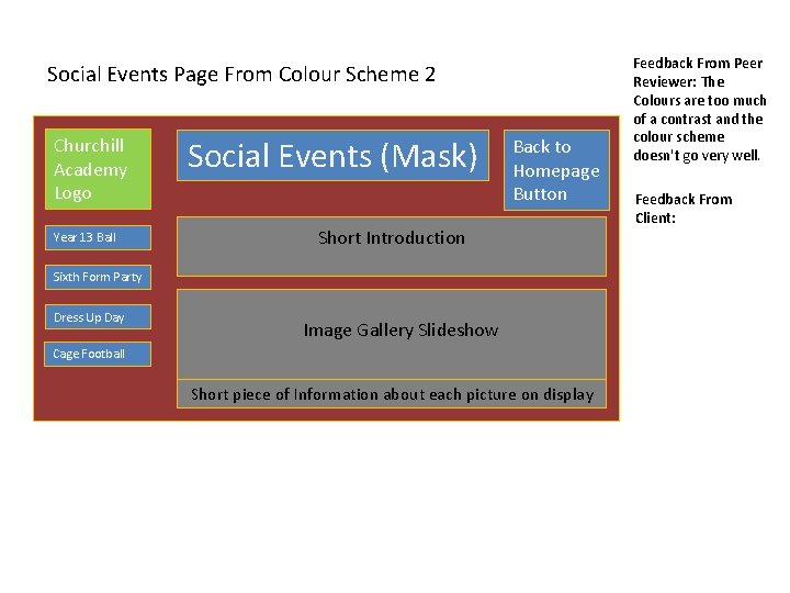
Social Events Page From Colour Scheme 2 Churchill Academy Logo Year 13 Ball Social Events (Mask) Back to Homepage Button Short Introduction Sixth Form Party Dress Up Day Image Gallery Slideshow Cage Football Short piece of Information about each picture on display Feedback From Peer Reviewer: The Colours are too much of a contrast and the colour scheme doesn't go very well. Feedback From Client:

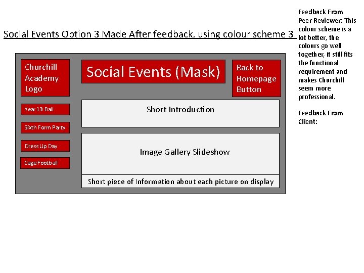
Social Events Option 3 Made After feedback, using colour scheme 3 Churchill Academy Logo Year 13 Ball Social Events (Mask) Back to Homepage Button Short Introduction Sixth Form Party Dress Up Day Image Gallery Slideshow Cage Football Short piece of Information about each picture on display Feedback From Peer Reviewer: This colour scheme is a lot better, the colours go well together, it still fits the functional requirement and makes Churchill seem more professional. Feedback From Client:

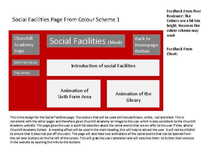
Social Facilities Page From Colour Scheme 1 Churchill Academy Logo Sixth Form Area Social Facilities (Mask) Back to Homepage Button Feedback From Peer Reviewer: The Colours are a bit too bright. However the colour scheme may work Feedback From Client: Introduction of social Facilities The Library Animation of Sixth Form Area Animation of the Library This is the design for the Social Facilities page. The colours that will be used will include Brown, white , red and black. This is consistent with the other pages and therefore gives Churchill Academy an image to the user which is also consistent to the Churchill Academy website. This page gives the user a quick introduction about the social events that are on offer to the user if they attend Churchill Academy School. A masking effect will be used in the main heading, this will help to attract the user. It will not be childish to ensure that it does not put-off the users. The page will also have two animations of the social events that can be opened from the roll over buttons on the far left of the screen. This will grab the users attention and will convince them to further their venture in the website by opening the links to the buttons.

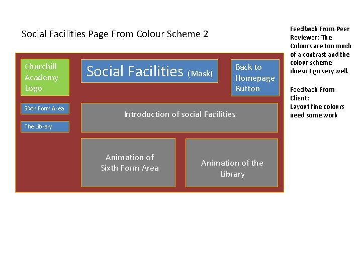
Social Facilities Page From Colour Scheme 2 Churchill Academy Logo Sixth Form Area Social Facilities (Mask) Back to Homepage Button Introduction of social Facilities The Library Animation of Sixth Form Area Animation of the Library Feedback From Peer Reviewer: The Colours are too much of a contrast and the colour scheme doesn't go very well. Feedback From Client: Layout fine colours need some work

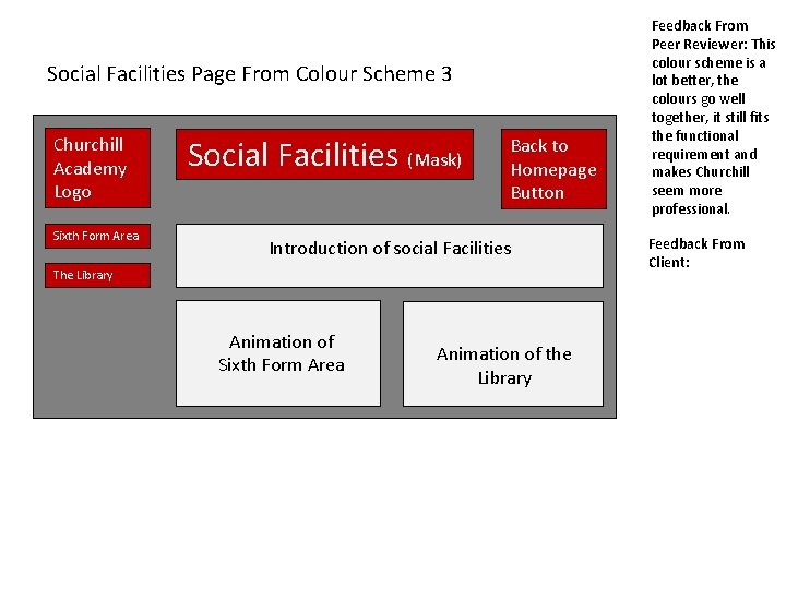
Social Facilities Page From Colour Scheme 3 Churchill Academy Logo Sixth Form Area Social Facilities (Mask) Back to Homepage Button Introduction of social Facilities The Library Animation of Sixth Form Area Animation of the Library Feedback From Peer Reviewer: This colour scheme is a lot better, the colours go well together, it still fits the functional requirement and makes Churchill seem more professional. Feedback From Client:

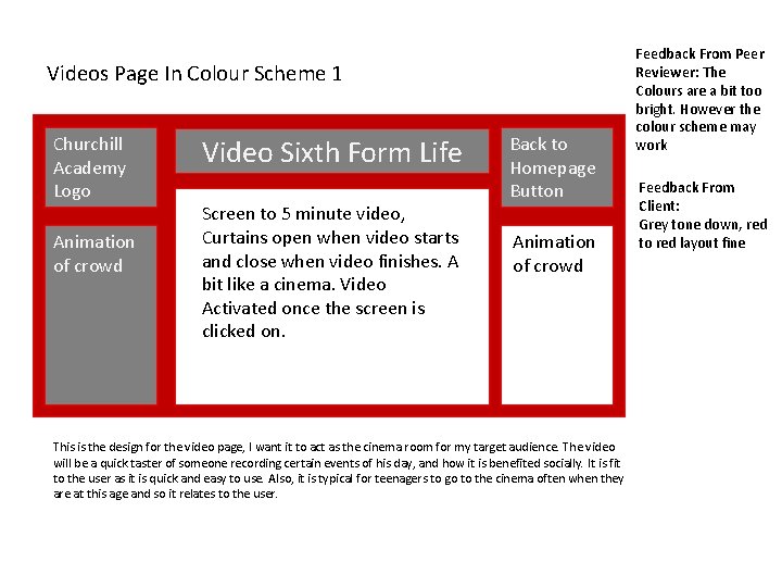
Videos Page In Colour Scheme 1 Churchill Academy Logo Animation of crowd Video Sixth Form Life Screen to 5 minute video, Curtains open when video starts and close when video finishes. A bit like a cinema. Video Activated once the screen is clicked on. Back to Homepage Button Animation of crowd This is the design for the video page, I want it to act as the cinema room for my target audience. The video will be a quick taster of someone recording certain events of his day, and how it is benefited socially. It is fit to the user as it is quick and easy to use. Also, it is typical for teenagers to go to the cinema often when they are at this age and so it relates to the user. Feedback From Peer Reviewer: The Colours are a bit too bright. However the colour scheme may work Feedback From Client: Grey tone down, red to red layout fine

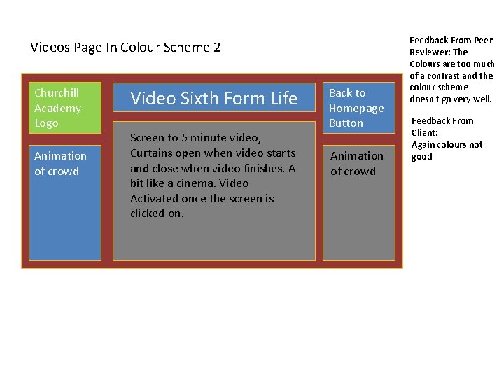
Videos Page In Colour Scheme 2 Churchill Academy Logo Animation of crowd Video Sixth Form Life Screen to 5 minute video, Curtains open when video starts and close when video finishes. A bit like a cinema. Video Activated once the screen is clicked on. Back to Homepage Button Animation of crowd Feedback From Peer Reviewer: The Colours are too much of a contrast and the colour scheme doesn't go very well. Feedback From Client: Again colours not good

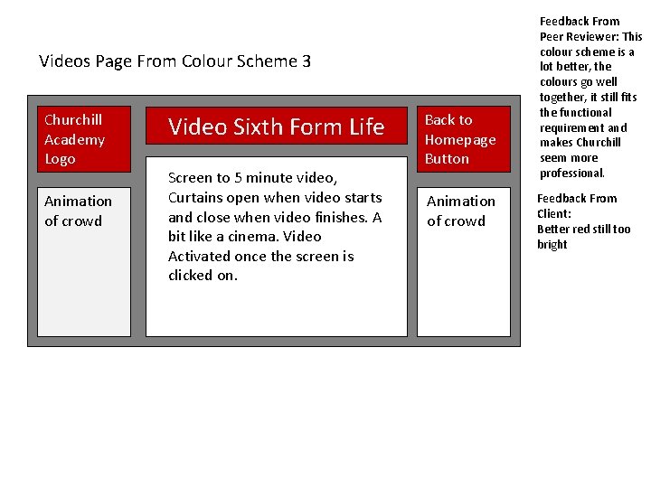
Videos Page From Colour Scheme 3 Churchill Academy Logo Animation of crowd Video Sixth Form Life Screen to 5 minute video, Curtains open when video starts and close when video finishes. A bit like a cinema. Video Activated once the screen is clicked on. Back to Homepage Button Animation of crowd Feedback From Peer Reviewer: This colour scheme is a lot better, the colours go well together, it still fits the functional requirement and makes Churchill seem more professional. Feedback From Client: Better red still too bright

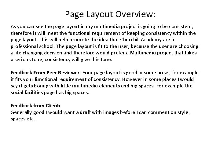
Page Layout Overview: As you can see the page layout in my multimedia project is going to be consistent, therefore it will meet the functional requirement of keeping consistency within the page layout. This will help promote the idea that Churchill Academy are a professional school. The page layout is fit to the user, because the user are choosing a life changing decision and therefore would prefer a Multimedia project that takes a serious tone, consistency will give this tone. Feedback From Peer Reviewer: Your page layout is good in some areas, for example it fits your functional requirement of consistency. However in some places I would say it gets boring with little multimedia elements and big spaces. For example the social facilities page has big spaces. Feedback from Client: Generally good I would want a draft with images before I can comment on style , spaces etc.

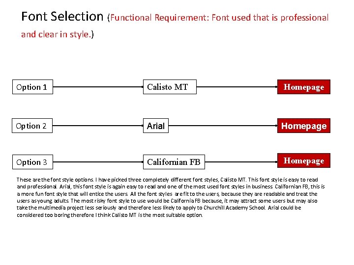
Font Selection (Functional Requirement: Font used that is professional and clear in style. ) Option 1 Calisto MT Homepage Option 2 Arial Homepage Option 3 Californian FB Homepage These are the font style options. I have picked three completely different font styles, Calisto MT. This font style is easy to read and professional. Arial, this font style is again easy to read and one of the most used font styles in business. Californian FB, this is a more fun font style that will entice the users. All the font styles are fit to the users, because they are readable and treat the users as young adults. The most risky font style to use would be California FB because, it may attract some users but may also take the multimedia project less seriously and therefore less likely to apply to Churchill Academy School. Arial could be considered too boring therefore I think Calisto MT is the most suitable option.

• Feedback From Peer Reviewer: The font option I think is most suitable for this multimedia project would be option 1 because it looks much more official and professional as opposed to option 2 which gives them a more relaxed sense, also option 3 is intimidating to the target audience. • • Feedback from Client: Option one with some changes as outlined • • From The Feedback From the feedback the font option I am going to choose is going to be:

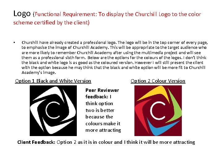
Logo (Functional Requirement: To display the Churchill Logo to the color scheme certified by the client) • Churchill have already created a professional logo. The logo will be in the top corner of every page, to emphasise the image of Churchill Academy. This will be appropriate to the target audience who are more likely to remember Churchill Academy after using the multimedia project and will see them as a professional sixth form. Below are the options for the colours of the logos. I don’t think the black and white logo is as good as the coloured version. However I will still present the client with the option because he may think that the black and white option will be more fit to Churchill Academy’s image. Option 1 Black and White Version Option 2 Colour Version Peer Reviewer feedback: I think option two is better because the colours make it more attracting Client Feedback: Option 2 as it is in colour and I think it will be more attracting