Graphic Representation A picture is worth a thousand
- Slides: 16

Graphic Representation “A picture is worth a thousand words” captures the value of using graphs to represent distributions.

Types of Graphs There are four common types of graphs used to represent frequency distributions: – bar graph – pie chart – histogram – frequency polygon

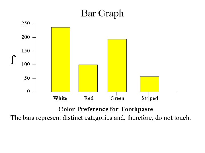
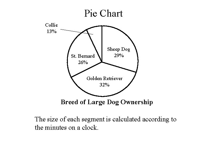
Types of Graphs Bar graph - a series of rectangles, each representing the frequency or relative frequency of values in an unordered or ordered variable. Pie chart - segmented circle in which each segment represents the frequency or relative frequency in an unordered variable.

Bar Graph 250 200 f 150 100 50 0 White Red Green Striped Color Preference for Toothpaste The bars represent distinct categories and, therefore, do not touch.

Pie Chart Collie 13% St. Bernard 26% Sheep Dog 29% Golden Retriever 32% Breed of Large Dog Ownership The size of each segment is calculated according to the minutes on a clock.

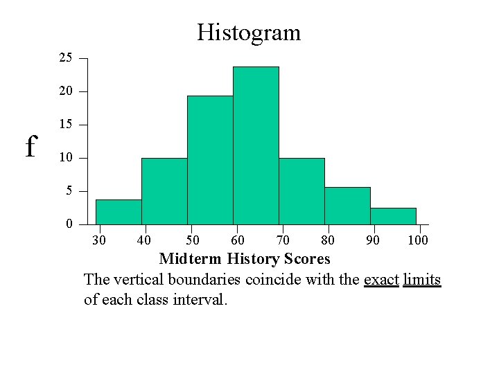
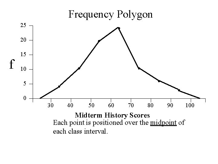
Types of Graphs Histogram - a series of rectangles, each representing the frequency or relative frequency of scores from a discrete or continuous variable. Frequency Polygon - a series of connected points, each representing the frequency or relative frequency of scores from a discrete or continuous variable.

Histogram 25 20 f 15 10 5 0 30 40 50 60 70 80 90 100 Midterm History Scores The vertical boundaries coincide with the exact limits of each class interval.

Frequency Polygon 25 20 f 15 10 5 0 30 40 50 60 70 80 90 Midterm History Scores Each point is positioned over the midpoint of each class interval. 100

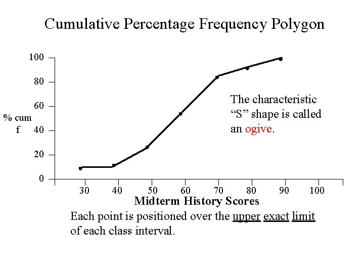
Cumulative Percentage Frequency Polygon 100 80 The characteristic “S” shape is called an ogive. 60 % cum f 40 20 0 30 40 50 60 70 80 90 100 Midterm History Scores Each point is positioned over the upper exact limit of each class interval.

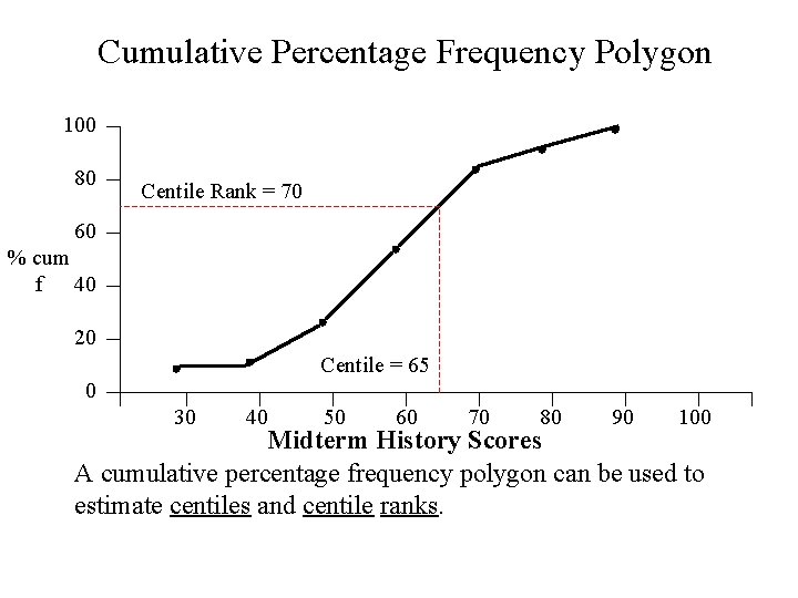
Cumulative Percentage Frequency Polygon 100 80 Centile Rank = 70 60 % cum f 40 20 Centile = 65 0 30 40 50 60 70 80 90 100 Midterm History Scores A cumulative percentage frequency polygon can be used to estimate centiles and centile ranks.

Describing Distributions • An important part of making sense of data is to describe frequency distributions. • There are four characteristics used for that purpose: – shape – kurtosis – central tendency – variability

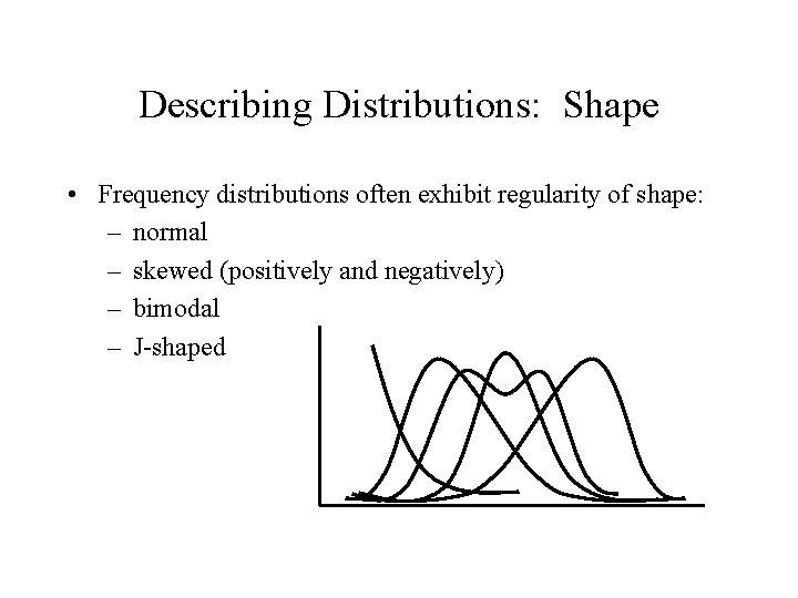
Describing Distributions: Shape • Frequency distributions often exhibit regularity of shape: – normal – skewed (positively and negatively) – bimodal – J-shaped

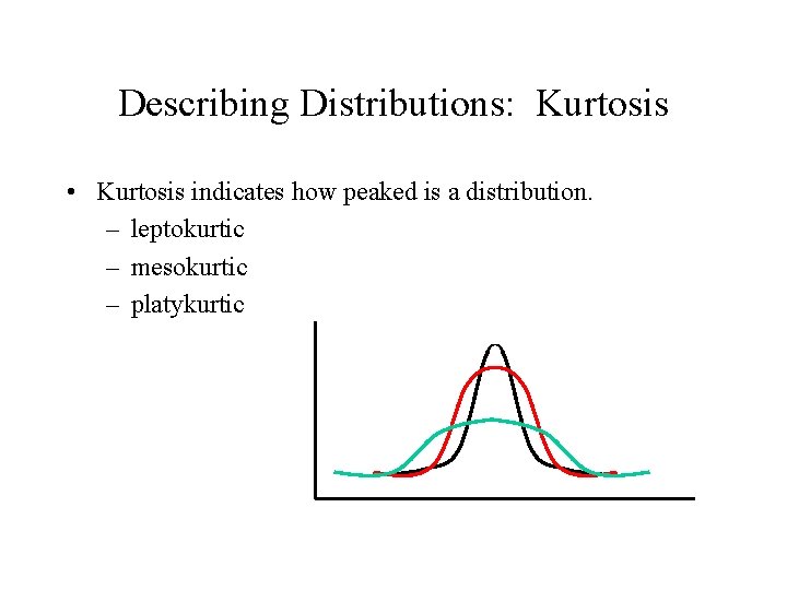
Describing Distributions: Kurtosis • Kurtosis indicates how peaked is a distribution. – leptokurtic – mesokurtic – platykurtic

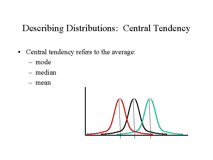
Describing Distributions: Central Tendency • Central tendency refers to the average: – mode – median – mean

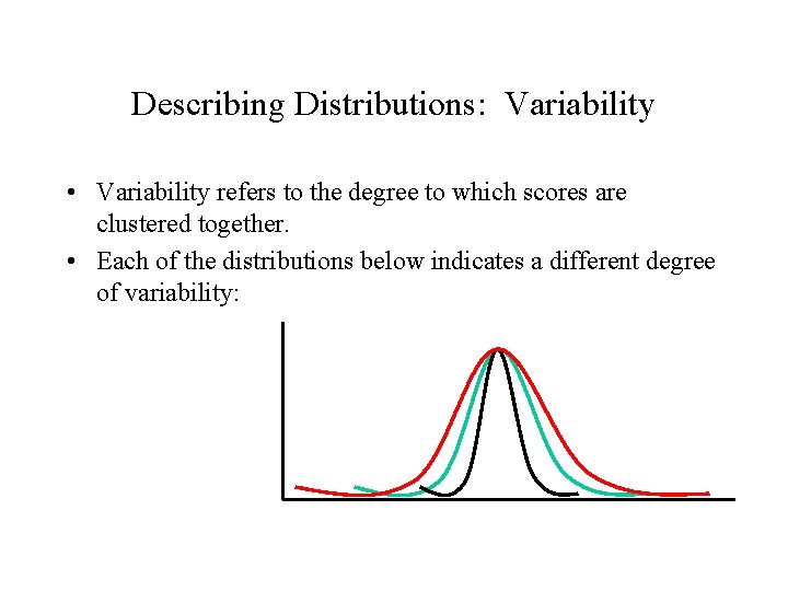
Describing Distributions: Variability • Variability refers to the degree to which scores are clustered together. • Each of the distributions below indicates a different degree of variability:

Describing Distributions • We will now consider “central tendency” and “variability” in greater detail.