GRAPHIC DESIGN The Magazine Cover The Design Principles

- Slides: 15

GRAPHIC DESIGN The Magazine Cover

The Design Principles Fonts Balance Proximity/Unity Alignment Repetition/Consistency Contrast White Space

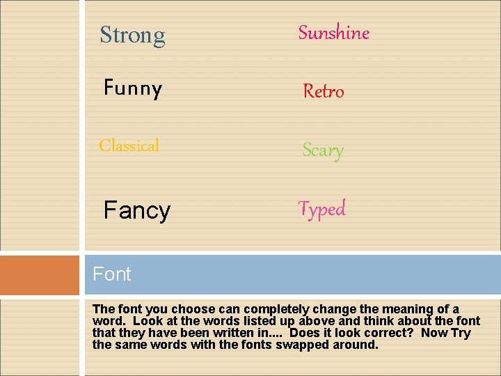
Strong Sunshine Funny Retro Classical Scary Fancy Typed Font The font you choose can completely change the meaning of a word. Look at the words listed up above and think about the font that they have been written in. . Does it look correct? Now Try the same words with the fonts swapped around.

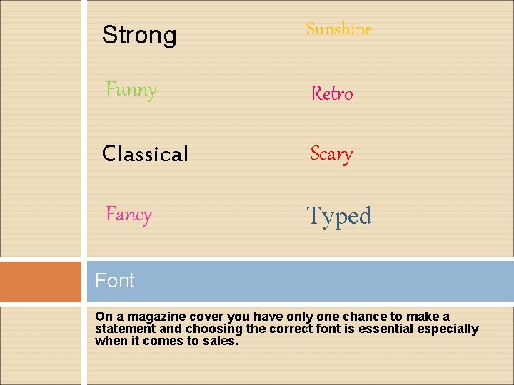
Strong Sunshine Funny Retro Classical Scary Fancy Typed Font On a magazine cover you have only one chance to make a statement and choosing the correct font is essential especially when it comes to sales.

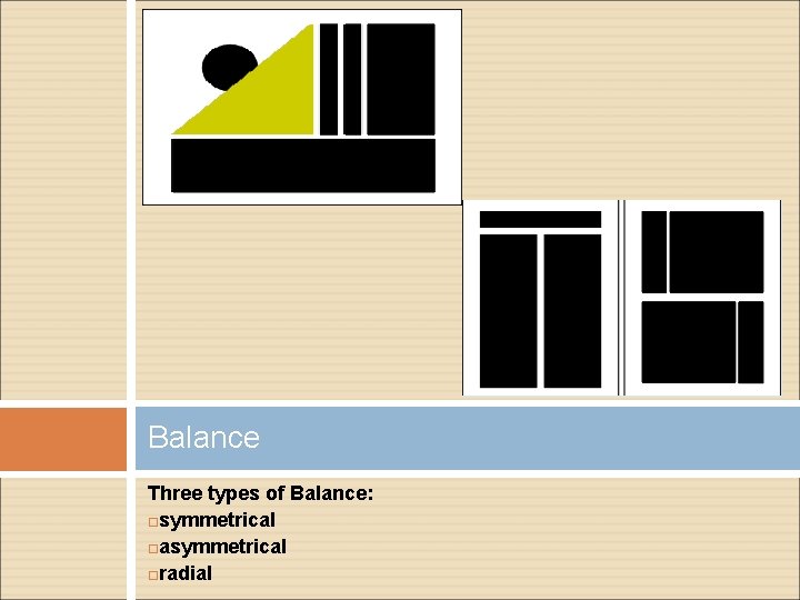
Balance allows the eye to flow easily over a page. Balance Three types of Balanc symmetrical asymmetrical radial

Balance Three types of Balance: symmetrical asymmetrical radial

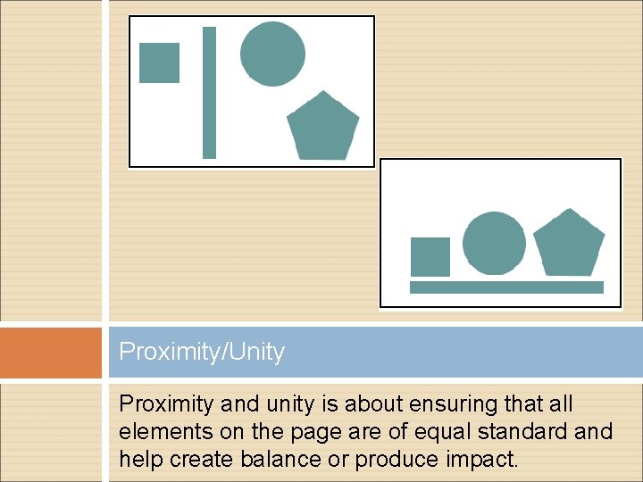
Proximity/Unity Proximity and unity is about ensuring that all elements on the page are of equal standard and help create balance or produce impact.

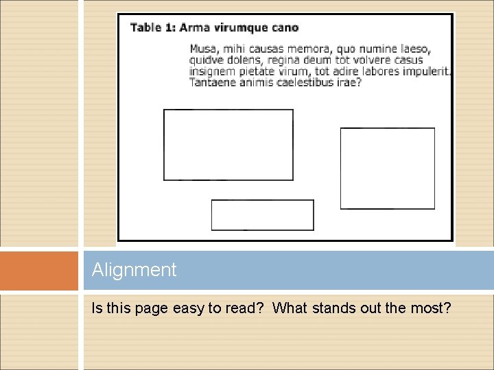
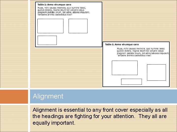
Alignment Is this page easy to read? What stands out the most?

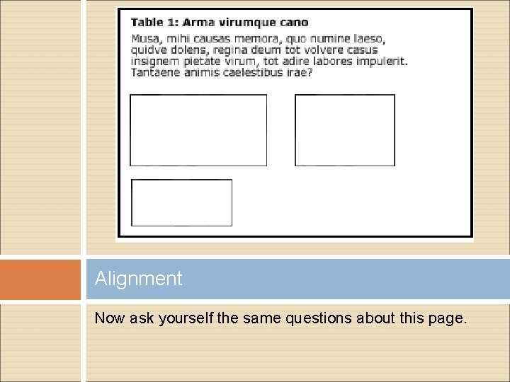
Alignment Now ask yourself the same questions about this page.

Alignment is essential to any front cover especially as all the headings are fighting for your attention. They all are equally important.

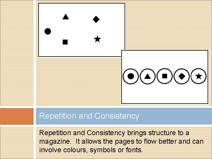
Repetition and Consistency brings structure to a magazine. It allows the pages to flow better and can involve colours, symbols or fonts.

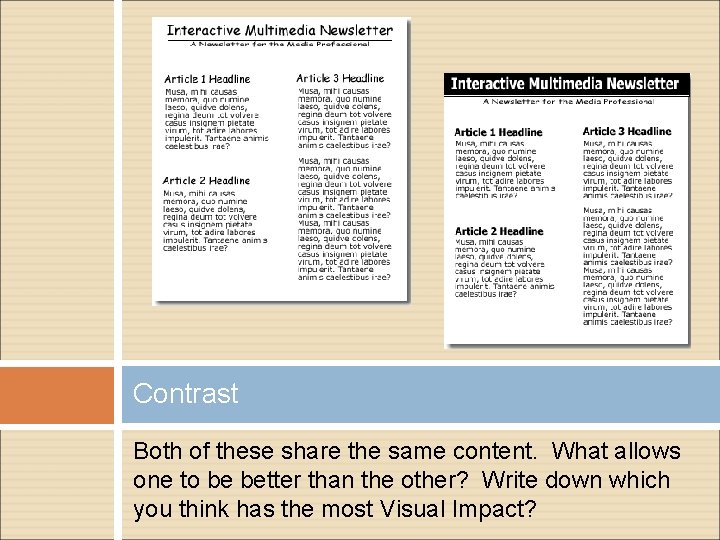
Contrast Both of these share the same content. What allows one to be better than the other? Write down which you think has the most Visual Impact?

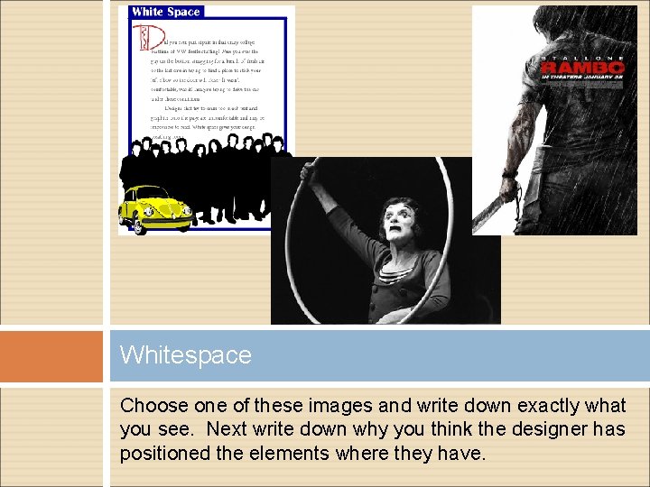
Whitespace Choose one of these images and write down exactly what you see. Next write down why you think the designer has positioned the elements where they have.

Collect a magazine and then begin to dissect it. Explore the different Graphic Principles mentioned in here and write down where and how they have been used. You might even find a few problems with the professionals. The Task Contrast Fonts Balance Repetition & Consistency Unity & Proximity Whitespace Alignment

Create the magazine cover and individual page for your magazine. The topic has been provided to you in your Brief Pack. You will create: A planning page of thumbnails A development of final idea (Drawn Visual) A final copy built using Photoshop Folio Work Health Music Gardening Fashion Sports Cars Hair and Beauty Film