Grade DE Scatter diagrams Use and interpret scatter
- Slides: 11

Grade D/E Scatter diagrams Use and interpret scatter graphs If you have any questions regarding these resources or come across any errors, please contact helpful-report@pixl. org. uk

Key Vocabulary Line of best fit Relationship Predict Estimate Trend Variable Positive correlation Negative correlation Outlier

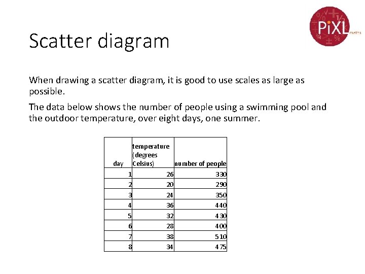
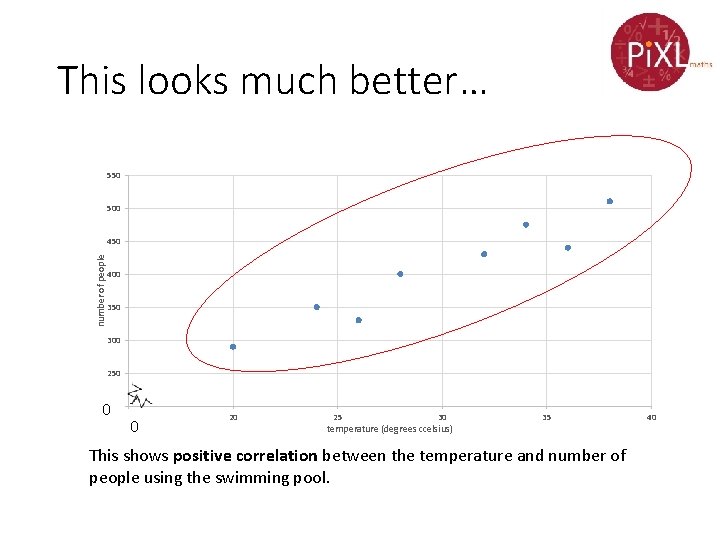
Scatter diagram When drawing a scatter diagram, it is good to use scales as large as possible. The data below shows the number of people using a swimming pool and the outdoor temperature, over eight days, one summer. temperature (degrees day Celsius) number of people 1 26 330 2 20 290 3 24 350 4 36 440 5 32 430 6 28 400 7 38 510 8 34 475

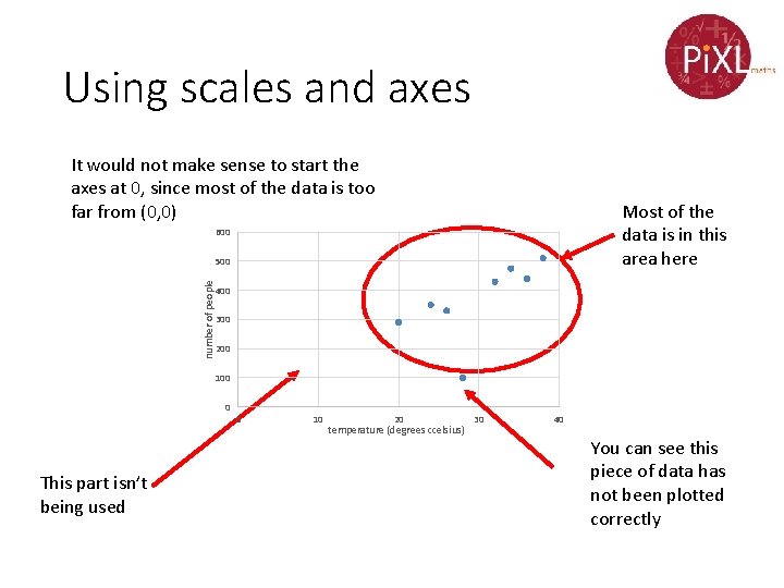
Using scales and axes It would not make sense to start the axes at 0, since most of the data is too far from (0, 0) Most of the data is in this area here 600 number of people 500 400 300 200 100 0 This part isn’t being used 0 10 20 temperature (degrees ccelsius) 30 40 You can see this piece of data has not been plotted correctly

This looks much better… 550 500 number of people 450 400 350 300 250 00200 15 0 20 25 30 temperature (degrees ccelsius) 35 This shows positive correlation between the temperature and number of people using the swimming pool. 40

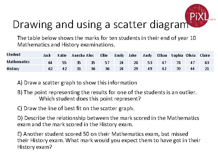
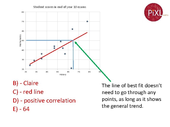
Drawing and using a scatter diagram The table below shows the marks for ten students in their end of year 10 Mathematics and History examinations. Student Mathematics History Jack 64 62 Katie 55 42 Anusha Alex 35 31 35 36 Ellie 57 36 Emily 24 24 Jake 28 29 Andy Ethan 53 49 47 42 Sophia Olivia 78 70 Claire 47 44 A) Draw a scatter graph to show this information B) The point representing the results for one of the students is an outlier. Which student does this point represent? C) Draw the line of best fit on the scatter graph. D) Describe the relationship between the mark scored in the Mathematics exam and the mark scored in the History exam. E) Another student scored 50 on their Mathematics exam, but missed their History exam. What mark would you expect them to have got in their History exam? 63 21

Student scores in end of year 10 exams 80 70 Mathematics 60 50 40 30 20 20 30 40 50 History 60 B) - Claire C) - red line D) - positive correlation E) - 64 70 80 90 The line of best fit doesn’t need to go through any points, as long as it shows the general trend.

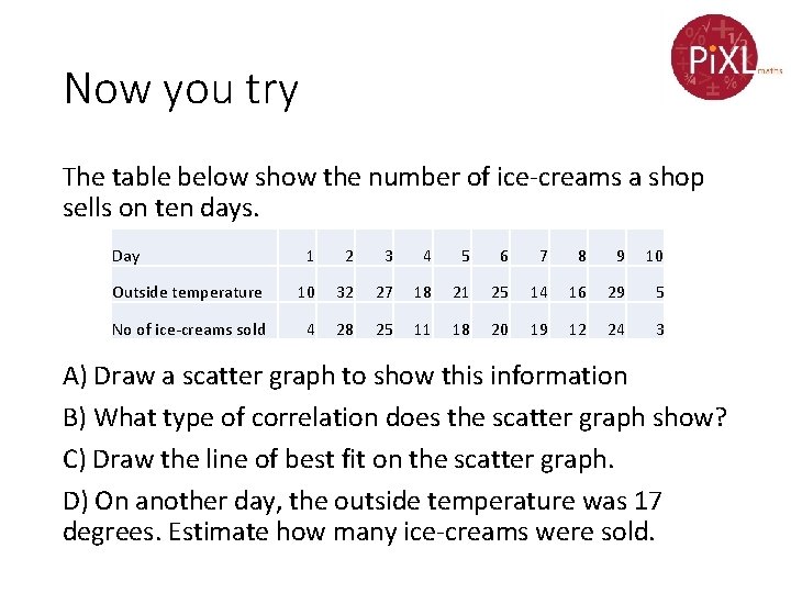
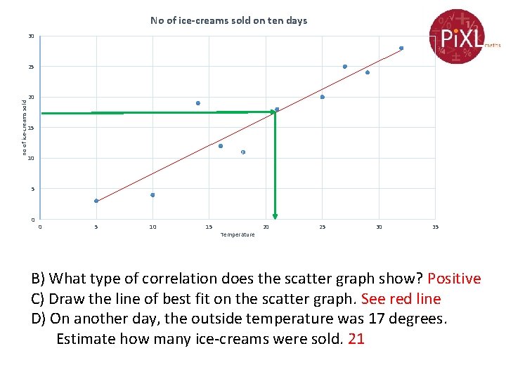
Now you try The table below show the number of ice-creams a shop sells on ten days. Day 1 2 3 4 5 6 7 8 9 10 Outside temperature 10 32 27 18 21 25 14 16 29 5 No of ice-creams sold 4 28 25 11 18 20 19 12 24 3 A) Draw a scatter graph to show this information B) What type of correlation does the scatter graph show? C) Draw the line of best fit on the scatter graph. D) On another day, the outside temperature was 17 degrees. Estimate how many ice-creams were sold.

No of ice-creams sold on ten days 30 no of ice-creams sold 25 20 15 10 5 0 0 5 10 15 Temperature 20 25 30 35 B) What type of correlation does the scatter graph show? Positive C) Draw the line of best fit on the scatter graph. See red line D) On another day, the outside temperature was 17 degrees. Estimate how many ice-creams were sold. 21

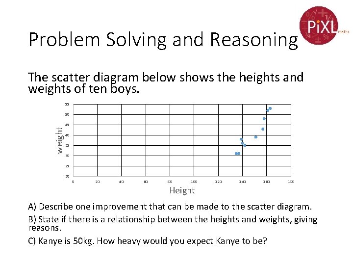
Problem Solving and Reasoning The scatter diagram below shows the heights and weights of ten boys. 55 50 weight 45 40 35 30 25 20 0 20 40 60 80 100 Height 120 140 160 180 A) Describe one improvement that can be made to the scatter diagram. B) State if there is a relationship between the heights and weights, giving reasons. C) Kanye is 50 kg. How heavy would you expect Kanye to be?

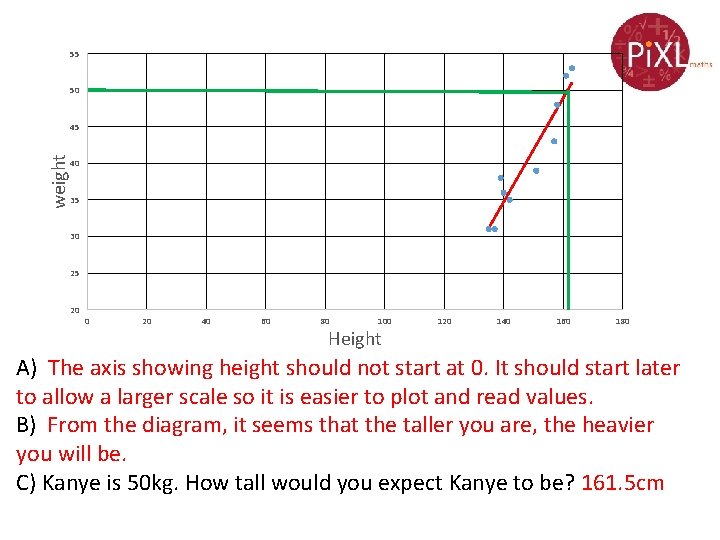
55 50 weight 45 40 35 30 25 20 0 20 40 60 80 100 Height 120 140 160 180 A) The axis showing height should not start at 0. It should start later to allow a larger scale so it is easier to plot and read values. B) From the diagram, it seems that the taller you are, the heavier you will be. C) Kanye is 50 kg. How tall would you expect Kanye to be? 161. 5 cm