Grade DE Comparing data using graphs Use graphical

- Slides: 11

Grade D/E Comparing data using graphs Use graphical representations to interpret, analyse and compare the distributions of data sets from univariate distributions (discrete, continuous and grouped) If you have any questions regarding these resources or come across any errors, please contact helpful-report@pixl. org. uk

Key Vocabulary Frequency polygon

Types of graph • There are many different types of graph • In this therapy, we will look at frequency polygons • We will look at cases where two separate populations are graphed in order to make comparisons

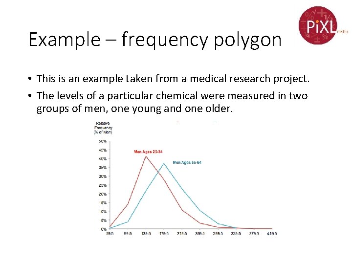
Example – frequency polygon • This is an example taken from a medical research project. • The levels of a particular chemical were measured in two groups of men, one young and one older.

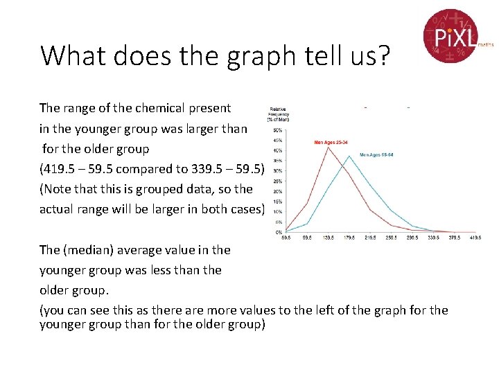
What does the graph tell us? The range of the chemical present in the younger group was larger than for the older group (419. 5 – 59. 5 compared to 339. 5 – 59. 5) (Note that this is grouped data, so the actual range will be larger in both cases) The (median) average value in the younger group was less than the older group. (you can see this as there are more values to the left of the graph for the younger group than for the older group)

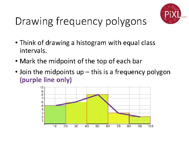
Drawing frequency polygons • Think of drawing a histogram with equal class intervals. • Mark the midpoint of the top of each bar • Join the midpoints up – this is a frequency polygon (purple line only)

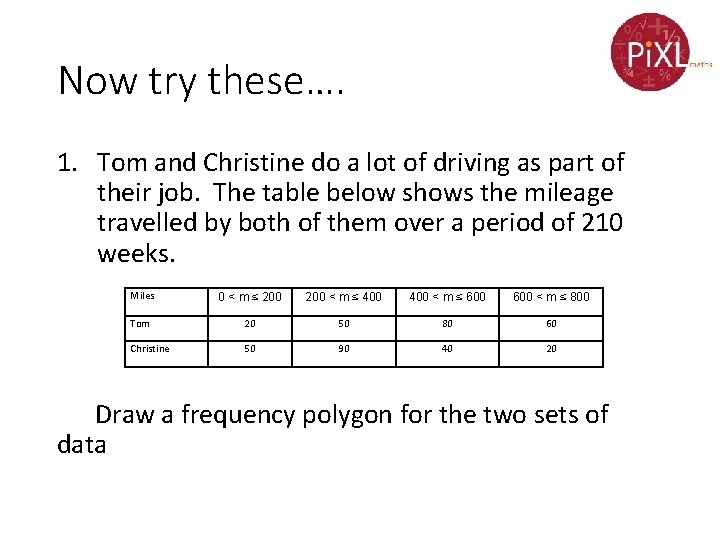
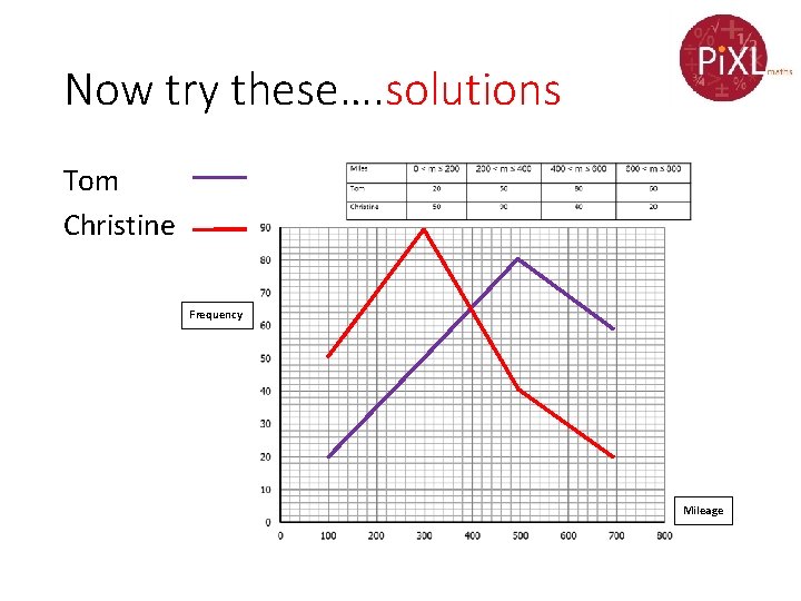
Now try these…. 1. Tom and Christine do a lot of driving as part of their job. The table below shows the mileage travelled by both of them over a period of 210 weeks. Miles 0 < m ≤ 200 < m ≤ 400 < m ≤ 600 < m ≤ 800 Tom 20 50 80 60 Christine 50 90 40 20 Draw a frequency polygon for the two sets of data

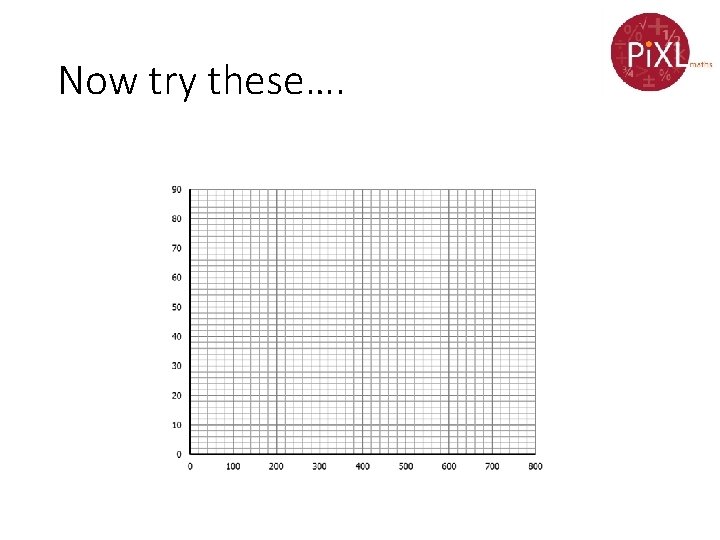
Now try these….

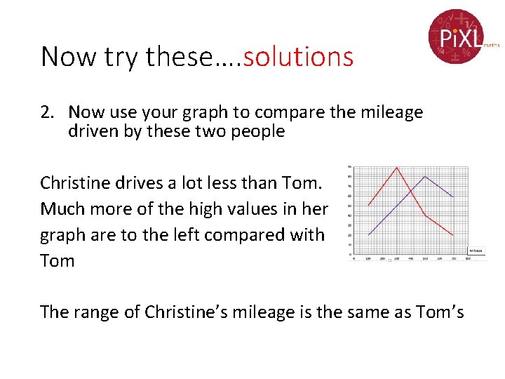
Now try these…. 2. Now use your graph to compare the mileage driven by these two people

Now try these…. solutions Tom Christine Frequency Mileage

Now try these…. solutions 2. Now use your graph to compare the mileage driven by these two people Christine drives a lot less than Tom. Much more of the high values in her graph are to the left compared with Tom The range of Christine’s mileage is the same as Tom’s