Good afternoon Happy Thursday Lets warm up with
- Slides: 17

Good afternoon Happy Thursday Let’s warm up with questions 1 -3 on page 3 of the Stats Packet.

4 y a D Unit 1

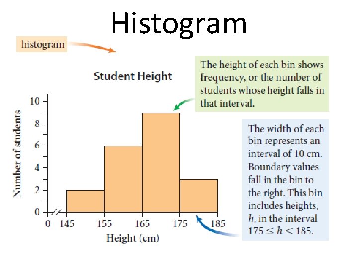
Histogram • Graphical representation of a data set • Shows cluster of values and gaps in data • Good way to display information from large data sets • Width of bar (x-axis) represents interval • Height of bar (y-axis) represents frequency

Histogram

Histogram • • Each interval bin should have the same width Level of detail shown depends on bin width Rule of Thumb: Bin Width = 15% of the range Bars always touch • Each bin includes the left endpoint value but not the right endpoint value

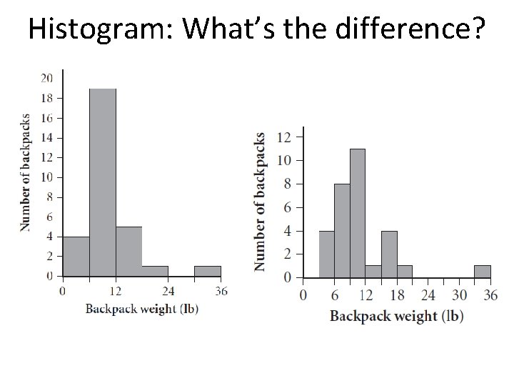
Histogram: What’s the difference?

Constructing a histogram: • Determine interval width – (Largest value – Smallest value)÷Desired number of intervals – 5 to 10 intervals is usually best( we decided 7 yesterday) • Organize data into a frequency table • Distribute data into intervals

Using Calculator In put data: Stat-> Edit L 1. TO organize data: Stat-> Sort. A-> input(L 1) To Graph: 2 nd y=, turn plot on, Under Type select the histogram. Hit Graph, Zoom 9 (Data)

Adjusting Window To adjust the interval size, Change Xscl: Trace: To see min and max for each interval You can change the x: max and x: min to adjust start. From

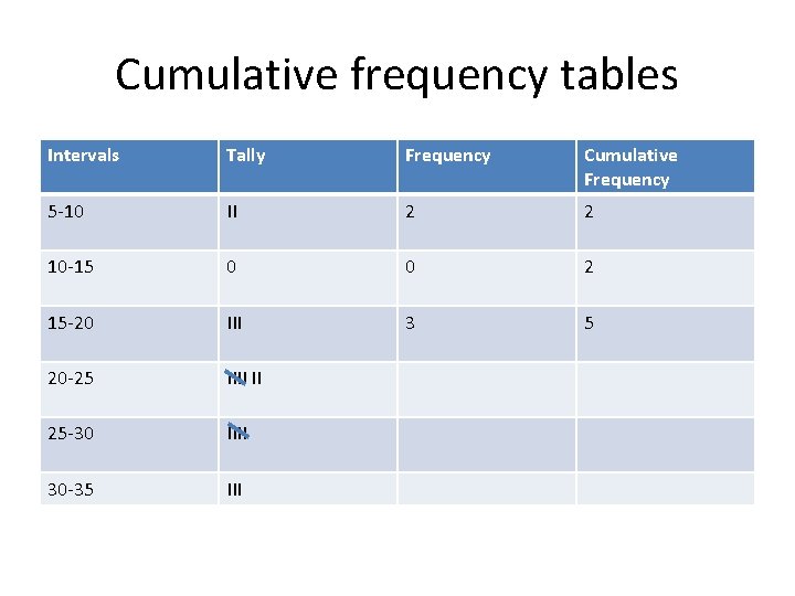
Good afternoon Happy Friday!!! Let’s start with a cumulative frequency tables. It is the same as a normal frequency table, with an additional column, where we sum up the frequencies so far.

Cumulative frequency tables Intervals Tally Frequency Cumulative Frequency 5 -10 II 2 2 10 -15 0 0 2 15 -20 III 3 5 20 -25 IIII II 25 -30 IIII 30 -35 III

Cumulative graph This will be a line or curve with points (x, y). Not a histogram. The upper bound of each interval will be the x coordinate. The cumulative frequency will be the y coordinate.

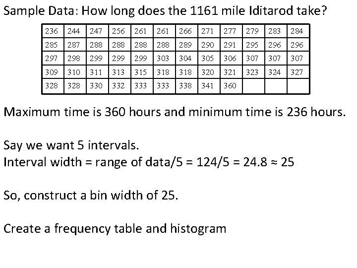
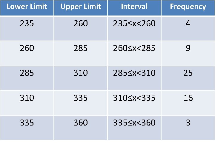
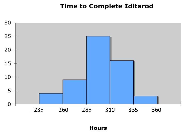
Sample Data: How long does the 1161 mile Iditarod take? 236 244 247 256 261 266 271 277 279 283 284 285 287 288 288 289 290 291 295 296 297 298 299 299 303 304 305 306 307 307 309 310 311 313 315 318 320 321 323 324 327 328 330 332 333 338 341 360 Maximum time is 360 hours and minimum time is 236 hours. Say we want 5 intervals. Interval width = range of data/5 = 124/5 = 24. 8 ≈ 25 So, construct a bin width of 25. Create a frequency table and histogram

Lower Limit Upper Limit Interval Frequency 235 260 235≤x<260 4 260 285 260≤x<285 9 285 310 285≤x<310 25 310 335 310≤x<335 16 335 360 335≤x<360 3

235 260 285 310 335 360

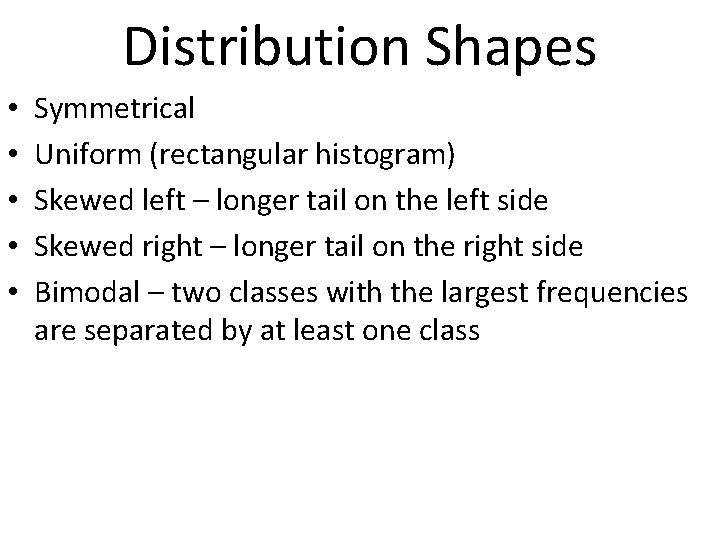
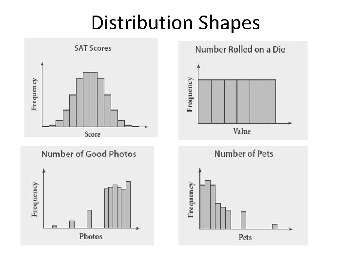
Distribution Shapes • • • Symmetrical Uniform (rectangular histogram) Skewed left – longer tail on the left side Skewed right – longer tail on the right side Bimodal – two classes with the largest frequencies are separated by at least one class

Distribution Shapes