Go with the flow Data visualization using Sankey

- Slides: 1

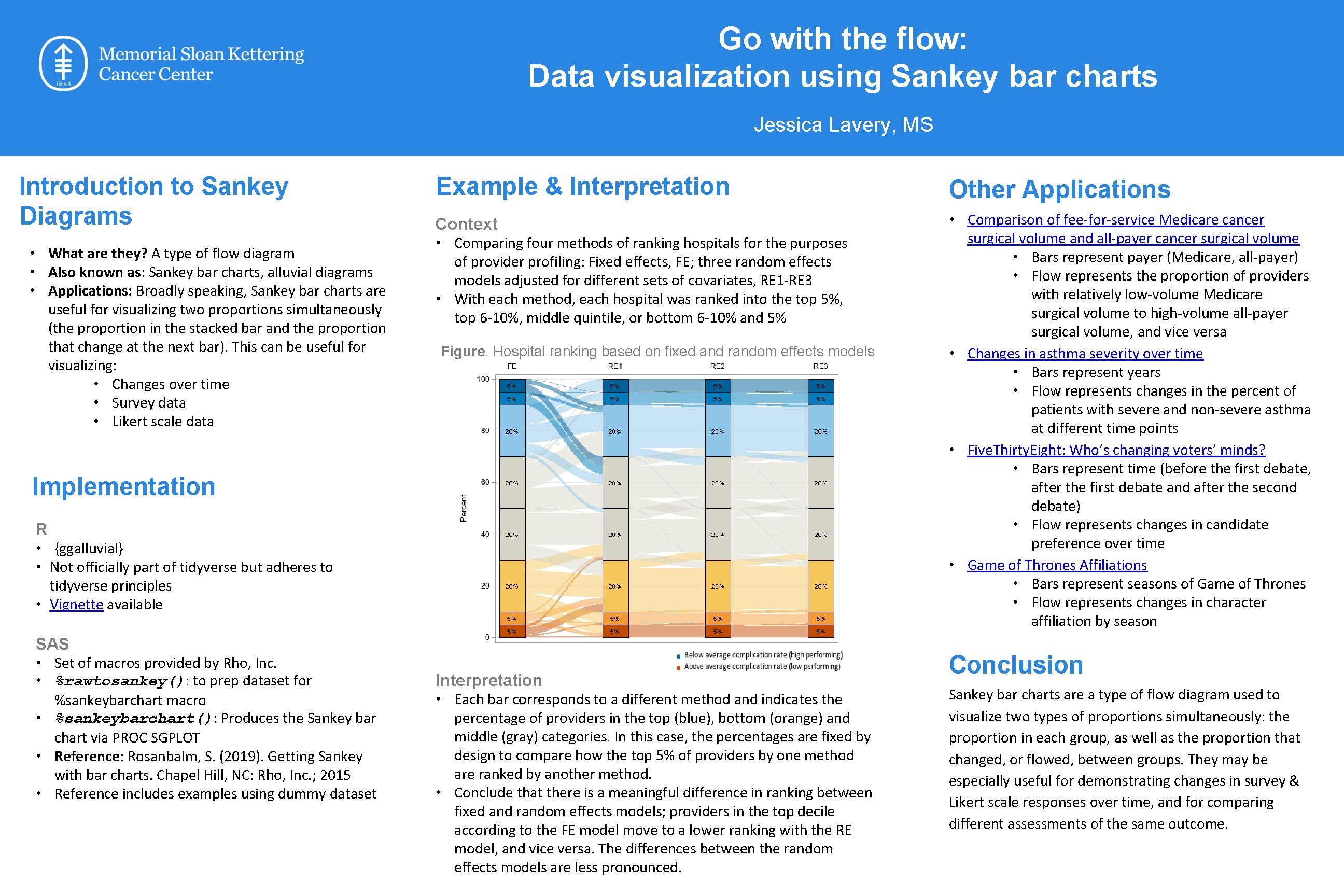
Go with the flow: Data visualization using Sankey bar charts Jessica Lavery, MS Introduction to Sankey Diagrams • What are they? A type of flow diagram • Also known as: Sankey bar charts, alluvial diagrams • Applications: Broadly speaking, Sankey bar charts are useful for visualizing two proportions simultaneously (the proportion in the stacked bar and the proportion that change at the next bar). This can be useful for visualizing: • Changes over time • Survey data • Likert scale data Example & Interpretation Other Applications Context • Comparing four methods of ranking hospitals for the purposes • Comparison of fee-for-service Medicare cancer surgical volume and all-payer cancer surgical volume • Bars represent payer (Medicare, all-payer) • Flow represents the proportion of providers with relatively low-volume Medicare surgical volume to high-volume all-payer surgical volume, and vice versa • Changes in asthma severity over time • Bars represent years • Flow represents changes in the percent of patients with severe and non-severe asthma at different time points • Five. Thirty. Eight: Who’s changing voters’ minds? • Bars represent time (before the first debate, after the first debate and after the second debate) • Flow represents changes in candidate preference over time • Game of Thrones Affiliations • Bars represent seasons of Game of Thrones • Flow represents changes in character affiliation by season of provider profiling: Fixed effects, FE; three random effects models adjusted for different sets of covariates, RE 1 -RE 3 • With each method, each hospital was ranked into the top 5%, top 6 -10%, middle quintile, or bottom 6 -10% and 5% Figure. Hospital ranking based on fixed and random effects models Implementation R • {ggalluvial} • Not officially part of tidyverse but adheres to tidyverse principles • Vignette available SAS • Set of macros provided by Rho, Inc. • %rawtosankey(): to prep dataset for %sankeybarchart macro • %sankeybarchart(): Produces the Sankey bar chart via PROC SGPLOT • Reference: Rosanbalm, S. (2019). Getting Sankey with bar charts. Chapel Hill, NC: Rho, Inc. ; 2015 • Reference includes examples using dummy dataset Interpretation • Each bar corresponds to a different method and indicates the percentage of providers in the top (blue), bottom (orange) and middle (gray) categories. In this case, the percentages are fixed by design to compare how the top 5% of providers by one method are ranked by another method. • Conclude that there is a meaningful difference in ranking between fixed and random effects models; providers in the top decile according to the FE model move to a lower ranking with the RE model, and vice versa. The differences between the random effects models are less pronounced. Conclusion Sankey bar charts are a type of flow diagram used to visualize two types of proportions simultaneously: the proportion in each group, as well as the proportion that changed, or flowed, between groups. They may be especially useful for demonstrating changes in survey & Likert scale responses over time, and for comparing different assessments of the same outcome.