Get out p 6 20 HW Get out

- Slides: 19

• Get out p. 6 & 20 HW • Get out notes & 1. 2 Slides • Get both a TI & HP calculator Chapter 1: Exploring Data Sec. 1. 2: Displaying Quantitative Data with Graphs, cont.

Histograms Histogram - a graph of the distribution of one quantitative variable where nearby values are grouped together. How to make a histogram: 1) Divide the range of data into classes of equal width. 2) Find the count (frequency) or percent (relative frequency) of individuals in each class. 3) Label and scale your axes and draw the histogram. The height of the bar equals its frequency. Adjacent bars should touch, unless a class contains no individuals.

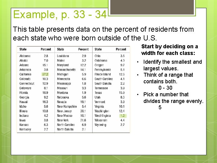
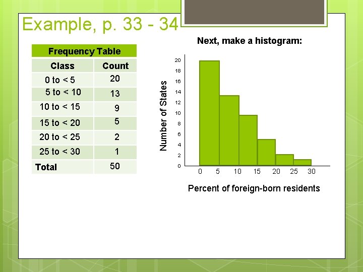
Example, p. 33 - 34 This table presents data on the percent of residents from each state who were born outside of the U. S. Start by deciding on a width for each class: • Identify the smallest and largest values. • Think of a range that contains both. 0 - 30 • Pick a number that divides the range evenly. 5

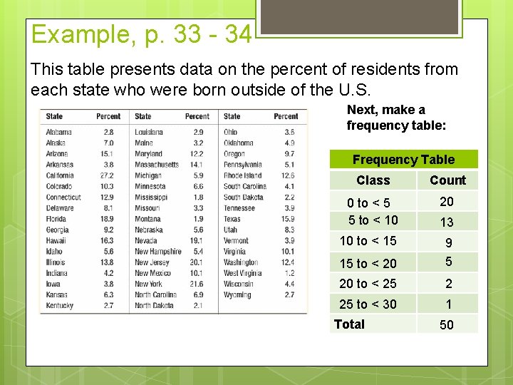
Example, p. 33 - 34 This table presents data on the percent of residents from each state who were born outside of the U. S. Next, make a frequency table: Frequency Table Class Count 0 to < 5 5 to < 10 20 10 to < 15 15 to < 20 9 5 20 to < 25 2 25 to < 30 1 Total 13 50

Example, p. 33 - 34 Next, make a histogram: Frequency Table 0 to < 5 5 to < 10 10 to < 15 Count 20 13 15 to < 20 9 5 20 to < 25 2 25 to < 30 1 Total 50 18 Number of States Class 20 16 14 12 10 8 6 4 2 0 0 5 10 15 20 25 30 Percent of foreign-born residents

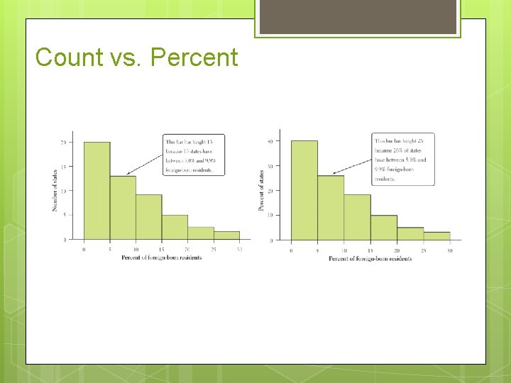
Count vs. Percent

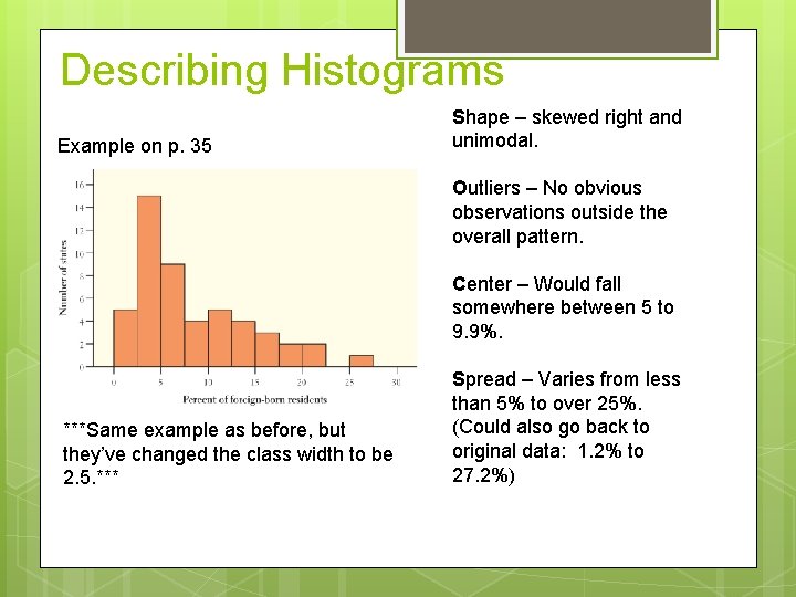
Describing Histograms Example on p. 35 Shape – skewed right and unimodal. Outliers – No obvious observations outside the overall pattern. Center – Would fall somewhere between 5 to 9. 9%. ***Same example as before, but they’ve changed the class width to be 2. 5. *** Spread – Varies from less than 5% to over 25%. (Could also go back to original data: 1. 2% to 27. 2%)

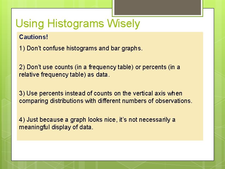
Using Histograms Wisely Cautions! 1) Don’t confuse histograms and bar graphs. 2) Don’t use counts (in a frequency table) or percents (in a relative frequency table) as data. 3) Use percents instead of counts on the vertical axis when comparing distributions with different numbers of observations. 4) Just because a graph looks nice, it’s not necessarily a meaningful display of data.

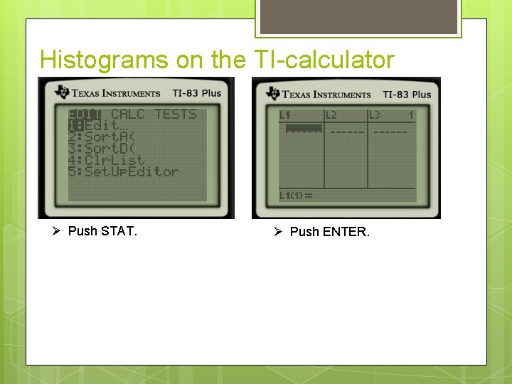
Histograms on the TI-calculator Push STAT. Push ENTER.

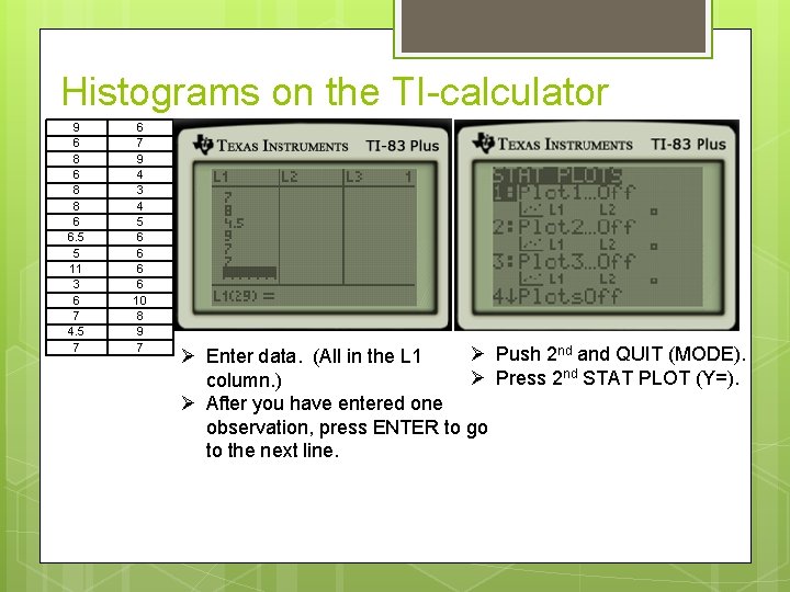
Histograms on the TI-calculator 9 6 8 8 6 6. 5 5 11 3 6 7 4. 5 7 6 7 9 4 3 4 5 6 6 10 8 9 7 Push 2 nd and QUIT (MODE). Enter data. (All in the L 1 Press 2 nd STAT PLOT (Y=). column. ) After you have entered one observation, press ENTER to go to the next line.

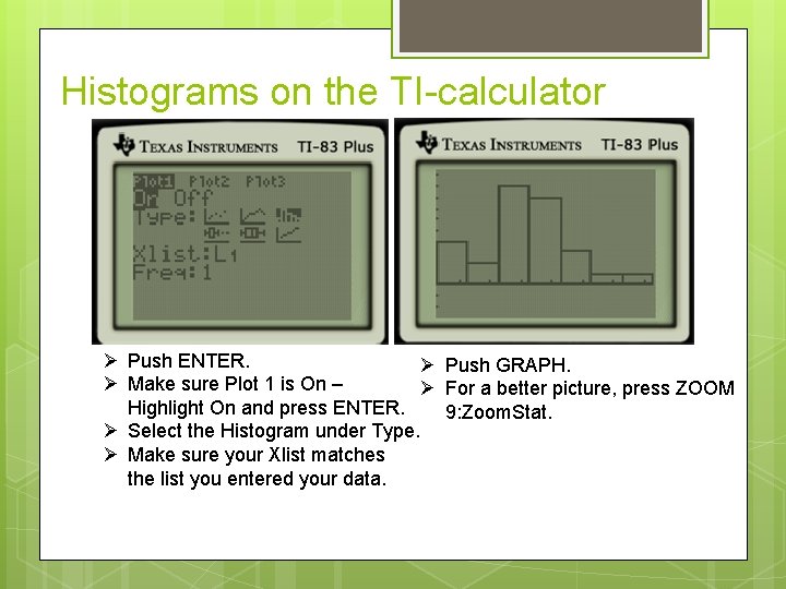
Histograms on the TI-calculator Push ENTER. Push GRAPH. Make sure Plot 1 is On – For a better picture, press ZOOM Highlight On and press ENTER. 9: Zoom. Stat. Select the Histogram under Type. Make sure your Xlist matches the list you entered your data.

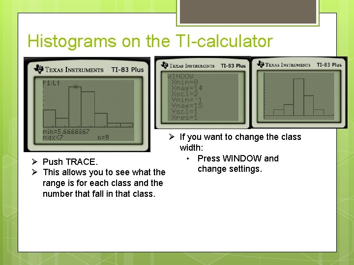
Histograms on the TI-calculator If you want to change the class width: • Press WINDOW and Push TRACE. change settings. This allows you to see what the range is for each class and the number that fall in that class.

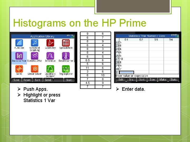
Histograms on the HP Prime Push Apps. Highlight or press Statistics 1 Var 9 6 8 8 6 6. 5 5 11 3 6 7 4. 5 7 6 7 9 4 3 4 5 6 6 10 8 9 7 Enter data.

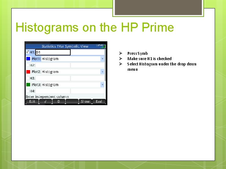
Histograms on the HP Prime Press Symb Make sure H 1 is checked Select Histogram under the drop down menu

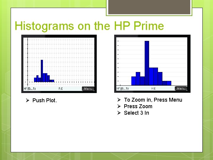
Histograms on the HP Prime Push Plot. To Zoom in, Press Menu Press Zoom Select 3 In

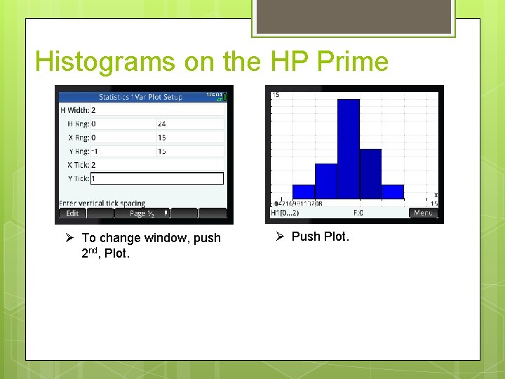
Histograms on the HP Prime To change window, push 2 nd, Plot. Push Plot.

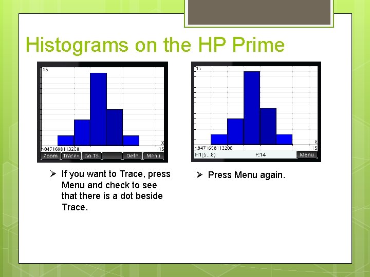
Histograms on the HP Prime If you want to Trace, press Menu and check to see that there is a dot beside Trace. Press Menu again.

Data Analysis: Making Sense of Data ü MAKE and INTERPRET dotplots and stemplots of quantitative data ü DESCRIBE the overall pattern of a distribution ü IDENTIFY the shape of a distribution ü MAKE and INTERPRET histograms of quantitative data ü COMPARE distributions of quantitative data The Practice of Statistics, 5 th Edition 18

Homework – Due Monday P. 44 – 45 #52 & 57