Gestalt Principles MAT 103 Introduction To Multimedia Nick
- Slides: 22

Gestalt Principles MAT 103 Introduction To Multimedia Nick Straley

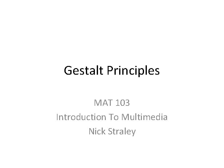
Figure and Background 1 This is one of those classic “magic” optical illusions that make use of the principle of Figure and Ground. The eye will see one of two images – balustrades or human figures – depending on what it perceives as the figure (object) and what it perceives as the ground (background). These relationships change as the eye switches the role of figure and ground depending on the view at that moment. This deliberate and unusual arrangement adds to the magical effect of the piece. Image Source: http: //magictricks 101. blogspot. com/2 008/05/optical-illusions-3. html

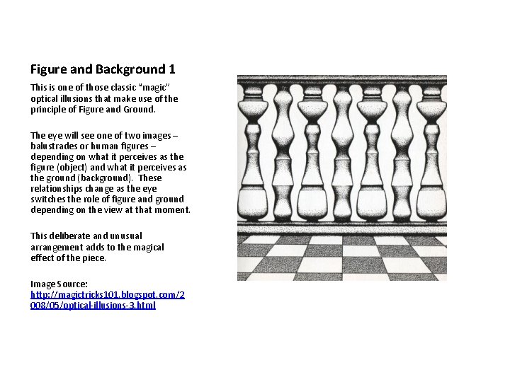
Figure and Background 2 This is an excellent example of the Gestalt principles of figure and background applied to advertising. The i. Pod ads made the consumer part of the background! The product and a bright primary color comprised the figure. There was an amazing tension created – is the product the point, and the consumer the afterthought? Is this consumer too cool to be a figure? She is dynamic and with movement – see her hair and bracelets. Is she cool enough and yet anonymous enough that we all identify with her? Image Source: http: //www. chaosmint. com/mac/ipod -ads/

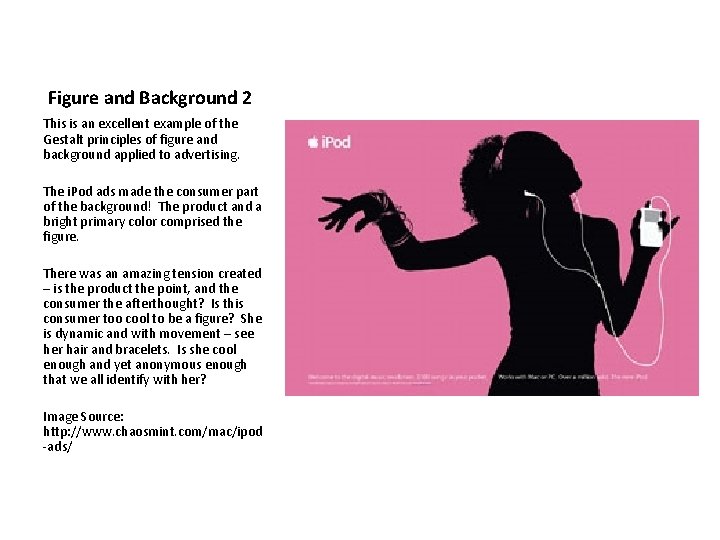
Proximity 1 Mark Twain once said: “"There are three kinds of lies: lies, damned lies and statistics. “ This histogram makes use of proximity to make the user believe these groupings are similar, despite the fact there is a seven year gap in the middle! The user will still look to identify a pattern between the groups of years due to proximity. Image Source: http: //www. learningsolutionsmag. com /articles/157/

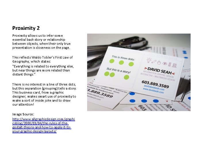
Proximity 2 Proximity allows us to infer some essential back story or relationship between objects, when their only true presentation is closeness on the page. This reflects Waldo Tobler’s First Law of Geography, which states: "Everything is related to everything else, but near things are more related than distant things. ” There is no interest in a line of three dots, but this separation (grouping) tells a story. This business card, from a graphic designer, makes smart use of proximity to make a sort of inside joke and to draw our attention! Image Source: http: //www. allgraphicdesign. com/graphi csblog/2008/03/04/the-rules-of-thegestalt-theory-and-how-to-apply-it-toyour-graphic-design-layouts/

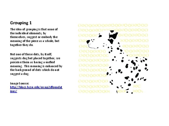
Grouping 1 The idea of grouping is that none of the individual elements, by themselves, suggest or embody the meaning of the piece as a whole, but together they do. Not one of these dots, by itself, suggests dog but placed together, we perceive them as having a unified meaning. This meaning is enhanced by the background of dots which do not suggest a dog. Image Source: http: //blogs. bgsu. edu/erynp 2 dfoundat ions/

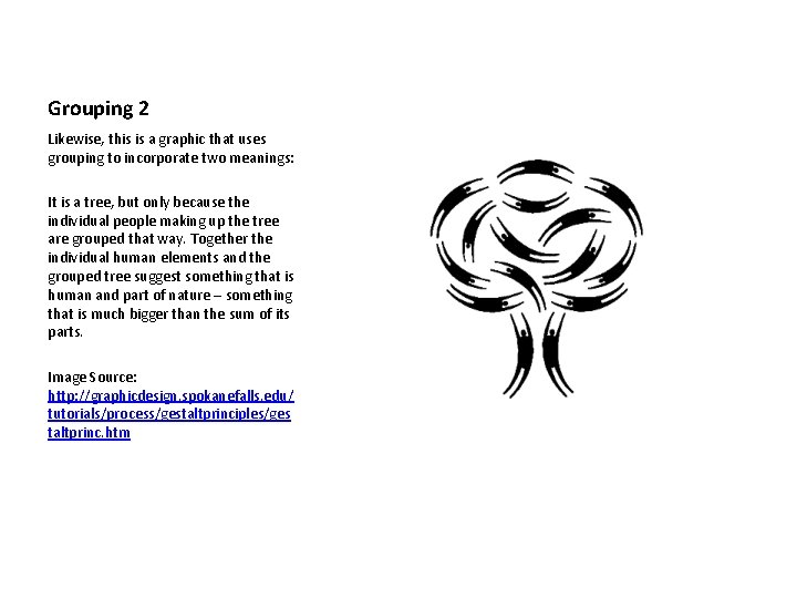
Grouping 2 Likewise, this is a graphic that uses grouping to incorporate two meanings: It is a tree, but only because the individual people making up the tree are grouped that way. Together the individual human elements and the grouped tree suggest something that is human and part of nature – something that is much bigger than the sum of its parts. Image Source: http: //graphicdesign. spokanefalls. edu/ tutorials/process/gestaltprinciples/ges taltprinc. htm

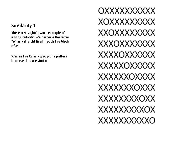
Similarity 1 This is a straightforward example of using similarity. We perceive the letter “o” as a straight line through the block of Xs. We see the Xs as a group or a pattern because they are similar.

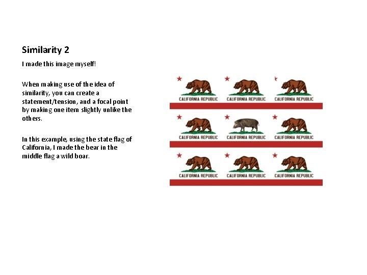
Similarity 2 I made this image myself! When making use of the idea of similarity, you can create a statement/tension, and a focal point by making one item slightly unlike the others. In this example, using the state flag of California, I made the bear in the middle flag a wild boar.

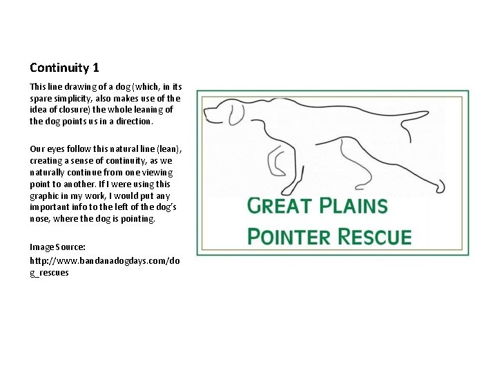
Continuity 1 This line drawing of a dog (which, in its spare simplicity, also makes use of the idea of closure) the whole leaning of the dog points us in a direction. Our eyes follow this natural line (lean), creating a sense of continuity, as we naturally continue from one viewing point to another. If I were using this graphic in my work, I would put any important info to the left of the dog’s nose, where the dog is pointing. Image Source: http: //www. bandanadogdays. com/do g_rescues

Continuity 2 This logo makes great use of continuity to direct our eye, AND To covey an advertising message: Amazon has everything. . . From A – To Z And their customers are smiling! Image Source: www. amazon. com

Closure 1 In this logo, the spare lines invite the viewer to complete the image of the dog. . . But more than that (for those who know Italian Greyhounds) they convey a part of the dog’s personality – a little bit timid and shy, something deserving of rescue and protection. Image Source: http: //silvaniigs. com/IGRescue. html

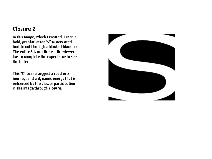
Closure 2 In this image, which I created, I used a bold, graphic letter “S” in oversized font to cut through a block of black ink. The entire S is not there – the viewer has to complete the experience to see the letter. This “S” to me suggest a road or a journey, and a dynamic energy that is enhanced by the viewer participation in the image through closure.

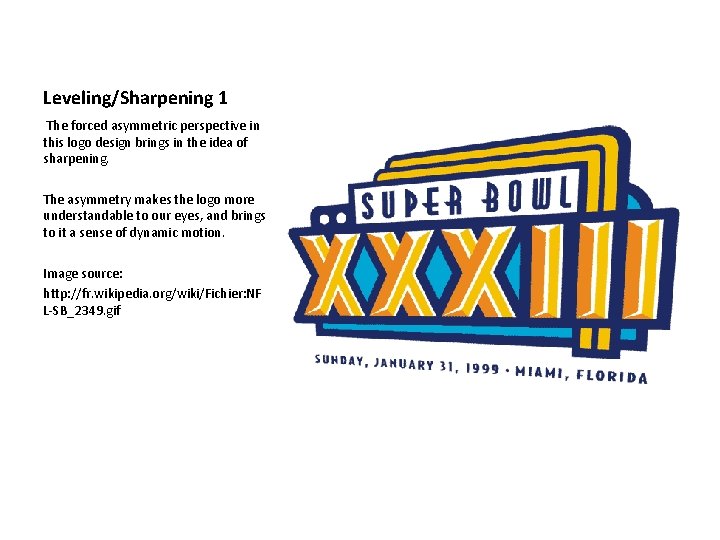
Leveling/Sharpening 1 The forced asymmetric perspective in this logo design brings in the idea of sharpening. The asymmetry makes the logo more understandable to our eyes, and brings to it a sense of dynamic motion. Image source: http: //fr. wikipedia. org/wiki/Fichier: NF L-SB_2349. gif

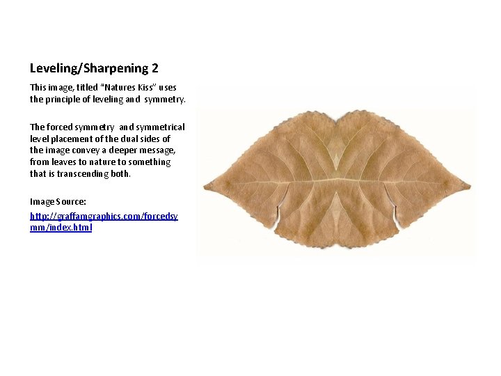
Leveling/Sharpening 2 This image, titled “Natures Kiss” uses the principle of leveling and symmetry. The forced symmetry and symmetrical level placement of the dual sides of the image convey a deeper message, from leaves to nature to something that is transcending both. Image Source: http: //graffamgraphics. com/forcedsy mm/index. html

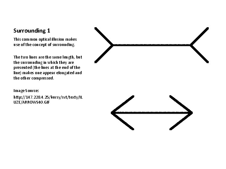
Surrounding 1 This common optical illusion makes use of the concept of surrounding. The two lines are the same length, but the surrounding in which they are presented (the lines at the end of the line) makes one appear elongated and the other compressed. Image Source: http: //147. 228. 4. 25/kursy/svt/texty/IL UZE/ARROWS 40. GIF

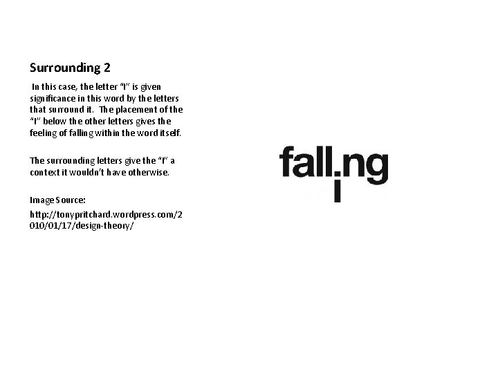
Surrounding 2 In this case, the letter “I” is given significance in this word by the letters that surround it. The placement of the “I” below the other letters gives the feeling of falling within the word itself. The surrounding letters give the “I” a context it wouldn’t have otherwise. Image Source: http: //tonypritchard. wordpress. com/2 010/01/17/design-theory/

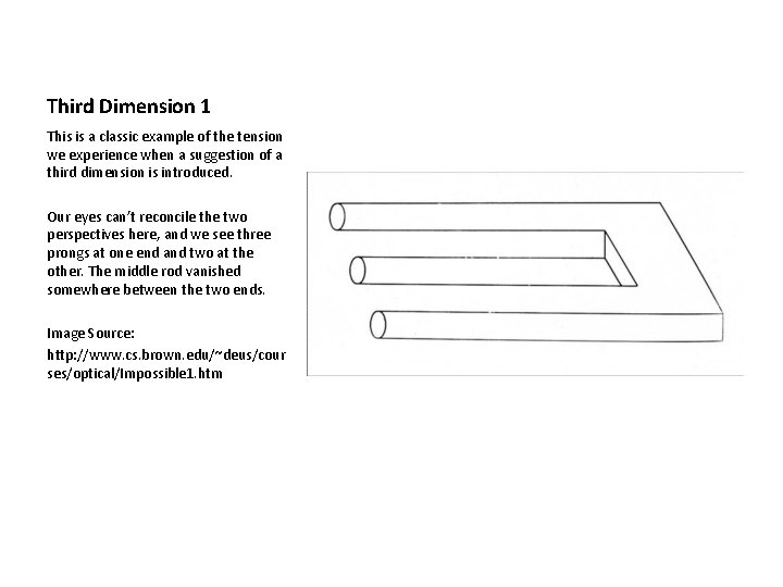
Third Dimension 1 This is a classic example of the tension we experience when a suggestion of a third dimension is introduced. Our eyes can’t reconcile the two perspectives here, and we see three prongs at one end and two at the other. The middle rod vanished somewhere between the two ends. Image Source: http: //www. cs. brown. edu/~deus/cour ses/optical/Impossible 1. htm

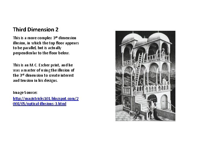
Third Dimension 2 This is a more complex 3 rd dimension illusion, in which the top floor appears to be parallel, but is actually perpendicular to the floor below. This is an M. C. Escher print, and he was a master of using the illusion of the 3 rd dimension to create interest and tension in his designs. Image Source: http: //magictricks 101. blogspot. com/2 008/05/optical-illusions-3. html

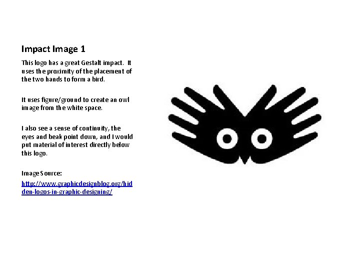
Impact Image 1 This logo has a great Gestalt impact. It uses the proximity of the placement of the two hands to form a bird. It uses figure/ground to create an owl image from the white space. I also see a sense of continuity, the eyes and beak point down, and I would put material of interest directly below this logo. Image Source: http: //www. graphicdesignblog. org/hid den-logos-in-graphic-designing/

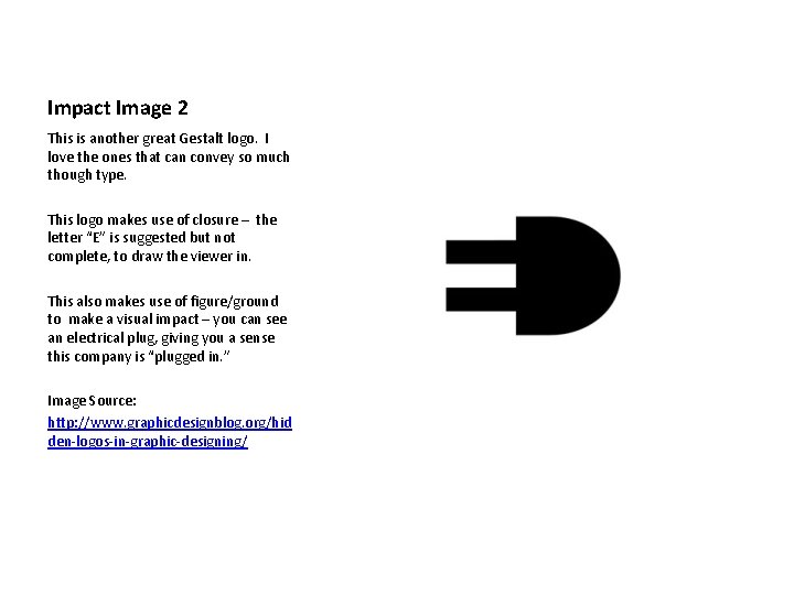
Impact Image 2 This is another great Gestalt logo. I love the ones that can convey so much though type. This logo makes use of closure – the letter “E” is suggested but not complete, to draw the viewer in. This also makes use of figure/ground to make a visual impact – you can see an electrical plug, giving you a sense this company is “plugged in. ” Image Source: http: //www. graphicdesignblog. org/hid den-logos-in-graphic-designing/

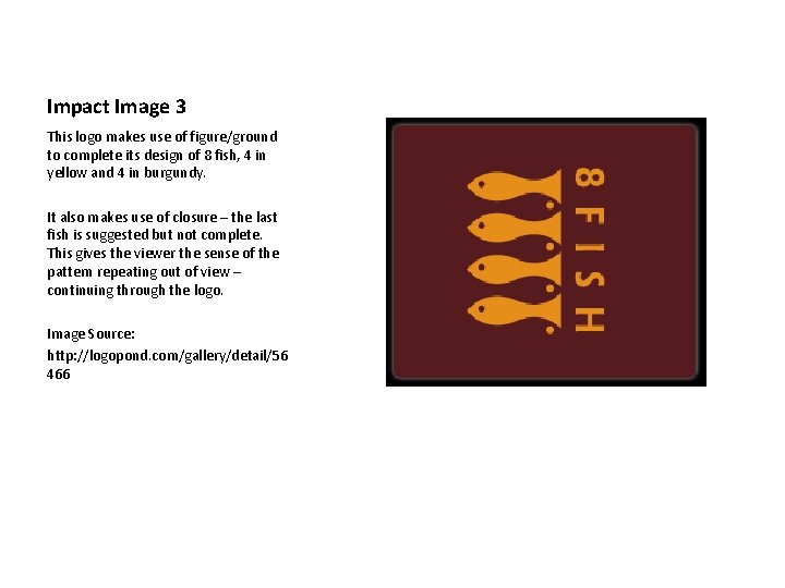
Impact Image 3 This logo makes use of figure/ground to complete its design of 8 fish, 4 in yellow and 4 in burgundy. It also makes use of closure – the last fish is suggested but not complete. This gives the viewer the sense of the pattern repeating out of view – continuing through the logo. Image Source: http: //logopond. com/gallery/detail/56 466