Gephi is a tool for exploring and understanding

- Slides: 30

Gephi is a tool for exploring and understanding graphs. Like Photoshop (but for graphs), the user interacts with the representation, manipulate the structures, shapes and colors to reveal hidden properties. http: //gephi. org @Beatriz. Patraca

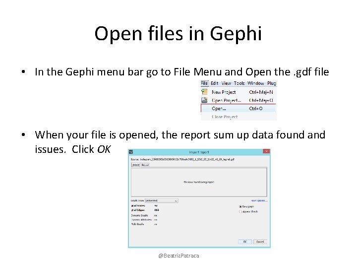
Open files in Gephi • In the Gephi menu bar go to File Menu and Open the. gdf file • When your file is opened, the report sum up data found and issues. Click OK @Beatriz. Patraca

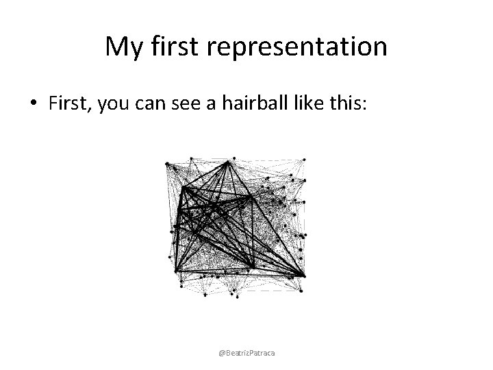
My first representation • First, you can see a hairball like this: @Beatriz. Patraca

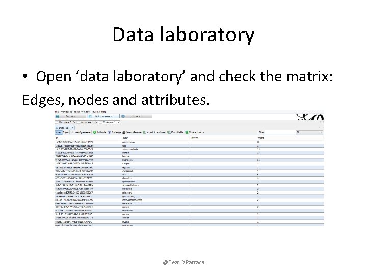
Data laboratory • Open ‘data laboratory’ and check the matrix: Edges, nodes and attributes. @Beatriz. Patraca

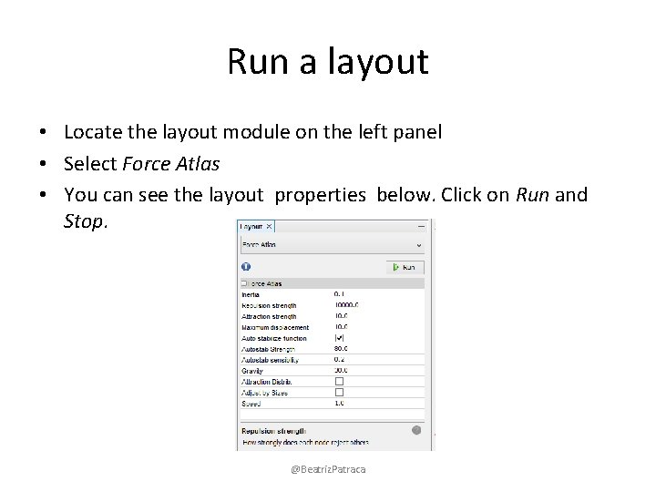
Run a layout • Locate the layout module on the left panel • Select Force Atlas • You can see the layout properties below. Click on Run and Stop. @Beatriz. Patraca

Control the layout • The purpose of layout properties is to let you control the algorithm in order to make a readable representation. • Force Atlas makes the connected nodes attracted to each other and pushes de unconnected nodes apart to create clusters of connections. @Beatriz. Patraca

Control the layout • Set the repulsion strength at 10 000 to expand the graph • Click enter to validate the value. • Click stop when it seems as if you have some distinct clusters. Repulsion strength: How strongly each pair of connected nodes attracted each other. @Beatriz. Patraca

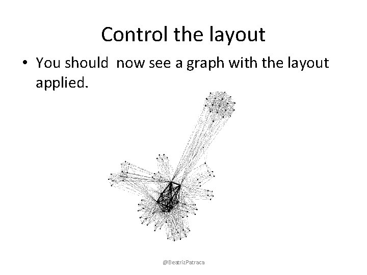
Control the layout • You should now see a graph with the layout applied. @Beatriz. Patraca

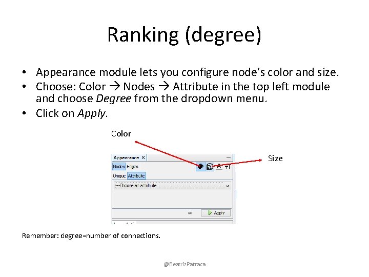
Ranking (degree) • Appearance module lets you configure node’s color and size. • Choose: Color Nodes Attribute in the top left module and choose Degree from the dropdown menu. • Click on Apply. Color Size Remember: degree=number of connections. @Beatriz. Patraca

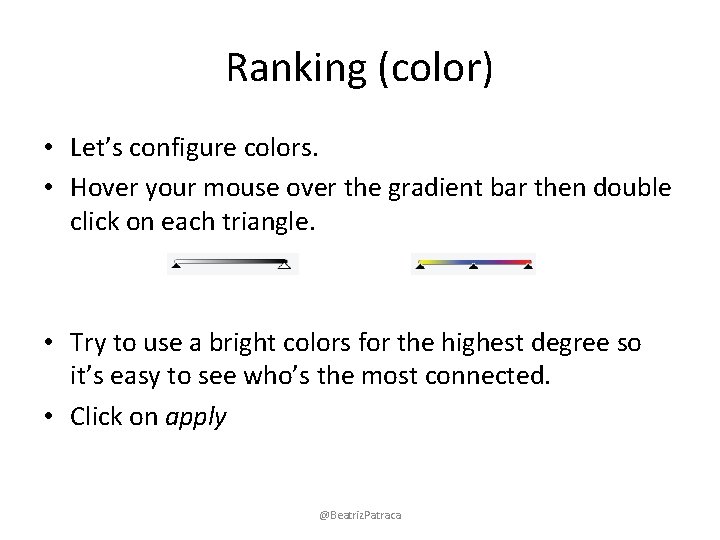
Ranking (color) • Let’s configure colors. • Hover your mouse over the gradient bar then double click on each triangle. • Try to use a bright colors for the highest degree so it’s easy to see who’s the most connected. • Click on apply @Beatriz. Patraca

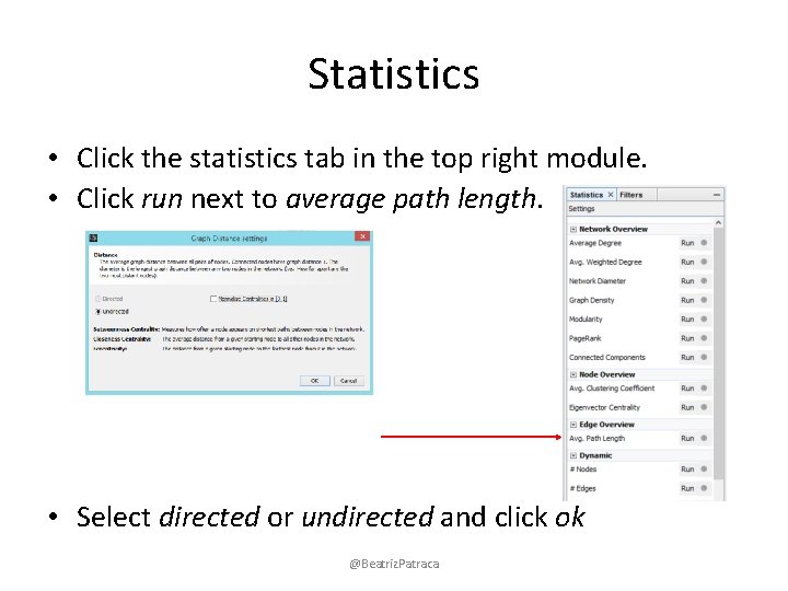
Statistics • Click the statistics tab in the top right module. • Click run next to average path length. • Select directed or undirected and click ok @Beatriz. Patraca

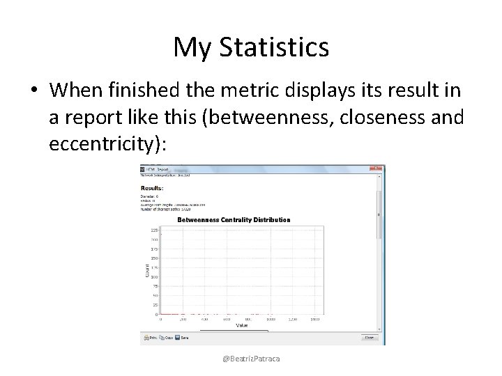
My Statistics • When finished the metric displays its result in a report like this (betweenness, closeness and eccentricity): @Beatriz. Patraca

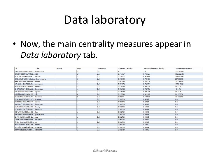
Data laboratory • Now, the main centrality measures appear in Data laboratory tab. @Beatriz. Patraca

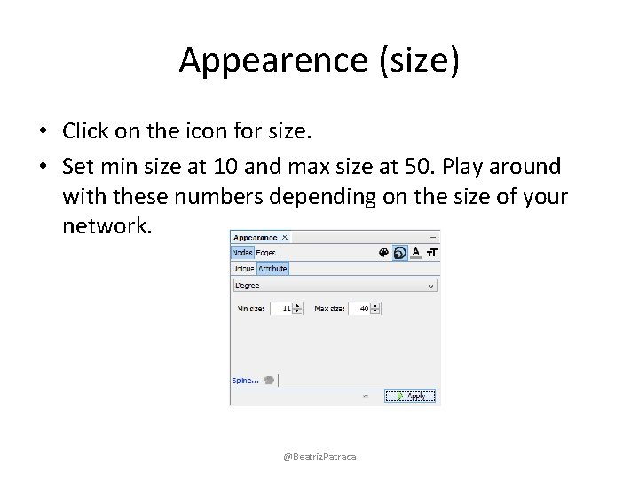
Appearence (size) • Click on the icon for size. • Set min size at 10 and max size at 50. Play around with these numbers depending on the size of your network. @Beatriz. Patraca

Appearance (Betweenness) • Return to appearance in the top left module and choose a rank parameter from the dropdown menu: Betweenness centrality • Click on the icon for size. • Set min size at 10 and max size at 50. Play around with these numbers depending on the size of your network. @Beatriz. Patraca

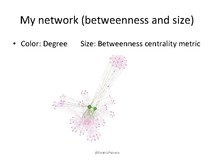
My network (betweenness and size) • Color: Degree Size: Betweenness centrality metric @Beatriz. Patraca

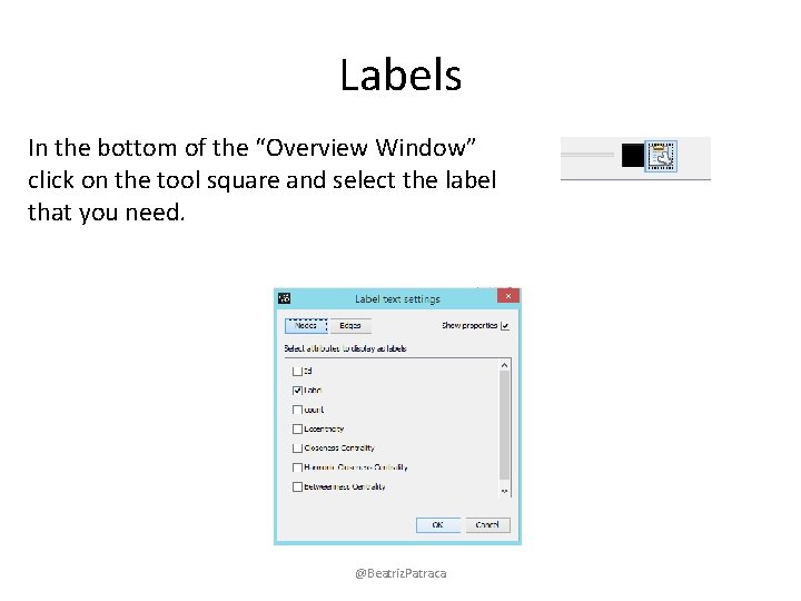
Labels In the bottom of the “Overview Window” click on the tool square and select the label that you need. @Beatriz. Patraca

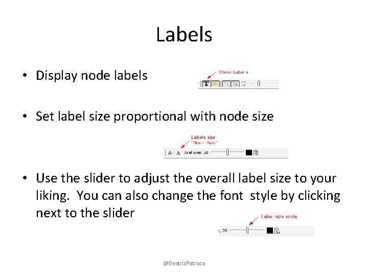
Labels • Display node labels • Set label size proportional with node size • Use the slider to adjust the overall label size to your liking. You can also change the font style by clicking next to the slider @Beatriz. Patraca

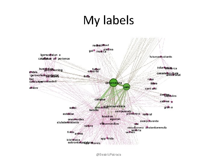
My labels @Beatriz. Patraca

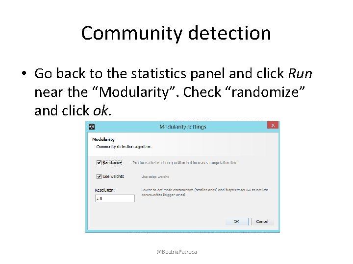
Community detection • Go back to the statistics panel and click Run near the “Modularity”. Check “randomize” and click ok. @Beatriz. Patraca

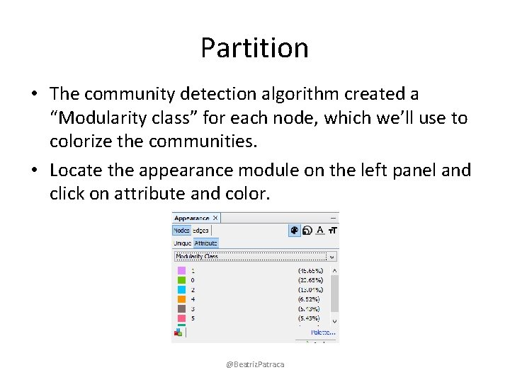
Partition • The community detection algorithm created a “Modularity class” for each node, which we’ll use to colorize the communities. • Locate the appearance module on the left panel and click on attribute and color. @Beatriz. Patraca

Partition • Choose “modularity class” from the dropdown menu. You can click “randomize colors” if you don’t like the colors. • Click apply to colorize. @Beatriz. Patraca

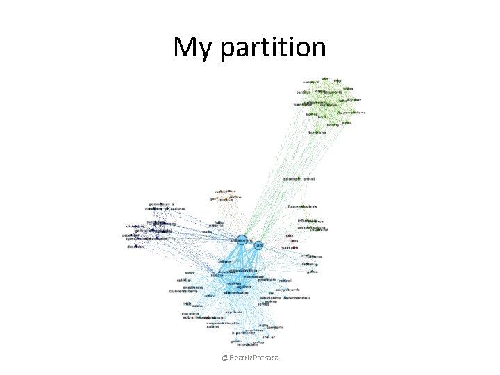
My partition @Beatriz. Patraca

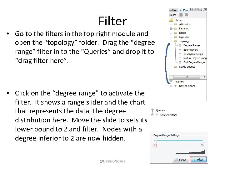
Filter • Go to the filters in the top right module and open the “topology” folder. Drag the “degree range” filter in to the “Queries” and drop it to “drag filter here”. • Click on the “degree range” to activate the filter. It shows a range slider and the chart that represents the data, the degree distribution here. Move the slide to sets its lower bound to 2 and filter. Nodes with a degree inferior to 2 are now hidden. @Beatriz. Patraca

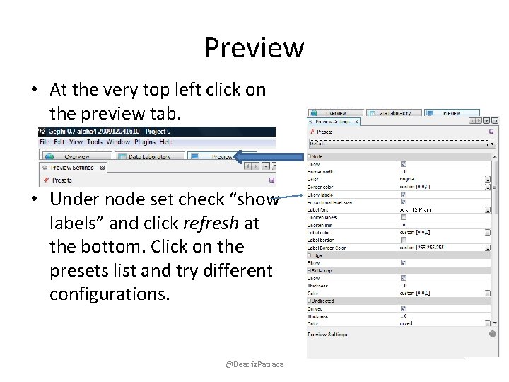
Preview • At the very top left click on the preview tab. • Under node set check “show labels” and click refresh at the bottom. Click on the presets list and try different configurations. @Beatriz. Patraca

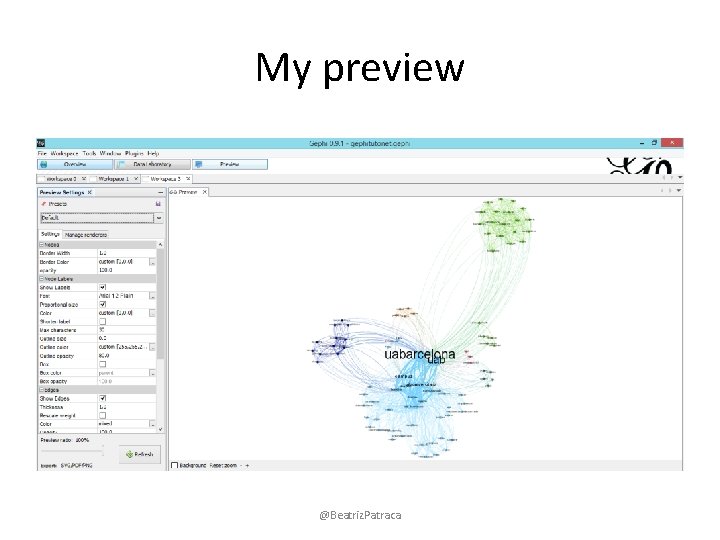
My preview @Beatriz. Patraca

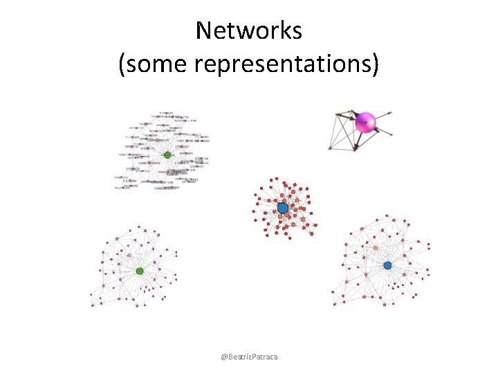
Networks (some representations) @Beatriz. Patraca

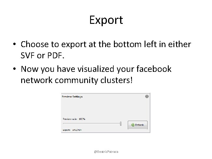
Export • Choose to export at the bottom left in either SVF or PDF. • Now you have visualized your facebook network community clusters! @Beatriz. Patraca

• Based on: http: //www. slideshare. net/sociomantic/facebook-networkanalysis-using-gephi-3996673 http: //gephi. org/2010/quick-start-tutorial/ http: //gephi. org/2011/new-tutorial-layouts-in-gephi/ Gephi website Gephi Wiki Gephi forum @Beatriz. Patraca

@Beatriz. Patraca