Geostatistics with gstat Organized by Gilberto Cmara from

Geostatistics with gstat Organized by Gilberto Câmara from ITC course on Geostatistics by D G Rossiter

Original material n ITC course on Geostatistics by D G Rossiter n http: //www. itc. nl/~rossiter/teach/lecnotes. html

Topic: The Meuse soil pollution data set n This will be used as a running example for the following lectures. n It is an example of an “environmental” dataset which can be used to answer a variety of practical and theoretical research question.

Meuse data set: source n n Rikken, M. G. J. & Van Rijn, R. P. G. , 1993. Soil pollution with heavy metals – An inquiry into spatial variation, cost of mapping and the risk evaluation of copper, cadmium, lead and zinc in the floodplains of the Meuse west of Stein, the Netherlands. Doctoraalveldwerkverslag, Dept. of Physical Geography, Utrecht University This data set is also used in the GIS text of Burrough & Mc. Donnell.

Meuse data set n 155 samples taken on a support of 10 x 10 m from the top 0 -20 cm of alluvial soils in a 5 x 2 km part the floodplain of the Maas (Meuse) near Stein (NL). id x, y cadmium copper lead zinc elev om ffreq soil lime landuse dist. m point number coordinates E and N, in m concentration in the soil, in mg kg-1 elevation above local reference level, in m organic matter loss on ignition, in percent flood frequency class, 1: annual, 2: 2 -5 years, 3: every 5 years soil class, coded has the land here been limed? 0 or 1 = F or T land use, coded distance from main River Maas channel, in m
")
Assessing the Meuse data set in R > > 1 2 3 4 library(gstat) data(meuse) attach(meuse) meuse [1: 4, 1: 5] x y cadmium copper lead 181072 333611 11. 7 85 299 181025 333558 8. 6 81 277 181165 333537 6. 5 68 199 181298 333484 2. 6 81 116

Exploratory data analysis n n Statistical analysis should lead to understanding, not confusion. . . so it makes sense to examine and visualise the data with a critical eye to see: Patterns; outstanding features Unusual data items (not fitting a pattern); blunders? from a different population? Promising analyses Reconaissance before the battle ¨ Draw obvious conclusions with a minimum of analysis ¨

Boxplot, stem-and-leaf plot, histogram n Questions One population or several? ¨ Outliers? ¨ Centered or skewed (mean vs. median)? ¨ “Heavy” or “light” tails (kurtosis)? ¨ > stem(cadmium) > boxplot(cadmium, horizontal = T) > points(mean(cadmium), 1, pch=20, cex=2, col="blue") > hist(cadmium) #automatic bin selection > hist(cadmium, n=16) #specify the number of bins > hist(cadmium, breaks=seq(0, 20, by=1)) #specify breakpoints
")
Cadmium histogram (skewed variable)

Summary Statistics These summarize a single sample of a single variable n 5 -number summary (min, 1 st Q, median, 3 rd Q, max) n Sample mean and variance > summary(cadmium) Min. 1 st Qu. Median Mean 3 rd Qu. Max. 0. 200 0. 800 2. 100 3. 246 3. 850 18. 100 > var(cadmium) [1] 12. 41678 n

The normal distribution n Arises naturally in many processes: a variables that can be modelled as a sum of many small contributions, each with the same distribution of errors (central limit theorem) Easy mathematical manipulation ¨ Fits many observed distributions of errors or random effects ¨ Some statistical procedures require that a variable be at least approximately normally distributed ¨ n Note: even if a variable itself is not normally distributed, its mean may be, since the deviations from the mean may be the “sum of many small errors”.
 ¨ n Numerical")
Evaluating normality n Graphical Histograms ¨ Quantile-Quantile plots (normal probability plots) ¨ n Numerical ¨ n Various tests including Kolmogorov-Smirnov, Anderson-Darling, Shapiro-Wilk These all work by compare the observed distribution with theoretical normal distribution having parameters estimated from the observed, and computing the probability that the observed is a realisation of theoretical > qqnorm(cadmium); qqline(cadmium) > shapiro. test(cadmium) Shapiro-Wilk normality test W = 0. 7856, p-value = 8. 601 e-14

Evaluating normality

Transforming to Normality: Based on what criteria? n 1. A priori understanding of the process ¨ e. g. lognormal arises if contributing variables multiply, rather than add n 2. EDA: visual impression of what should be done n 3. Results: transformed variable appears and tests normal
) Min. 1 st Qu.")
Log transform of a variable with positive skew > summary(log(cadmium)) Min. 1 st Qu. Median Mean 3 rd Qu. Max. -1. 6090 -0. 2231 0. 7419 0. 5611 1. 3480 2. 8960 > stem(log(cadmium)) > hist(log(cadmium), n=20) > boxplot(log(cadmium), horizontal=T) > points(mean(log(cadmium)), 1, pch=20, cex=2, col="blue") > qqnorm(log(cadmium), main="Q-Q plot for log(cadmium ppm)") > qqline(log(cadmium)) > shapiro. test(log(cadmium)) Shapiro-Wilk normality test W = 0. 9462, p-value = 1. 18 e-05 This is still not normal, but much more symmetric

Topic: Regression n n A general term for modelling the distribution of one variable (the response or dependent) from (“on”) another (the predictor or independent) This is only logical if we have a priori (non-statistical) reasons to believe in a causal relation Correlation: makes no assumptions about causation; both variables have the same logical status Regression: assumes one variable is the predictor and the other the response

Actual vs. fictional ‘causality’ n Example: proportion of fine sand in a topsoil and subsoil layer n Does one “cause” the other? n Do they have a common cause? n Can one be used to predict the other? n Why would this be useful?

Linear regression model n Model: y = b 0+b 1 x+e b 0: intercept, constant shift from x to y ¨ b 1: slope, change in y for an equivalent change in x ¨ e: error, or better, unexplained variation ¨ n The parameters b 0 and b 1 are selected to minimize some summary measure of e over all sample points

Simple regression n n Given the fitted model, we can predict at the original data points: pi; these are called the fitted values Then we can compute the deviations of the fitted from the measured values: ei = ( pi−yi); ¨ these are called the residuals ¨ n The deviations can be summarized to give an overall goodness-of-fit measure

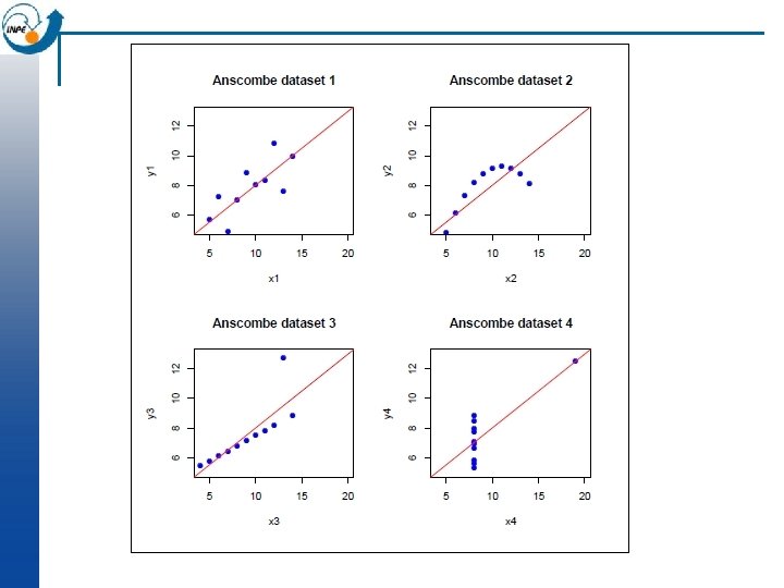
Look before you leap! n Anscombe developed four different bivariate datasets, all with the exact same correlation r = 0. 81 and linear regression y = 3+0. 5 x: n 1. bi-variate normal 2. quadratic 3. bi-variate normal with one outlier 4. one high-leverage point n n n

Bivariate analysis: heavy metals vs. organic matter n n Scatterplot by flood frequency Regression of metal on organic matter (why this order? ) Same, including flood frequency in the model > plot(om, log(cadmium)) > plot(om, log(cadmium), col=as. numeric(ffreq), cex=1. 5, pch=20)
 ~ om) > summary(m) Residuals:")
Model: Regression of metal on organic matter > m<-lm(log(cadmium) ~ om) > summary(m) Residuals: Min 1 Q Median 3 Q Max -2. 3070 -0. 3655 0. 1270 0. 6079 2. 0503 Coefficients: Estimate Std. Error t value Pr(>|t|) (Intercept) -1. 04574 0. 19234 -5. 437 2. 13 e-07 *** om 0. 21522 0. 02339 9. 202 2. 70 e-16 *** --Residual standard error: 0. 9899 on 151 degrees of freedom Multiple R-Squared: 0. 3593, Adjusted R-squared: 0. 3551 F-statistic: 84. 68 on 1 and 151 DF, p-value: 2. 703 e-16 Highly-significant model, but organic matter content explains only about 35% of the variability of log(Cd).

Good fit vs. significant fit n n n R 2 can be highly significant (reject null hypothesis of no relation), but. . . the prediction can be poor In other words, only a “small” portion of the variance is explained by the model Two possiblities 1. incorrect or incomplete model (a) other factors are more predictive ¨ (b) other factors can be included to improve the model ¨ (c) form of the model is wrong ¨ n 2. correct model, noisy data

Regression diagnostics n Objective: to see if the regression truly represents the presumed relation n Objective: to see if the computational methods are adequate n Main tool: plot of standardized residuals vs. fitted values n Numerical measures: leverage, large residuals

Examining the scatterplot with the fitted line n Is there a trend in lack of fit? (further away in part of range) ¨ n Is there a trend in the spread? ¨ n a non-linear model heteroscedasity (unequal variances) so linear modelling is invalid Are there points that, if eliminated, would substantially change the fit? ¨ high leverage, isolated in the range and far from other points
 ~ om) > plot(om,")
Model diagnostics: regression of metal on organic matter > m<-lm(log(cadmium) ~ om) > plot(om, log(cadmium), col=as. numeric(ffreq), cex=1. 5, pch=20); abline(m) > plot(log(cadmium[!is. na(om)]), fitted(m), col=as. numeric(ffreq), pch=20) > abline(0, 1) > plot(fitted(m), studres(m), col=as. numeric(ffreq), pch=20) Ø abline(h=0) Ø qqnorm(studres(m), col=as. numeric(ffreq), pch=20); qqline(studres(m)) n We can see problems at the low metal concentrations. This is probably an artifact of the measurement precision at these levels (near or below the detection limit).
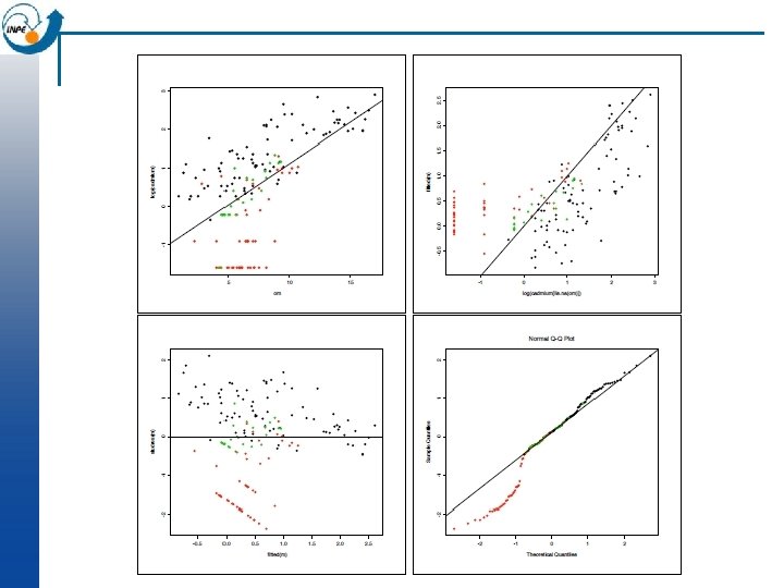

Revised model: Cd detection limit Values of Cd below 1 mg kg-1 are unreliable Replace them all with 1 mg kg-1 and re-analyze: > cdx <-ifelse(cadmium>1, cadmium, 1) > plot(om, log(cdx), col=as. numeric(ffreq), cex=1. 5, pch=20) > m<-lm(log(cdx) ~ om) > summary(m) Residuals: Min 1 Q Median 3 Q Max -1. 0896 -0. 4250 -0. 0673 0. 3527 1. 5836 Coefficients: Estimate Std. Error t value Pr(>|t|) (Intercept) -0. 43030 0. 11092 -3. 879 0. 000156 *** om 0. 17272 0. 01349 12. 806 < 2 e-16 ***

Revised model: Cd detection limit Residual standard error: 0. 5709 on 151 degrees of freedom Multiple R-Squared: 0. 5206, Adjusted R-squared: 0. 5174 F-statistic: 164 on 1 and 151 DF, p-value: < 2. 2 e-16 > abline(m) > plot(log(cdx[!is. na(om)]), fitted(m), col=as. numeric(ffreq), pch=20); abline(0, 1) > plot(fitted(m), studres(m), col=as. numeric(ffreq), pch=20); abline(h=0) > qqnorm(studres(m), col=as. numeric(ffreq), pch=20); qqline(studres(m)) Much higher R 2 and better diagnostics. Still, there is a lot of spread at any value of the predictor (organic matter).
~1, ~x+y, meuse) np dist gamma 1 57")
Experimental variogram > v <- variogram (log(cadmium)~1, ~x+y, meuse) np dist gamma 1 57 79. 29244 0. 6650872 2 299 163. 97367 0. 8584648 3 419 267. 36483 1. 0064382 4 457 372. 73542 1. 1567136 5 547 478. 47670 1. 3064732 6 533 585. 34058 1. 5135658 7 574 693. 14526 1. 6040086 8 564 796. 18365 1. 7096998 9 589 903. 14650 1. 7706890 10 543 1011. 29177 1. 9875659 11 500 1117. 86235 1. 8259154 12 477 1221. 32810 1. 8852099 13 452 1329. 16407 1. 9145967 14 457 1437. 25620 1. 8505336 15 415 1543. 20248 1. 8523791 np are the number of point pairs in the bin; dist is the average separation of these pairs; gamma is the average semivariance in the bin.

Plotting the experimental variogram n This can be plotted as semivariance gamma against average separation dist, along with the number of points that contributed to each estimate np: > plot(v, plot. numbers=T ) n (Note: gstat defaults to 15 equally-spaced bins and a maximum distance of 1/3 of the maximum separation. These can be over-ridden with the width= and cutoff= arguments, respectively. )

Plotting the variogram

Analysing the variogram n Later we will look at fitting a model to the variogram; but even without a model we can notice some features, which we define here only qualitatively: Sill: maximum semi-variance; represents variability in the absence of spatial dependence ¨ Range: separation between point-pairs at which the sill is reached; distance at which there is no evidence of spatial dependence ¨ Nugget: semi-variance as the separation approaches zero; represents variability at a point that can’t be explained by spatial structure. ¨ n In the previous slide, we can estimate the sill 1. 9, the range 1200 m, and the nugget 0. 5 i. e. 25% of the sill.

Using the experimental variogram to model the random process n Notice that the semivariance of the separation vector g(h) is now given as the estimate of covariance in the spatial field. n So it models the spatially-correlated component of the regionalized variable n We must go from the experimental variogram to a variogram model in order to be able to model the random process at any separation.

Modelling the variogram n From the empirical variogramwe now derive a variogram model which expresses semivariance as a function of separation vector. It allows us to: n Infer the characteristics of the underlying processfrom the functional form and its parameters; n Compute the semi-variance between any point-pair, separated by any vector; n Interpolate between sample points using an optimal interpolator (“kriging”)

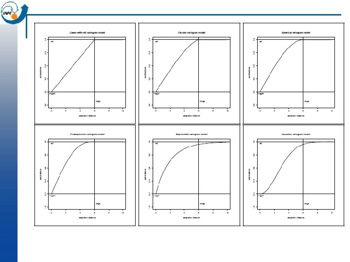
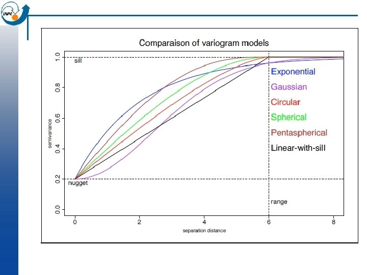
“Authorized” Models n n Any variogram function must be able to model the following: 1. Monotonically increasing ¨ n n n possibly with a fluctuation (hole) 2. Constant or asymptotic maximum (sill) 3. Non-negative intercept (nugget) 4. Anisotropy Variograms must obey mathematical constraints so that the resulting kriging equations are solvable (e. g. , positive definite between-sample covariance matrices). The permitted functions are called authorized models.

Visualization of the model in gstat-windows n Open the “meuse. txt” file in gstatw n Visualize the data n Try to fit various variogram models

Gstat for windows

Defining the bins n Distance interval, specifying the centres. E. g. (0, 100, 200, . . . ) means intervals of [0. . . 50], [50. . . 150], . . . All point pairs whose separation is in the interval are used to estimate g(~h) for h as the interval centre ¨ Narrow intervals: more resolution but fewer point pairs for each sample ¨ > v <- variogram(log(cadmium)~1, ~x+y, meuse, boundaries = seq(50, 2050, by = 100)) > plot(v, pl=T) > par(mfrow = c(2, 3)) # show all six plots together > for (bw in seq(20, 220, by = 40)) { v<-variogram(log(cadmium)~1, ~x+y, meuse, width=bw) plot(v$dist, v$gamma, xlab=paste("bin width", bw)) }

Defining the bins Each bin should have > 100 point pairs; > 300 is much more reliable > v <- variogram(log(cadmium)~1, ~x+y, meuse, width=20) > plot(v, plot. numbers=T) > v$np [1] 6 19 27 27 51 65 58 62 62 82 76 75 86 81 76 [16] 91 92 90 88 92 112 103 80 116 108 106 79 94 117 99 [31] 100 101 108 117 110 117 114 107 96 110 109 106 114 117 104 [46] 98 94 117 92 110 105 91 89 98 89 91 103 102 93 92 [61] 73 85 88 91 88 84 75 81 90 73 93 95 76 85 67 [76] 77 88 60 > v <- variogram(log(cadmium)~1, ~x+y, meuse, width=120) > v$np [1] 79 380 485 577 583 642 654 648 609 572 522 491 493 148 > plot(v, plot. numbers=T)

Fitting the model n n Once a model form is selected, then the model parameters must be adjusted for a ‘best’ fit of the experimental variogram. By eye, adjusting parameters for good-looking fit Hard to judge the relative value of each point ¨ Use the windows version of gstat ¨ n Automatically, looking for the best fit according to some objective criterion Various criteria possible in gstat ¨ In both cases, favour sections of the variogram with more pairs and at shorter ranges (because it is a local interpolator). ¨ Mixed: adust by eye, evaluate statistically; or vice versa ¨

Fitting the model manually We’ve decided on a spherical + nugget model: > # Calculate the experimental variogram and display it Ø v 1 <- variogram(log(cadmium)~1, ~x+y, meuse) > plot(v 1, plot. numbers=T) > # Fit by eye, display fit > m 1 <- vgm(1. 4, "Sph", 1200, 0. 5); plot(v 1, plot. numbers=T, model=m 1) n

Fitting the model automatically > # Let gstat adjust the parameters, display fit > m 2 <- fit. variogram(v 1, m 1) > m 2 model psill range 1 Nug 0. 5478478 0. 000 2 Sph 1. 3397965 1149. 436 > plot(v 1, plot. numbers=T, model=m 2) > # Fix the nugget, fit only the sill of spherical model > m 2 a <fit. variogram(v 1, m 1, fit. sills=c(F, T), fit. range=F) > m 2 a model psill range 1 Nug 0. 500000 0 2 Sph 1. 465133 1200

Model comparison n By eye: c 0 = 0. 5, c 1 = 1. 4, a = 1200; total sill c 0+c 1 = 1. 9 Automatic: c 0 = 0. 548, c 1 = 1. 340, a = 1149; total sill c 0+c 1 = 1. 888 The total sill was almost unchanged; gstat raised the nugget and lowered the partial sill of the spherical model a bit; the range was shortened by 51 m.

What sample size to fit a variogram model? n Can’t use non-spatial formulas for sample size, because spatial samples are correlated, and each sample is used multiple times in the variogram estimate ¨ ¨ ¨ No way to estimate the true error, since we have only one realisation Stochastic simulation from an assumed true variogram suggests: < 50 points: not at all reliable 100 to 150 points: more or less acceptable > 250 points: almost certaintly reliable n More points are needed to estimate an anisotropic variogram. n This is very worrying for many environmental datasets (soil cores, vegetation plots, . . . ) especially from short-term fieldwork, where sample sizes of 40 – 60 are typical. Should variograms even be attempted on such small samples?

Approaches to spatial prediction n n This is the prediction of the value of some variable at an unsampled point, based on the values at the sampled points. This is often called interpolation, but strictly speaking that is only for points that are geographically inside the sample set (otherwise it is extrapolation.

Approaches to prediction: Local predictors n Value of the variable is predicted from “nearby” samples * Example: concentrations of soil constituents (e. g. salts, pollutants) ¨ Example: vegetation density ¨

Local Predictors n Each interpolator has its own assumptions, i. e. theory of spatial variability ¨ Nearest neighbour Average within a radius Average of n nearest neighbours Distance-weighted average within a radius Distance-weighted average of n nearest neighbours ¨ Optimal” weighting -> Kriging ¨ ¨

Ordinary Kriging n The theory of regionalised variables leads to an “optimal” interpolation method, in the sense that the prediction variance is minimized. n This is based on theory of random functions, and requires certain assumptions.

Optimal local interpolation: motivation n Problems with average-in-circle methods: ¨ n 1. No objective way to select radius of circle or number of points Problems with inverse-distance methods: 1. How to choose power (inverse, inverse squared. . . )? ¨ 2. How to choose limiting radius? ¨ n In both cases: 1. Uneven distribution of samples could over– or under– emphasize some parts of the field ¨ 2. prediction error must be estimated from a separate validation dataset ¨

An “optimal” local predictor would have these features: n n n n Prediction is made as a linear combination of known data values (a weighted average). Prediction is unbiased and exact at known points Points closer to the point to be predicted have larger weights Clusters of points “reduce to” single equivalent points, i. e. , over-sampling in a small area can’t bias result Closer sample points “mask” further ones in the same direction Error estimate is based only on the sample configuration, not the data values Prediction error should be as small as possible.
 that satisfies certain criteria for optimality.")
Kriging n n A “Best Linear Unbiased Predictor”(BLUP) that satisfies certain criteria for optimality. It is only “optimal” with respect to the chosen model! Based on theory of random processes, with covariances depending only on separation (i. e. a variogram model) Theory developed several times (Kolmogorov 1930’s, Wiener 1949) but current practise dates back to Matheron (1963), formalizing the practical work of the mining engineer D G Krige (RSA).

How do we use Kriging? n n 1. Sample, preferably at different resolutions 2. Calculate the experimental variogram 3. Model the variogram with one or more authorized functions 4. Apply the kriging system, with the variogram model of spatial dependence, at each point to be predicted Predictions are often at each point on a regular grid (e. g. a raster map) ¨ These ‘points’ are actually blocks the size of the sampling support ¨ Can also predict in blocks larger than the original support ¨ n 5. Calculate the error of each prediction; this is based only on the sample point locations, not their data values.
 n In OK, we model the value of variable")
Prediction with Ordinary Kriging (OK) n In OK, we model the value of variable z at location si as the sum of a regional mean m and a spatiallycorrelated random componente(si): n Z(si) = m+e(si) n The regional mean m is estimated from the sample, but not as the simple average, because there is spatial dependence. It is implicit in the OK system.
 n n Predict at points, with unknown mean (which")
Prediction with Ordinary Kriging (OK) n n Predict at points, with unknown mean (which must also be estimated) and no trend Each point x is predicted as the weighted averageof the values at all sample Z*x = ån λi Zæçè xi ö÷ø 0 i=1 λ =? i n n n The weights assigned to each sample point sum to 1 Therefore, the prediction is unbiased “Ordinary”: no trend or strata; regional mean must be estimated from sample
 # also make")
OK in gstat # load 40 m interpolation grid data(meuse. grid) # also make a full grid in the bounding box covering the same area meuse. box<-expand. grid( x=seq(min(meuse. grid$x), max(meuse. grid$x), by=40), y=seq(min(meuse. grid$y), max(meuse. grid$y), by=40) )

OK in gstat n The krige method is used with a variogram model: # compute experimental variogram v <- variogram (log(cadmium) ~ 1, ~ x+y, meuse) # estimated model m <- vgm(1. 4, "Sph", 1200, 0. 5) # fitted model m. f <- fit. variogram (v, m) [1] "SSErr: 2. 80736271217044 e-05" kr <- krige (log(cadmium)~ 1, loc=~ x+y , data=meuse, newdata= meuse. grid, model=m. f ) [using ordinary kriging]
 # visualize interpolation; note aspect option to get correct")
OK in gstat library (lattice) # visualize interpolation; note aspect option to get correct geometry levelplot (var 1. pred ~ x+y, kr, aspect=mapasp(k 1)) # visualize prediction error levelplot (var 1. var ~ x+y, kr, aspect=mapasp(k 1))
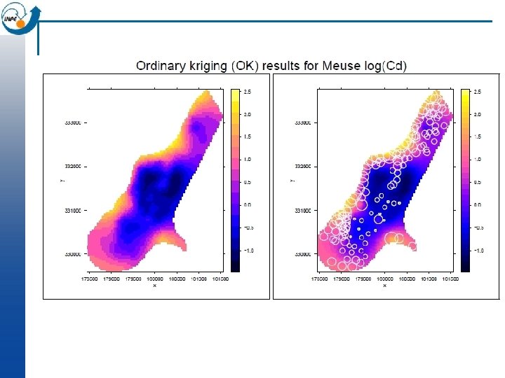
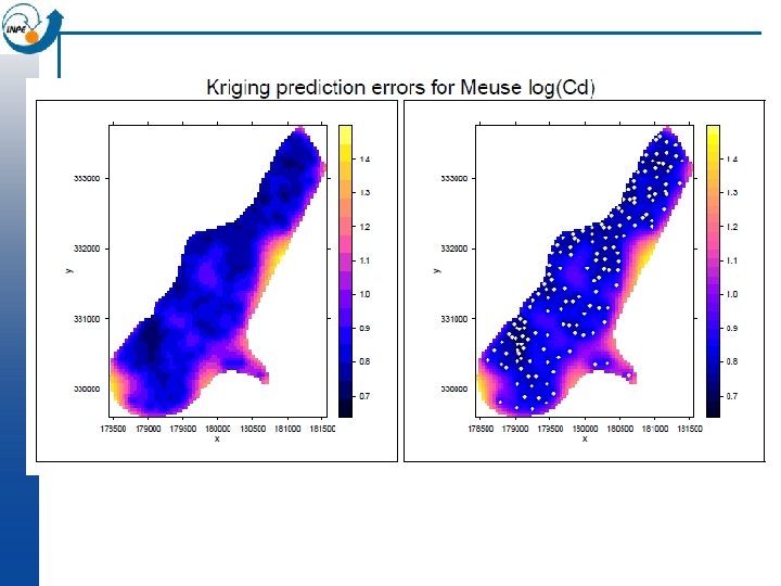

How realistic are maps made by Ordinary Kriging? n The resulting surface is smooth and shows no noise, no matter if there is a nugget effect in the variogram model n So the field is the best at each point taken separately, but taken as a whole is not a realistic map n The sample points are predicted exactly ; they are assumed to be without error, again even if there is a nugget effect in the variogram model (Note: bloc kriging does not have this problem)
- Slides: 64