Geography Fieldwork Skills Part 3 Data Presentation LO

- Slides: 8

Geography Fieldwork Skills Part 3 – Data Presentation LO – to develop key geographical skills for GCSE, further education and the workplace. Success Criteria 1. Complete a Choropleth map for your Environmental Quality Survey. 2. To complete a proportional circles diagram for your litter count. 3. To complete bar chart for your pedestrian count.

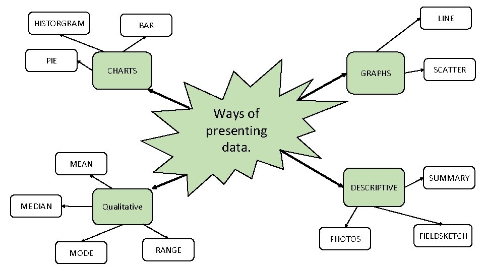
HISTORGRAM PIE LINE BAR CHARTS GRAPHS SCATTER Ways of presenting data. MEAN DESCRIPTIVE MEDIAN SUMMARY Qualitative MODE RANGE PHOTOS FIELDSKETCH

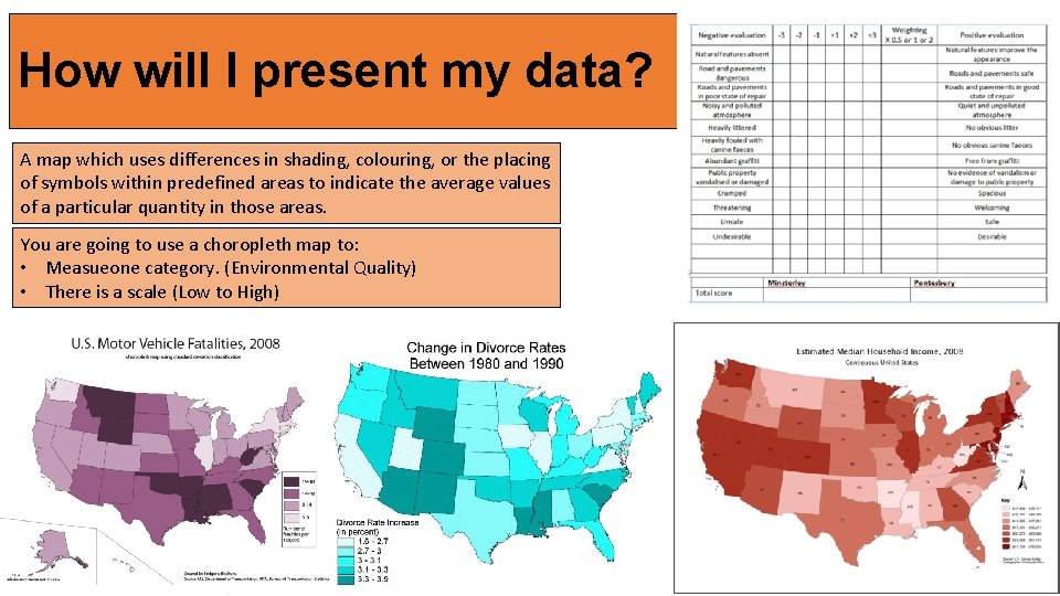
How will I present my data? A map which uses differences in shading, colouring, or the placing of symbols within predefined areas to indicate the average values of a particular quantity in those areas. You are going to use a choropleth map to: • Measueone category. (Environmental Quality) • There is a scale (Low to High)

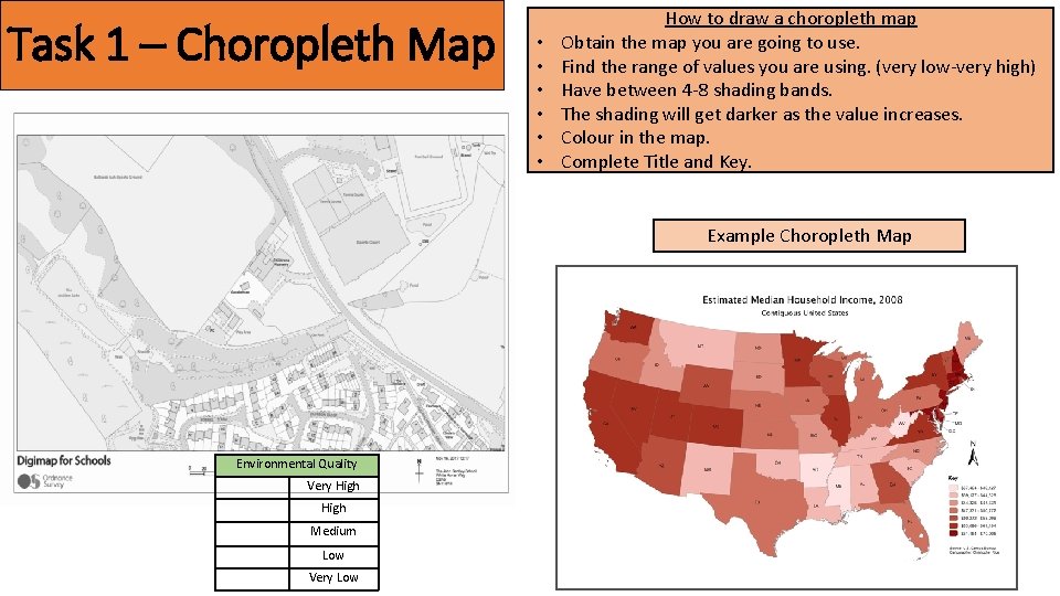
Task 1 – Choropleth Map • • • How to draw a choropleth map Obtain the map you are going to use. Find the range of values you are using. (very low-very high) Have between 4 -8 shading bands. The shading will get darker as the value increases. Colour in the map. Complete Title and Key. Example Choropleth Map Environmental Quality Very High Medium Low Very Low

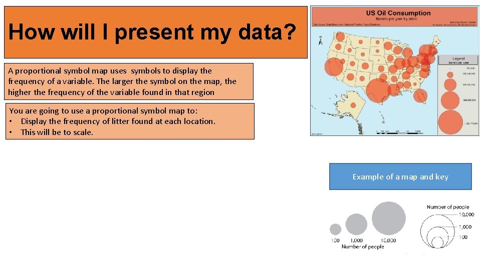
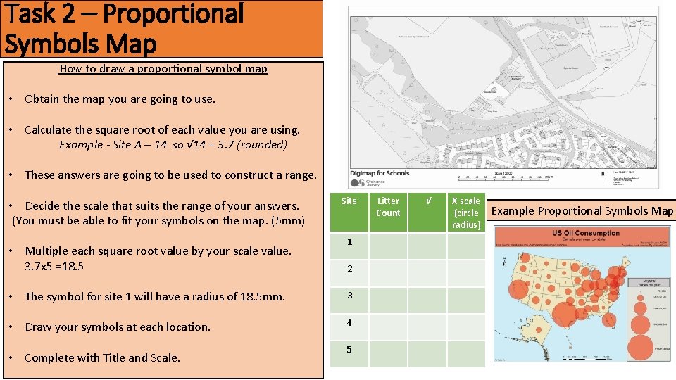
How will I present my data? A proportional symbol map uses symbols to display the frequency of a variable. The larger the symbol on the map, the higher the frequency of the variable found in that region You are going to use a proportional symbol map to: • Display the frequency of litter found at each location. • This will be to scale. Example of a map and key

Task 2 – Proportional Symbols Map How to draw a proportional symbol map • Obtain the map you are going to use. • Calculate the square root of each value you are using. Example - Site A – 14 so √ 14 = 3. 7 (rounded) • These answers are going to be used to construct a range. • Decide the scale that suits the range of your answers. (You must be able to fit your symbols on the map. (5 mm) • Multiple each square root value by your scale value. 3. 7 x 5 =18. 5 Site 1 2 • The symbol for site 1 will have a radius of 18. 5 mm. 3 • Draw your symbols at each location. 4 • Complete with Title and Scale. 5 Litter Count √ X scale (circle radius) Example Proportional Symbols Map

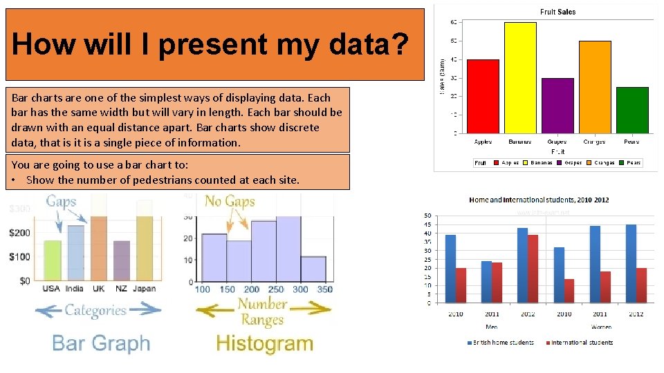
How will I present my data? Bar charts are one of the simplest ways of displaying data. Each bar has the same width but will vary in length. Each bar should be drawn with an equal distance apart. Bar charts show discrete data, that is it is a single piece of information. You are going to use a bar chart to: • Show the number of pedestrians counted at each site.

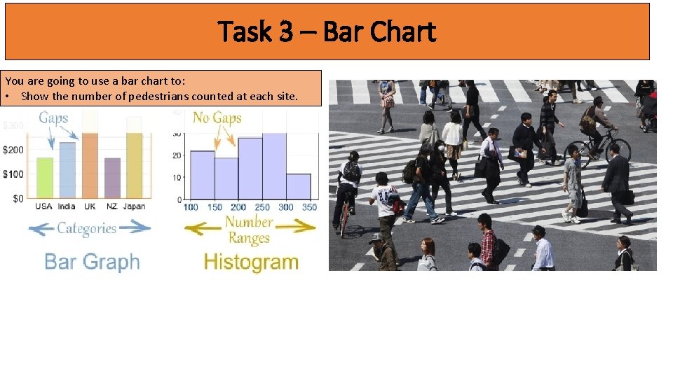
Task 3 – Bar Chart You are going to use a bar chart to: • Show the number of pedestrians counted at each site.