Geo 479579 Geostatistics Ch 4 Spatial Description What


, which refers to the value at a particular")


 and V(t+h) (fatness of")


 § Cross-correlation function (Eq 4. 15)")
 (4. 9) (4. 10) (4. 11)")
 (4. 15) (4. 18)")

- Slides: 43
Geo 479/579: Geostatistics Ch 4. Spatial Description
What is GIS? ► G: maps ► I: spreadsheets ► S: the system that puts the maps and spreadsheets together
Components in GIS ► Spatial locations ► Attributes ► Topology
Spatial Locations ► Specified with reference to a common coordinate system Geographic coordinate system (lat and long) UTM (Universal Transverse Mercator) State Plane
GIS Data Models ► Vector points lines polygons networks ► Raster grids courtesy: Mary Ruvane, http: //ils. unc. edu/
Difference from Other Statistics § Geostatistics explicitly consider the spatial nature of the data: such as location of extreme values, spatial trend, and degree of spatial continuity § If we rearrange the data points, do the mean and standard deviation change? Do the geostatistical measurements change? § Statistics, geostatistics, spatial statistics
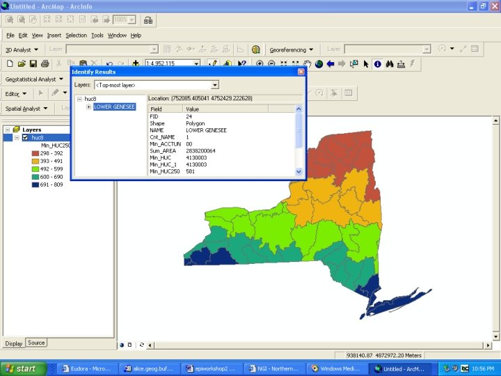
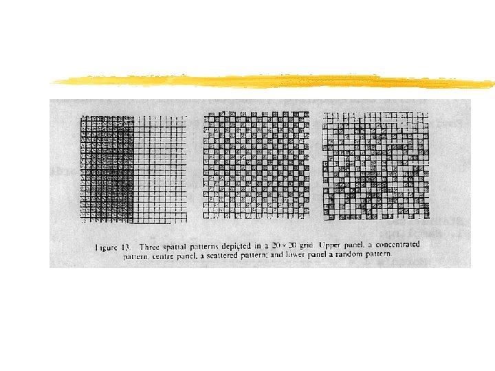
Data Posting § A map on which each data location is plotted, along with its corresponding data value. § Data posting is an important initial step for detecting outliers or errors in the data. (A single high value surrounded by low values are worth rechecking) § Data posting gives an idea of how data are sampled, and it may reveal some trends in the data.
Contour Maps Contour maps show trends and outliers
Symbol Maps § Symbol map use color and other symbols to show values in classes and the order between classes
Indicator Maps They show where values are above or below a threshold. A series of indicator maps can be used to show a phenomenon
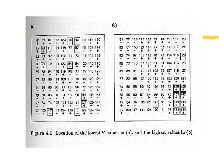
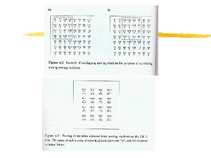
Moving Window Statistics § Implication of anomalies in the data. § Summary statistics within a moving window is used to investigate anomalies both in the average value and in the variability within regions (windows)
Moving Window Statistics…
Neighborhood Statistics… Moving windows 3 4 5 0 1 Richness Interspersion 6 8 3 1 5 6 7 5 8 8 6 3 4 0 2 1 5 7 5 8 7 8 3 8 0 5 1
Moving Window Statistics… § The size of the window depends on average spacing between point locations and on the overall dimensions of the study area. § Size of the window should be large enough to obtain reliable statistics, and small enough to capture local details. § Overlapping moving windows can have both worlds. If have to choose, reliable statistics is preferred.
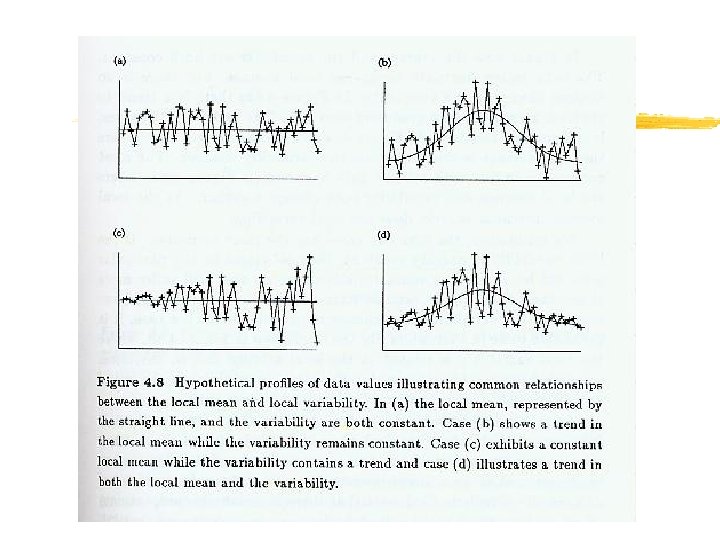
Proportional Effect § Proportional effect refers to the relationship between the local means and the local standard deviations from the moving window calculations. § Four relationships between local average and local variability (Figure 4. 8). - a stable local mean and a stable variability - a varying mean but a stable variability - a stable mean but a varying variability - the local mean and variability change together
Proportional Effect… § The first two cases are preferred because of a low variability in standard deviation. § The next best thing is case (d) because the mean is related to the variability in a predictable fashion. § A scatterplot of mean vs. standard deviation helps detect the trend.
Spatial Autocorrelation § First law of geography: “everything is related to everything else, but near things are more related than distant things” – Waldo Tobler § Also known as spatial dependence
Spatial Autocorrelation… § Spatial Autocorrelation is a correlation of a variable with itself through space. § If there is any systematic pattern in the spatial distribution of a variable, it is said to be spatially autocorrelated. § If nearby or neighboring areas are more alike, this is positive spatial autocorrelation. § Negative autocorrelation describes patterns in which neighboring areas are unlike. § Random patterns exhibit no spatial autocorrelation.
Spatial Autocorrelation… § First order effects relate to the variation in the mean value of the process in space – a global or large scale trend. § Second order effects result from the correlation of a variable in reference to spatial location of the variable – local or small scale effects.
Spatial Autocorrelation… § A spatial process is stationary, if its statistical properties such as mean and variance are independent of absolute location, but dependent on the distance and direction between two locations.
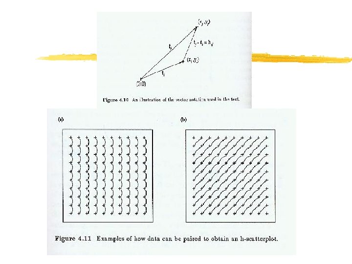
H-Scatterplots § An h-scatterplot shows all possible pairs of data values whose locations are separated by a certain distance h in a particular direction. § The location of the point at is denoted as , and the separation between two points i and j can be denoted as or.
H-Scatterplots… § X-axis is labeled V(t), which refers to the value at a particular location t; Y-axis is labeled V(t+h), which refers to the value a distance and direction h away. § The shape of the cloud of points on an hscatterplot tells us how continuous the data values are over a certain distance in a particular direction.
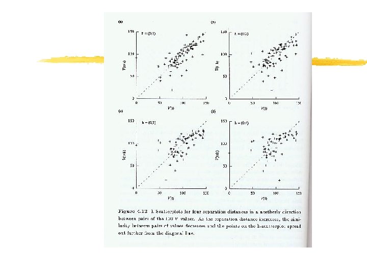
H-Scatterplots… § If the data values at locations separated by h are very similar then the pairs will plot close to the line x=y, a 45 -degree line passing through the origin. § As the data values become less similar, the cloud of points on the h-scatterplot becomes wider and more diffuse.
H-Scatterplots… § In Figure 4. 12, the similarity between pairs of values decreases as the separation distance increases. § Presence of outliers may considerably influence the summary statistics.
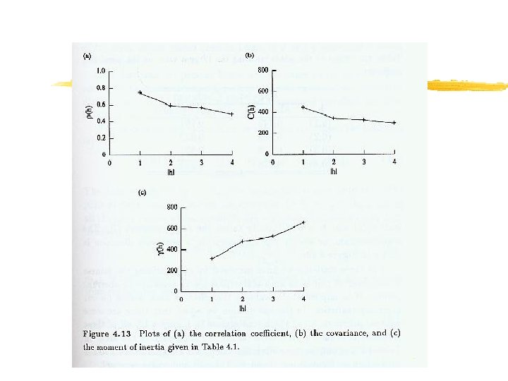
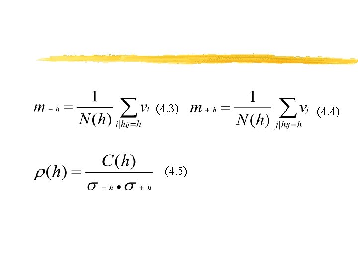
Correlation Functions, Covariance Functions, and Variograms § Similarity between V(t) and V(t+h) (fatness of the cloud of points on an h-scatterplot) can be summarized in several ways. § These include covariance correlation function or correlogram variogram
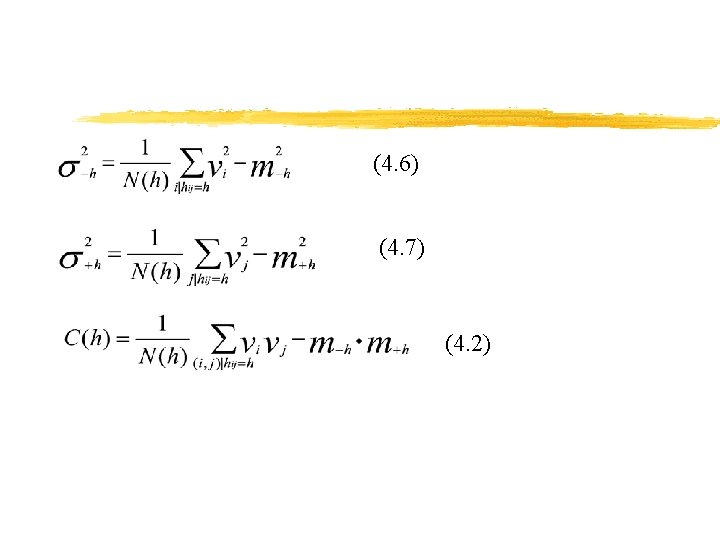
Correlation Functions, Covariance Functions and Variograms… § The relationship between the covariance of an h-scatterplot and h is called the covariance function, denoted as (Equation 4. 2).
Correlation Functions, Covariance Functions and Variograms… § The relationship between the correlation coefficient of an h-scatterplot and h is called the correlation function or correlogram, often denoted as (Equation 4. 5).
Correlation Functions, Covariance Functions and Variograms… § The variogram, is half the average squared difference between the paired data values (Equation 4. 8).
Cross h-Scatterplots § Instead of paring the value of one variable with the value of the same variable at another location, we can pair values of a different variable at another location. § Plot V value at a particular data location against U value at a separation distance h to the east. Figure 4. 14.
Cross h-Scatterplots § Cross-covariance function (Eq 4. 12) § Cross-correlation function (Eq 4. 15) § Cross-semivariogram (Eq 4. 18)
(4. 8) (4. 9) (4. 10) (4. 11)
(4. 12) (4. 15) (4. 18)
Spatial Continuity § Two data close to each other are more likely to have similar values than two data that are far apart. § Relationship between two variables. § Relationship between the value of one variable and the value of the same variable at nearby locations.