GCSE Statistics Quality Assurance January 2022 Learning Objectives
GCSE Statistics Quality Assurance
January 2022 Learning Objectives • plot quality control charts for means and medians or ranges (8. 6) • understand target values, and action and warning limits (8. 6) • understand what actions need to be taken when values lie between/outside the action and warning limits (8. 6) Reference Material • MEP • 10 Ticks
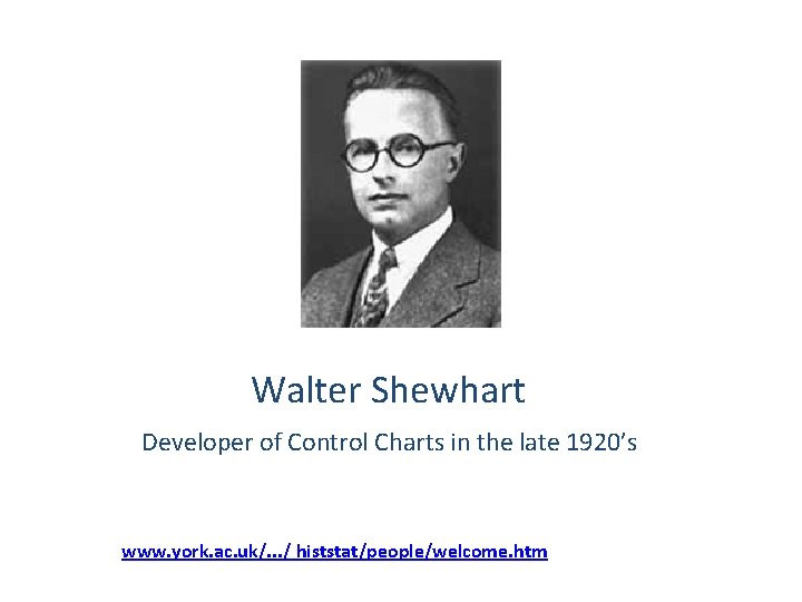
Walter Shewhart Developer of Control Charts in the late 1920’s www. york. ac. uk/. . . / histstat/people/welcome. htm
Control Charts • Control charts are particularly useful for monitoring quality and giving early warnings that a process may be going “Out of Control” and on its way to producing defective parts. • Out of control is not used to describe Miss Pam but, for example, manufacturing processes where limits are needed such as the weight of crisps in a packet. This needs to stay within a set range.
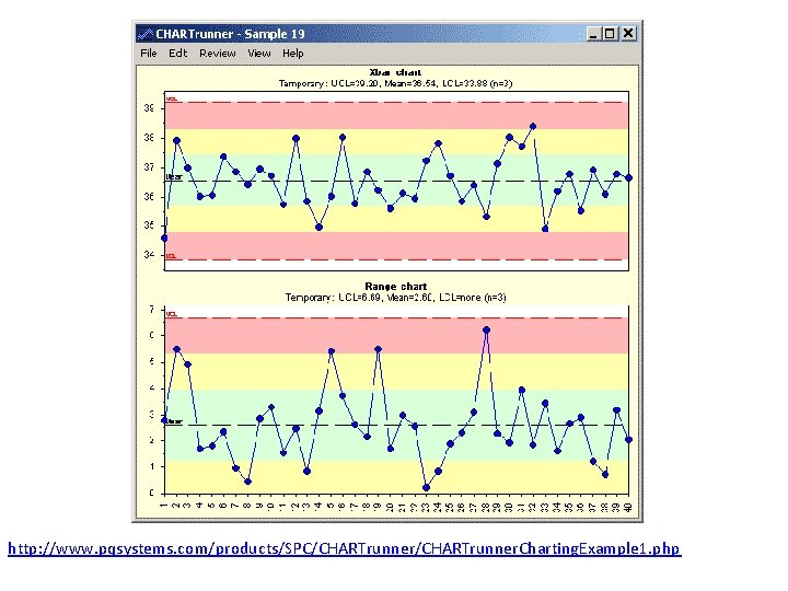
Quality assurance is used to check the quality of a product. Samples are taken at regular intervals and compared with what they should be. Generally you compare the mean or median of the sample and the range. A control chart is a time series chart use for process control. You can use a control chart with the mean, median or range. Each chart has warning limits set. This is when you become aware the process may be going wrong and you take another sample. Each chart has action limits set, these are the values beyond which action has to be taken. Stop machine and reset. If a process is under control only 1 in 20 (5%) of checks should fall outside the warning limits.
http: //www. pqsystems. com/products/SPC/CHARTrunner. Charting. Example 1. php

Warning limits are usually set at µ ± 2σ If a sample mean is between the warning limits the process is in control and the product is acceptable Action limits are usually set at µ ± 3σ If a sample mean is between the warning limits and the action limits another sample is taken immediately to see if there might be a problem If a sample mean is outside the action limits the process is stopped and the machine reset.

What does the control chart look like? - First we measure a number of parts as they come off the line. - For example we might measure 4 parts per hour for 20 hours. - Those 80 parts would give us an overall mean and standard deviation that would define the control chart. - The average of the size of the four parts would give us the y values for each hour (plotted on the x-axis) +3 -3 Time
Edexcel do not join the dots in their control charts so neither do you!

Quality control charts for means Sample mean Upper action limit Lower action limit
Quality control charts for medians look the same as control charts for means. Why do it then? Sometimes the median is easier to find and can be plotted quicker.
Quality control charts for ranges In an ideal situation the range would be zero. This would mean each product produced would be exactly the same size. Range is controlled by the accuracy of the machine and so no target range is set. Control charts for ranges have warning and action limits in the same way as the control charts for means. If a sample range falls between the warning and action limits another sample is taken. If a sample range falls outside the action limits then the machine needs checking. Sometimes the lower warning and action limits on a range chart are omitted Limits for ranges are more complex than those for means. You will only be asked to plot the points and state actions to be taken.
Your turn Read example 10 page 313 Exercise 8 E page 315
- Slides: 13