Frequency Diagrams Three Types 1 Histogram 2 Polygon


 Histogram Equal class interval Daily wages")

")
 No. of workers (F) Adjusted Frequency 10 -15")


 Polygon With Histogram")
 Polygon Without Histogram Method : 1. Mid values of the classes are marked")

 Y 35 30 25 20 15 10")


 Scale : 1 c. m. = 50 students on Y-axis")
- Slides: 24
Frequency Diagrams Three Types 1. Histogram 2. Polygon 3. Ogive
Histogram Is a graphical presentation of a frequency distribution of a continuous Series. While constructing a histogram , Values of the Variable are shown on the X- Axis, and their frequencies on the Y Axis. Histograms are different from Bar diagram because these are Two Dimensional Both Length & Breadth of the rectangles are considered for purpose of a Comparison. Bars are one dimensional – only length of the bars is considered for purpose of a comparison.
Histograms of Frequency Distribution are of Two Types 1. Histogram of Equal class Intervals 2. Histogram of Unequal class intervals
I. Histogram of Equal Class Interval Note: Line of Histogram are adjoining Represent the following data by Histogram Wages (in Rs. ) No. of Workers (F) 0 - 5 5 - 10 4 10 10 15 20 25 30 14 22 32 15 3 - 15 20 25 30 35
No. of worker (F) Histogram Equal class interval Daily wages
II. Histogram of Unequal Class Interval Note : width of the rectangle would be different. frequencies must be adjusted , otherwise the histogram would give a misleading picture Method : 1. 2. 3. 4. Take the class which has the lowest class interval. Do not adjust the frequencies of the lowest class. Frequencies of other classes are adjusted with this lower class interval Adjusted frequencies will decide the height of each rectangle of histogram but width will be according to class limits 5. The frequencies of minimum class interval on which the frequencies of the other classes are adjusted will not be changed.
Example : Represent the following data by means of histogram. Daily wages (Rs. ) No. of workers (F) 10 -15 7 15 -20 19 20 -25 28 25 -30 15 30 -40 12 40 -60 12 60 -80 8
Solution : Daily wages (Rs. ) No. of workers (F) Adjusted Frequency 10 -15 7 - 7 15 -20 19 - 19 20 -25 28 - 28 25 -30 15 - 15 30 -40 12 5 x 12/10= 6 40 -60 12 5 x 12/20= 3 60 -80 8 5 x 8/20= 2 5= difference of class interval 12= frequency 10 = is the difference of class interval
Frequency Histogram of Unequal class Daily wages
II. Polygon is another form of diagrammatic presentation of data. It is formed by Joining mid points of the tops of all rectangles in a Histogram. Frequency Polygon can be drawn by two ways : (a) With Histogram (b) Without Histogram (a) Polygon With Histogram Example : Draw a frequency polygon of the following distribution of students obtaining marks in an examination Marks Students : 10 -20 5 20 -30 12 30 -40 15 40 -50 22 50 -60 14 4
(a) Polygon With Histogram
(a) Polygon Without Histogram Method : 1. Mid values of the classes are marked on the X axis of the graph. frequency on the y axis. 2. Join the points plotted for the mid points corresponding to their frequencies. Example : Draw a frequency polygon of the following distribution of students obtaining marks in an examination Marks Students : 10 -20 5 20 -30 12 30 -40 15 40 -50 22 50 -60 14 4
Solution : Polygon Without Histogram Marks Mid Values Students : 10 -20 10+20/2 =15 5 20 -30 20+30/2= 25 12 30 -40 30+40/2=35 15 40 -50 40+50/2= 45 22 50 -60 50+60/2=55 14 60+70/2=65 4
Polygon Without Histogram Frequency (No. of student) Y 35 30 25 20 15 10 5 o 5 15 25 35 45 55 65 75 x Marks (Mid Value) of class interval Minimum frequency is 5
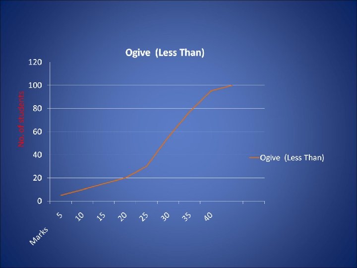
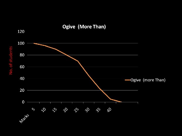
III. Ogive OR cumulative Frequency curve Is the curve which is constructed by plotting cumulative frequency data on the graph paper , in the form of a smooth curve. Ogive may be constructed in two ways – (1) Less than Method (2) More than method
Example : graph these data in the form of less than ogive & more than ogive Marks No. of students 0 - 5 4 5 - 10 6 10 - 15 10 15 - 20 10 20 - 25 25 25 - 30 22 30 - 35 18 35 - 40 5
1. Less than method In this method , frequencies are cumulated and indicated in the graph corresponding to Upper limits of the classes in a frequency distribution Less than Type Marks C. F. Less than 5 4 ----- 10 4+6 = 10 ------ 15 10+10 =20 -------20 20+10 =30 ------- 25 30+25=55 ----- 30 55+22 =77 --- 35 77 + 18 =95 --- 40 95+ 5 =100
More than method In this method, we take cumulative total of the frequencies beginning with lower limit of the 1 st class interval. thus in a series showing 0 -5, 5 -10 and 10 -15 as different class interval , we find the frequency for more than 0 , more than 5, and more than 10.
More than Type Marks C. F More than 0 100 ------ 5 100 - 4 =96 ---- 10 96 – 6 = 90 -------15 90 - 10 =80 -----20 80 - 10 =70 ---25 70 - 25 =45 ---30 45 – 22 =23 -- 35 23 - 18 = 5 ----40 5 - 5 =0
3. Arithmetic Line graph An arithmetic line graph is also called time series graph and is a method of diagrammatic presentation of data. In it time, (hour, day, date, week, month, year etc. ) is plotted along x axis and the value of the variable (time series data ) along Y axis.
Example : Years No. of Students 2000 50 2001 150 2002 100 2003 150 2004 2005 225 2006 200
Solution : (2000 -06) Scale : 1 c. m. = 50 students on Y-axis No. of students Y X Years