FORMS IN HTML Forms An HTML form provides


- Slides: 17
FORMS IN HTML
Forms An HTML form provides data gathering functionality to a web page. Html provides the <form>…</form> tags with which an html form can be created to capture user input. Input tag: defines an input area within a form. The different ways of input are specified by “type” attribute. This attribute can accept text, radio, checkbox, password submit, reset, image, hidden etc as its value.
TEXT FIELDS It presents the user with a prompt for a single line of text. These fields are commonly used for a name address, email address, country, postal code etc. <input type=“text” name=“text-id” value=“default-text” size=“n” maxlegth=“m” read only> Name: to label the content. This name is not visible to the user and must be unique within the form. Value: to supply initial text to the txt field and is optional. The content of this attribute will be shown on the text field, unless the user changes it. Size: to specify the physical size of the text input box. The default value is usually a length of 20 characters.
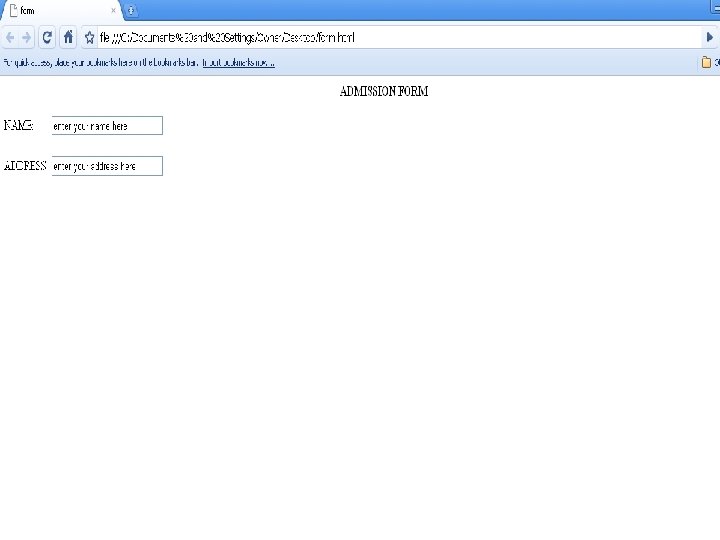
Maxlength: to set the number of character a user can input. The default value of max length is unlimited. Readonly: to lock the predefined content within the text field and the content won’t be editable further. <html> <head><title>form</title></head> <body> <p align="center"> <b> ADMISSION FORM</b> <form> <p> NAME: <input type="text" name="name" value="enter your name here" size=25 maxlength=30> ADDRESS: <input type="text" name="address" value="enter your address here" size=25 maxlength=30> </form> </body> </html>
Password fields are similar to the text fields, except the content of the field are not visible on the screen. It displays **** instead of the actual input. <input type=“password” name=“password-id” value=“default-text” size=“n” maxlength=“m” readonly>
Radio Buttons These are mutually exclusive i. e. they allow the user to choose one of the several options. Selecting one turns the other off. These buttons are viewed in the browser as small circles with a prompt and the selected one appears with a solid dot in it. <input type=“radio” name=“radio-id” value=“choiceid” checked> Value: it is the value assigned by the user. Each radio button must be assigned a value. Checked: causes the radio button to be on when the form is first created.
Checkboxes An input tag with attribute type=“checkbox” offers the user an “on” or “off” switch. Each check box works independently from the other, visitor can select or deselect any combination of checkboxes. Use of these boxes are appropriate where user can have more than one right answer. <input type=“checkbox” name=“box-id” value=“choice-id” checked>
Drop down list A pull down menu lets the user select one choice out of many possible choices. All choices are not visible on screen, they are hidden. They occupy minimal amount of space. <select name=“text-id” size=“n” multiple> <option value=“choice-id 1” selected>text-label 1</option> <option value=“choice-id 2” selected>text-label 2</option> <option value=“choice-id 3” selected>text-label 3</option> </select> Size: no. of items to be displaced at a time. Selected: this value will be selected when 1 st time page appears.
TEXTAREA This tag is used to set an area within a form in which the user can type a large amount of text. This is basically used for giving comments and free form feedback from visitor <textarea name=“text-id” rows=“n” cols=“m” wrap=“virtual|physically|off” read only>INITIAL TEXT</text area> Rows: specifies the height of the text area. Cols: this attribute specifies the width of the text area. Wrap: if option is off then text is handled as one long sequence of text without line breaks. If its virtual the text appears on page as if its recognized line breaks but when the form is submitted the line breaks are turned off. If its set to physical then line breaks are included. Readonly: it prevents the user to alter the initial content.
Reset and submit buttons Submit: submits the information to the URL given as the action attribute of the form tag. <input type=“submit” value=“button-label”>. Image can also be used for submit button. <input type=image src=path heigth=n width=m alt=text border=0> Reset: clears the form enteries to the default one or leaves them blank if no default values are specified. <input type=“reset” value=“button-label”>.
FILES To allow visitor to upload files. <input type=file name=field-id size=n > Size: to specify the physical size of the field’s input box.
HIDDEN VALUES They do not appear in the displayed form. By setting the “type” attribute to hidden, it is possible to transmit default or previously specified text that is hidden from the user to the handling program. <input type=hidden name=data-id value=“hidden form data”>
Fieldset and legend tags <fieldset> tag creates a box around a group of widgets and <legend> tag provides a label to the field set. Both tags require closing tag. <body> <fieldset> <legend><H 2>DETAILS</H 2></legend> <form> …. </form> </fieldset> </body>
NAVIGATING THOUGH A FORM By default, we navigate through the form in order on which elements appear in the form, using the tabindex attribute we can change this default order. Access keys: provide keyboard access to the form using accesskey attribute
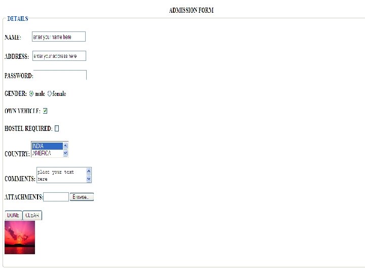
<body> <p align="center"> <b> ADMISSION FORM</b> <fieldset> <legend><b>DETAILS</legend> <form> <p> NAME: <input type="text" name="name" value="enter your name here" size=25 maxlength=30 readonly> ADDRESS: <input type="text" name="address" value="enter your address here" size=25 maxlength=30> PASSWORD: <input type="password" name="passwordid" value="" size=25 maxlength=30> GENDER: <input type="radio" name="gender" value="male" checked> male <input type="radio" name="gender" value="female" >female OWN VEHICLE: <input type ="checkbox" name="vehicle" value="vehicle" checked> HOSTEL REQUIRED: <input type ="checkbox" name="hostel" value="hostel" > COUNTRY: <select name="country" size=2 multiple> <option value="india" selected>INDIA <option value="america">AMERICA <option value="australia">AUSTRALIA <option value="new zealand">NEW ZEALAND <option value="china">CHINA </select> COMMENTS: <textarea name=“comments” rows=“ 10” cols=“ 10” wrap=“physical” >place your text here</textarea> ATTACHMENTS: <input type=file name=file-name size=10> <input type=hidden name=hidden-box value=“hidden form data”> <input type="submit" value="DONE"><input type="reset" value="CLEAR"> <input type=image src=sunset. jpg heigth=100 width=100 alt="text" border=1> </form> </fieldset> </body>