Forms copyright Penny Mc Intire 2010 Forms Forms


- Slides: 72
Forms copyright Penny Mc. Intire, 2010
Forms • Forms capture information from your visitor. • They must be so obvious and unambiguous that there’s no doubt about how to use them. • Bad form design = bad input. 2 copyright Penny Mc. Intire, 2010
Principles of Form Design: 1. Reduce Physical Effort • Minimize clicks, keystrokes, mouse movements, and scrolling. 3 copyright Penny Mc. Intire, 2010
Principles of Form Design: 2. Reduce Cognitive Effort • • The form should be simple and easy to understand. Avoid visual chaos. 4 copyright Penny Mc. Intire, 2010
Principles of Form Design: 3. Avoid Unnecessary Entries • Don’t ask for the same piece of information more than once. • • E. g. , if permanent address and shipping address are the same, let them check a “same as” button instead of typing twice. If the information might be used on future visits, store it in the database or in a cookie. 5 copyright Penny Mc. Intire, 2010
Principles of Form Design: 3. Avoid Unnecessary Entries • Avoid requiring any information perceived to be unnecessary or not benefiting the visitor. Examples: • • Marketing questions. Forcing visitors to log in before getting into the site. 6 copyright Penny Mc. Intire, 2010
Principles of Form Design: 3. Avoid Unnecessary Entries • Indicate required fields with an asterisk, a color, etc. 7 copyright Penny Mc. Intire, 2010
Input Controls/Widgets • Two general categories: – Predefined choice controls like radio buttons, checkboxes, list boxes. – Text controls that allow the visitor to enter free-form text data. 8 copyright Penny Mc. Intire, 2010
Input Controls/Widgets: Predefined Choice Controls • They minimize visitor keystrokes and ensure accuracy. – No typos, etc. – Use whenever there a limited number of choices, like states, countries, etc. 9 copyright Penny Mc. Intire, 2010
Input Controls/Widgets: Predefined Choice Controls • Dependent choices / filtered choices: when an early choice may determine which later choices are available… 10 copyright Penny Mc. Intire, 2010
Predefined Choice Controls: Radio Buttons • • When only one option can be chosen; i. e. , mutually exclusive options. Called “option buttons” by Microsoft. Easiest to line them all up if the radio button is to the left of the text that describes it. Must make clear which buttons belong together, with white space, the <fieldset> tag, a header, borders, background color, etc… 11 copyright Penny Mc. Intire, 2010
Note borders and headers, separating topics.
Predefined Choice Controls: Checkboxes • • • When multiple options can be chosen. Again, it’s easiest to align the checkboxes when they’re on the left. Again, they should be visually grouped somehow. 13 copyright Penny Mc. Intire, 2010
Predefined Choice Controls: List Boxes • • • When listing all options would take up too much space on the screen. Yes, many of us would rather type “IL” than deal with a list box of 50 states, but the list box has a better chance of capturing accurate input (i. e. , no typos). Decide the order of the items: – Strictly alphabetical? – Most common choice first, as the default? 14 copyright Penny Mc. Intire, 2010
Predefined Choice Controls: List Boxes • Drop-down list versus scrollable list: Drop-down List Box 15 copyright Penny Mc. Intire, 2010
Predefined Choice Controls: List Boxes • <select size=“ 1”…>, the default, displays a single entry and a dropdown, like we just saw. – The single displayed entry is usually a statement like “Select one…” 16 copyright Penny Mc. Intire, 2010
Predefined Choice Controls: List Boxes • Scrollable list: Scrollable List Box 17 copyright Penny Mc. Intire, 2010
Predefined Choice Controls: List Boxes • <select size=“n”…> displays a scrollable box with n entries displayed at once. 18 copyright Penny Mc. Intire, 2010
Predefined Choice Controls: List Boxes • • Use the attribute multiple in the select statement for choosing multiple items with CTRL-click. A gotcha: multiple plus size=“ 1” provides a scrollable box with only one entry displayed at a time, which is claustrophobic: 19 copyright Penny Mc. Intire, 2010
Predefined Choice Controls: List Boxes • Non-clickable headers in a list box, to group items: 20 copyright Penny Mc. Intire, 2010
Predefined Choice Controls: List Boxes <select …> <optgroup label="Hobbies"> <option …>…</option> </optgroup> <optgroup label="Sports">. . . </optgroup> 21 copyright Penny Mc. Intire, 2010
Text Controls: Single Line Text Input • size attribute and maxlength should roughly correspond, although maxlength might be somewhat longer, allowing for scrolling on rare longer items. • Bad: 22 copyright Penny Mc. Intire, 2010
Text Controls: Single Line Text Input • However, making all fields different lengths can lead to visual chaos: somewhat chaotic visually pleasing 23 copyright Penny Mc. Intire, 2010
Text Controls: Single Line Text Input • Therefore, there must be a compromise between indicating field lengths accurately and making the form aesthetically appealing. 24 copyright Penny Mc. Intire, 2010
Text Controls: Single Line Text Input • Punctuation and formatting: – Various ways of guiding visitors to use correct input formatting… The first one conserves keystrokes, but makes it harder for a visitor to notice input errors, because it all runs together. 25 copyright Penny Mc. Intire, 2010
Text Controls: Single Line Text Input • Alternative: allow visitors to enter data any way they want. Phone numbers, for instance: – 8155551212 – 815 -555 -1212 – 815. 555. 1212 – (815) 555 -1212 • Advocated by many experts, but visitors might pause, looking for direction. 26 copyright Penny Mc. Intire, 2010
Text Controls: Single Line Text Input • Displaying default value in the field: – Advantage – Saves keystrokes when the default is used. – Disadvantage – the default must be erased when the default is not used. – Use only when perhaps 90% of the visitors will use the default? 27 copyright Penny Mc. Intire, 2010
Text Controls: Single Line Text Input • For critical fields (e. g. , new password), force user to type twice, preferably on a new screen so the visitor can’t copy and paste. 28 copyright Penny Mc. Intire, 2010
Text Controls: <textarea> tag • Used for multiple line text inputs. • Also used for informational text that scrolls, using readonly attribute… 29 copyright Penny Mc. Intire, 2010
Submit Buttons • Standard submit buttons use <input type="submit" …> • Can use your own image instead: <a href="#" on. Click="form. Name. submit(); " > <img src=“my. Own. Button. gif" … /> </a> 30 copyright Penny Mc. Intire, 2010
Submit Buttons • After submit, send back a response page, so the visitor knows the action was accepted. • To avoid multiple submissions (visitor clicks multiple times): – Reassure visitor with feedback, like a small animation. – Better: disable the button by adding to the <form> tag… onsubmit="this. form. Name. disabled=true" • The page would need to be reloaded to re-enable the button. 31 copyright Penny Mc. Intire, 2010
Reset Buttons • Can use a custom image, just like with a submit button. • Some experts argue that reset buttons should never be used; rarely does a visitor clear an entire form. • If you do put a reset button on the page, use Java. Script to pop-up a window asking, “Are you sure? ” 32 copyright Penny Mc. Intire, 2010
Submit and Reset Buttons • Safer/more positive of the two on the left so focus lands there first. • Verify all ejector seat functions (i. e. , nonreversible actions) with a pop-up. 33 copyright Penny Mc. Intire, 2010
Transaction Structure: Wizards • Wizard: a linear, step-by-step interaction that loads one page per step, in a defined order… 34 copyright Penny Mc. Intire, 2010
Login Shopping Cart Shipping
Transaction Structure: Control Panels • Control panel: The entire transaction is presented on one (often) long page… 36 copyright Penny Mc. Intire, 2010
Transaction Structure: Wizards versus Control Panels • Wizard advantages: – Ideal for visitors who are not tech savvy or who perform the task only occasionally, because it’s less intimidating. – Dependent choices (discussed earlier) are much easier to program on separate pages. • Control panel advantages: – Only one page load for the whole thing. – Less tedious, cumbersome, and condescending to visitors who are familiar with the process. 38 copyright Penny Mc. Intire, 2010
Input Form Page Layout: Controlling Tab Order • A form control is said to have focus if the cursor is resting on it. • Form controls naturally acquire focus following the sequence of their location in the HTML source code; left to right, top to bottom on the display. • Sometimes the natural order doesn’t make sense, as in the following default tabbing order… 39 copyright Penny Mc. Intire, 2010
Input Form Page Layout: Controlling Tab Order HTML order, but not usual human order… Instead, we would prefer… 40 copyright Penny Mc. Intire, 2010
Input Form Page Layout: Controlling Tab Order • To control tab order, add tabindex="n" to the control. – Values starting at 1. – If no tabbing order on a control, it is picked up (in source code order) after all tabindex items are done. – I have had problems getting tabindex to work consistently, especially in IE. 41 copyright Penny Mc. Intire, 2010
Input Form Page Layout: Controlling Focus • You can set focus to a specific control. • For instance, you can set focus to the first control on the page when it loads. – Add to the body tag… on. Load=document. form. Name. field. Name. focus(); • Or you can set focus to a field in error, when the error is discovered. – More about this when we discuss Java. Script. 42 copyright Penny Mc. Intire, 2010
Input Form Hints • Present input controls in the expected order. – Bad example: 43 copyright Penny Mc. Intire, 2010
Input Form Hints – Another bad example: Asking for a credit card number before displaying the items in the cart and showing total cost of the sale, including tax and shipping. 44 copyright Penny Mc. Intire, 2010
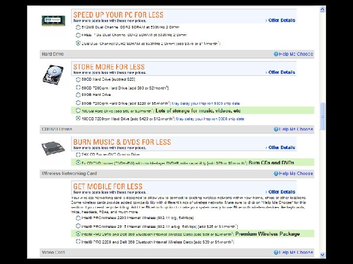
Input Form Hints • Chunk input controls by category, like on the Dell control panel… 45 copyright Penny Mc. Intire, 2010
Form Validation • Validate as much as possible on the client, using Java. Script, to avoid wasting bandwidth with invalid entries. • Client-side validation is generally limited to completeness (all required fields are entered) and format (numeric, etc. ). 46 copyright Penny Mc. Intire, 2010
Form Validation • Can validate upon submit, as well as when each field is entered and then loses focus. • The latter is rarely done these days, although often done on non-web applications. • Free validation scripts (dates, states, email addresses, valid zip codes, etc. ) at www. javascriptsource. com. 47 copyright Penny Mc. Intire, 2010
Visitor Support: Instructions, Help, & Error Handling • Also under the categories of user-centric design, human factors, and usability. • “Don’t explain unless you have to, and consider all explanations as bad design, unless you can’t find a better way. ” John Cato, User-Centered Web Design. 48 copyright Penny Mc. Intire, 2010
Visitor Support: Instructions, Help, & Error Handling • Principles of visitor support: – Practice defensive design – make it hard for the visitor to make a mistake. – Cope gracefully with errors (more in a bit). – Less is more – be brief and salient, and make sure that critical information is highlighted. 49 copyright Penny Mc. Intire, 2010
Visitor Support: Instructions, Help, & Error Handling – Provide obvious documentation for probabilities, and less “in your face” documentation for rarer possibilities, to avoid overwhelming the visitor with too much information. 50 copyright Penny Mc. Intire, 2010
Visitor Support: Instructions • Accurately label each form control, including any formatting requirements (e. g. , date). • Instructions should be close to the applicable control. • Be unobstrusive – e. g. , don’t pop up a separate window with instructions unless the visitor requests it. 51 copyright Penny Mc. Intire, 2010
Visitor Support: Instructions • Use a consistent vocabulary (e. g. , don’t use “participant” in one place, “member” in another. • Be concise; avoid TMI. • Include the title attribute on form controls if you need to provide further instructions on rollover. 52 copyright Penny Mc. Intire, 2010
Visitor Support: Help • Should rarely need on web sites; only for the most complicated tasks. • If a visitor consults “help, ” it’s because he or she is at a crisis point and already frustrated. • Which means we need to be particularly, well, helpful. 53 copyright Penny Mc. Intire, 2010
Visitor Support: Help • Two types: – Action-based help, like a tutorial. – Reference-based, with just an explanation. • Links to help can be in two places: – On the main navigation, always available… 54 copyright Penny Mc. Intire, 2010
Visitor Support: Help – Contextual help / smart help, right where needed… 55 copyright Penny Mc. Intire, 2010
Visitor Support: Feedback • Example of appropriate feedback: if visitors enter shipping info on one page and credit card info on another, redisplay all order information on a summary page before asking for order confirmation. 56 copyright Penny Mc. Intire, 2010
Visitor Support: Feedback • Two types of feedback: – Modal: requires a response before the activity can proceed, usually in the form of a dialog box… 57 copyright Penny Mc. Intire, 2010
Visitor Support: Feedback – Modeless: feedback that’s informational but doesn’t require an action from the visitor. • Examples: – Active link formatting indicates that a click on a text link was recognized. – An animation to indicate that an activity is progressing. 58 copyright Penny Mc. Intire, 2010
Visitor Support: Feedback • Avoid modal feedback whenever possible because it delays the visitor. – Use only for critical errors or doublechecking before executing an irreversible (so called “ejector seat”) action. 59 copyright Penny Mc. Intire, 2010
Visitor Support: Error Handling/Contingency Design • Be helpful: state the error, it’s implications, and what to do. – Some of my favorite error messages… • Be clear and non-technical: – “Our UNIX server doesn’t recognize URLs with embedded spaces, ” versus – “Please don’t use spaces in the address. ” • Be concise; extraneous information merely obscures critical information. 60 copyright Penny Mc. Intire, 2010
Visitor Support: Error Handling/Contingency Design • Be polite, non-technical, non-accusatory, and apologetic. • Avoid humor; a visitor at a crisis point rarely has much of a sense of humor. • Focus the cursor on the field in error, so the visitor doesn’t need to hunt for it. • Make sure the error stands out on the page, with color coding, asterisks, or an obvious error icon. 61 copyright Penny Mc. Intire, 2010
Visitor Support: Error Handling/Contingency Design • If the error is discovered after hitting the server, don’t make the visitor re-enter the entire form again! • Two polite options: – Present the entire form again, with fields populated as the visitor entered them and errors highlighted. – Present an abbreviated form, with only the fields in error. 62 copyright Penny Mc. Intire, 2010
Visitor Support: Error Handling/Contingency Design • Surprising finding: successful resolution of a problem builds customer loyalty faster than delivering a product that performs flawlessly! 63 copyright Penny Mc. Intire, 2010
Visual Design of Form Controls • All of the design guidelines we’ve already examined – layout, color, typography, etc. – apply to form pages. • But we can do styling on individual form controls, too, using CSS… 64 copyright Penny Mc. Intire, 2010
65 copyright Penny Mc. Intire, 2010
Visual Design of Form Controls • These examples use background colors, borders (including ridge, dotted, double, etc. ), fonts (including size, typefaces, styles, and color). • Just because we can do this much styling doesn’t mean we should; some of these controls are almost unrecognizable. 66 copyright Penny Mc. Intire, 2010
Visual Design of Form Controls • Sometimes, the styling around a control can help to increase accuracy, like this color coding… 67 copyright Penny Mc. Intire, 2010
Input Forms and Accessibility • Ideally, the label should be to the left of the input control itself, so that the screen reader reads the label first. – Unfortunately, that makes it hard to line things up on the screen visually. – An alternate is to use the following to associate the label with the control… <label for="control. Name"> label goes here </label> 68 copyright Penny Mc. Intire, 2010
Input Forms and Accessibility • To make chunking more explicit, surround related form elements in a <fieldset> tag, complete with a <legend>. 69 copyright Penny Mc. Intire, 2010
Input Forms and Accessibility • Don’t use instructions as the default value in a field, because once data entry has started, the instructions can’t be revisited. • Avoid using long list boxes with the multiple attribute; whenever possible use checkboxes instead. 70 copyright Penny Mc. Intire, 2010
Input Forms and Accessibility • Don’t set the default value for a single yes/no checkbox to “yes. ” • Use the title attribute to provide tooltips on rollover. 71 copyright Penny Mc. Intire, 2010
Resources • http: //www. creativepro. com/article/view -source-building-better-formsdreamweaver-cs 3 Auto form validation in Dreamweaver CS 3 and newer 72 copyright Penny Mc. Intire, 2010