Format for Ease of Access Importance Design Principles


- Slides: 20
Format for Ease of Access • Importance • Design Principles • Design Elements
Importance • First impression is purely visual • Sloppy format alienates reader Good Page Design • Helps reader understand your information • Helps reader locate information • Helps reader notice important content
Basic Design Principles • • • Placement Proximity Alignment Contrast Repetition
Content Placement Certain parts of the page are more important than others • Bottom of page – might not be seen or read. • Eye level – Approximately 1/3 from the top and 2/3 from the bottom – gets more attention. • Bulleted lists – get more attention. – The first few points in the list get more attention.
Placement is one way to accent results within a section Section Heading Beginning of section The beginning of a section receives emphasis, as does the beginning of a paragraph. Table I Time-Flight Results Illustration End of paragraph No. Height Time A 10 cm 1 ms B 11 cm 2 ms The end of a section receives emphasis, as does the end of a paragraph. End of section
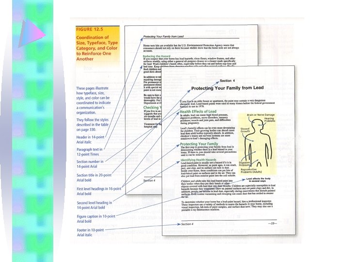
Repetition Use repetition to unify your communication visually • Same grid pattern throughout • Same type treatment (font, size, color, etc. ) for headings, subheadings, and text
Repetition Use consistent headings and subheadings
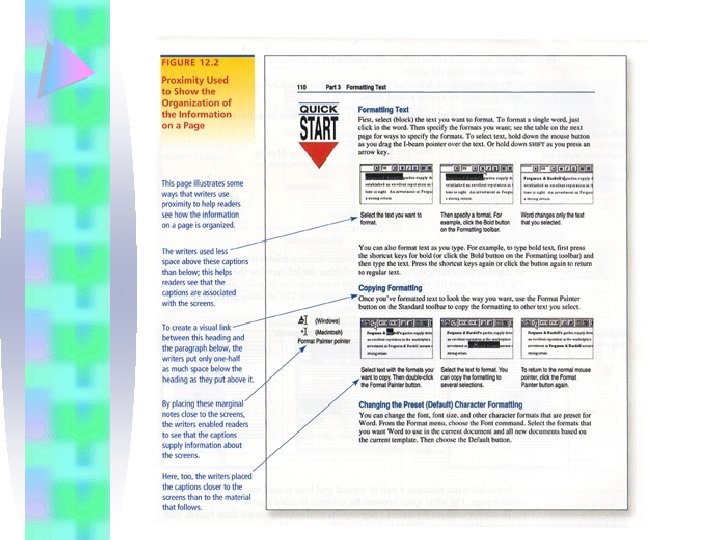
Proximity Use white space to place related items close to one another Not Grouped Martina Aleverez AAA Consultants, Inc 4357 Evington Street Montclair, NJ 50517 (416) 232 -9999
Proximity White space gives shape to document and orients the user
space for margins space for headings space for illustrations
Alignment Arbitrary placement of text causes confusion for the reader Arbitrary Placement Martina Aleverez AAA Consultants, Inc 4357 Evington Street Montclair, NJ 50517 (416) 232 -9999 Alignment Relationship Martina Aleverez AAA Consultants, Inc 4357 Evington Street Montclair, NJ 50517 (416) 232 -9999
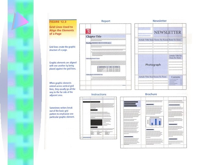
Alignment Grid lines can be used to create the page layout
Contrast Use contrast to establish hierarchy and focus No Contrast Emphasis Martina Aleverez AAA Consultants, Inc 4357 Evington Street Montclair, NJ 50517 (416) 232 -9999 CAUTION: Don’t overdo graphic contrast !
Contrast Use lists for easy reading Items you might list: • Advice or examples • Conclusions/recommendations • Criteria for evaluation • Errors to avoid • Material for a procedures • Equipment in a procedure • Parts of a mechanism • Steps in a sequence
Contrast Select type that is easy to read Serif Times New Roman abcdefghijklmnopqr stuvwxyz 1234567890 Sans Serif Arial abcdefghijklmnopqr stuwxyz 1234567890 Avoid all Caps TYPE IS TO READ Type is to read
48 point posters 36 point presentation slides 24 point 18 point titles 14 point 12 point text 10 point 8 point footnotes
Design Elements • • • Text Headings / Subheadings Graphics White space / grid Headers and footers Physical features