Focused Simple How to design a poster Graphic

- Slides: 1

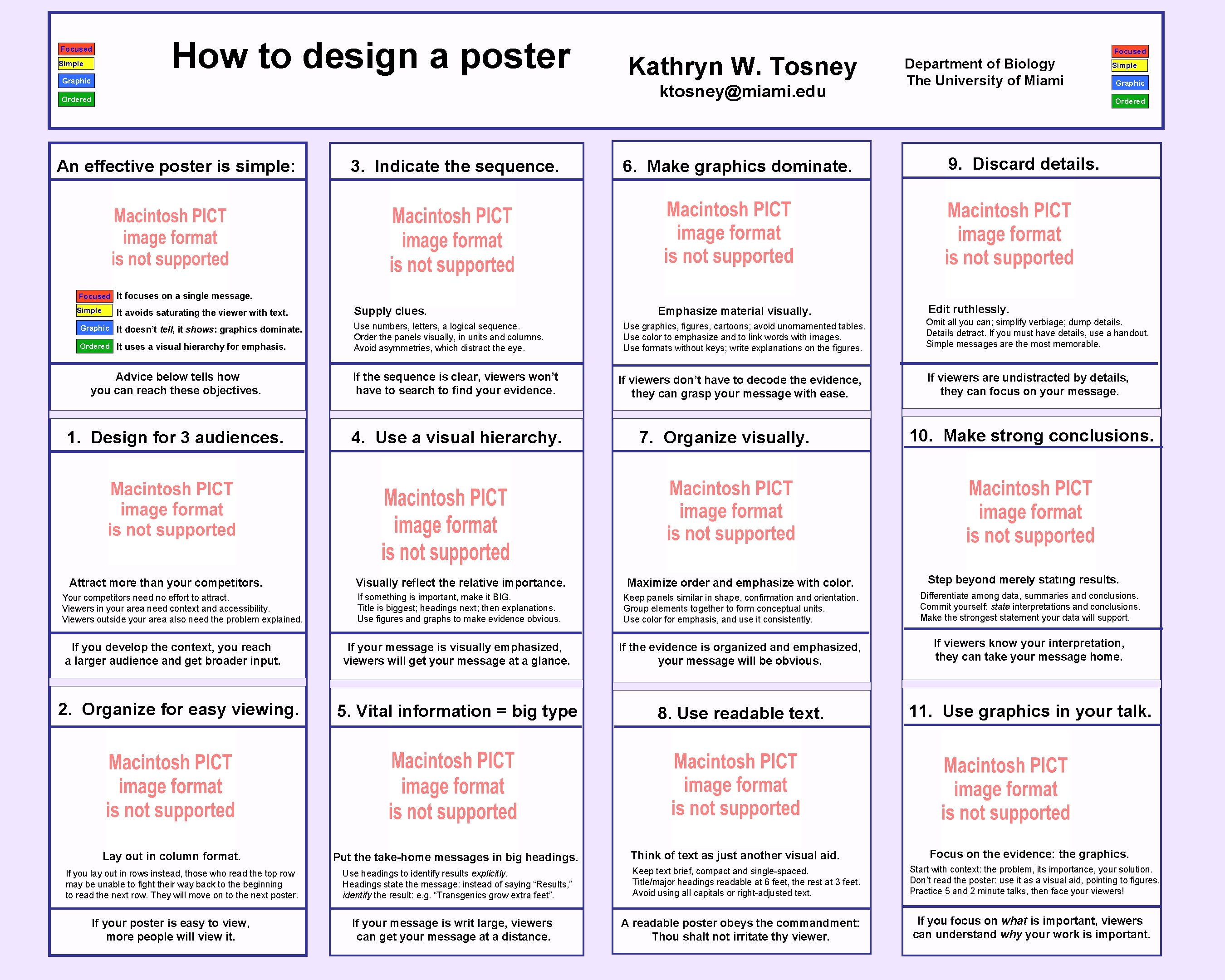
Focused Simple How to design a poster Graphic Kathryn W. Tosney ktosney@miami. edu Ordered An effective poster is simple: 3. Indicate the sequence. 6. Make graphics dominate. Focused Department of Biology The University of Miami Simple Graphic Ordered 9. Discard details. Focused It focuses on a single message. Simple It avoids saturating the viewer with text. Graphic It doesn’t tell, it shows: graphics dominate. Ordered It uses a visual hierarchy for emphasis. Supply clues. Emphasize material visually. Use numbers, letters, a logical sequence. Order the panels visually, in units and columns. Avoid asymmetries, which distract the eye. Advice below tells how you can reach these objectives. If the sequence is clear, viewers won’t have to search to find your evidence. 1. Design for 3 audiences. 4. Use a visual hierarchy. Focused Attract more than your competitors. Your competitors need no effort to attract. Viewers in your area need context and accessibility. Viewers outside your area also need the problem explained. If you develop the context, you reach a larger audience and get broader input. 2. Organize for easy viewing. Lay out in column format. If you lay out in rows instead, those who read the top row may be unable to fight their way back to the beginning to read the next row. They will move on to the next poster. If your poster is easy to view, more people will view it. Use graphics, figures, cartoons; avoid unornamented tables. Use color to emphasize and to link words with images. Use formats without keys; write explanations on the figures. If viewers don’t have to decode the evidence, they can grasp your message with ease. 7. Organize visually. Focused Edit ruthlessly. Omit all you can; simplify verbiage; dump details. Details detract. If you must have details, use a handout. Simple messages are the most memorable. If viewers are undistracted by details, they can focus on your message. 10. Make strong conclusions. Focused Step beyond merely stating results. Visually reflect the relative importance. Maximize order and emphasize with color. If something is important, make it BIG. Title is biggest; headings next; then explanations. Use figures and graphs to make evidence obvious. Keep panels similar in shape, confirmation and orientation. Group elements together to form conceptual units. Use color for emphasis, and use it consistently. Differentiate among data, summaries and conclusions. Commit yourself: state interpretations and conclusions. Make the strongest statement your data will support. If your message is visually emphasized, viewers will get your message at a glance. If the evidence is organized and emphasized, your message will be obvious. If viewers know your interpretation, they can take your message home. 5. Vital information = big type 8. Use readable text. 11. Use graphics in your talk. Put the take-home messages in big headings. Use headings to identify results explicitly. Headings state the message: instead of saying “Results, ” identify the result: e. g. “Transgenics grow extra feet”. If your message is writ large, viewers can get your message at a distance. Think of text as just another visual aid. Keep text brief, compact and single-spaced. Title/major headings readable at 6 feet, the rest at 3 feet. Avoid using all capitals or right-adjusted text. A readable poster obeys the commandment: Thou shalt not irritate thy viewer. Focus on the evidence: the graphics. Start with context: the problem, its importance, your solution. Don’t read the poster: use it as a visual aid, pointing to figures. Practice 5 and 2 minute talks, then face your viewers! If you focus on what is important, viewers can understand why your work is important.