FiveMinute Check over Lesson 7 7 Main Idea

 Main Idea and Vocabulary Concept Summary: Graphs Example")

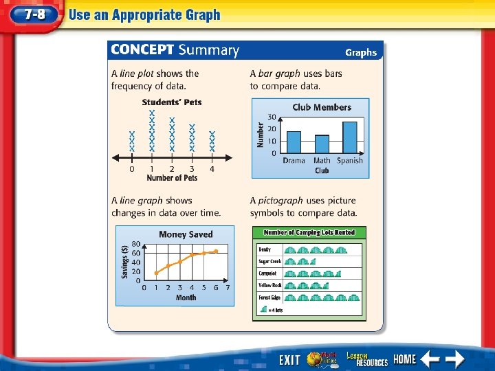


 Image Bank Math Tool Chest Use an Appropriate")
 The table shows the number of baseball caps sold at")

- Slides: 18
Five-Minute Check (over Lesson 7– 7) Main Idea and Vocabulary Concept Summary: Graphs Example 1: Use an Appropriate Graph Example 2: Real-World Example 3: Real-World Example Use an Appropriate Graph
• I will select and make an appropriate graph for presenting data. • pictograph
Use an Appropriate Graph The table shows the weights of 12 puppies. Select and make an appropriate graph for presenting the data.
Use an Appropriate Graph A line plot could be used to show the frequency of the data. Answer: So, the line plot is the most appropriate graph for presenting the data.
Look at the table. What type of graph would best represent this data? A. bar graph B. line graph C. line plot D. pictograph 1. 2. 3. 4. A B C D
Meg biked five days as shown in the table. Select and make an appropriate graph for presenting the data.
A line graph would be useful to show the changes in the biking schedule over a five day period. Answer: So, making a line graph is the most appropriate for presenting the data.
Look at the table. What type of graph would best represent this data? A. bar graph B. line plot C. pictograph D. double bar graph 1. 2. 3. 4. A B C D
Felipe surveyed fifth- and sixth-grade students to find out their favorite school lunches. Select and make an appropriate graph for presenting data.
There are two sets of data: the fifth- and sixth-grade students favorite school lunch. To compare the four lunch choices, use a double bar graph. It allows you to compare both sets of data at a glance.
Answer: So, making a double bar graph is most appropriate for presenting the data.
What kind of graph would best represent the changes in data over time? A. line plot B. bar graph C. line graph D. pictograph 1. 2. 3. 4. A B C D
End of the Lesson
Five-Minute Check (over Lesson 7– 7) Image Bank Math Tool Chest Use an Appropriate Graph
(over Lesson 7– 7) The table shows the number of baseball caps sold at a store over four months. If you were to make a line graph of this data, what would the changes from June to September look like? A. The number of caps sold decreased each month. B. There is no increase or decrease in the number of caps sold each month. C. The number of caps sold increased each month. D. The number of caps increased until the middle of the summer months, and then began to decrease. 1. 2. 3. 4. A B C D