FiveMinute Check over Lesson 7 5 Main Idea






- Slides: 17


Five-Minute Check (over Lesson 7– 5) Main Idea and Vocabulary Example 1: Make and Interpret a Bar Graph Example 2: Make and Interpret a Bar Graph

• I will make and interpret bar graphs and double bar graphs. • bar graph • double bar graph

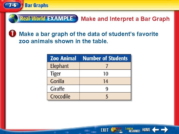
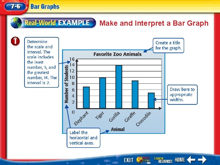
Make and Interpret a Bar Graph Make a bar graph of the data of student’s favorite zoo animals shown in the table.

Make and Interpret a Bar Graph

Make and Interpret a Bar Graph Answer: You can see from the graph that more students chose the gorilla as their favorite zoo animal than any other.

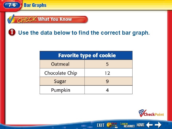
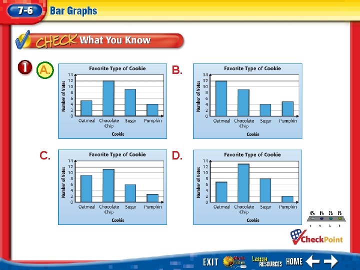
Use the data below to find the correct bar graph.

A. B. C. D. 1. 2. 3. 4. A B C D

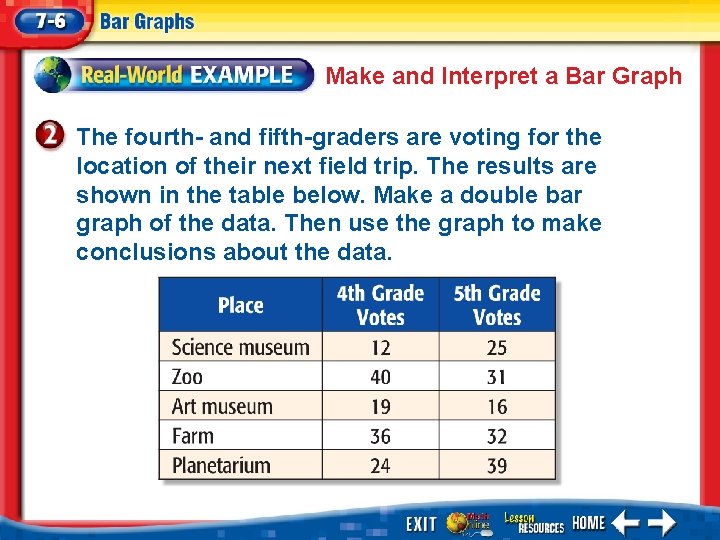
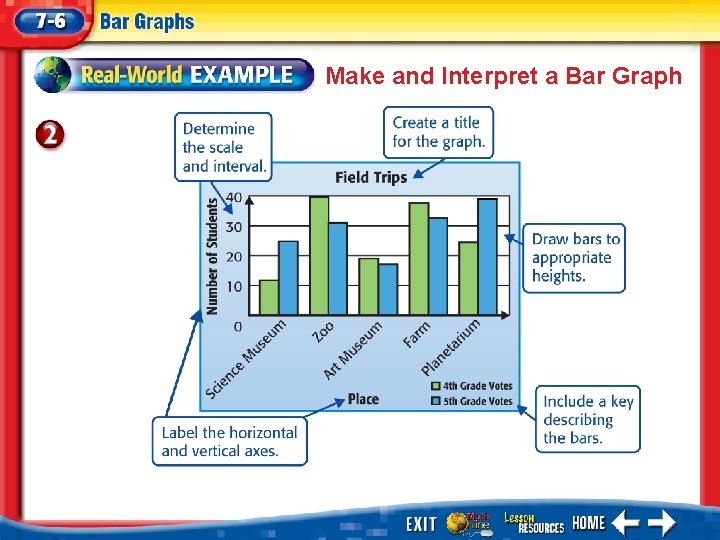
Make and Interpret a Bar Graph The fourth- and fifth-graders are voting for the location of their next field trip. The results are shown in the table below. Make a double bar graph of the data. Then use the graph to make conclusions about the data.

Make and Interpret a Bar Graph

Make and Interpret a Bar Graph You can make the following conclusions from the graph. • The field trip that received the greatest number of fourth grade votes was the zoo. • The field trip that received the greatest number of fifth grade votes was the planetarium. • The range of fourth grade votes is 40 – 12 or 28. The range of fifth grade votes is 40 – 18 or 22. So, the fourth grade votes were more spread out.

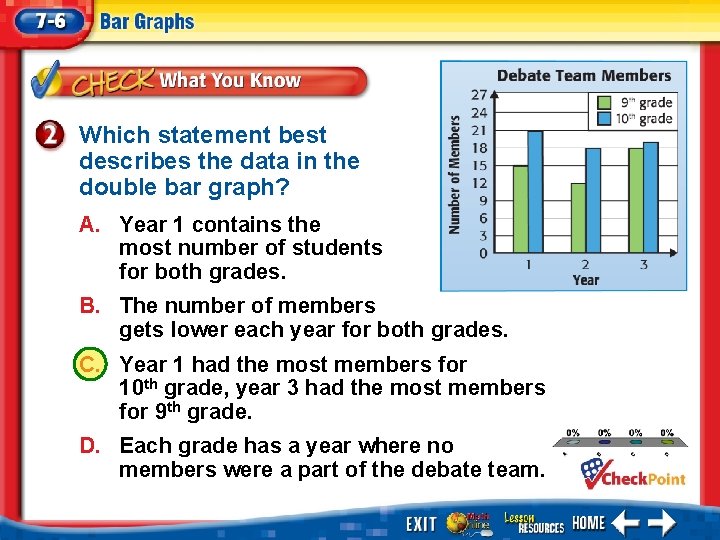
Which statement best describes the data in the double bar graph? A. Year 1 contains the most number of students for both grades. B. The number of members gets lower each year for both grades. C. Year 1 had the most members for 10 th grade, year 3 had the most members for 9 th grade. D. Each grade has a year where no members were a part of the debate team. 1. 2. 3. 4. A B C D

End of the Lesson

Five-Minute Check (over Lesson 7– 5) Image Bank Math Tool Chest Use an Appropriate Graph

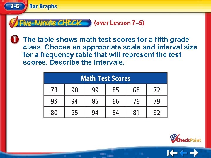
(over Lesson 7– 5) The table shows math test scores for a fifth grade class. Choose an appropriate scale and interval size for a frequency table that will represent the test scores. Describe the intervals.

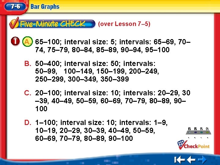
(over Lesson 7– 5) A. 65– 100; interval size: 5; intervals: 65– 69, 70– 74, 75– 79, 80– 84, 85– 89, 90– 94, 95– 100 B. 50– 400; interval size: 50; intervals: 50– 99, 100– 149, 150– 199, 200– 249, 250– 299, 300– 349, 350– 399 C. 20– 100; interval size: 10; intervals: 20– 29, 30 – 39, 40– 49, 50– 59, 60– 69, 70– 79, 80– 89, 90– 100 1. A D. 1– 100; interval size: 10; intervals: 1– 9, 10– 19, 20– 29, 30– 39, 40– 49, 50– 59, 60– 69, 70– 79, 80– 89, 90– 100 2. 3. 4. B C D
