Figures and Tables Senior Thesis Seminar Fall 2020
Figures and Tables Senior Thesis Seminar Fall 2020
Where you will use graphics? • Presentation • Proposal • Poster • Thesis
Why do you need graphics? • Clarify thinking • It is useful to create diagrams and figures early in the process of developing your ideas. • Having a figure outline can be the first step towards writing your thesis • Communicate your study effectively • A picture is worth a thousand words.
What can graphics show? • Present structure of your study/experiment • Logic flow of whole or parts of your argument • Illustrate key concepts • Explain particular methods • Scientific equipment that you are using and an explanation of how it works • Flow chart showing the steps in a process and the possible causes and consequences
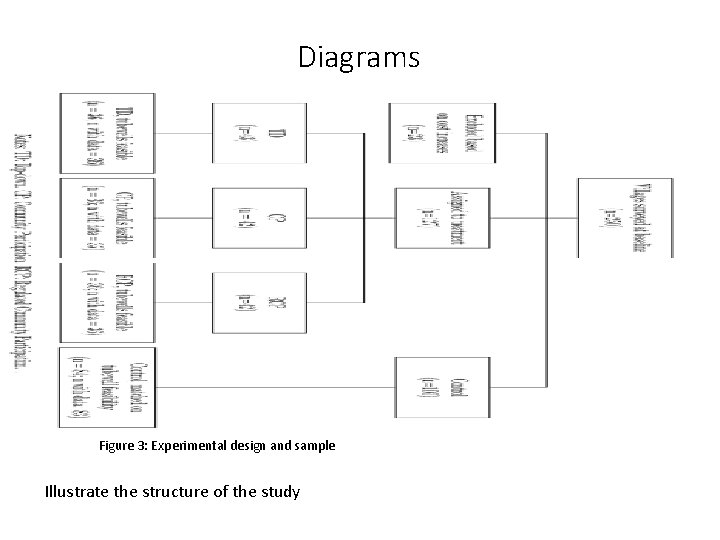
Diagrams Figure 3: Experimental design and sample Illustrate the structure of the study
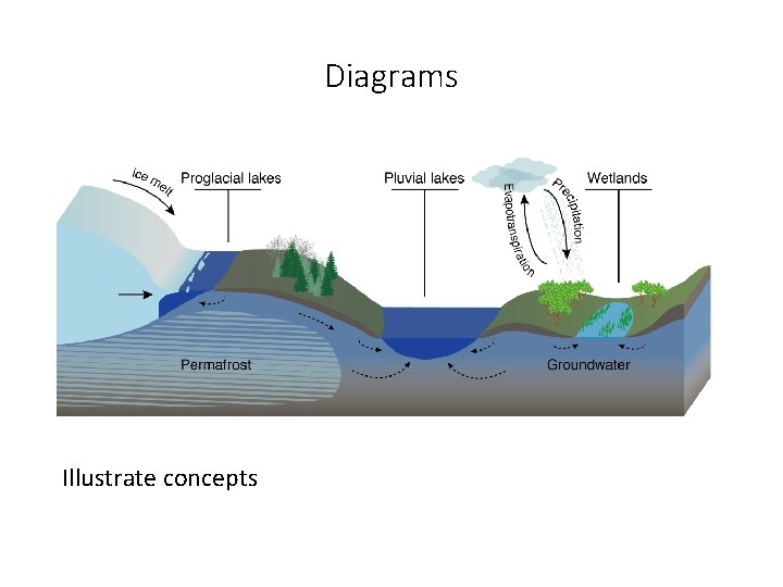
Diagrams Illustrate concepts
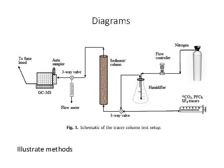
Diagrams Illustrate methods
What can graphics show? • Communicate results • Preliminary results • Anticipate results – show potential relationships • Results from related project – explain potential differences • Describe data • Summarize main results from related literature
How to “screen grab” a figure from a paper • High resolution figures are often accessible in the online version of the paper https: //advances. sciencemag. org/content/6/9/eaay 2935? intcmp=trendmdadv • You can open the relevant PDF page with a vector graphic software to modify your figure (e. g. Adobe Illustrator, Affinity Desinger) • If you need to screenshot a figure, do it at maximum zoom • When saving your ppt you can compress figures to make your file size smaller
Where and how to place figures and tables? • Incorporate figures and tables in the text following the first citation. The number of species from 1990 to 2000 has increased (Fig. 1). • Mention and explain the figure or table in the text before it appears. • Number figures in the order in which they are cited in the text. • Same with tables. • Caption • At the top for tables, at the bottom for figures • Can highlight the key findings but should not include full description • Explain lines, points, etc. • Include references, data sources Figure 1: Comparison between the location of earthquakes obtained using a traditional approach versus the new relocation approach used here. Black line denotes the plate boundary.
How create graphics? Guiding questions • Does it convey key relationship in data or key element of study? • Is it self-explanatory and guide reader to “take-home lesson”? • Is it clear and simple? • No extraneous legends or lines. • No bells and whistles like 3 D unless serve important purpose. • High resolution. • Are axes labeled and units indicated? • Is all critical information there? • Show uncertainty with error bars • Indicate goodness of fit • • Does figure distort data in any way? Does it use space well? Do the colors work? Is the font big enough? Figures need revisions – just like text.
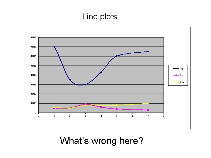
Line plots 0. 08 0. 07 0. 06 0. 05 Tap 0. 04 Pur Brita 0. 03 0. 02 0. 01 0 0 1 2 3 4 5 6 What’s wrong here? 7 8
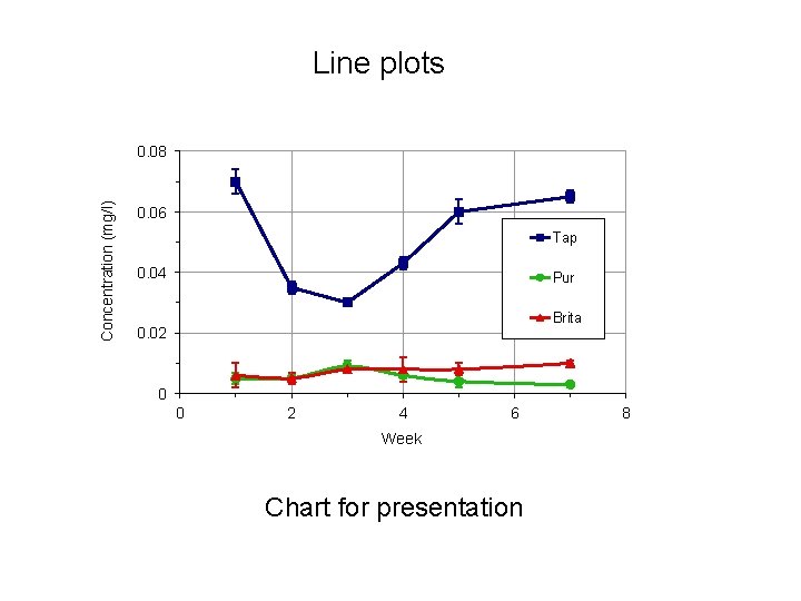
Line plots Concentration (mg/l) 0. 08 0. 06 Tap 0. 04 Pur Brita 0. 02 0 0 2 4 6 Week Chart for presentation 8
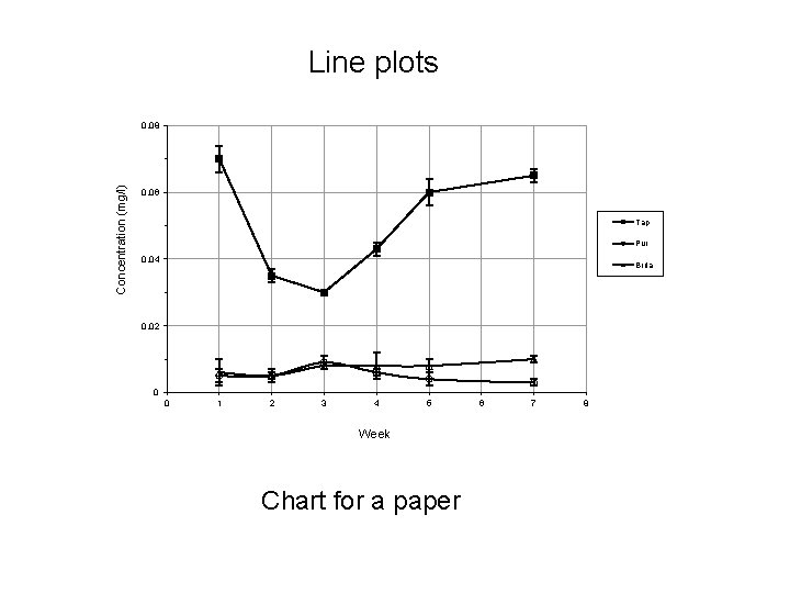
Line plots Concentration (mg/l) 0. 08 0. 06 Tap Pur 0. 04 Brita 0. 02 0 0 1 2 3 4 5 Week Chart for a paper 6 7 8
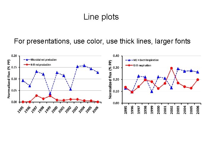
Line plots For presentations, use color, use thick lines, larger fonts
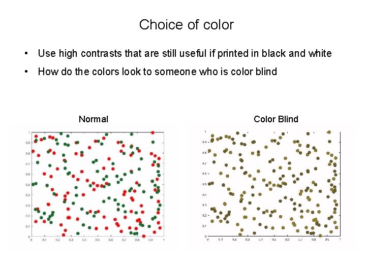
Choice of color • Use high contrasts that are still useful if printed in black and white • How do the colors look to someone who is color blind Normal Color Blind
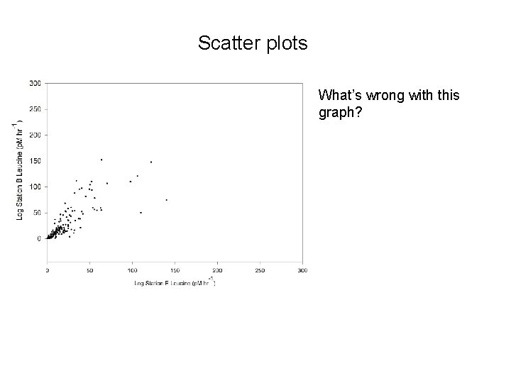
Scatter plots What’s wrong with this graph?
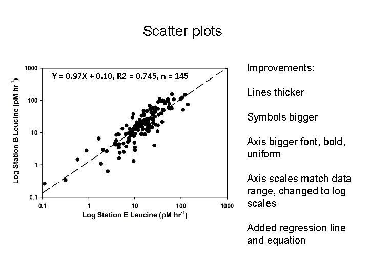
Scatter plots Y = 0. 97 X + 0. 10, R 2 = 0. 745, n = 145 Improvements: Lines thicker Symbols bigger Axis bigger font, bold, uniform Axis scales match data range, changed to log scales Added regression line and equation
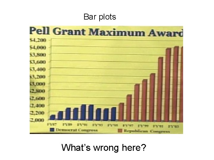
Bar plots What’s wrong here?
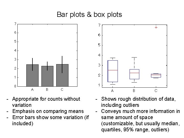
Bar plots & box plots - Appropriate for counts without variation - Emphasis on comparing means - Error bars show some variation (if included) - Shows rough distribution of data, including outliers - Conveys much more information in same amount of space (customizable, but usually median, quartiles, 95% range, outliers)
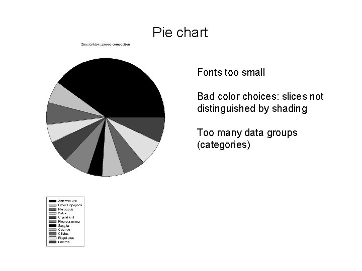
Pie chart Fonts too small Bad color choices: slices not distinguished by shading Too many data groups (categories)
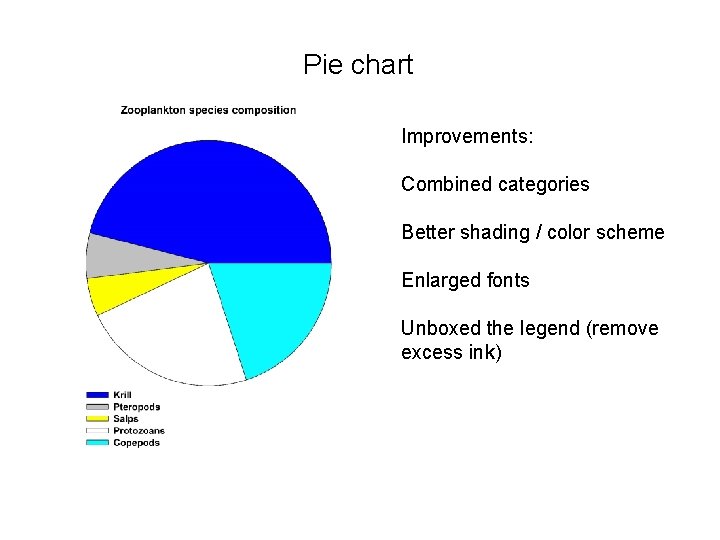
Pie chart Improvements: Combined categories Better shading / color scheme Enlarged fonts Unboxed the legend (remove excess ink)
Tools to make good figures • Excel (don’t use the default!) • Computational environments: Matlab, python (Matplotlib), R, … • Cartoons, diagrams: Affinity Designer, Adobe Illustrator, Power. Point, … • Maps: GMT, Geo. Map. App, Arc. GIS, QGIS… You can use drafting programs (Affinity Designer, Adobe Illustrator, …) to modify your figures
Additional resources Senior Seminar website How to … Create Good Graphs and Captions Almost Everything You Wanted to Know About Making Tables and Figures Ten Simple Rules for Better Figures
- Slides: 24