Figure of the Day Faculty notes Each figure


")


 -2 +2 B) -2")
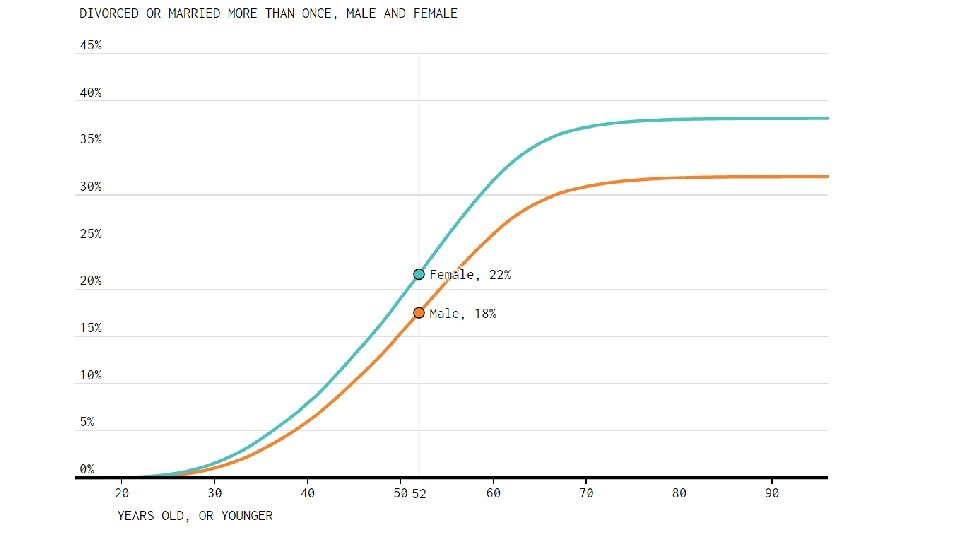
 B) https: //www. bloomberg. com/graphics/2015 -whats-warming-the-world/")


- Slides: 74
Figure of the Day
Faculty notes • Each figure is presented as a pair of slides, the first with all axis labels and legends removed, and the second as the original figure • Students are asked to make observations about the unlabeled version and guess what pattern is represented. Give students a few minutes to discuss in groups or partners, then call on groups to share with the class. • The figures in this presentation are very roughly ordered by difficulty or complexity, although this will of course vary with student backgrounds. This exercise works well as a ‘warm up’ at the beginning of each class www. biomaap. org
Faculty Notes: Other tips for student engagement • Try to respond positively (or neutrally) to each student suggestion or guess, pulling out key observations and asking for their reasoning even if the guess is ‘wrong. ’ This should NOT be a game of hot/cold (“Is it precipitation? “ “No” “Is it temperature? ” “No” is not how this should go). See the Instruction Guide for more on this • You can give hints, but don’t tell students the answer until discussion has petered out. Even if the first response has correctly guessed the figure, don’t stop! Continue to take further guesses and observations (“Did anyone come up with a different guess? ”). This helps the students enjoy the process of figuring out the puzzle rather than focusing on ‘the right answer’
Faculty Notes: Other tips for student engagement • It can be helpful to ask about certain features every time (suggestions below). This reinforces key graphing skills and also gives the students a starting point to go to if the are stuck. You can also prompt for these features when the class reports back. These features could include: • Independent (explanatory) variable • Dependent (response) variable • Variable types: numerical (discrete or continuous) vs. categorical (ordinal vs. nominal) • More than two variables plotted? (i. e. with colors, patterns, etc. ) • What is the scale of any numerical variables? Can you use your knowledge of the world to contextualize those? (e. g. , if the numbers range from 0 to 100 then it might be percent but it’s probably not total population of countries)
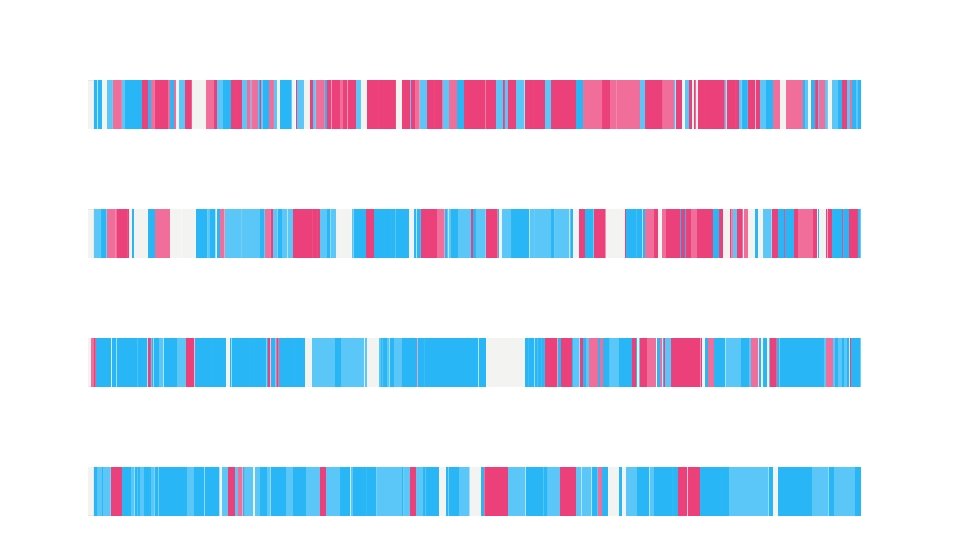
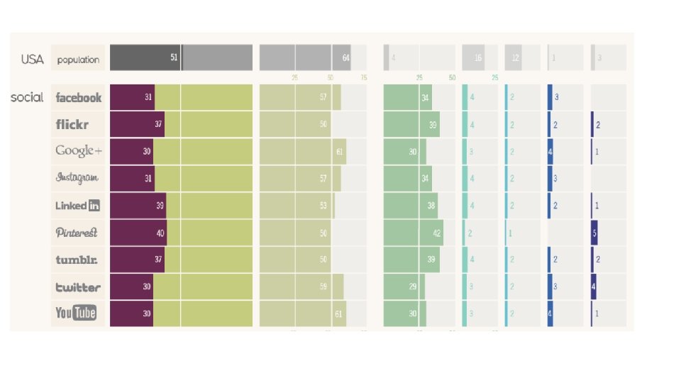
Figure of the Day “Rules” • If you have already seen the graph, don’t give it away! Let your classmates enjoy figuring it out • Start with observations: what do you know? Variable types? Are the colors or numbers typically used in a certain context? • Enjoy the puzzle! www. biomaap. org
? JAN FEB MAR APR MAY JUN JUL AUG SEP OCT NOV DEC
TED Talk: “The beauty of data visualization, ” David Mc. Candless
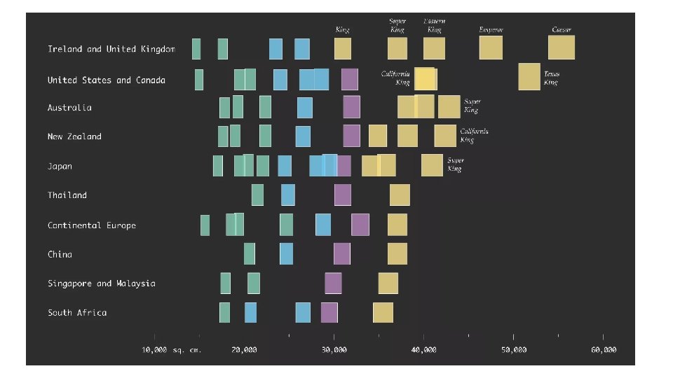
http: //flowingdata. com/2016/12/14/bed-sizes-around-the-world/
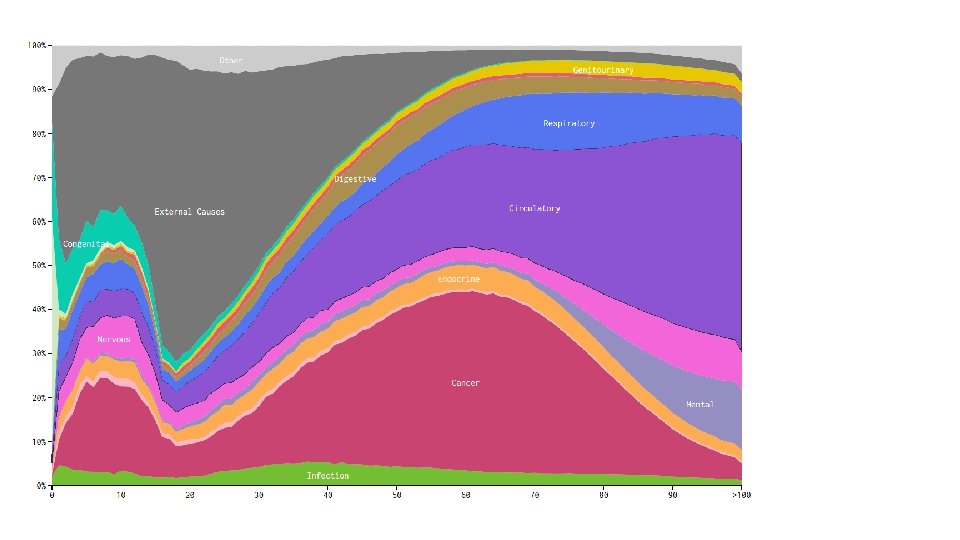
http: //flowingdata. com/2016/01/05/causes-of-death/
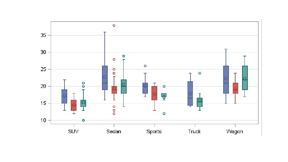
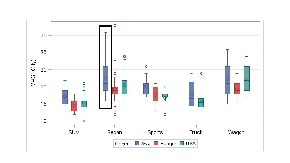
http: //blogs. sas. com/content/graphicallyspeaking/2013/03/24/custom-box-plots/
Miles per gallon
Miles per gallon
Miles per gallon
Miles per gallon
Miles per gallon
Miles per gallon
http: //flowingdata. com/2017/03/17/when-americans-lost-their-virginity/
http: //flowingdata. com/2017/03/17/when-americans-lost-their-virginity/
+2 A) -2 +2 B) -2
A) B) https: //www. bloomberg. com/graphics/2015 -whats-warming-the-world/
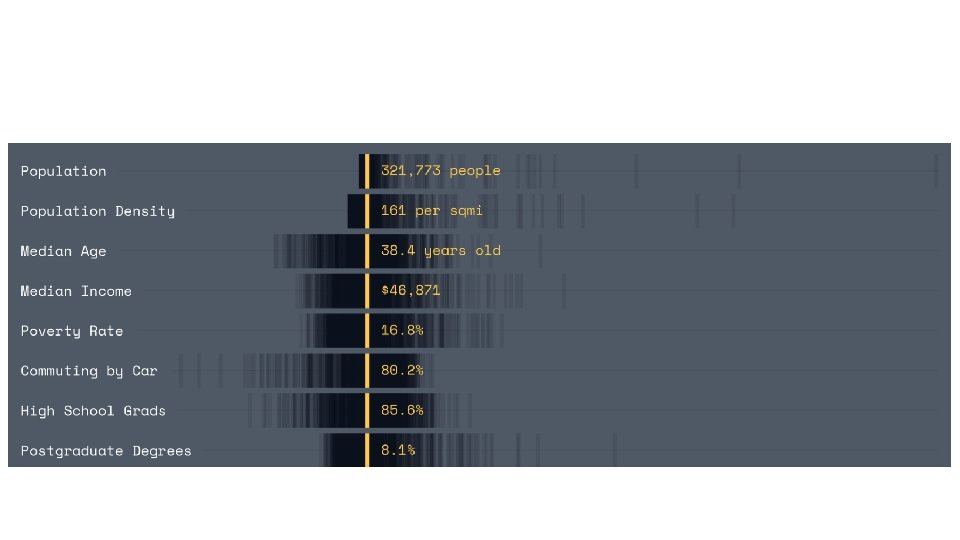
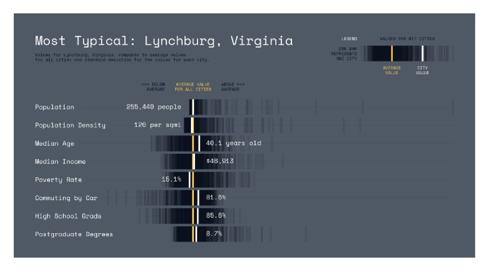
https: //shift. newco. co/lynchburg-virginia-the-most-typical-city-in-america-eedfc 45412 a 2#. 4 wona 7 y 3 r
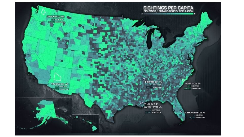
http: //uxblog. idvsolutions. com/2015/06/sightings. html
http: //www. pnnl. gov/science/images/highlights/atmospheric/dnb_united_states-580. jpg
http: //www. informationisbeautiful. net/2015/information-is-beautiful-awardswinners-2015/
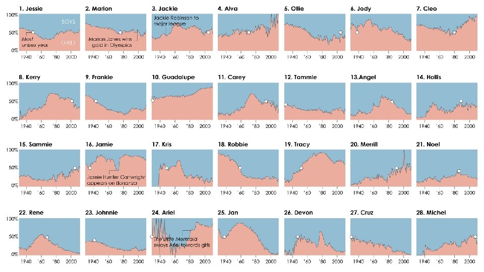
https: //flowingdata. com/2013/09/25/the-most-unisex-namesin-us-history/
http: //www. tampabay. com/projects/2015/investigations/pinellas-failure-factories/chart-failing-black-students/#
http: //www. tampabay. com/projects/2015/investigations/pinellas-failure-factories/chart-failing-black-students/#
http: //www. informationisbeautiful. net/visualizations/based-on -a-true-story/
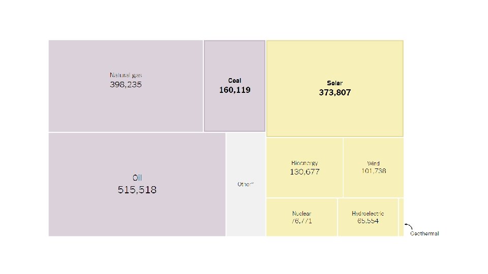
https: //www. nytimes. com/interactive/2017/04/25/climate/todays-energy-jobs-are-in-solar-not-coal. html
http: //www. informationisbeautiful. net/visualizations/diversity-in-tech-static/
http: //www. informationisbeautiful. net/visualizations/oil-well-static/
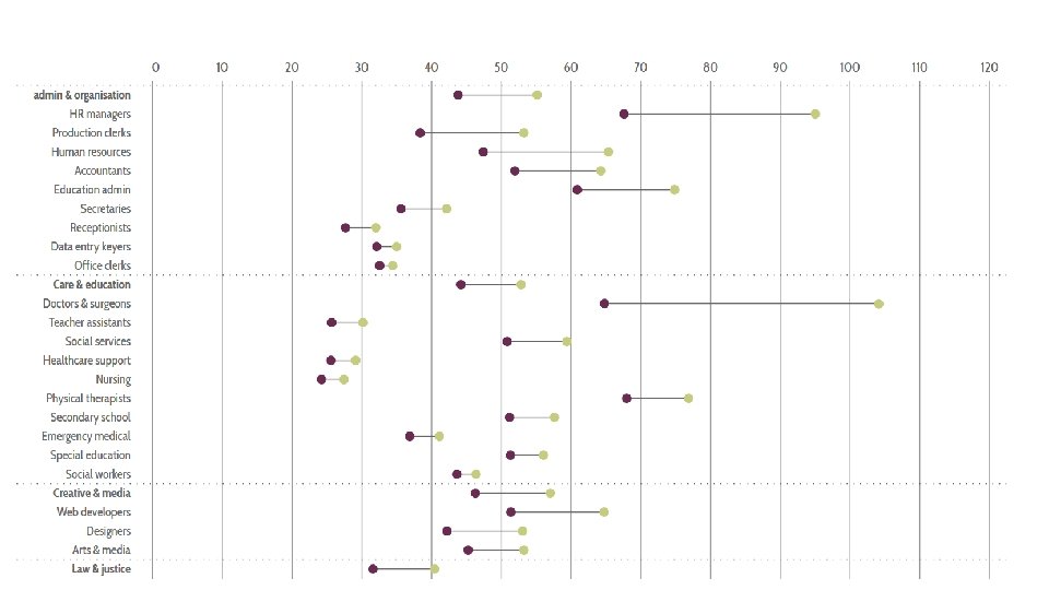
http: //www. informationisbeautiful. net/visualizations/gender-pay-gap/
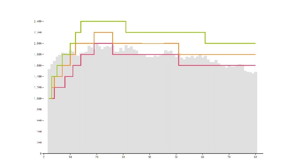
Females http: //flowingdata. com/2016/06/07/calorie-needs-againstconsumption/
Males
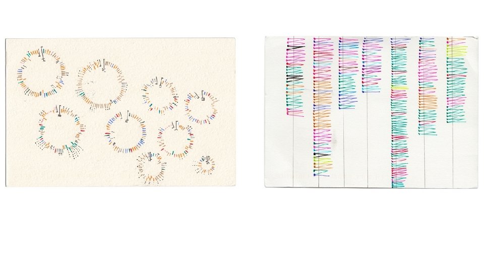
http: //www. dear-data. com/week-04
http: //www. dear-data. com/week-08 -1
Bad Graphs • The figures on the following slides are misleading and particularly bad examples of data visualization
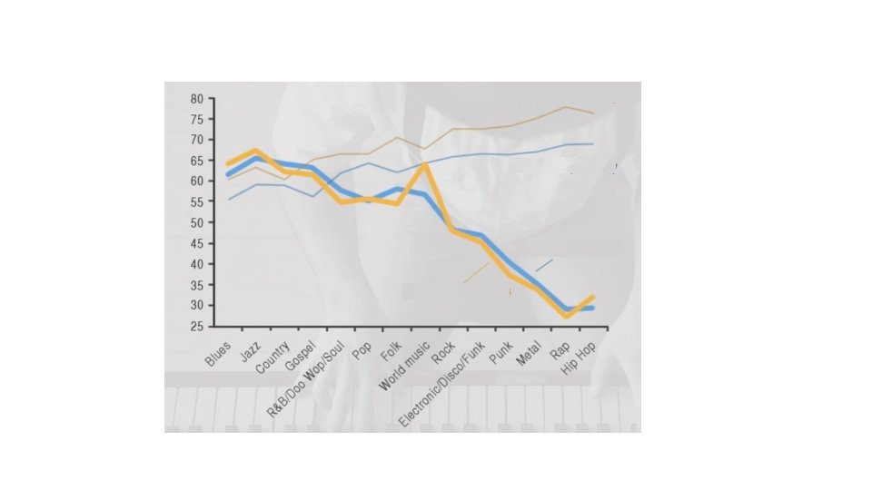
http: //callingbullshit. org/case_studies/case_study_musician_mortality. html
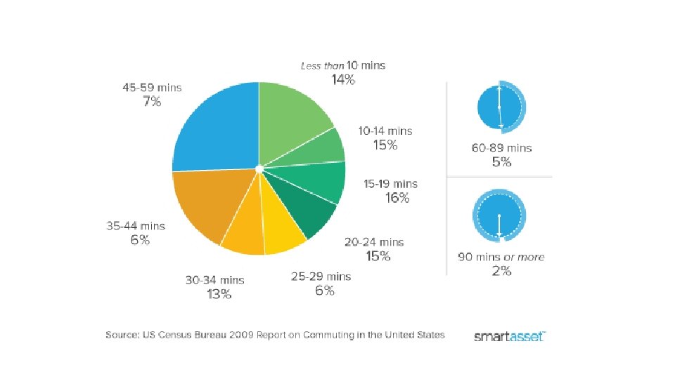
https: //smartasset. com/mortgage/what-will-my-commute-be
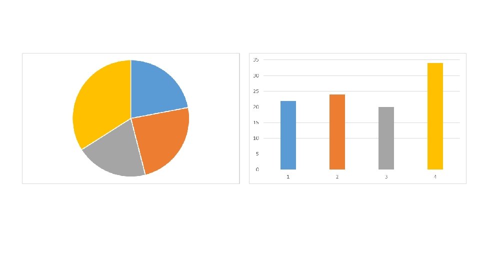
Pie charts versus bar graphs
1 • Write down numbers in order from highest to lowest percentage 4 2 3
• Write down numbers in order from highest to lowest amount
Class responses