Figure 10 1 Schematic representation of the ocean


.")


 atmosphere, (b) continental crust, (c) ocean,")

, phosphorus,")

 versus dissolved inorganic carbon (DIC). Arrows indicate changes")


.")

.")


- Slides: 38
Figure 10 -1. Schematic representation of the ocean basin and continental margin.
Figure 10 -2. Schematic cross section showing the three-layer ocean.
Figure 10 -3. Schematic representation of the interaction between winds and the ocean surface. From Williams (1962).
Figure 10 -4. Average surface currents of the world’s oceans. From Williams (1962).
Figure 10 -5. Schematic representation of the Ekman spiral in the Northern Hemisphere. Surface water moves at 45 o to the right of the prevailing wind direction. With increasing depth, the water velocity decreases and the Coriolis deflection increases. The net movement of water in the water column is at 90 o to the prevailing wind direction.
Figure 10 -6. Generalized pattern of vertical circulation in the Atlantic Ocean. The water masses are NACW (North Atlantic Central Water), SACW (South Atlantic Central Water), AIW (Arctic Intermediate Water), AAIW (Antarctic Intermediate Water), NADW (North Atlantic Deep Water), NABW (North Atlantic Bottom Water), AADW (Antarctic Deep Water), AABW (Antarctic Bottom Water), and MIW (Mediterranean Intermediate Water). The labels at the top of the diagram identify the positions of the Subtropical Convergence (STC), Antarctic Convergence (AC), and the Antarctic Divergence (AD).
Figure 10 -7. T-S characteristics for various water masses in the Atlantic Ocean. From von Arx (1962).
Figure 10 -8. T-S diagram for water samples in Example 10 -1. The intermediate waters are mixtures of MIW and NADW. The numbers in parentheses are the fraction of MIW in each sample.
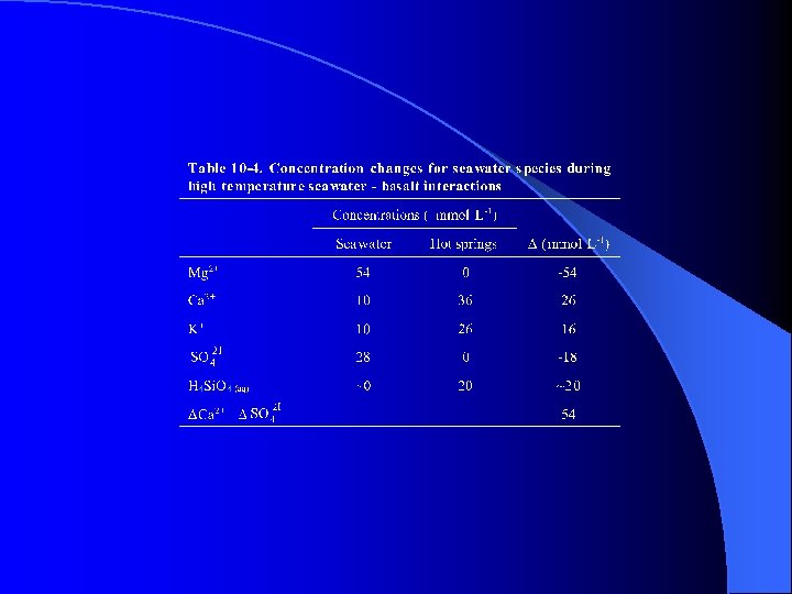
Figure 10 -9. Chemical balance between the (a) atmosphere, (b) continental crust, (c) ocean, and (d) oceanic crust. From Edmond and von Damm (1983).
Figure 10 -10. Schematic diagram showing inorganic chemical processes that occur at a hydrothermal vent. From “Geomicrobiology of the deep sea hydrothermal vents”, by H. W. Jannasch and M. J. Mottl in SCIENCE, #229, pp. 717 -725. Copyright 1985 American Association for the Advancement of Science. Reprinted with permission.
Figure 10 -11. Schematic representation of depth versus the variations in temperature (T), phosphorus, carbon dioxide, and oxygen in a region with high biological activity.
Figure 10 -12. Two-box model for the cycling of biologically utilized elements. After Broecker (1971).
Figure 10 -13. Carbonate alkalinity (CA) versus dissolved inorganic carbon (DIC). Arrows indicate changes in CA and DIC in response to various biological and chemical processes. Modified from Broecker (1974).
Figure 10 -14. Depth versus p. H for the average open ocean. See text for discussion.
Figure 10 -15. Concentration of boron species as a function of p. H at 20 o. C and salinity = 35‰.
Figure 10 -16. Variation in buffer capacity as a function of p. H for boric acid and carbonic acid in seawater.
Figure 10 -17. Variation in total buffering capacity for ocean and surface water as a function of p. H.
Figure 10 -18. Schematic plot of concentration versus salinity. Species A shows conservative behavior. Species B and C show nonconservative behavior. Internal processes are adding species B to the seawater. Internal processes are removing species C from the seawater.
Figure 10 -19. Distribution of major marine sediment types. From Aplin (2000).
Figure 10 -20. Schematic representation of the reactions that can occur between reactive minerals (opal, degraded alumino-silicates, Fe and Al oxyhydroxides, organic matter) and the clay minerals in marine sediments. From Aplin (2000).
Figure 10 -21. Methane hydrate stability in ocean sediment. From Kvenvolden (1988).
Figure 10 -22. Water circulation in a basin where evaporation exceeds precipitation. Note that the circulation extends throughout the entire depth of the basin. Figure 10 -23. Water circulation in a basin where precipitation exceeds evaporation. Note that there is very little vertical circulation. The water flow is largely confined to the surface layers above the sill depth.
Figure 10 -24. Change in concentration of heavy metal contaminant with time.
Figure 10 -25. Change in bioindicators, as a function of time, in response to changes in land use in the Chesapeake Bay area. From Zimmerman and Canuel (2000).
Figure 10 -26. Distinction between pyrolytic and petrogenic PAHs based on P/A and Fluo/Pyr ratios. Adapted from Budzinski et al. (1997).
Figure 10 -C 2 -1. Depth versus variations in the abundance of Zn 2+ (free zinc), Zn. T, and ligands in the northeastern Atlantic Ocean. Note that in the surface waters the abundance of the ligands significantly exceeds that of total zinc and in the deep waters the abundances of ligands and total zinc are approximately equal.
Figure 10 -C 5 -1. Map of San Francisco Bay showing locations of surface sediment samples and sediment cores. From Hostettler et al. (1999). Figure 10 -C 5 -2. Appearance of contaminants in the sediment record. The dashed lines connect the shallowest interval where a contaminant was not detected to the nearest interval where it was detected. The solid line connects the depth interval where a contaminant was first detected to the depth of maximum concentration. From van Green and Luoma (1999).